yTravel Blog
10 • 9
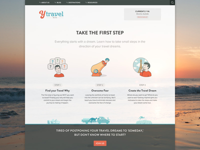
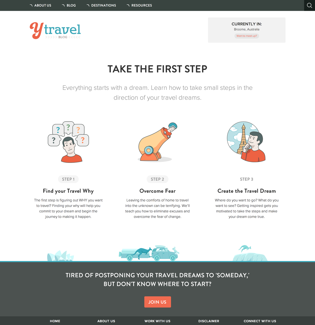
The Client's Redesign Announcement Post: http://www.ytravelblog.com/design-travel-blog-redesign-tips/
More Projects


10 • 9
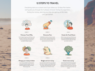
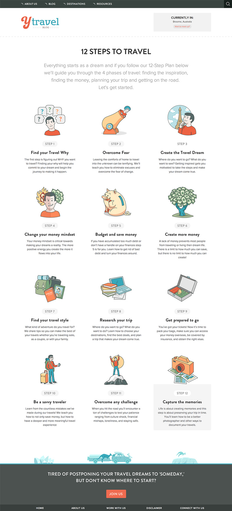
The Client's Redesign Announcement Post: http://www.ytravelblog.com/design-travel-blog-redesign-tips/


