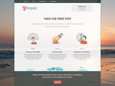
yTravel Blog - 12 Steps to Travel landing page
http://www.ytravelblog.com/12-steps/take-first-step/
The 12 steps to travel are divided up into 4 phases: Take the first step, find the money, plan your trip, and get on the road. The concept behind this design is to lead readers in a fun way through the evergreen content and increase page views. In the old design their content was getting buried in the blog index and users couldn't find it.
Props to @Henry Brown (dev) and @Piotr Antkowiak (icons)
You can find the MEGA details behind this redesign over at Never North:
http://nevernorth.com/ytravel-website-design/
More by Zeda Labs View profile
Like

