yTravel Blog 12 Steps to Travel Landing Page
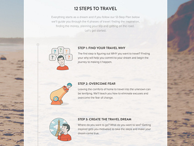
With yTravel Blog growing to over 1200+ posts their best content was getting buried inside the blog index. After researching their audience and finding their biggest struggle was getting started I created the 12 steps to travel. This divided out yTravel's content into 12 landing pages that users could easily browse through and find the content they needed, when they needed it. It also opened the client up to additional monetization strategies.
Props to @Henry Brown for bringing this concept to life and @Piotr Antkowiak for the sweet icons!
More by Zeda Labs View profile
Like

