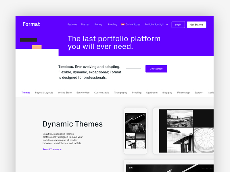
Format is an online portfolio built for designers, artists, illustrators, and photographers. The best part? It’s easy to use, flexible, and fully customizable. For more information or to try Format visit www.format.com.
Want to know what the Format team is working on right now? A product designer and interactive designer share what it’s like to be a part of the team in the Timeout below. If you think it sounds fun, Format is currently hiring an interactive/web designer in Toronto, Canada.
Who are you and what is your background?
I’m a product designer at Format. I was born and raised in the Toronto area, and in the past, I’ve worked at a number of startups and digital agencies here in Canada and in the US. My background is in art and illustration, and I’ve pursued just about every creative hobby you can imagine… from embroidery to calligraphy to pottery to textile weaving, I love to make things with my hands.
Hello! My name is Nixson Sysanga, and I’m multidisciplinary creative based in Toronto with a passion for craft and detail. I’m currently designing with the awesome team at Format. Previously, I crafted interactive experiences at digital production and design agency—Jam3—for clients such as Facebook, Google and more. Before that, I spent some time in Australia where I studied design and futurism, majoring in visual communication design.
Why is Format’s portfolio tool unique? Why should designers try it?
Lauren: One of the nicest compliments I’ve ever received about my work was from a designer who used Format for his online portfolio. He said that it was clear that every interface in our app was designed with the user’s goal in mind. That’s exactly the kind of product that I love to use—purposeful, well-considered and simple.
Nixson: Format is unique because we truly believe in the power of the artist. We want to empower creative minds by making it easy to build a portfolio website without writing any code. It’s intuitive and has a variety of professionally designed themes making it extremely easy to set up and update. You’ll be able to quickly get your online portfolio up and running in no time.
Choose a favorite shot of yours. Why is it a favorite?
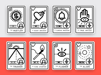
Lauren: As a product designer, most of my time is spent laboring over user flows and UI components, so it was a true delight to be asked to work on a quirky illustration project for our recent “Creative Diagnosis” campaign. Our creative team wrote a series of 16 hilarious creative profiles and wanted to do some fun tarot-style cards to represent each one. It was an exciting challenge to capture the different personality types in an illustration style that suited our rebrand—bold, geometric and just a bit off-kilter.
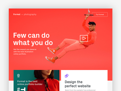
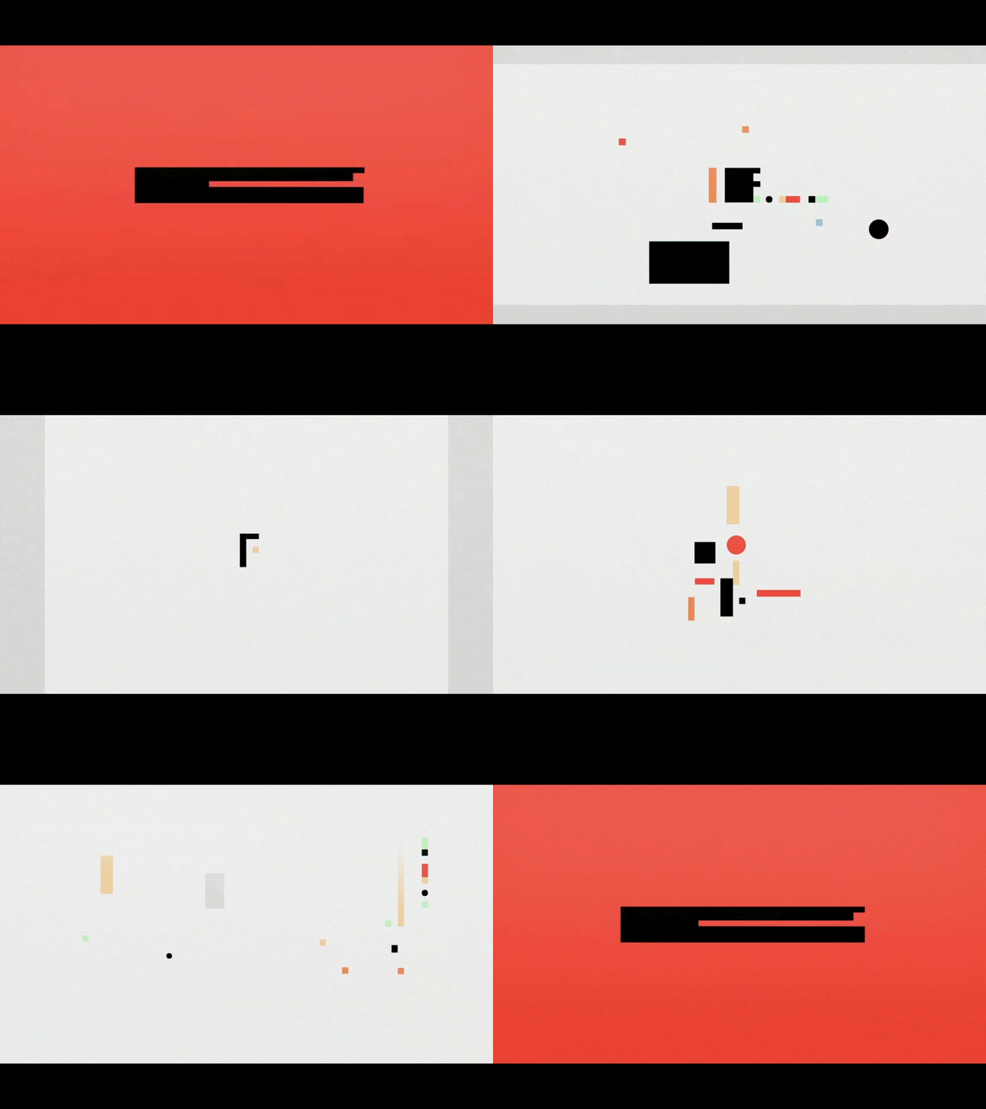
Nixson: The Format + Professions teaser is probably one of my favourite shots. While it might not necessarily show it outright, it represents a year-long process of rebranding Format. Prior to rebranding, we had a limited brand language, which meant we were limited in the way we could communicate with our community. It was really exciting to be able to work on solutions that grow our brand language and give our in-house design team a bold new foundation to work from.
Tell us about your setup. What tools did you use to create the shot (e.g. hardware, software, pens, paper, blowtorch)?

Lauren: Before jumping onto the computer, I did a bunch of pencil sketching in my trusty dot-grid notebook. While I typically use Sketch for my day-to-day, nothing beats good old Adobe Illustrator for vector drawing. I wanted the illustrations to match the style of Format’s newly redesigned icons, so I worked with a strict grid and regular, geometric shapes, inspired by Polish poster design. This helped unify the look of the illustrations, and the extra restriction helped me to solve problems quickly and get through all 16 illustrations in a relatively short period of time.
Nixson: I’ve got a pretty simple setup that consists of a MacBook Pro connected to 27” Cinema Display and a notepad for sketching. For software, Sketch and InVision are my bread and butter. I’ve also got iA writer on my desktop where I write down ideas as they come to me.
What’s the most challenging part of your job?
Lauren: When designing a new feature, it can be a challenge to sift through all our research, interviews and feedback to decide what’s essential to the user’s experience. We’re all about striking the right balance between what people want and what they need, to make Format both powerful and easy-to-use. Sometimes we’re surprised to find that the features we assumed would be important don’t actually matter much to our users, and vice versa. Luckily, with a digital product, there’s always room for improvement and iteration.
Nixson: Figuring out ways to make sure our target audience knows what Format is and ensure that my work helps to clearly communicate its power and use cases are the biggest challenges I face as a designer at Format.
Choose a favorite shot from another player. Why do you dig it?
Lauren: This shot is by my dear friend Tegan Mierle. We’ve known each other since the first day of art school, and she’s been a huge influence on my career—she encouraged me to pursue interactive design and gave me my first job in the industry. Tegan always brings a sense of humor into her work, and never shies away from incorporating playful illustrations into a project. She’s living in San Francisco now and always reps her Canadian upbringing, hence why I thought this Tim Hortons-inspired shot was particularly noteworthy!
Nixson: I have to give a shoutout to Andrew Vucko and his shot of the Format Rebrand Launch video. I love the frenetic visuals and am really glad the team got to work with him again after seeing the amazing work he did for the InFrame series.
Find Format on Dribbble, Twitter, and at www.format.com.
Find Lauren on Dribbble, Twitter, and at www.barless.ca.
Find Nixson on Dribbble, Twitter and nixsonsysanga.com.
Find more Interviews stories on our blog Courtside. Have a suggestion? Contact stories@dribbble.com.
