Congratulations to Dribbble’s graduating class of new UI designers! After recently completing our Introduction to UI Design course, we’re excited to highlight some of the amazing case studies completed throughout the 4-week program.
Throughout the course, students were introduced to the principles of UI design, including user research, wireframing, prototyping, and visual design. Each student brought their unique perspective and creativity to the projects, resulting in a diverse range of impressive case studies. Join us in celebrating their hard work and accomplishments!
The design challenge
Designers were challenged to establish the visual language for an NFT marketplace app that offers a unique and engaging experience for users. Their goal was to provide a visually appealing and intuitive app for the modern art enthusiast, utilizing user research, mood boards, and visual exploration to guide their designs.
By establishing a cohesive visual aesthetic and scaling the design across multiple screens, these designers have succeeded in creating functional prototypes that could truly revolutionize the digital art scene. Let’s take a closer look at some incredible case studies from our recent UI design grads.
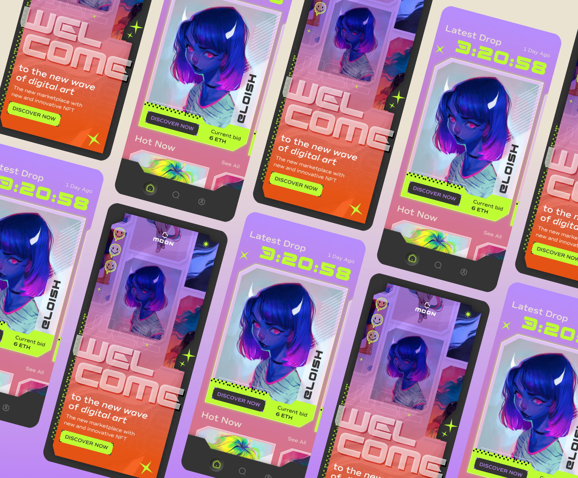
1. Cyberpunk retrofuturism – Hollie Moser
The case study by Hollie Moser focuses on the design project of ‘Moon’, a new NFT marketplace app aimed at revolutionizing the digital art scene. The theme of the app was centered around ‘robo girls’ with lime, orange, and purple accents featuring cyberpunk retrofuturism. Overall, the design project was successful in establishing the visual language of the app and creating a deeply curated (and beautiful) experience for the users.
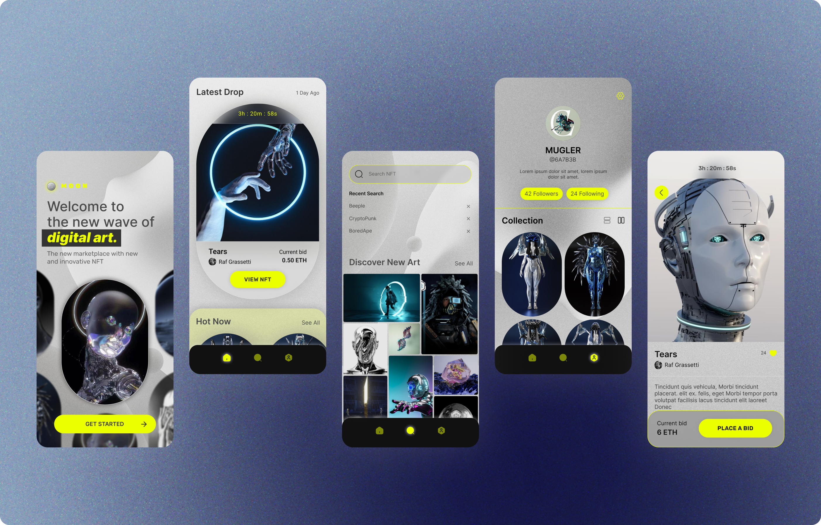
2. Minimal Futurist – Yunji Shin
Yunji Shin enrolled in Dribbble’s UI Intro course to begin their journey in user interface design. In establishing a new visual language for a fictitious client, MOON, a startup that aims to revolutionize the NFT marketplace, Yunji experimented with different concepts and directions, ultimately choosing a minimalistic design with neutral gray tones and a neon green glow button.
The designer plans to continue their journey in UI design by learning more about interactive prototyping, auto layout, building a scalable design system, and other features of Figma.
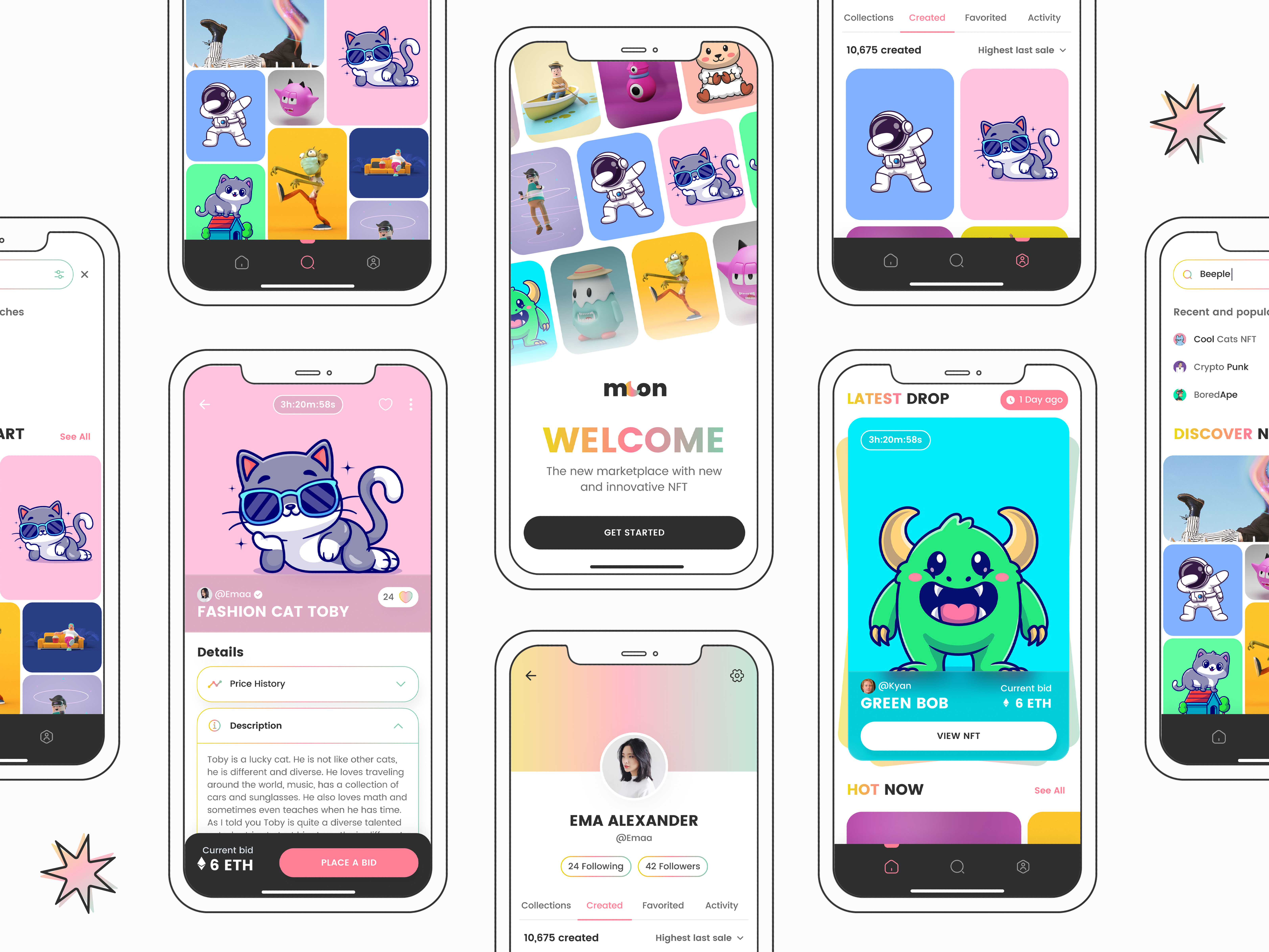
3. Playful Neo-Brutalism – Jen Satzger
This case study by Jen Satzger outlines the design process for creating a new NFT marketplace app for Moon, a startup that aims to revolutionize the industry with a design-first approach. The app is targeted toward niche collectors who value curated digital experiences and visual aesthetics. The chosen direction used bold colors, strong lines, and solid drop shadows to complement the NFT artwork without being distracting.
“For this exploration, I wanted to leave the world of gradients so I delved into the Neo Brutalistic UI design trend. I took inspiration from the NFT artist ‘Cool Cats’.” – Jen
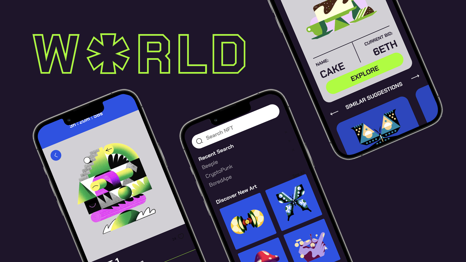
4. Calm & Colorful – Sean Courier
Sean Courier’s case study is about designing an app for a startup called World, with the goal of revolutionizing the NFT marketplace business with a design-first approach and a deeply curated experience for the users. The designer used Figma to build the app and learned how to create useable graphics that are scalable and practical. View the full case study! ✨
5. Playful & Bold – Zlati Petrova
Zlati Petrova’s goal with the Moon app was to strike a balance between aesthetic appeal and user experience. User research was conducted to identify the target audience, who were described as tech-savvy professionals with an appreciation for beautiful experiences and digital art. The resulting design features intuitive navigation and a bold, engaging visual style with quirky colors and geometric shapes.
6. Dark & Edgy – Tenzin Norsang
Tenzin Norsang’s design process involved developing mood boards, wireframes, visual explorations, a final visual, and a design system. Though a ‘light theme’ was considered and explored, the final visual was developed using a dark theme with edgy and sleek visual aesthetics that capture the essence of the NFT and Crypto design trends. The entire project is designed and developed using Figma and FigJam.
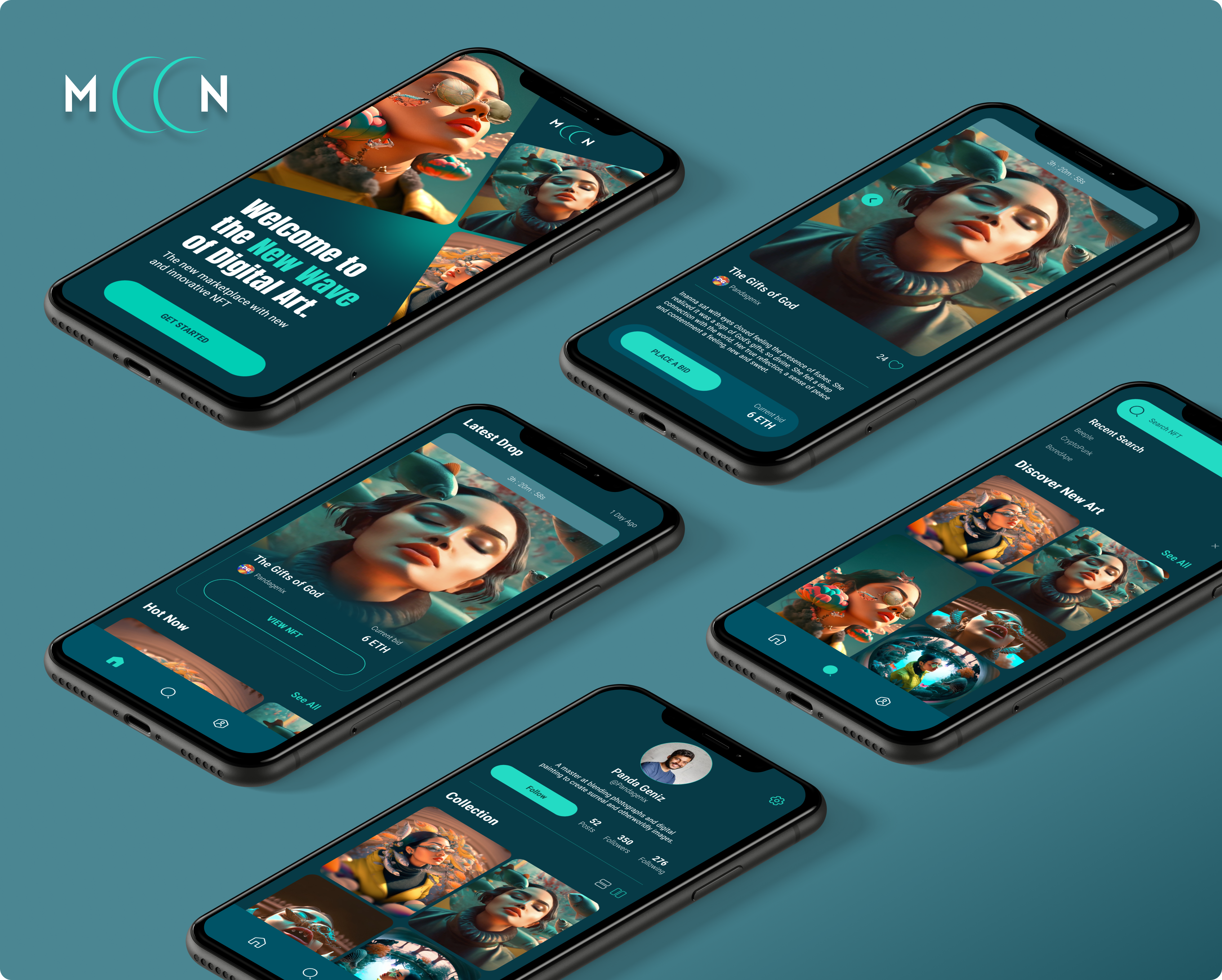
7. Bright & Colorful – Kevin Woodruff
Kevin Woodruff’s app is targeted at tech-savvy individuals with a strong sense of visual aesthetics and art. Kevin’s design process involved creating moodboards and exploring two visually distinct directions. The final visual design is bright, colorful, and clean. Kevin scaled the design onto 5 screens based on the wireframes to create a high-fidelity design and functional prototype in Figma.
Learn UI design online with Dribbble
Just like any skill, learning the ins and outs of UI design takes time. But if you’re eager to supercharge your learning, check out Dribbble’s new Introduction to UI Design course. Taught by Metalab’s Principal Designer Daniele Buffa, this 4-week course is designed to introduce you to the creative world of UI design while helping you develop the Figma skills needed to bring your ideas to life. Learn more and enroll today! ■

Find more Inspiration stories on our blog Courtside. Have a suggestion? Contact stories@dribbble.com.
