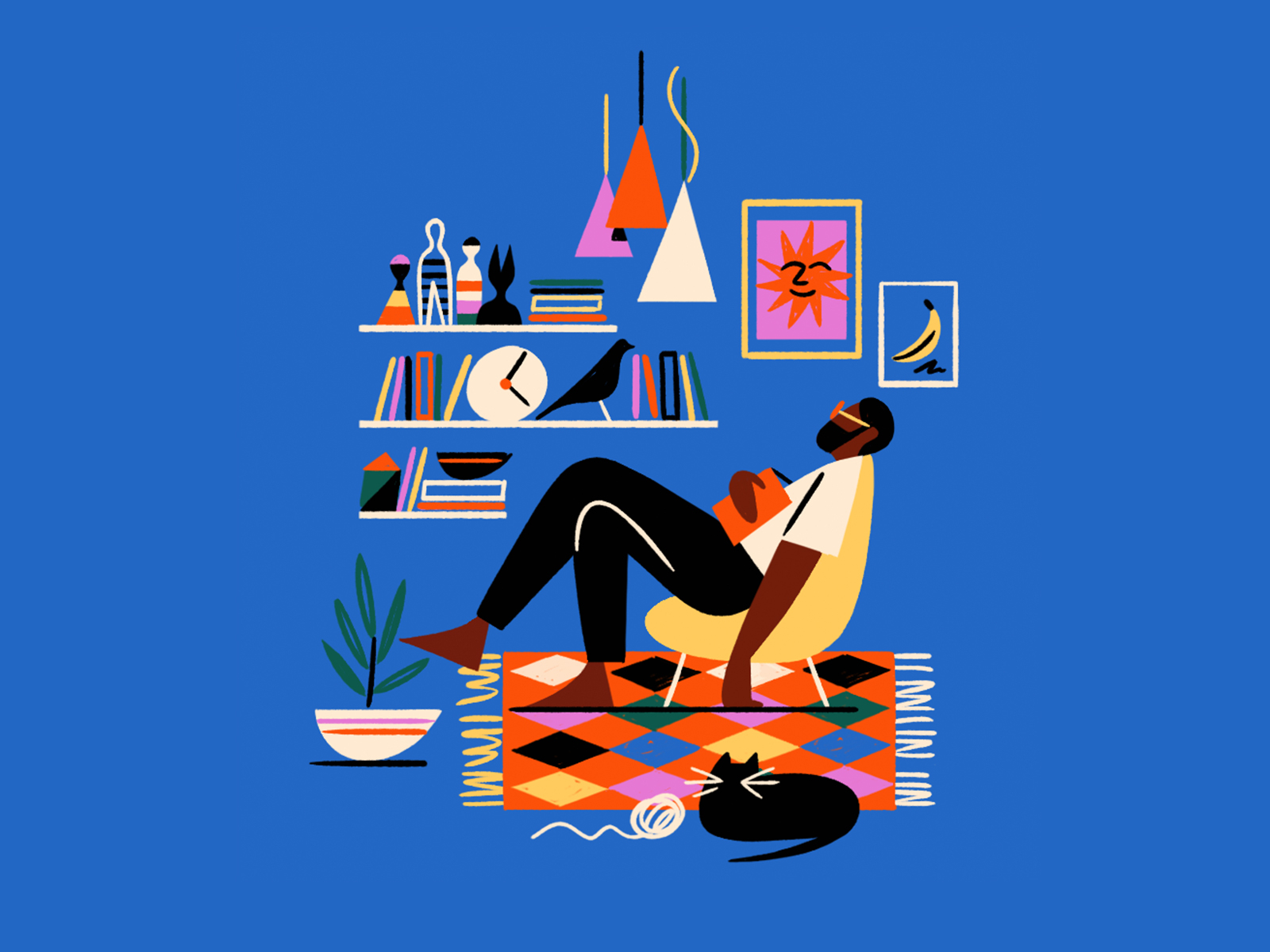
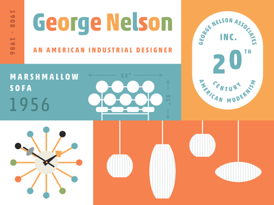
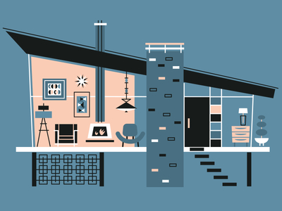
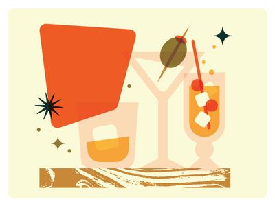
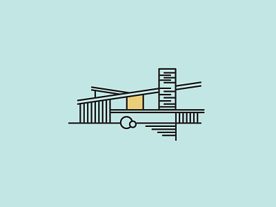
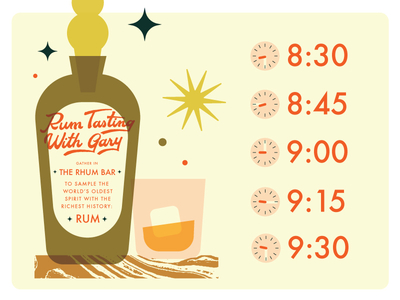
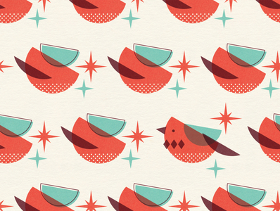
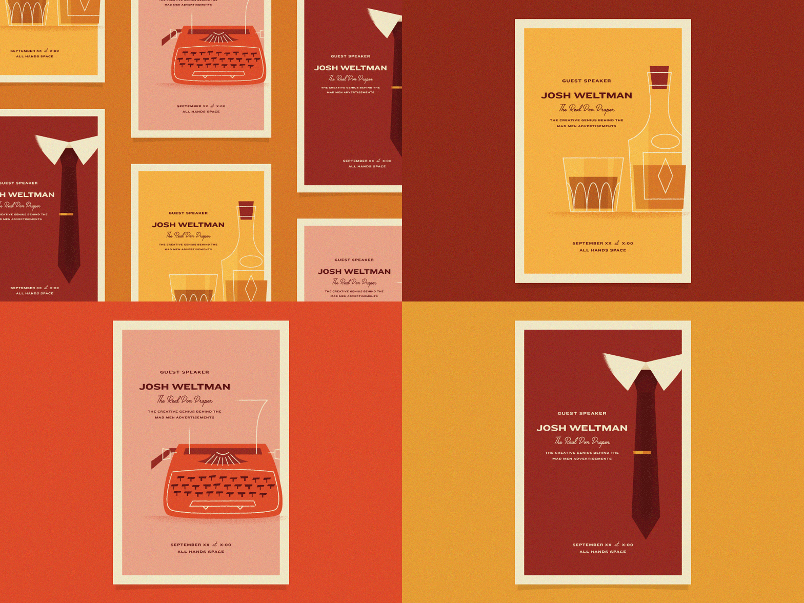
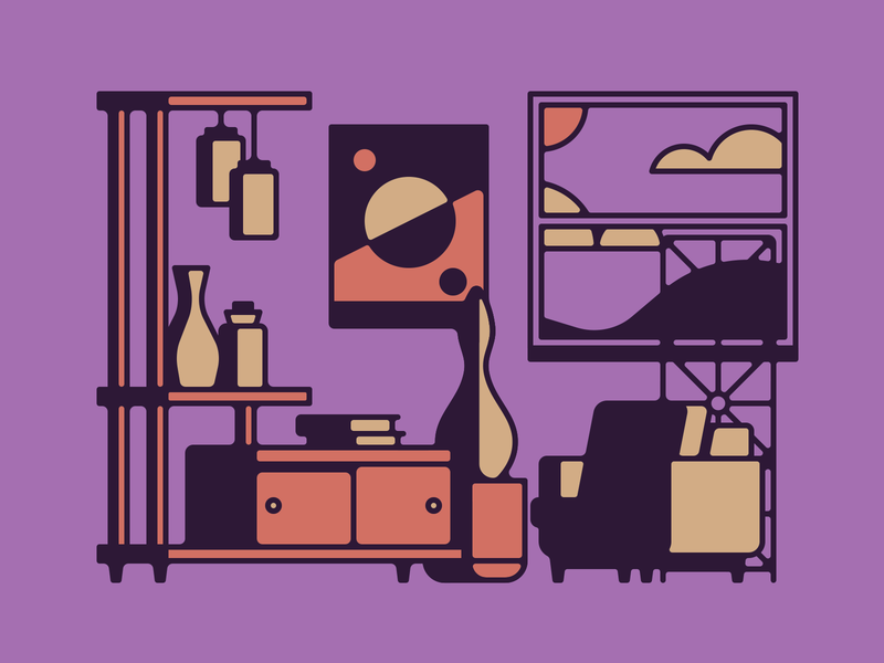
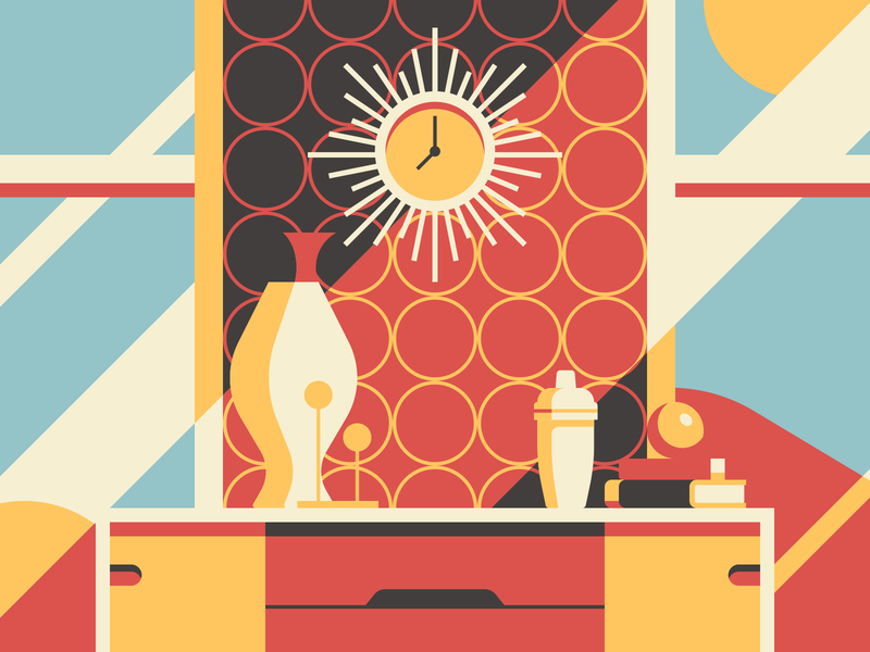
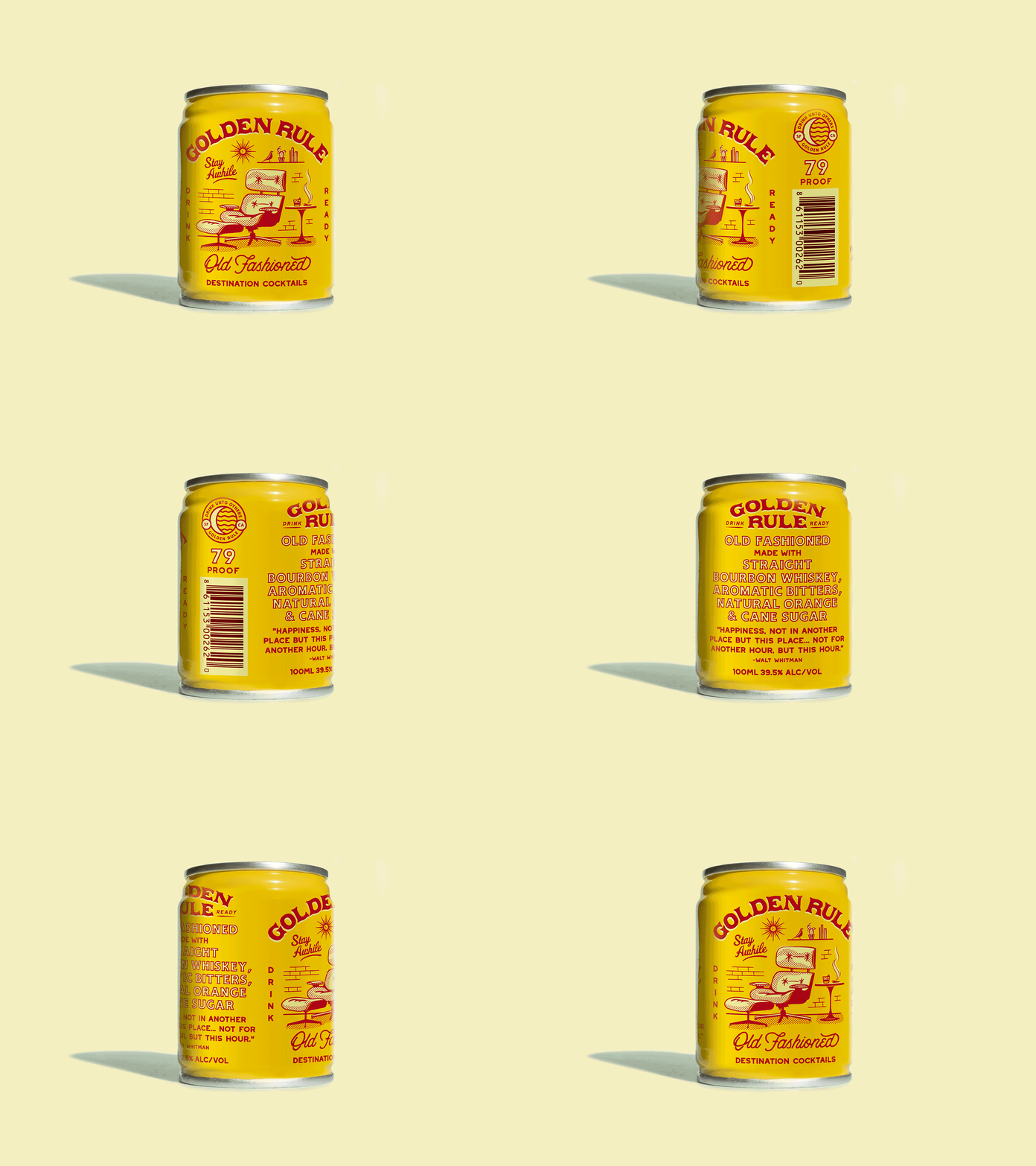
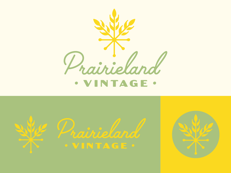
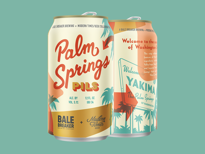
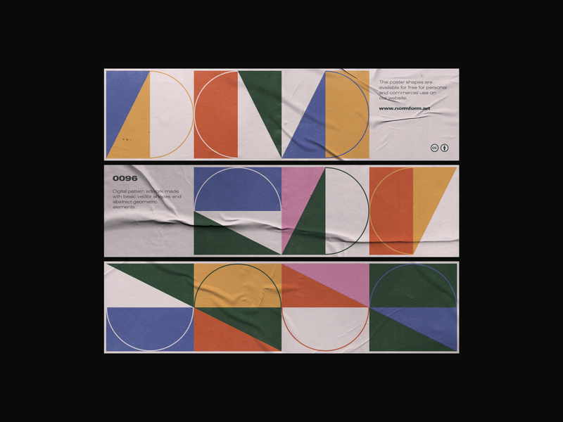
Oh, what would we do without our trusty MCM? This graphic design trend took the world by storm post-WWII for a good reason. The clean and straightforward lines did a lot to inspire future trends, including the minimalist movement that so many designers are so fond of.
And although these designs definitely give off a “retro” vibe, mid-century modern elements in graphic design aren’t going anywhere any time soon. Playful, shape-based lettering is still prevalent throughout many modern designs, along with many geometric stylings.
In fact, the colors, more than anything else, tend to give most MCM graphic designs a “retro” feeling. Trade in the earthy browns, oranges, and greens for some greyscale and neons, and you have a more modern Mid-century Modern aesthetic that any Palm Springs resident would be ecstatic about. ■
Mid-Century Modern-Inspired Graphic Design
Row 1: Kyle Anthony Miller, Ethan Silva, Victoria Fernández. Row 2: Whitney Anderson, Steve Wolf, Whitney Anderson. Row 3: Zara Picken, Lisa Engler, Mia Ditmanson. Row 4: Justin Mezzell, Justin Mezzell, Nicola Broderick. Row 5: Tracy Niven, Chad Gowey for Blindtiger Design, Normform.
More design inspiration
- Design by the Decades: Y2K graphic design trends
- Design by the Decades: 80s graphic design trends
- Get inspired: Retro branding with a modern twist
Find more Inspiration stories on our blog Courtside. Have a suggestion? Contact stories@dribbble.com.
