Great UI design can mean the difference between a successful digital product and a mediocre one. But if you’re new to UI design, how can you ensure that you’re following the right steps in your process to set your designs up for success?
Whether you’re looking to learn UI design from scratch or build upon your existing skills, study up on the most common mistakes new UI designers make and how to avoid them.
Mistake 1: Lack of proper research
When it comes to the design process, research focuses on understanding the needs, experiences, and behavior of users so that products can solve their problems. If you are a UI designer, depending on the size of your team, you may not be conducting the research yourself, but you should definitely reference it to add the appropriate context to your designs.
The research could involve working with cross-functional teams, like marketing and product, or simply understanding the problem that the product is trying to solve from the user’s perspective.
It is fun to play around with designs on your own time, but if you neglect research in your design process, you’ll end up with bad ideas, bad solutions, and you’ll risk making design decisions that aren’t user-centered.
Mistake #2: Missing key UI design fundamentals
Despite the fact that designers can be self-taught and make a killing at producing quality work, you shouldn’t overlook UI fundamentals you’ll learn at a traditional design school or course.
The importance of contrast (color, size, alignment), intuitive CTAs (like buttons and links), good form, typography, responsiveness, and designing with real content should never be overlooked.
In the event that you didn’t attend a traditional design school, or you have not taken many courses on the subject, now is the time to start before these mistakes begin to appear in your work.

Mistake 3: Prioritizing trends over usability
Though it’s fun to get inspired by design trends, when you look at some of the most successful platforms and products on the market, you’ll notice that “trendy” designs are rarely used.
Beautiful designs do not necessarily translate to functional ones. Keep this in mind and always ask, “Is this design functional?”.” Functional designs aren’t necessarily ugly, but focusing on function over beauty is important.
Fads change quickly, so fonts and patterns that are popular one month may not be the same as the next. A fad can draw attention to your product and maybe attract a few new users, but constant changes to the interface are going to frustrate and confuse your loyal followers.
Mistake 4: Forgetting to consider the accessibility of your UI
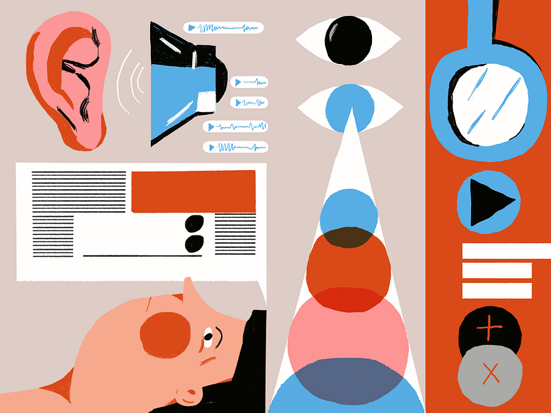
Fonts, color, and style consistency are important elements that distinguish a great UI design. While your design might look beautiful on the surface, it also needs to be accessible and inclusive to all types of users. This includes blind, color blind, and visually impaired individuals.
An easy way to ensure you’re meeting the accessibility standards of the web is by downloading plugins like Stark to help check if your designs are accessible while you’re actually designing.
📌 RELATED: 4 signs your product is not as accessible as you think
Mistake 5: Not seeking & applying feedback
As a budding designer, you need to be open to feedback and guidance from more senior designers who may have made the same mistakes as you when they were starting out.
Finding a design mentor is the best place to start. By seeking out a mentor instead of navigating the rapidly evolving design landscape alone, you can build your skills more quickly while enjoying an enriching learning experience. In addition to helping you jump-start your career, you might even make a new friend.
Learn UI design in 4 weeks
Just like any skill, learning the ins and outs of UI design takes time. But if you’re eager to supercharge your learning, check out Dribbble’s new Introduction to UI Design course. Taught by Metalab’s Principal Designer Daniele Buffa, this 4-week course is designed to introduce you to the creative world of UI design while helping you develop the Figma skills needed to bring your ideas to life.
As a part of the course, you’ll also get matched with a seasoned design mentor to support you on your projects and offer personalized feedback to help you improve your designs. Learn more and enroll today. ■

![]() About the Author: Olivia Hoskin is a freelance writer with a background in tech and marketing. A true design fan at heart, you’ll find her writing about the latest industry trends, technologies, and the inspiring endeavors of fellow creators. She’s a champion of remote work, a lover of responsible technology, and a fitness geek and enjoyer of the outdoors in her spare time. Find her at oliviahoskin.com.
About the Author: Olivia Hoskin is a freelance writer with a background in tech and marketing. A true design fan at heart, you’ll find her writing about the latest industry trends, technologies, and the inspiring endeavors of fellow creators. She’s a champion of remote work, a lover of responsible technology, and a fitness geek and enjoyer of the outdoors in her spare time. Find her at oliviahoskin.com.
Find more Process stories on our blog Courtside. Have a suggestion? Contact stories@dribbble.com.


