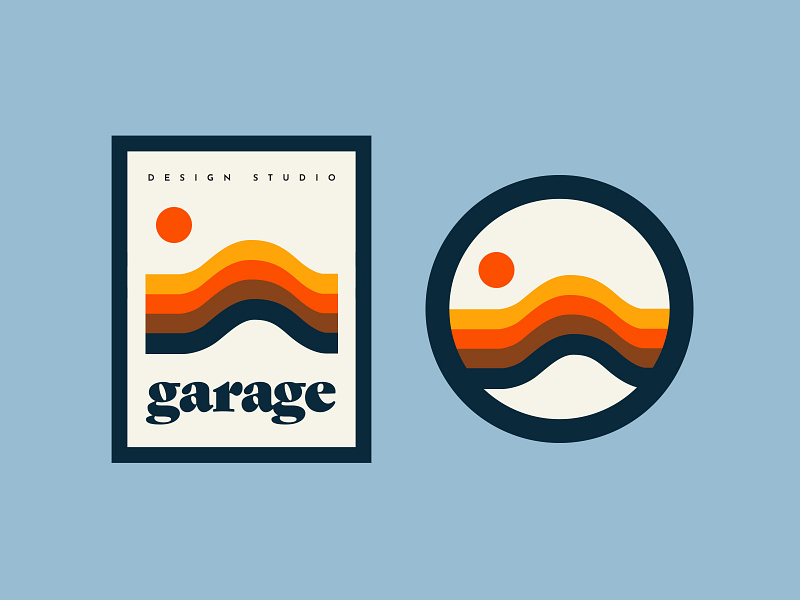
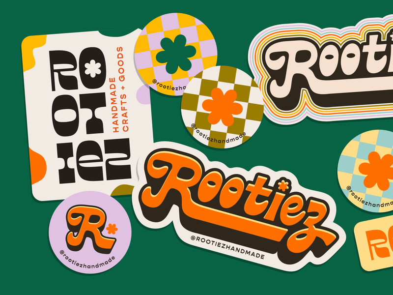
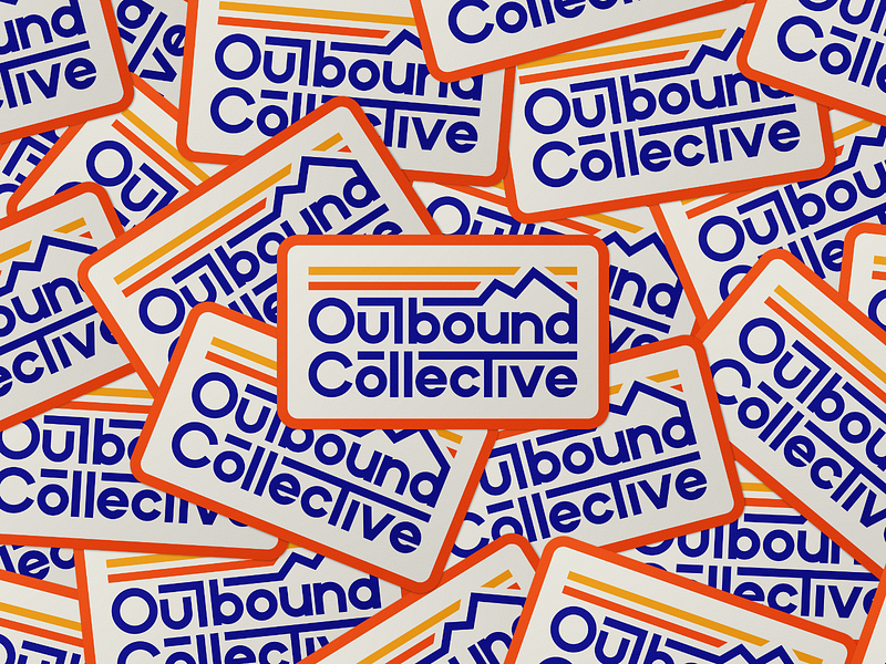
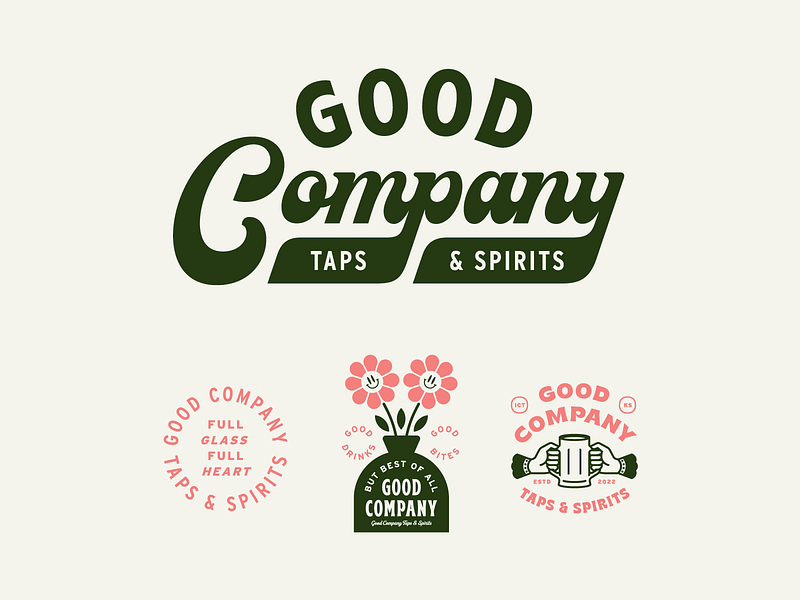
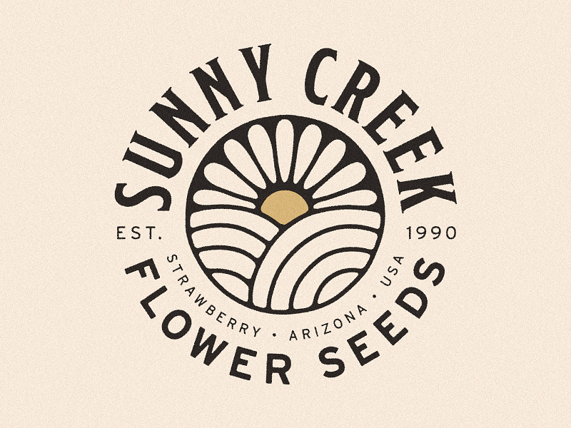
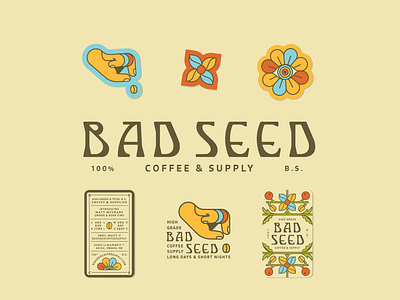
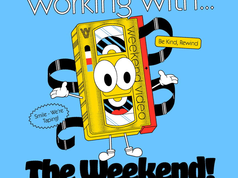
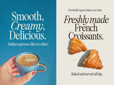
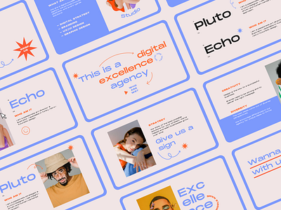
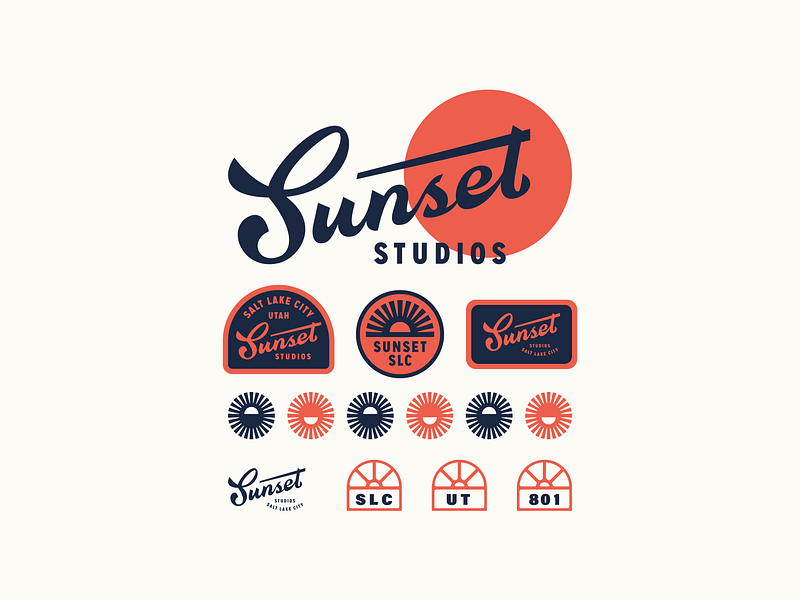
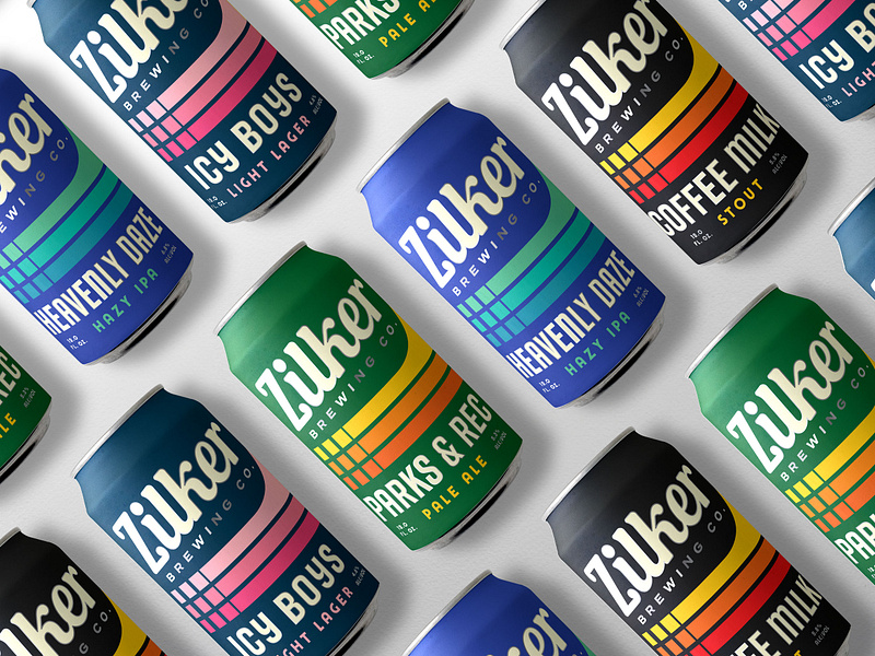
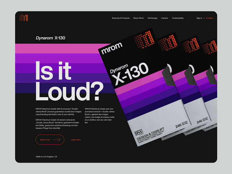
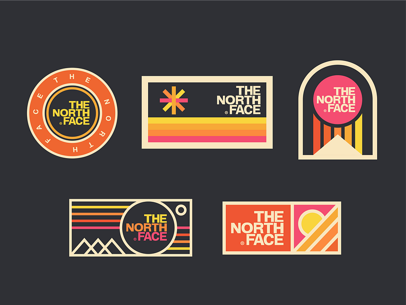
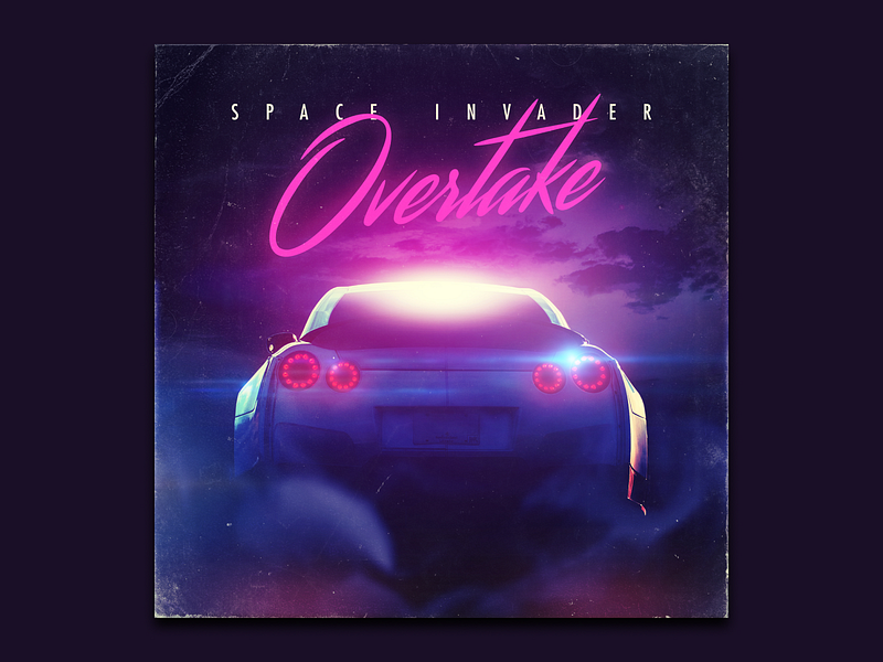
While it may not be fun to have things from your childhood be called “retro,” these designs certainly bring some fond memories. These bold colors and wavy lines make us feel all kinds of feelings.
The retro design style creates a sense of familiarity and connection with viewers that can only be described as the feeling of nostalgia. There is no one age or decade associated with “retro” designs since designers usually aim to target audiences who grew up with them.
And because almost everything modern is a well-forgotten “something” from the past, retro designs appeal to young and old audiences alike.
Retro branding with a modern flair is certainly on the rebound. Don’t miss the VW bus and get on board with this design trend! ■
Row 1: Garage Design Studio, Hannah Smith for Trust Design Shop, Nicholas D'Amico. Row 2: Nathan Holthus, Mark Johnston, Ryan Tantillo. Row 3: Bret Hawkins, Nicky Laatz, Ruxandra Nastase. Row 4: Visual Jams, Nicholas D'Amico, SAMPLE. Row 5: Matt Romo, Danielle Podeszek, Justin Mezzell.
✨ More retro-inspired resources
- Bold & Groovy: Exploring 70s inspired typography & lettering
- Your favorite logo designs get a retro‑inspired makeover
- Design by the Decades: Get inspired by 80s graphic design trends
Find more Inspiration stories on our blog Courtside. Have a suggestion? Contact stories@dribbble.com.

