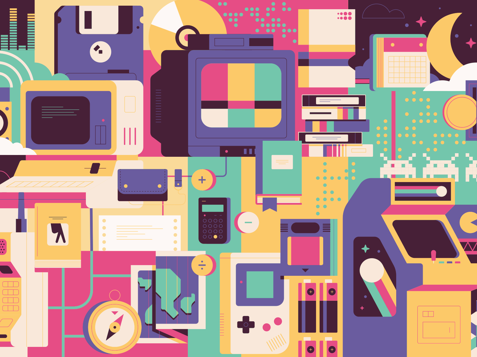
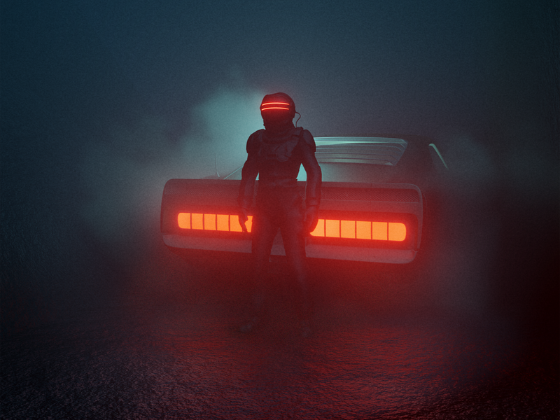
If you miss the days when all the youths donned Air Jordans, MTV actually played music, Fresh Prince was on regularly scheduled programming, and troll dolls adorned the dashboard of every oversized car, then you’re a true 80s kid at heart.
Continuing our Design by the Decades series, here is the 80s Edition. Interested in the 70s? Check out 70s graphic design trends to inspire you.
Exploring 80s graphic design trends
It turns out that a lot of those 80s trends have returned in modern times, so you’re in luck if you’re nostalgic for some good old 80s vibes. Remember the velvet couch that Grandma never got rid of? Well, it’s back in style! Use it as a gorgeous design component in your home renovation project. Let’s just vow to leave teased hair and chunky personal technology where they belong, in the past.
But seriously, the 1980s were one of the most exciting times for graphic designers, with vibrant colors, crazy patterns, and geometric postmodern design styles that still influence many designers today.
Are you curious about what graphic design trends of the 80s have stood the test of time? Here are our top three selections to check out:

Tropical Everything
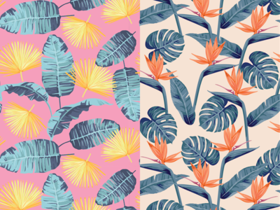
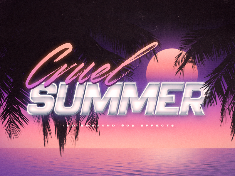
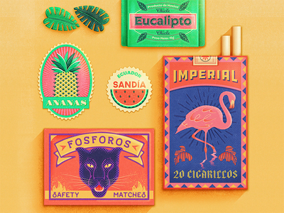
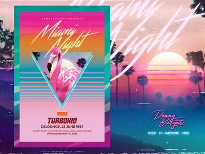
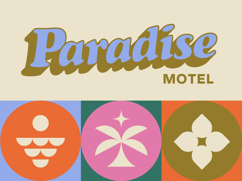
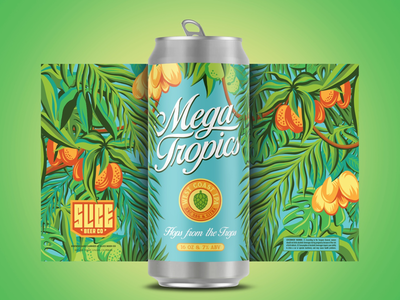
With a nod to the original art deco period of the 1920s and 1930s, this 80s rendition combines minimalism and extravagance. In addition to the clean lines and sans-serif fonts, 80s-style tropical designs are characterized by drop shadows and glows, adding extra personality and vibrance to textual elements. Miami Vice, anyone?
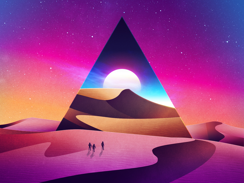
Tropical design goes beyond logos, however. Movie posters, album covers, and interiors everywhere featured palm trees, neon pastels, and retro suns. The tropical style of the 80s remains popular with a resurgence in modern-retro brands like Poolsuite FM/Vacation.Inc.
Row 1: Lauren Griffin, Roberto Perrino, Tierra C.. Row 2: Denny Busyet, Renee Fleck, Brethren Design Co.
Pop Culture & Loud Neons
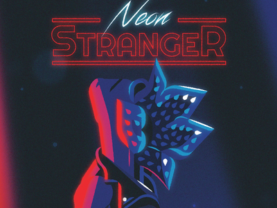
During the golden age of pop culture, the music, movies, and TV of the 1980s had a profound impact on graphic design trends. It’s a timeless design style filled with glowing fluorescents and the “neon-noir” of classic movies like License to Kill and Risky Business; designers will revisit this style for years to come.
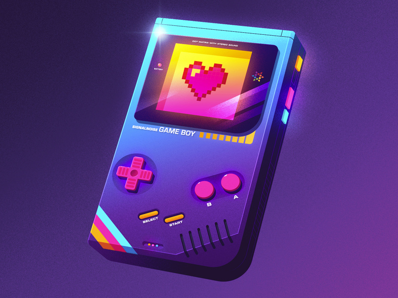
In designs from the 1980s, gradients, drop shadows, and glows dominate posters and other artwork. Retro design is heavily influenced by nostalgia, so it’s easy to identify any present-day designs going for an 80s vibe. There’s a reason everyone was so incredibly fond of 2017’s Stranger Things… and it wasn’t just the storyline 😉
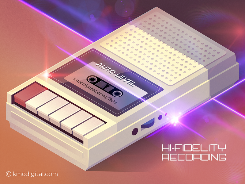
Row 1: Visual Jams, Justin Mezzell, James White. Row 2: James White, Larry Fulcher, kmcdigital.
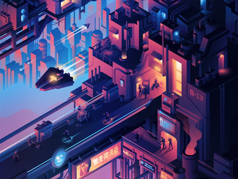
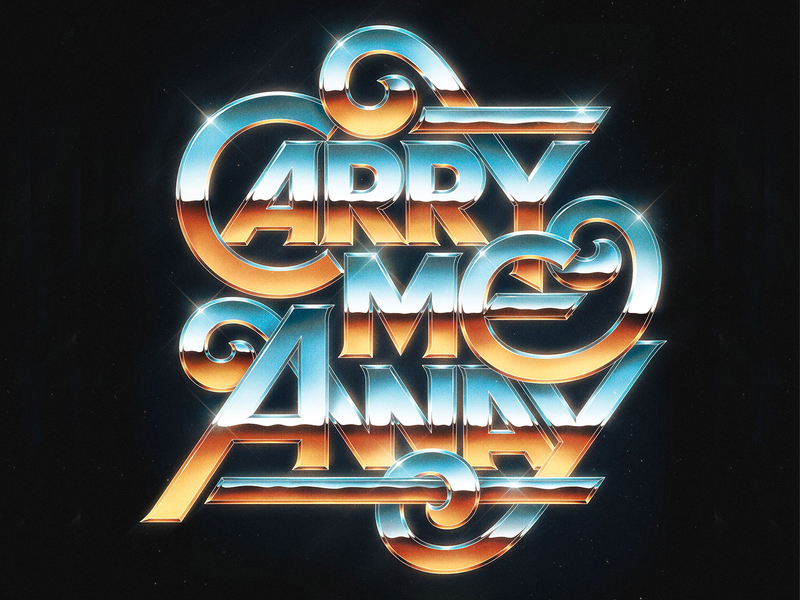
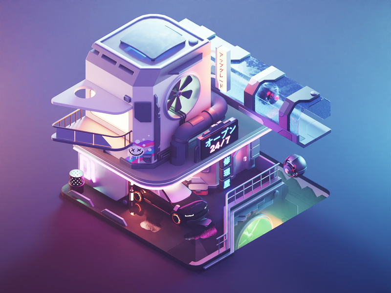
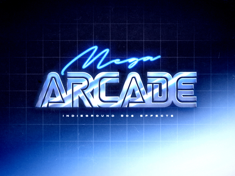
Cyberpunk, Sans Serif & Strong Lines (oh my!)
As a result of the proliferation of personal technology like cell phones and personal computers, the 80s were all about technology and cyberspace. During this decade, science fiction was huge in films, books, and even music, influencing design styles. Today, these styles remain an integral part of the arsenal of graphic designers behind media with futuristic themes.
From Blade Runner to the Matrix, the “digital aesthetic” influenced 80s design. Since this trend first gained popularity, technological advancements have significantly advanced the elements, making them seem “retro” to us today.
The fonts of the 80s cyberpunk digital landscape clearly reflect this retro feeling. Shiny, metal elements, glitchy/pixelated effects, and laser-focused visuals (literally, lasers) are all invited to this party. There are countless examples of the metallic typeface trend in metal bands from the 80s, including Metallica, Megadeth, and Iron Maiden. Get inspired by retro fonts and cyberpunk aesthetics below.
Row 1: Davide Baratta, Yegor Shustov, Mark van Leeuwen. Row 2: Roman Klčo, Roberto Perrino, Trent Walton.
Add some 80s inspired designs to your portfolio
It was a crazy time to be alive in the 1980s, and the design scene was almost polarizing. On the one hand, the colors are vibrant, tropical, and carefree, while on the other, it’s all about technology, cyberpunk, and dystopia. It’s in neon, however, where things cross over. Our hunch is that pop culture influences and mass media encouraged more individuality, as reflected in the wide range of design styles. ■
![]() About the Author: Olivia Hoskin is a freelance writer with a background in tech and marketing. A true design fan at heart, you’ll find her writing about the latest industry trends, technologies, and the inspiring endeavors of fellow creators. She’s a champion of remote work, a lover of responsible technology, and a fitness geek and enjoyer of the outdoors in her spare time. Find her at oliviahoskin.com.
About the Author: Olivia Hoskin is a freelance writer with a background in tech and marketing. A true design fan at heart, you’ll find her writing about the latest industry trends, technologies, and the inspiring endeavors of fellow creators. She’s a champion of remote work, a lover of responsible technology, and a fitness geek and enjoyer of the outdoors in her spare time. Find her at oliviahoskin.com.
Find more Inspiration stories on our blog Courtside. Have a suggestion? Contact stories@dribbble.com.
