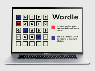
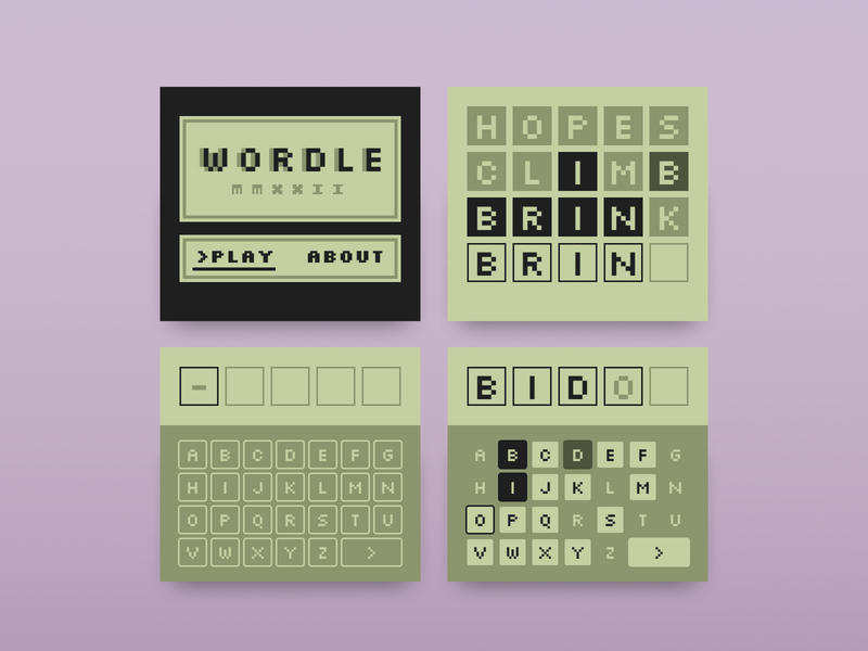
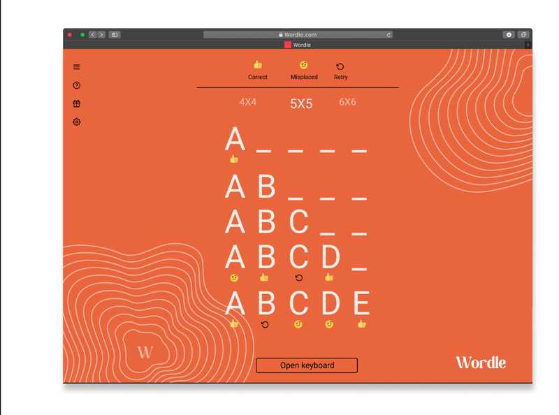
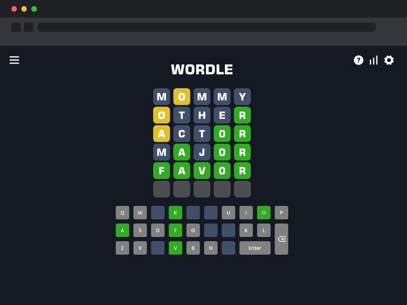
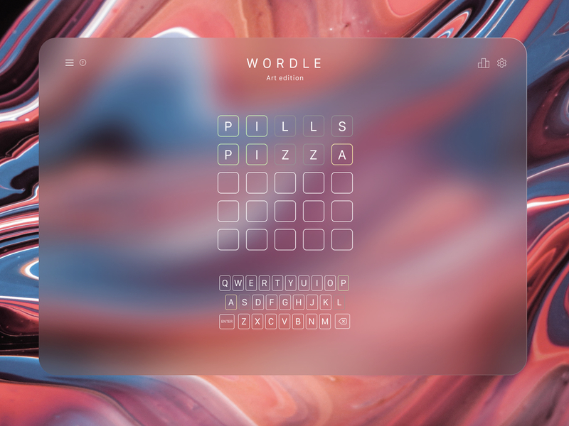
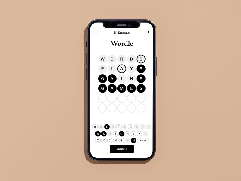
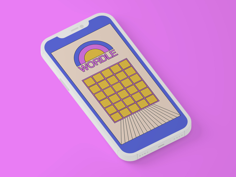
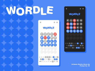
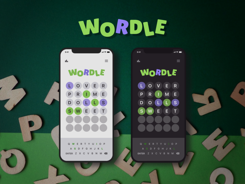
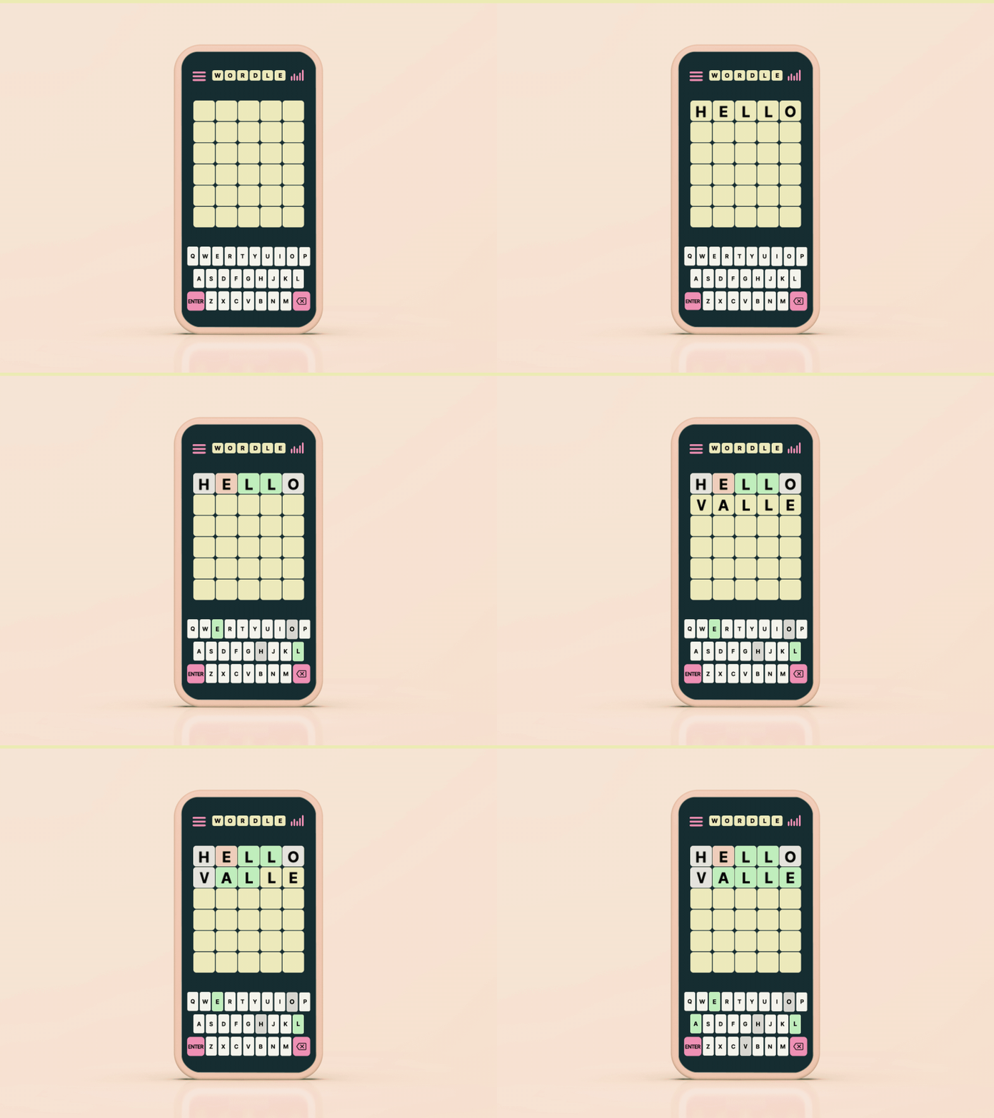
Earlier this month, graphic designers on Dribbble were challenged with an exciting new design prompt: Redesign the user interface of the popular word game, Wordle!
As you can imagine, the design community did not disappoint when it came to creativity. While some graphic designers chose to redesign elements of Wordle’s user experience, others chose to make simple aesthetic updates to Wordle’s UI design.
Without further ado, here’s how graphic designers on Dribbble would redesign Wordle. Then, be sure to check out the rest of the entries submitted to Dribbble’s Wordle design challenge.
Graphic designers reimagine Wordle
Check out a few of our favorite Wordle redesigns below. How would you redesign this simple yet satisfying daily word puzzle? Which Wordle redesign below is your favorite?
You might also like
Did you enjoy these redesigns? Enjoy exploring more collections of just-for-fun redesigns from graphic designers on Dribbble below:
- Famous logos designs reimagined
- Instagram’s app logo gets a redesign
- Popular logos get a retro makeover
Find more Inspiration stories on our blog Courtside. Have a suggestion? Contact stories@dribbble.com.

