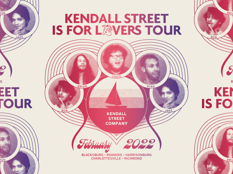
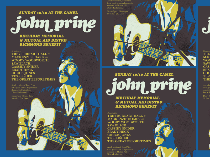
Those who grew up with smartphones may find it difficult to imagine how life was in the 1970s. To put it into perspective, the internet was decades away from commercialization, and the dot com boom and “modern” technology were just beginning to bubble to the surface.
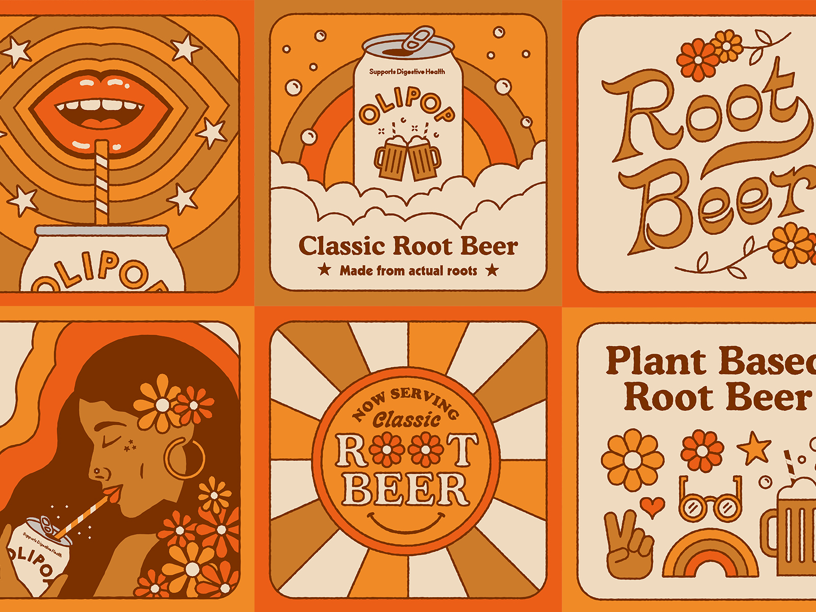
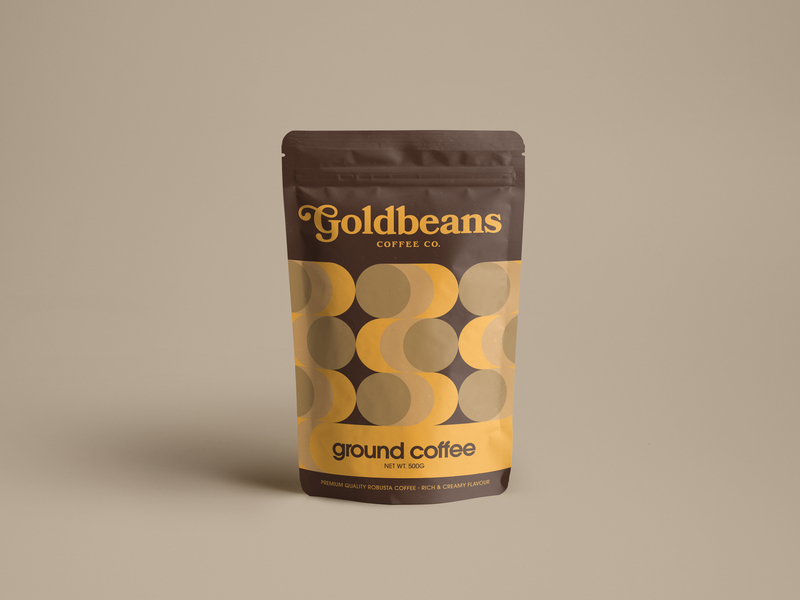
Nature was, therefore, a tremendous driving force behind the common visual themes of the 70s, including flowers, mushrooms, sunsets, and earthy browns, reds, yellows, and greens. Many of these trends are a continuation of popular elements of psychedelic 1960s designs. Still, many 70s styles have also come into their own through the emergence of 70s rock, pop culture, the growth of advertising, and the beginning of mass-produced media.
The 1970s saw graphic design using mixed media in various applications, including combining photography, typeface illustrations, and real people. Continue reading to learn more about the characteristics of 70s graphic design and get inspired to explore these retro design trends in your own design projects.

Exploring 70s graphic design trends
When we say “70s,” you say… “groovy,” right?! Graphic designers everywhere probably recognize the famous tri-color CBC logo, album art from icons like the Sex Pistols, The Ramones, Rolling Stones, and David Bowie, and even NASA’s “worm” logo. But what influenced these designs?
Here are three extra “groovy” graphic design trends from the 70s to explore in your work this year.
Floral Patterns
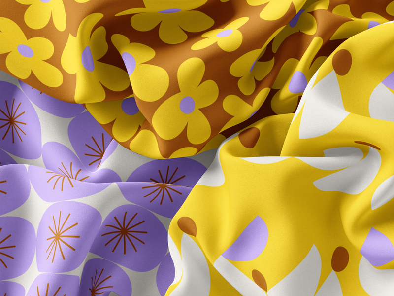
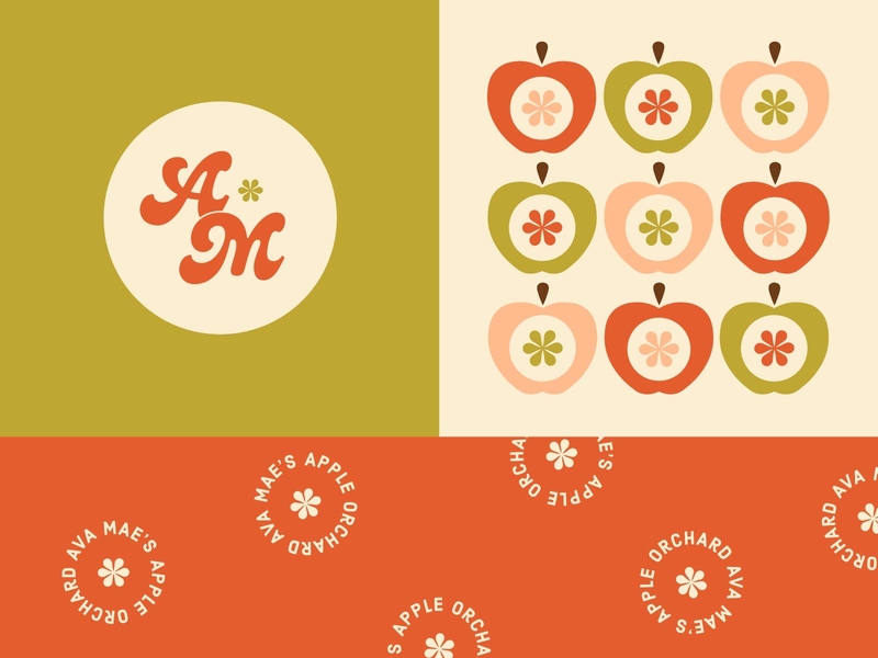
It’s no secret that flowers ruled the 1970s. The “flower child” trend originated during the Summer of Love in 1967. Still, it survived the last three years of the 60s, making its way directly into the floral patterns strongly associated with the 70s.
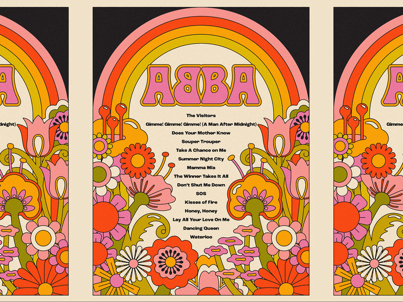
Often called “hippie” patterns, floral patterns in 70s era designs include paisley patterns, mandalas, and floral motifs in general. Rather “hippie” designs, today they’re just “hip.”
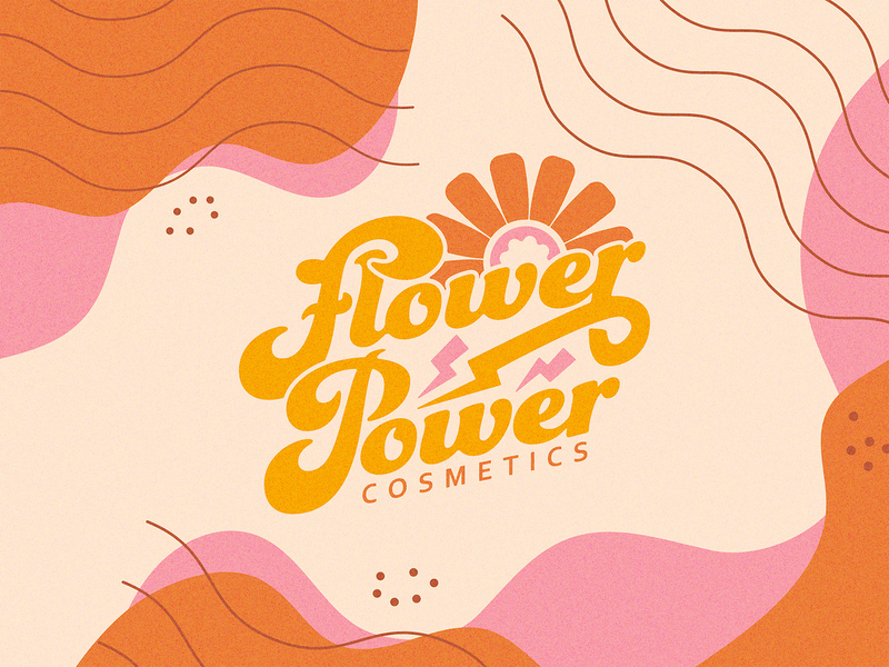
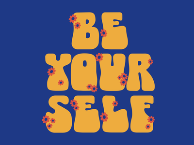
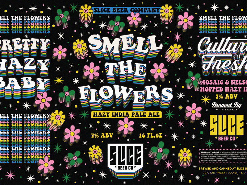
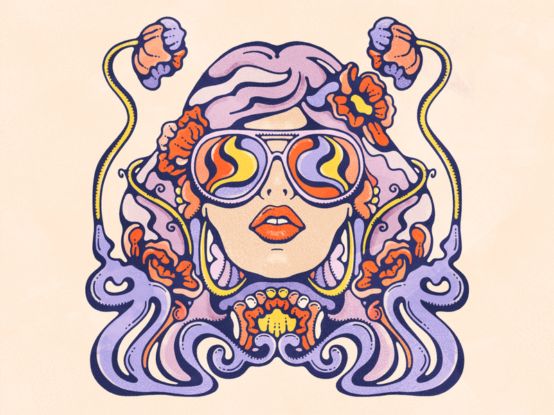
Row 1: Nolan Fleming, Meg Lewis, Bailey Sullivan. Row 2: Tractorbeam, Brethren Design Co, Lively Scout.
Clashing Colors
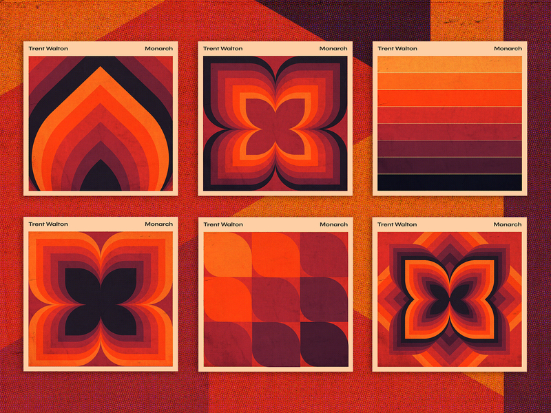
It may be that your floral pattern incorporates the 70s trend of color clashing, specifically reds, browns, oranges, and greens. The colors are pretty natural.
You can see these colors in paisleys, mandalas, or other patterns of simple shapes used in posters, wallpapers, and carpets, among other places.
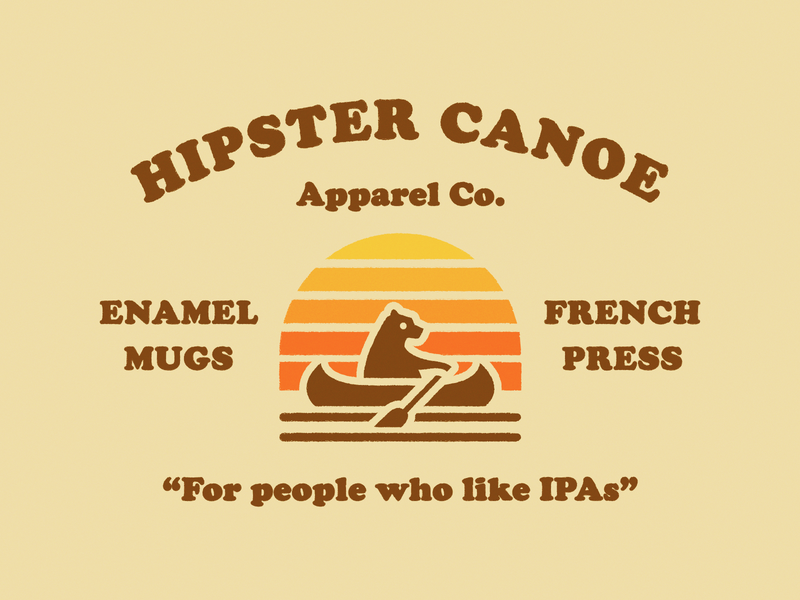
Row 1: Lisa Engler, Pavlov Visuals, Mario Lovric. Row 2: Trent Walton, Aleisha Samek, Jay Master .
Persona-Driven Graphics
Whether you’re looking at a famous 70s rock album or a Coca-Cola ad, you’ll find a lot of persona or character-driven graphics mixed with funky-fresh typefaces throughout the designs of the 70s.
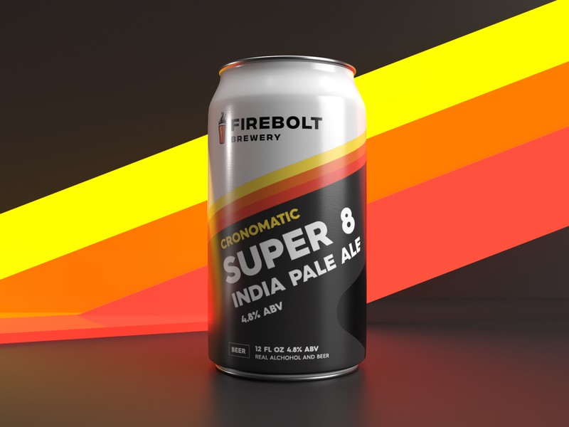
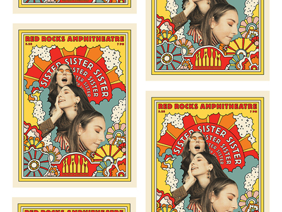
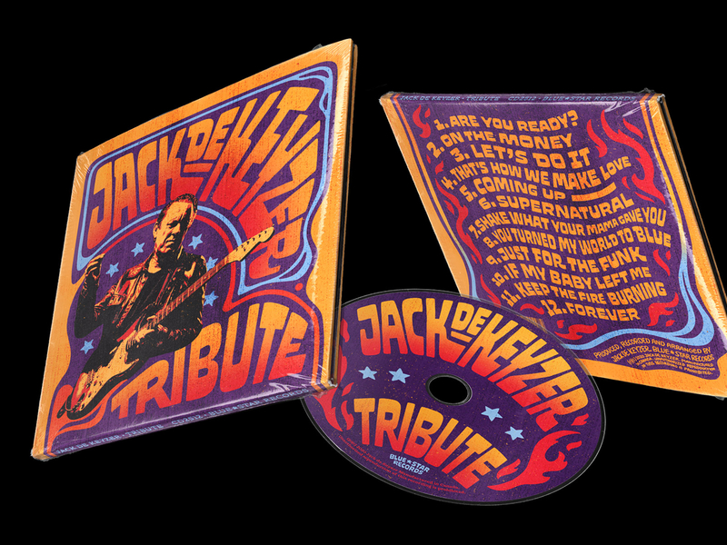
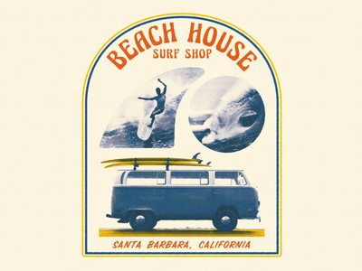
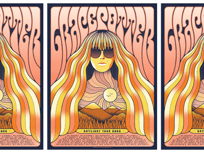
This mainly refers to the collage-style combinations of real-life photography with colorful shapes, prints, and typography. Look to leaders in pop-punk like The Ramones and Generation X for prime examples of collage and persona-driven graphics design.
Other themes throughout this category include hippies, flower children, psychedelic “wavy” shapes, and disco scenes. Think Woodstock-style peace, love, and rock ’n roll.
Row 1: SG Kivett, Scott Biersack, Wildwood Design Co.. Row 2: Half & Half, Brent McCormick, Brent McCormick.
Get inspired by the 70s
In a time famous for psychedelics, tubular typography, and disco, search for 70s styles on everything from wallpapers and stationery to posters, carpets, and funky tapestries. The design world is seeing a lot more of these delightful retro throwbacks in our current tech-heavy digital landscape. To be honest, it’s an uplifting break to see adorable packaging or fun posters and t-shirts with this style!
Compared to the clean and highly minimalist trends that came before it like Atomic Age Design, Mid-century Modern and Swiss Design (hello, Helvetica), the 70s era of graphic design can only be described as “trippy” and “tubular,” and we’re here for it! ■
![]() About the Author: Olivia Hoskin is a freelance writer with a background in tech and marketing. A true design fan at heart, you’ll find her writing about the latest industry trends, technologies, and the inspiring endeavors of fellow creators. She’s a champion of remote work, a lover of responsible technology, and a fitness geek and enjoyer of the outdoors in her spare time. Find her at oliviahoskin.com.
About the Author: Olivia Hoskin is a freelance writer with a background in tech and marketing. A true design fan at heart, you’ll find her writing about the latest industry trends, technologies, and the inspiring endeavors of fellow creators. She’s a champion of remote work, a lover of responsible technology, and a fitness geek and enjoyer of the outdoors in her spare time. Find her at oliviahoskin.com.
Find more Inspiration stories on our blog Courtside. Have a suggestion? Contact stories@dribbble.com.
