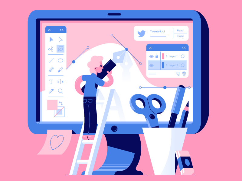
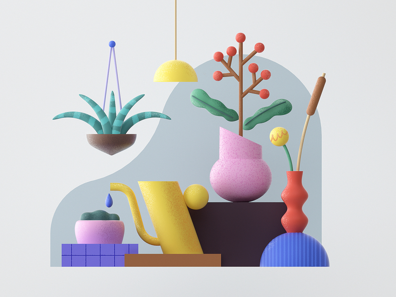
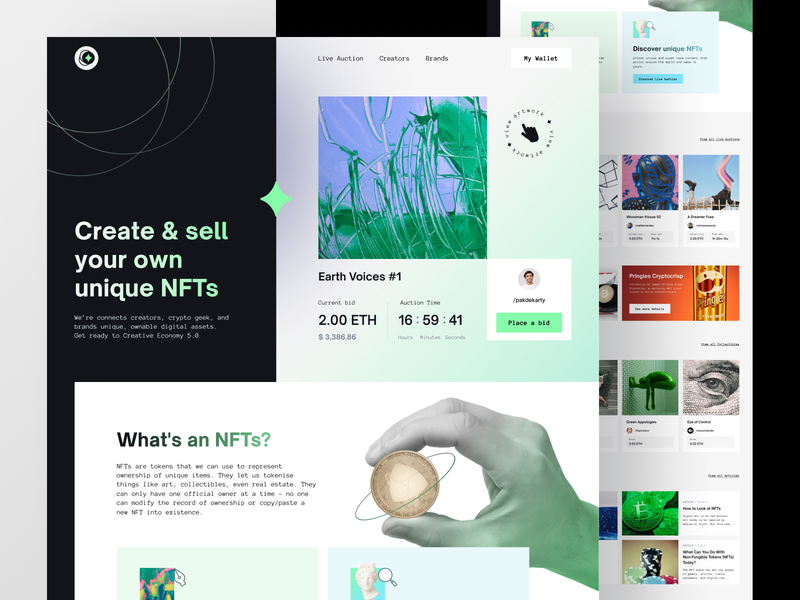
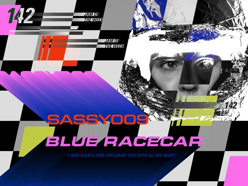
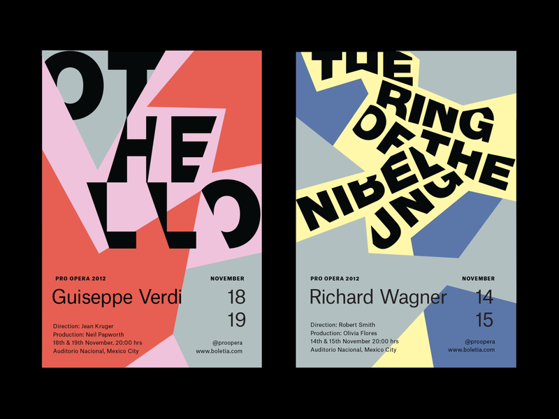
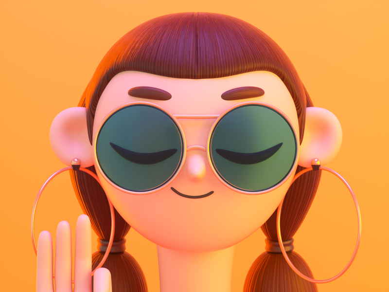
There can never be enough emphasis on the role that graphic design plays in our daily lives. Good design enhances the identity of our favorite brands and extends far beyond the appearance of an entity. We use it to provide information, convey messaging, or convince our audience through combinations of images, shades, and shapes.
Because there are so many players and influences in the field, it can be hard to keep up with the changes in the world of graphic design. As a designer, it’s beneficial to keep up with the latest graphic design trends and choose which ones work in your design portfolio.
To lighten your mind, this article will explain, and more importantly, show you, the top ten graphic design trends and creative styles you’ll start to notice more in 2022, some of which will last for several years.
📌 RELATED ARTICLE — How 2020 Changed The Design Industry
Trend #1 — Combining 2D x 3D
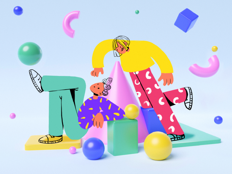
There has been an upward trend in 3D design for many years, and it continues to evolve and establish itself further. It gives designers unlimited room for creativity since it provides an almost endless array of options.
The most popular work we’re seeing in this arena ranges from highly realistic 3D visuals that blur the line between digital and physical elements to mashups that incorporate 2D graphics and paper cutouts.
2022 will be the year of a significant cross-over between 2D and 3D.
Row 1: Sally Yang, 14islands, tubik.arts.
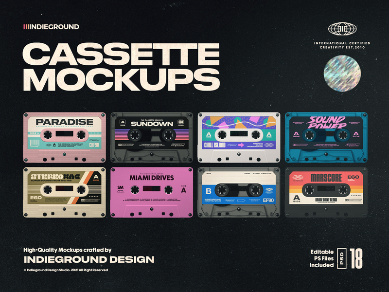
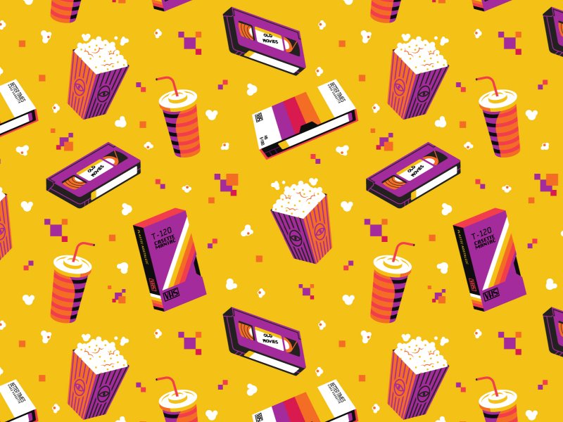
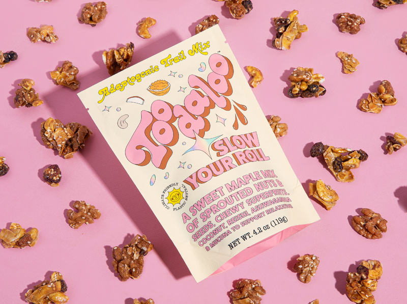
Trend #2 — Nostalgia (90s)
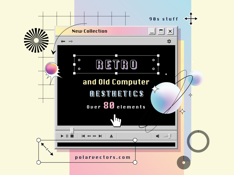
Pretty recently, popular media like Netflix’s Cobra Kai & Stranger Things (among countless others) brought back 80s nostalgia and ushered in an era of vaporwave landscapes, neon colors, and Gothic serifs. And retro comebacks are finally hitting the 90s in 2022!
We can see the 90s making a comeback in many of the trends on this list. Yet, the nostalgia trend reflects a longing for the past through rose-colored glasses.
Toward that end, we are reliving the 90s through simple emojis, primitive internet frames, geometric shapes, and sketchy illustrations. The dripping slime and bright color blocks of childhood are still kings.
In your next design project, channel the 90s for a retro vibe.
Row 1: Diana Hlevnjak, Roberto Perrino, Salmorejo Studio.
Trend #3 — Twisted Typography
This trend involves anything “offbeat” that breaks your order, whether one letter is upside down, in a larger or smaller font, or entirely left out.
A portion of your lettering in a smaller text could be arranged so that they reveal a different message from the rest. This trend is a great way to make a point and draw someone’s attention to a specific area of the design.
Also, if you’re thinking of the Squid Game intro, you’re not alone.
Row 1: Hrvoje Grubisic, Anton Aheichanka for InVision, Hrvoje Grubisic.
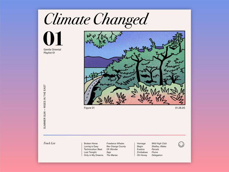
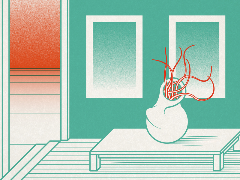
Trend #4 — Ukiyo-e style design
Japanese ukiyo-e is a form of art that flourished from the 17th to the 19th century. They depicted female beauties, kabuki actors, sumo wrestlers, scenes from history and folk tales, travel scenes, landscapes, and flora and fauna. The term ukiyo-e is Japanese for “pictures of floating worlds.”
Vector designers are familiar with bold outlines, flat colors, and limited perspective techniques found in this type of art. In today’s creative world, similar designs are being used to give ordinary flat vector scenes that extra edge.
Row 1: Elina Cecilia Giglio, Gabrielle Widjaja, Jacek macha Machowski.
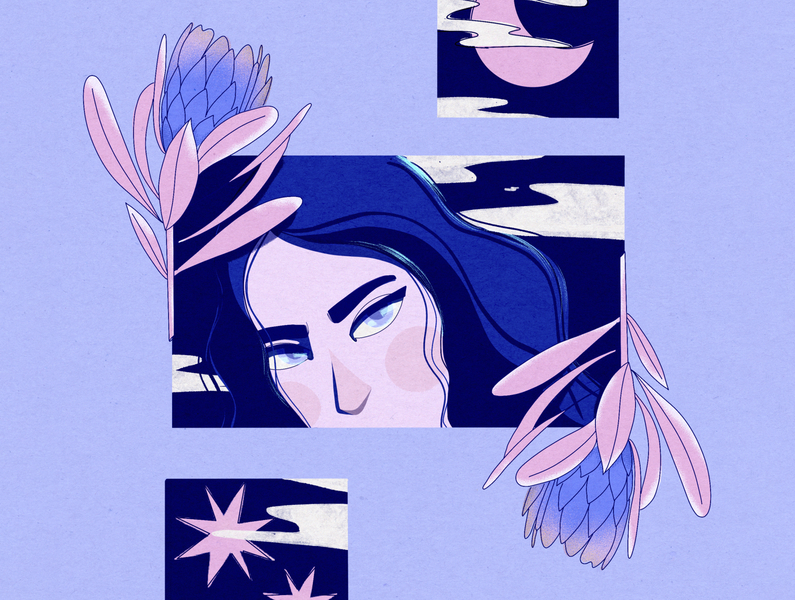
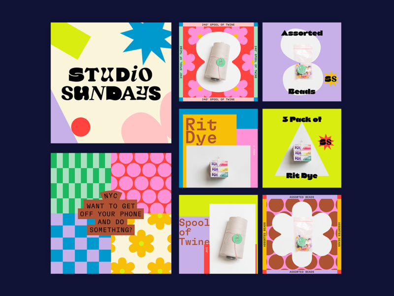
Trend #5 — Candy Colored Vibes
Standing out from the clutter of online content creation nowadays is a job in itself. As a result, graphic designers have started finding creative ways to use color to capture our attention while scrolling.
A trend of vibrant candy-colored scenes is sprouting up all over the internet.
Hint: it’s easier to create these fairy-floss themes if you know and can implement some color theory to create your tasty digital creations.
Row 1: Ryan Hammond for Herefor Studio, Meg Lewis, brenton_clarke.
Trend #6 — The rise of the anti-designer
An anti-design is what it sounds like: rejecting traditional design principles and aesthetics.
Our senses are challenged by asymmetry, color clashes, bare interfaces, and busy patterns in this trend. The style has been criticized for appearing ugly just for ugliness’ sake. However, to its supporters, it results in projects liberated from the beauty standards constructed by conventional designers.
The anti-designers plan to break the rules entirely in 2022.
Row 1: ilham yoga ✲ for Omnicreativora, Sara Aube for Rogue Studio, Mariela Mezquita.
Trend #7 — 3D Characters (think NFTs!)
Nintendo 64 fans, rejoice! Our favorite 3D-style characters have invaded the graphic design space once again in a big way for many apps, websites, and animations.
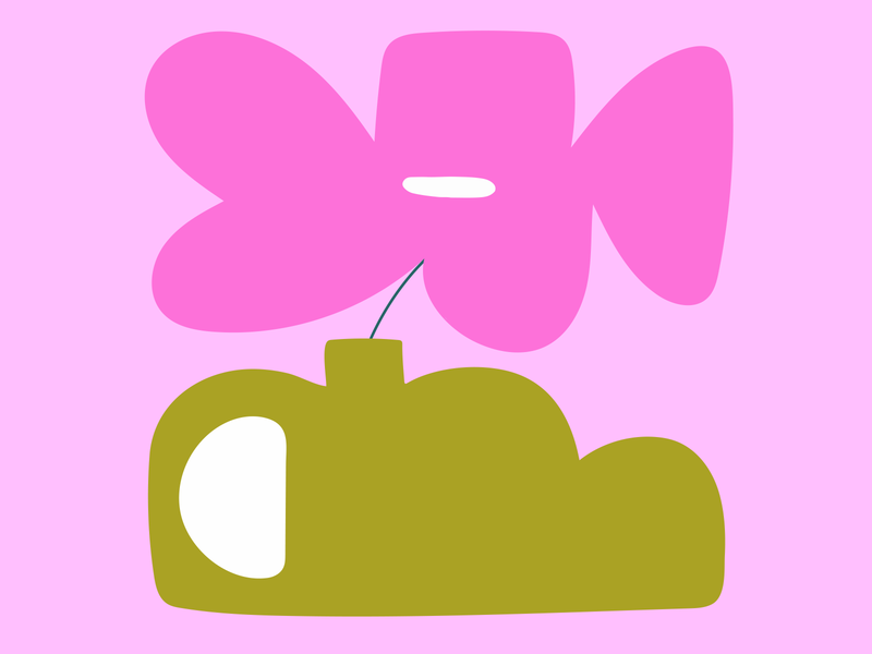
The characters can be created as 2D designs, holographic designs, candy color designs, or anything we’re talking about in this article. We can all enjoy the 3D character trend, as shown in the following examples.
Row 1: VAGO, Tran Mau Tri Tam ✪, Nguyen Nhut.
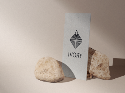
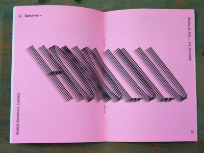
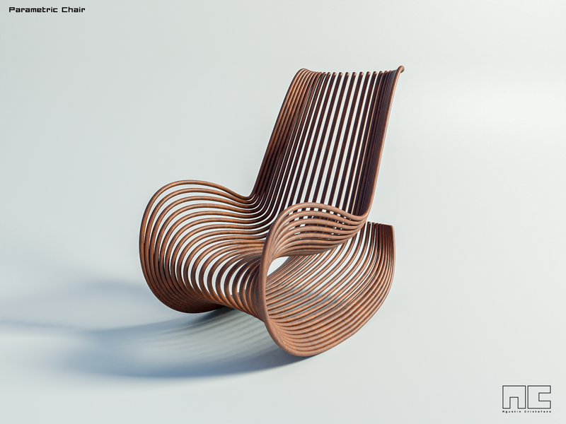
Trend #8 — Parametric patterns
A parametric pattern consists of geometric structures whose lines morph depending on their relative positions. Graphs of parametric equations inspire the style.
As part of the designs of 2022, parametric patterns represent the complexity of the subjects they represent, from communication to identity.
The graphic design industry relies heavily on patterns. These decorative elements add visual interest to backgrounds and break up solid colors. With parametric geometry, in 2022, designers will put statement patterns front and center.
Row 1: Paul Rover, Carlos de Toro, Agustin Cristofano.
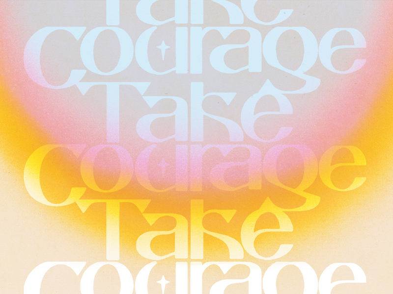
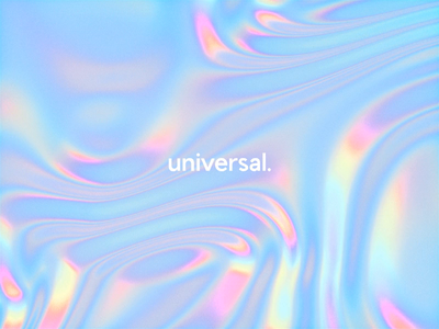
Trend #9 — Holographic design
With its mixture of high-gloss multidimensional pastel highlights, holographic design is undoubtedly high-tech and futuristic. Even in static images, these highlights give the impression of movement. 3D motion designers especially have been loving this trend for its mesmerizing effects.
The holographic trend has recently appeared in other areas of our lives like fashion (remember those 90s see-through holographic bags and jelly shoes?), stationary, and so on. As a result, it is no surprise that this trend has also reached the animation and web realms. Apps and logos are also no exception.
Trend #10 — Extreme “high school” bubble design
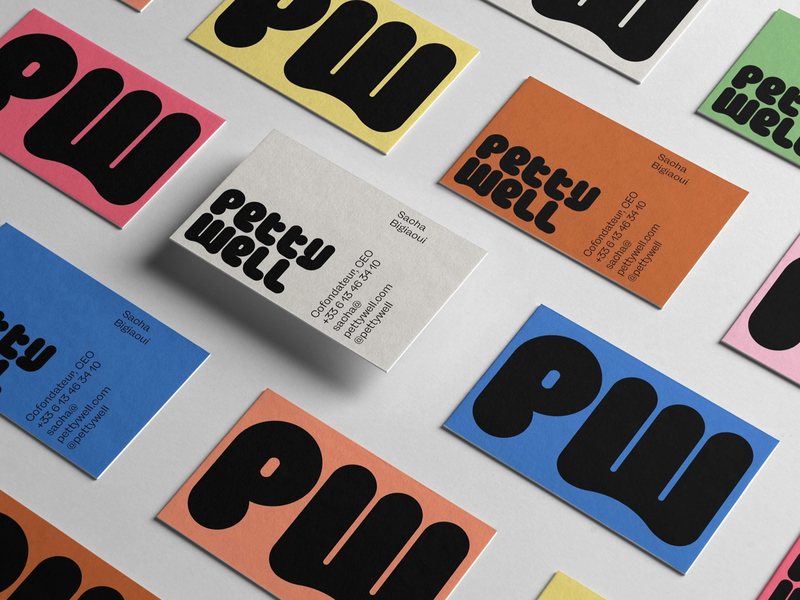
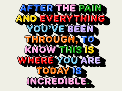
A graphic designer’s work is not complete without some fun. Since circles lack corners, they convey a friendly and lighthearted vibe, undeniably positive. As we could all use positivity in our lives, designing rounded graphics and lettering styles will be a popular trend for 2022.
The 2022 trend is exaggerated through elongated forms and psychedelic colors instead of the typical bubble fonts and shapes found on children’s products. The result is an inflatable design that feels grown-up while still retaining that vital spark of childlike fun.
Row 1: Mr.Mockup™, 𝚕𝚞𝚕𝚊, Meg Lewis.
Add these graphic design trends to your portfolio in 2022
As a whole, 2022’s graphic design trends may seem quite random. From anti-design and parametric patterns to candy colors and extreme bubble doodles, what they all have in common is a giant 90s flashback. There is no denying that these unique design trends will highlight the upcoming year in design.
It will be exciting to see how this global community of designers will come together in 2022 to create incredible designs (just don’t try to master them all at once!). ■
![]() About the Author: Olivia Hoskin is a freelance writer with a background in tech and marketing. A true design fan at heart, you’ll find her writing about the latest industry trends, technologies, and the inspiring endeavors of fellow creators. She’s a champion of remote work, a lover of responsible technology, and a fitness geek and enjoyer of the outdoors in her spare time. Find her at oliviahoskin.com.
About the Author: Olivia Hoskin is a freelance writer with a background in tech and marketing. A true design fan at heart, you’ll find her writing about the latest industry trends, technologies, and the inspiring endeavors of fellow creators. She’s a champion of remote work, a lover of responsible technology, and a fitness geek and enjoyer of the outdoors in her spare time. Find her at oliviahoskin.com.
Find more Inspiration stories on our blog Courtside. Have a suggestion? Contact stories@dribbble.com.
