In the past year, trends in innovation and culture have changed more quickly and dramatically than ever before.
It’s no surprise, then, that many aspects of design moved in diverse directions. Physical activities like work, education, dating, and shopping have migrated online. The metaverse, a speculative virtual world navigated by our avatars, is moving full steam ahead. (At least brands seem to think so.) The web—and by extension, the way it’s designed—became as much a part of real-life as the physical world. And despite the fact that we know more about the pandemic than before, it’s unlikely that we will return to the “normal” conditions of life and design anytime soon. Certainly not in 2022—it looks like some changes are here to stay.
We don’t have a crystal ball to predict how the precarity of our moment will impact web design in the coming year, but we do have the next best thing—leading designers from across the industry. With their help, we’ve analyzed what’s happening in terms of design, innovation, and culture, and forecast some of the biggest trends you can expect in 2022.
✏️ Thank to our friends at Editor X for writing and sponsoring this blog post!
1. Dark Mode
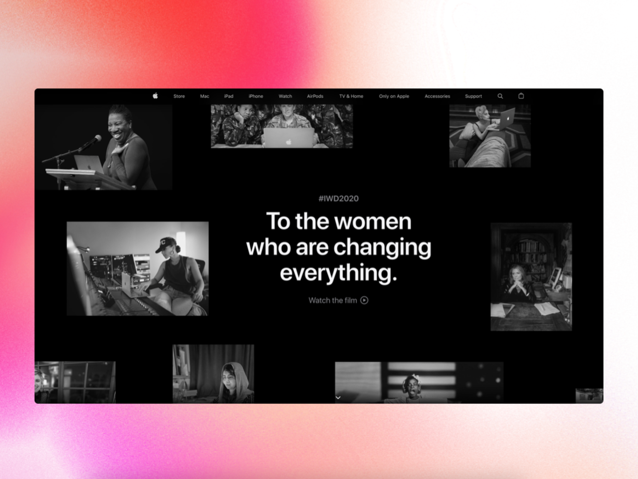
Your phone’s dark mode feature saves battery and is perceived to be easier on the eyes, but it can also be a graphic move that creates visual interest—all important factors considering how our screen time has increased over the past 18 months. Monochromatic websites are becoming increasingly popular, used by brands like Apple, WeTransfer, and Spotify, and by studios like Pentagram for the Moholy-Nagy Foundation. Dark mode options are being used by personal websites and social media sites as well—Twitter has “dim” and “lights out” options.
“The internet has become very busy and with so many things competing for attention, circling back to a more pared-back visual aesthetic feels like a natural progression,” said Brandon Levesque, Art Director at Cusp, a collective made up of agencies from across Europe and North America. “Dark mode can act as a subtle easter egg on the site to peak the user’s sense of discovery. As it becomes an option on most devices, we will start to see it trickle down to other aspects of the digital design space, like sites that take an editorial approach or place primary focus on photography.
2. Evolution of corporate Memphis
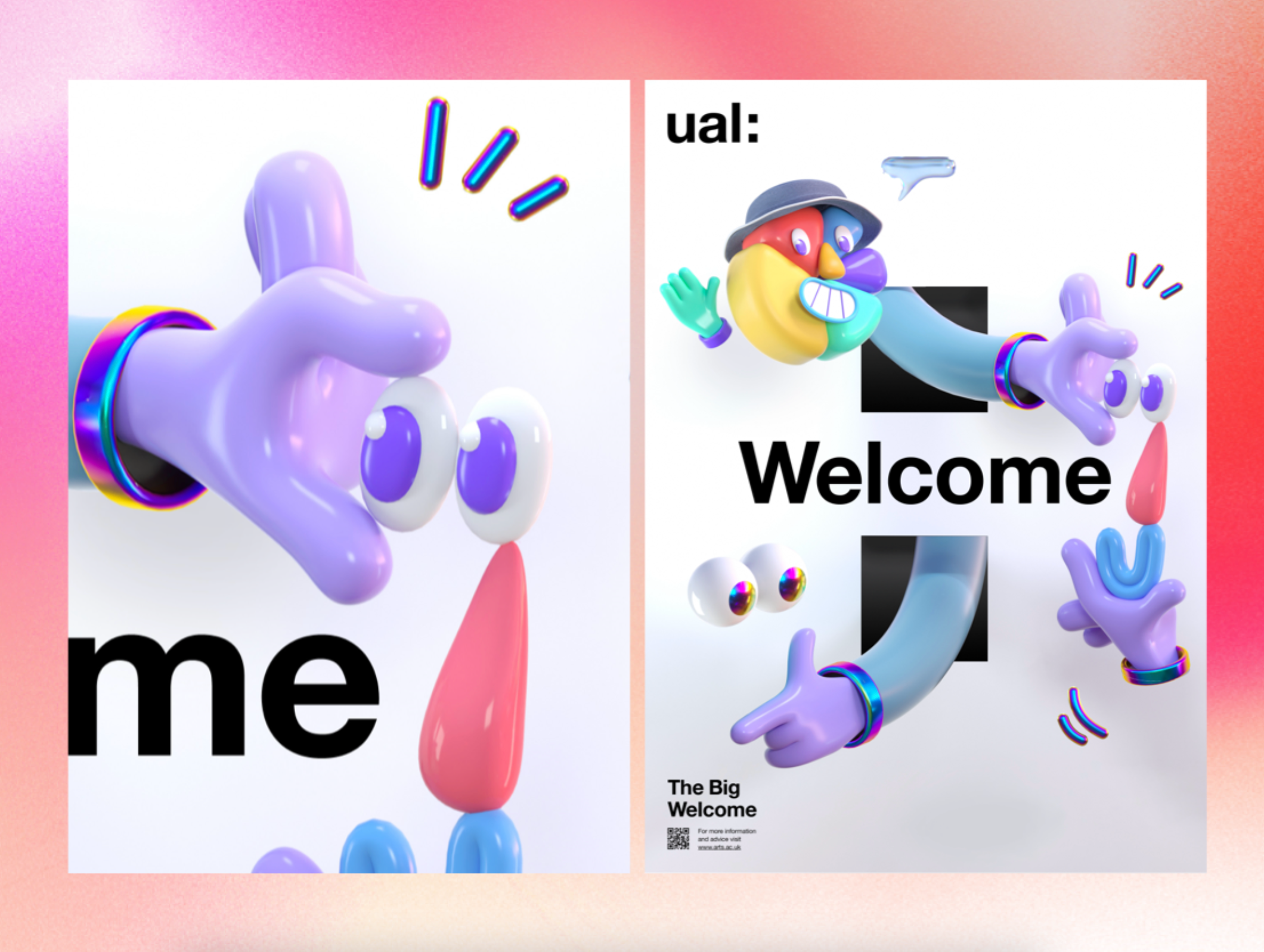
Over the past several years, major tech companies like Airbnb, Hinge, and Airtable have adopted THE now-ubiquitous, abstracted, flat illustration style inspired by the postmodern Memphis movement from the 80s. The style’s popularity means that while it may not go away anytime soon, it is due for a shakeup: there’s increasing criticism that tech companies use the generic figures to appear more human-centered and friendly, despite their contradictory policies and business practices.
Indian e-retailer Flipkart’s figures feature characteristics from an array of backgrounds, University of the Arts London’s whimsical humanoid forms, and this recent Chipotle ad featuring music by Kacey Musgraves, are examples of how this trend might evolve.
Writer and strategist Samantha Culp predicts that future-forward companies will begin to take risks, updating the Corporate Memphis color palette and leaning into “jewel-toned psychedelia and cosmic art, lesser-known figures from Impressionism and Expressionist art, art nouveau (and the way art nouveau is influencing Solarpunk, and just more ‘pastiche’ of various clashing styles and periods all at once.”
3. Typographic landing pages
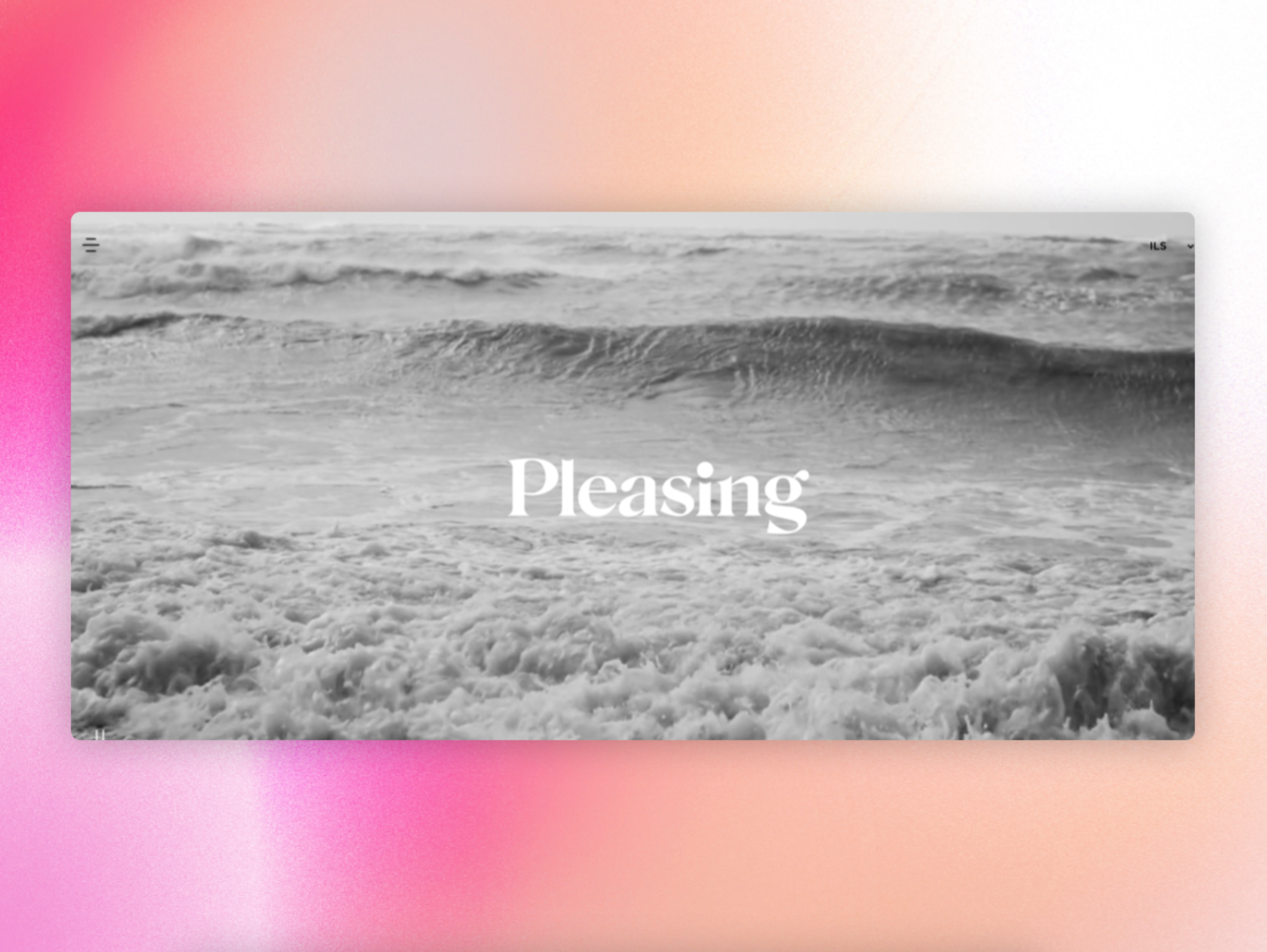
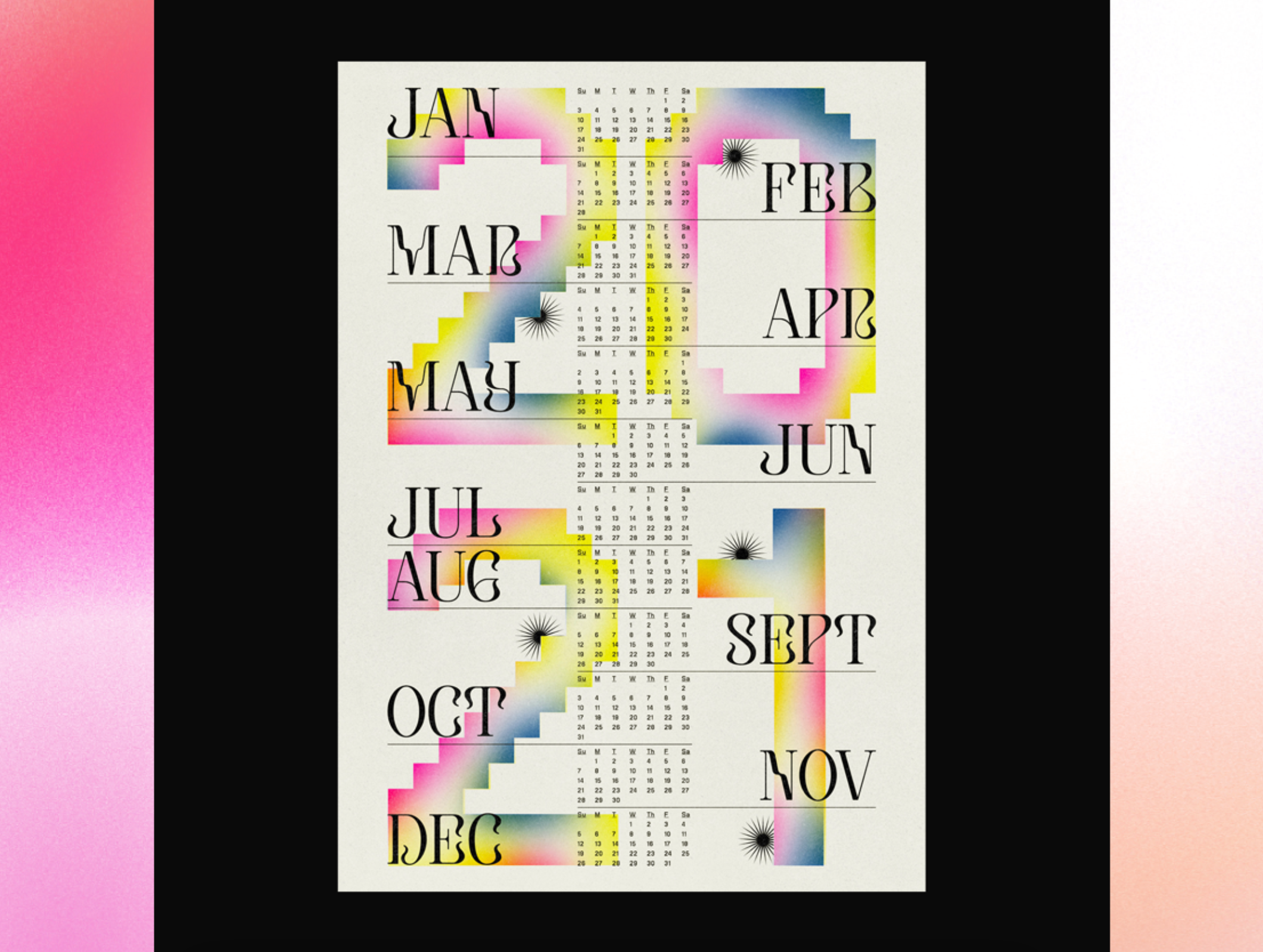
Bold, prominent, and expressive typography will continue its reign over landing pages. While this trend made waves in 2021 as well—see Gawker’s relaunched website, DIA Studio’s type system for the Chaumont Biennale 2021, and Harry Styles’ beauty brand Pleasing—it will evolve to include many different kinds of applications, from portfolios and brand websites to online publications and microsites.
“In the last few years a lot of big brands have begun investing in their own type systems because they understood that typography is a powerful way to convey the brand’s tonality and persona,” said Laura Scofield, strategist and creative lead at January.ai. Scofield adds that this trend can be interpreted as a throwback to modernist posters, Penguin’s iconic book covers, and movie titles like Wes Anderson’s use of typography as a storytelling device in his films. “Prominently displaying type has always been part of graphic design, but now more and more brands and companies are leveraging it on the web,” she said.
4. Preparing for the metaverse
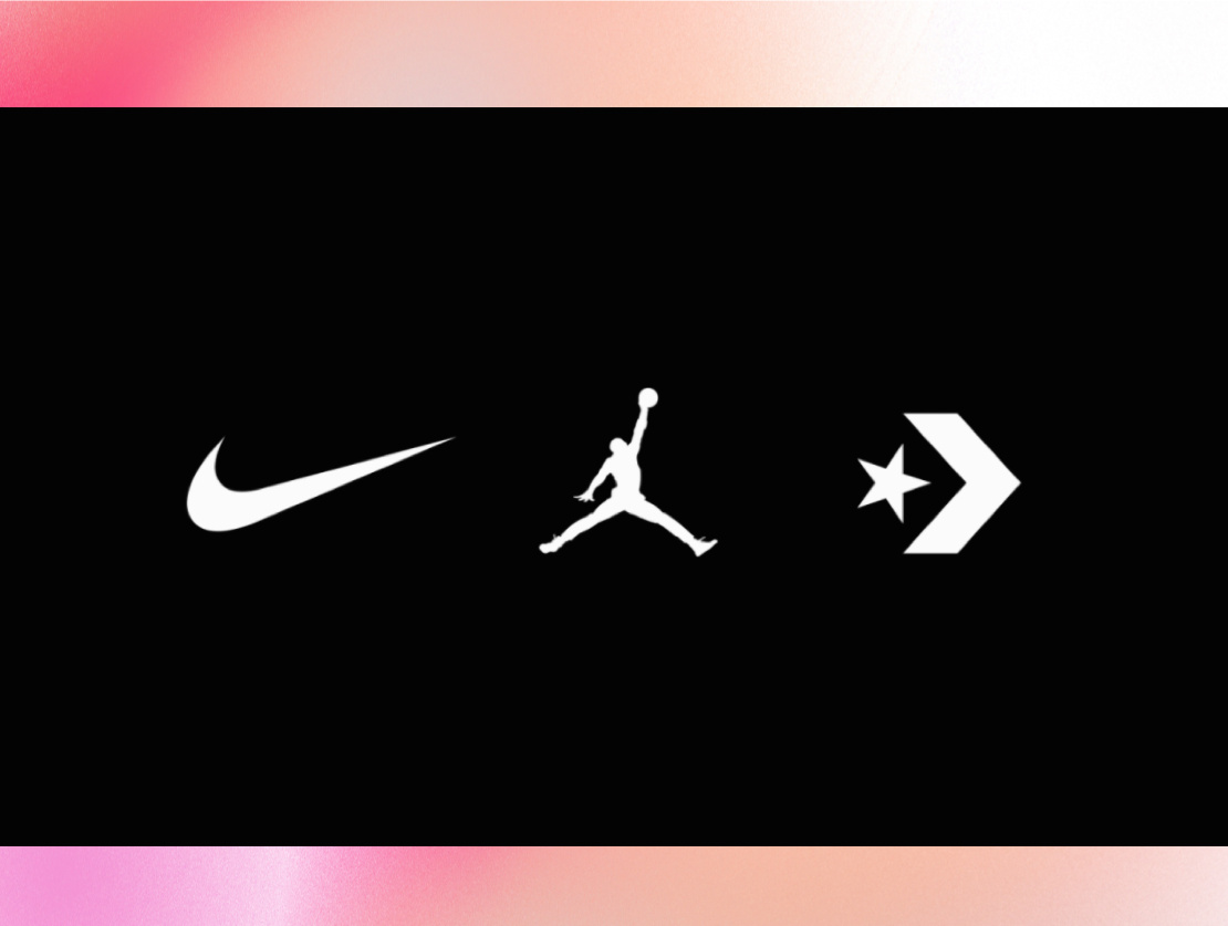
The metaverse is here and brands and designers alike will have to urgently prepare for the opportunities and challenges it brings with it. There is a slew of recent examples: Nike acquired RTFKT Studios, a virtual fashion startup that makes NFTs and digital sneakers, Adobe bought Substance, a 3D-texturing app used for game and film production, audiences tuned into virtual concerts on Fortnight, and Facebook rebranded to Meta and is investing heavily in AR and VR. Brands, entertainment, and the corporate world will be unrecognizable very soon—Bill Gates predicted that within three years most office meetings will take place via avatars.
As the future arrives more quickly than expected, 2022 will see companies building interaction design teams and coming up with strategies to succeed in the era of extended reality. “It’s hard to imagine that only some 30 years ago, there were no interaction designers,” said Adhiraj Singh, a San Francisco-based art director and interaction designer whose clients include Red Bull and Microsoft. “But today interaction designers are considered the architects of digital experiences that we use to work, game, network, entertain, travel, and even fall in love.”
5. Deeper collaboration
What we’ve learned about remote work so far is that despite its challenges, it has tremendous possibilities for productivity as well as collaboration. And as more and more industries continue to work remotely, tools that support teamwork will take on a more human-centered approach. Frameworks like Figma, Miro, and Google Workspace are constantly innovating on improving collaboration, while digital design workshops like Open Collab and collaborative web development platforms like Editor X will transform how hybrid or remote design work takes place.
“Even without the pandemic, collaboration is a standard that enables agencies to work efficiently and smoothly. But the workflow in agencies today is quite linear,” said Na’ama Ben-Oliel Ronan, product team lead at Editor X. “On most websites and production platforms, designing together is either impossible or awfully limited. So we’ll start to see the creation process becoming much more parallel.”
6. Playfulness and nostalgia
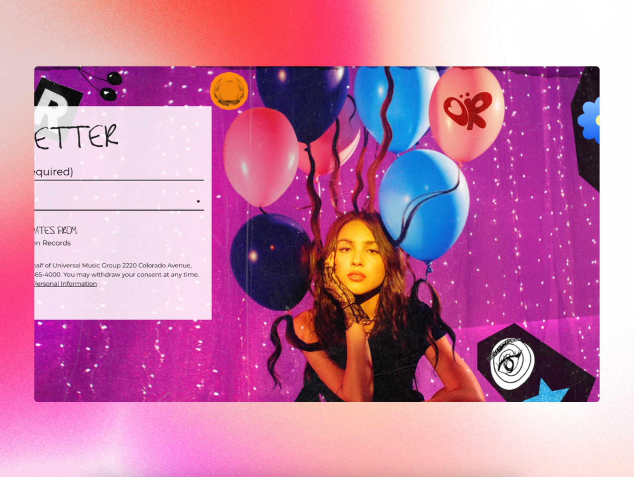
Just as real-life objects inspired early skeuomorphism, elements from the real world will make their way back into design as web designers use new technology like 3D graphics to recreate the fun and physical aspects of childhood (consider the Nintendo founder family website, Yamauchi No. 10, for instance). Handdrawn elements by studios like Pentagram and Luke & Nik, and Y2K references from cultural trend setters like Olivia Rodrigo (both big trends in 2021), as well as old-school games will return in a big way.
“Having designed websites since the [late ‘90s/early 2000s], I see websites today looking like the Flash websites we used to design,” explains Hege Aaby, founder and creative director of Sennep. ”They are fun and experimental, often with a nostalgic flavor. After the death of Flash, technology has finally caught up, giving web designers great freedom to create immersive and creative websites. The ticker tape, sideways scrolling—that for a long time was a no-no—and the use of retro typefaces and colors are back. The reference to old technology never gets old.”
7. Narrative typography
While the internet can sometimes make it seem like the world is a small, homogeneous place where neutral aesthetics reign supreme, more and more designers are recognizing the need for hyperlocal design—especially when it comes to typography on the web. Type designers are increasingly experimenting with typefaces inspired by their unique cultural narratives, in a variety of languages and which take into consideration the nuances of their local scripts. Collectives like the Syrian Design Archive and Archief Cairo, which work to preserve their local visual history, are growing.
“There hasn’t been much done to explore the form of non-Latin scripts. For example, what does Devanagari graffiti or a Telugu logo look like? While local type foundries have always existed, diverse groups of people are now experimenting with their cultures and languages because of the advent of modern type design software and social media,” said Manav Dhiman, designer and founder of ManVsType. Dhiman points out that localized ligatures, like the rupee symbol in his Bombay typeface, are important from a functional standpoint, too: “Someone who doesn’t experience the frustration of not being able to type it easily on a daily basis would not have even thought about making it simpler.”
8. Interactive education
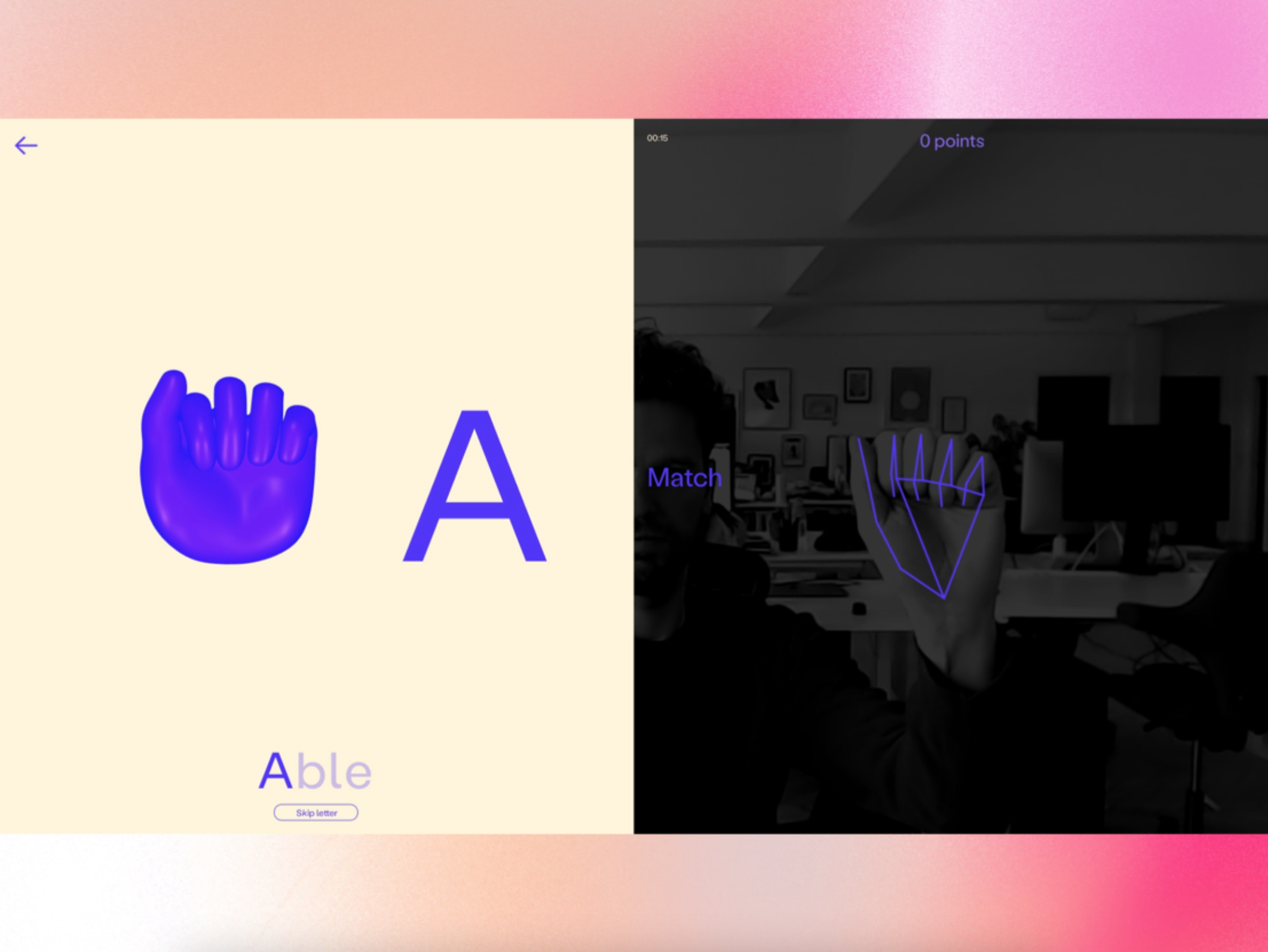
As the trend toward online education continues to grow in momentum, designers are harnessing the power of interactive platforms and are using machine learning and AI to solve unconventional learning problems beyond classroom instruction. Students can use Otter, the AI-powered transcription platform, to take notes. Fingerspelling, a machine vision-powered website created by creative studio Hello Monday for The American Society for Deaf Children, helps parents of deaf children learn ASL using a webcam and hand-tracking. Wongle, another Hello Monday application from 2020, uses Google Cloud Vision to teach children the letters of the alphabet. The possibilities for experiential, interactive learning are endless, and will be a major trend as education continues to remain online in 2022.
“There is something interesting about thinking that someone taught the computer to ‘see,’ and now the computer is using that knowledge to teach us back,” said Anders Jessen, Founding Partner of Hello Monday. “I think the man-hours put into making the algorithm and detection—while it is a lot of work—is incrementally small in terms of how many hours it can save when used for learning.”
9. Digital fashion experiences
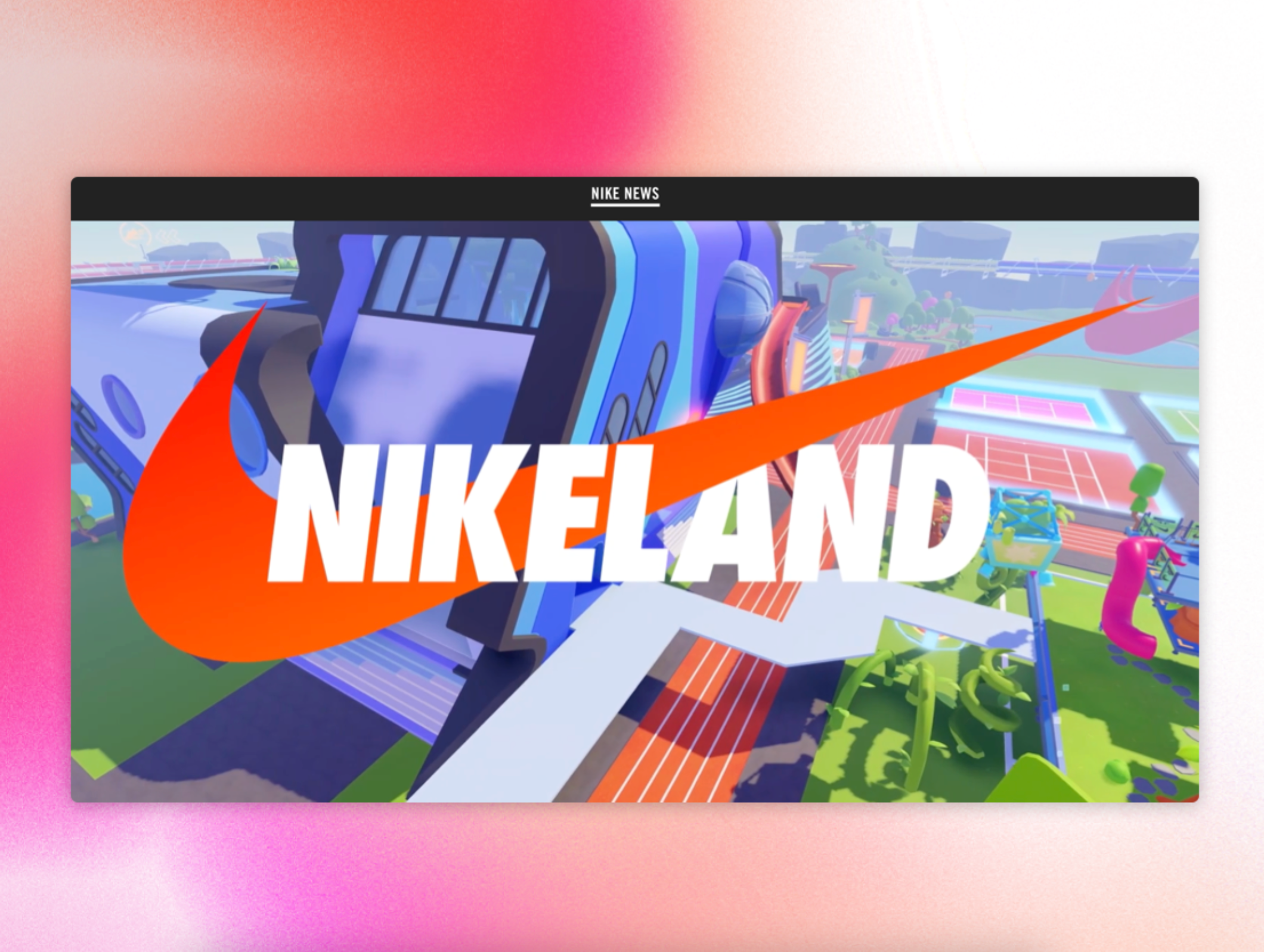
Succeeding as a fashion brand means leading with cutting-edge practices, and for luxury brands, engaging AR and VR experiences is a clever strategy to appeal to early adopters. Progressive brands are already using this trend, innovating experiences that help them stand out beyond attractive retail and e-commerce sites. Nike collaborated with online gaming platform Roblox to create Nikeland, in which players can dress their avatars in Nike gear, and created an immersive virtual world for its 2021 ACG collection. Under Armour launched digital catalogues with 3D product renderings. Balenciaga launched a video game for its SS 2021 collection, Burberry launched a new AR shopping tool based on the Greek goddess Olympia, and Gucci created a colorful, dynamic gaming website for the launch of its Gucci Basket sneaker.
The partnership between style and digital design will grow stronger as the technology for interactive and sensory experiences expands. “COVID-19 has accelerated the need for fashion brands to communicate through digital touchpoints, especially luxury brands that are used to relying on their physical presence to connect with their audience and build brand loyalty,” said Rian Verhagen, Managing Partner of Superhero Cheesecake, a creative studio in Amsterdam with clients like Gucci and Viktor&Rolf. “I think the role of AR and VR in 2022 will be to provide increasingly realistic and tactile product displays. I’m expecting to see more brands turning their digital platforms into online flagship experiences.”
10. Inclusive assets
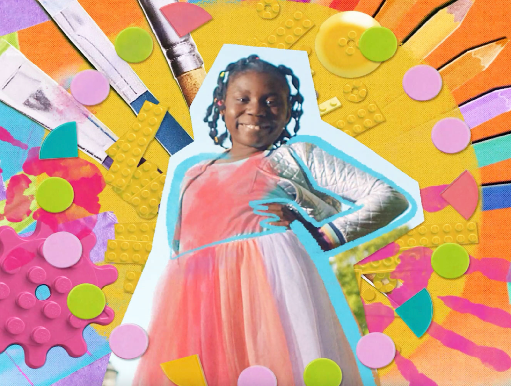
As cultural conversation expands to include the voices of previously underrepresented communities, especially of people of color, differently-abled people, and members of the LGBTQ+ community, designers and brands will become more sensitive to unconscious biases that come through in web content, images, and visual language. A wider range of resources like stock imagery will be required as companies like LEGO, CitiBank, and Microsoft introduce inclusive practices into their external communication and product design. The industry will also need more people from underrepresented communities in leadership positions, like Chanel’s new CEO Leena Nair.
“We know that images have a crucial role to play in how people—and children—view themselves and the world surrounding them,” said Dr. Rebecca Swift, Global Head of Creative Insight at Getty Images. “It is very easy to fall into the trap of using stereotypes but everything that is put out into the digital world needs to be rethought through the lens of accessibility and inclusion.”
Start a trend of your own in 2022
Whether you’re ready to get creative with these design trends or feeling inspired to create your own, Editor X can help. Editor X is the first ever, fully collaborative web creation platform for designers and agencies. You can explore some of the top Editor X creations on the Showroom, or visit the Shaping Design blog to keep up with the latest trends and discussions on all things design. Ready to transform the way you create websites? Visit EditorX.com. ■
About the Author — Sneha Mehta is a writer and designer, currently based in Mumbai, India. She writes about the cultural connotations of design and food for companies like Pentagram and 1st Dibs, and for publications like Vogue and The Juggernaut.
Find more Inspiration stories on our blog Courtside. Have a suggestion? Contact stories@dribbble.com.


