The necessary skills you need as a designer is often debated. Should designers code, write, or understand business? These skills are incredibly valuable but perhaps not essential. However, many would argue that every designer should learn the fundamentals of psychology.
As humans, we have an underlying “blueprint” for how we perceive and process the world around us—the study of psychology helps us define this blueprint. As a designer, you can leverage psychology to build more intuitive, human-centered products and experiences.
But knowing where to start can be a challenge. In this article, we’ll cover the basics that should be helpful for all the different variants of designer Lokis out there. Some of you may have already studied this in college—but for those of you that haven’t, you’ll find plenty of useful information to start applying to your work.
✏️ A big thanks to our friends at Domain.ME for writing and sponsoring this blog post!
Gestalt Principles
Developed by German psychologists in the 1920s, Gestalt Principles (or Gestalt Theory) explain how people tend to organize visual elements into groups, and how the whole is often greater than its parts. Their application takes advantage of how the brain self-organizes information in a manner that’s orderly, regular, symmetrical, and simple.
Along with systems such as grid theory, the Golden Ratio, and color theory, the Gestalt Principles form the basis of many design rules a lot of my designer friends follow today. Used in a logo, the Gestalt principles make it more interesting, more visually arresting, and therefore the message becomes more memorable.
How to apply this to your designs
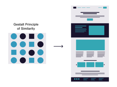
The term Gestalt means ‘unified whole’, which is a good way of describing the overarching theme behind the Gestalt principles. These refer to the way in which humans when looking at a group of objects, will see the whole before we see the individual parts.
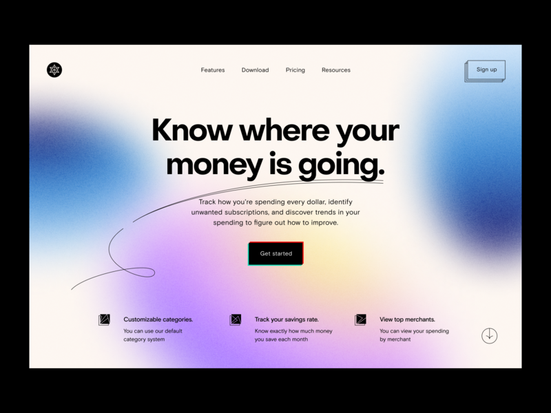
In UX design, using similarity makes it clear to your visitors which items are alike. For example, in a features list using repetitive design elements (such as an icon accompanied by 3-4 lines of text), the similarity principle would make it easy to scan through them. In contrast, changing the design elements for features you want to highlight makes them stand out and gives them more importance in the visitor’s perception.
The implementation of Gestalt principles can improve not just the aesthetics of a design, but also its functionality and user-friendliness. And, they are a valuable set of ideas for any designer to learn.
Visceral Reactions
Have you ever fallen in love with a website only seconds after you’ve landed on it? Or maybe you disliked an application, hated it even, only after a quick glance at it? If yes, then you already know what is a visceral reaction.
This kind of reaction comes from the part of our head called the ‘old brain’ responsible for the instincts and it reacts much faster than our consciousness does. Visceral reactions are rooted in our DNA, so they can easily be predicted.
How to apply this to your designs:
Designers can use this principle to draw attention to their creations. It’s not very difficult to guess what looks nice to people and what doesn’t. Naturally, you have to know your target audience and their needs first.
People tend to determine the figure and ground relationship before making any other resolutions about what they see. We’ve evolved to prioritize this perception so we can better navigate our surroundings. Without it, we’d be running into objects and tripping over sidewalks. Use that for your next project!
Humans have limited short term memory
We can only hold so much information at any one time. This is especially true when we are bombarded with multiple abstract or unusual pieces of data in rapid succession.
How to apply this to your designs
Eliminate the need for people to remember information by making relevant information visible or readily available. If a user has carried out a search, show the search term along with the results. If they have filtered something, show the items that have been filtered. If they have entered incorrect information, show them which field was incorrect and why.
Users should not have to remember the previous state if it affects the present state. Inform them if their previous decisions affect their current state. This way, if they feel their current state is incorrect, they know what information to change.
Psychology of Shapes
Even a basic understanding of the psychology of logo shapes in graphic design is enough to show us how important different patterns can be to customer perception. Something as simple as using a circle, instead of a square, could be enough to change the way that your target audience thinks and feels about your brand.
The simple reason why logo shapes are so crucial is that the human brain is hard-wired to memorize and assign meaning to them. In fact, the way that we process shape is a fundamental aspect of how humans learn things. A distinctive shape remains stored within the banks of your memory long after you’ve seen it. Just think about that iconic Nike swoosh or the Twitter bird.
Psychology of Color
Have you ever noticed how a yellow room tends to make you feel brighter or happier? Or how a red dress can make you feel a sense of passion, while a red sign can alert you of danger?
The topic of color psychology can be a bit complicated because color and feelings can be highly subjective. But studies suggest that color does influence emotion in specific ways.
In design, the color acts as a key function that grabs the attention of the user. Color is the easiest aspect to remember when it comes to encountering new things for new users. And, the colors of a design always make a connection with the branding of the product or a person. So, naturally, designers should always use color as a way to communicate what the product is about.
Choose your colors wisely
Graphic design is more than just choosing a few colors that look pleasant together. Depending on your upbringing, cultural background, and personal preference, certain colors can make you feel a certain way. Understanding the psychology of color and knowing how to use it strategically is one of the basic fundamentals of graphic design.
The Paradox of Choice: Why more is less
Have you ever stood in front of a candy aisle and been overwhelmed by the number of choices in front of you? Or browse your favorite streaming media service struggling to pick something to watch because the possibilities are seemingly endless? You’re not alone. This internal struggle when presented with many options to choose from is called the paradox of choice.
When we’re given more options, why are we less likely to choose? Well, people are more likely to feel overwhelmed when presented with too many choices in front of them. More choices requires more time and effort to go through and compare everything. This can lead to anxiety, stress, unhappiness, high expectations, regret, and self-blame if a
Why is choice important in UX design?
Too many things being explained at once makes it difficult for the user to focus on just one piece of content. Instead of taking the time to process all the information, a user is likely to simply switch to your competitor’s website.
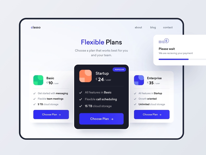
Adding features that have little to no value to most users undermines people’s innate abilities to collect and process information efficiently. Keeping the number of options at a reasonable level allows people to make decisions more easily and complete tasks faster.
Let your portfolio be your next big project
Choosing a domain name for your website is an important decision you’ll have to make as a design professional. Investing in a personalized domain name is critical to owning the search results that come up when someone Googles your name. Remember, potential clients and employers will do their research. Having a personalized domain that links to your design portfolio or your personal website will enable you to own the results that come up when anyone searches your name.
Choose a personalized domain name that speaks to who you are and try to incorporate all of the principles above. Yes, it is possible and it is also a great practice for your future endeavors. We’d opt for .ME, since it is highly personalized and can make your domain name different and unique!
Wrapping up
What people see and what people feel are two very different things. The first is an aesthetic experience; the latter is a psychological one. Good design needs both, so designers need more than a basic understanding of psychology for their work to make a worthwhile impression.
Now that you understand the importance of psychology in design, you have gained the tools to put this into action. In the end, understanding the psychology component in design is what makes or breaks successful designers. ■
✨ Header Illustration by Oleg Shcherba from Ouch!
About the Author: Biljana Martinić is a dedicated Content Creator/Writer at Domain.ME, the international tech company that operates the internet domain “.ME.” Her articles focus on balancing information with SEO needs—but never at the expense of providing an entertaining read. With a music playlist for every silly occasion, she considers herself as some kind of a song sommelier. The last dog she’s seen is always the best dog she’s ever seen.
Find more Process stories on our blog Courtside. Have a suggestion? Contact stories@dribbble.com.

