This article was originally published in TechCrunch and was written by Stark’s CTO and co-founder Michael Fouquet. Founded by Cat Noone, Stark is the go-to accessibility tool.
For too many companies, accessibility wasn’t baked into their products from the start, meaning they now find themselves trying to figure out how to inject it retrospectively. But bringing decades-long legacy code and design into the future isn’t easy (or cheap).
Businesses have to overcome the fear and uncertainty about how to do such retrofitting, address the lack of education to launch such projects, and balance the scope of these iterations while still maintaining other production work.
Among the U.S. adult population, 26% live with some form of disability, and businesses that are ignorant or slow to respond to accessibility needs are producing digital products for a smaller group of users. Someone who is a neophyte might not be able to use a product with overwhelming cognitive overhead. Someone using a product that isn’t localized may not be able to refill their prescription in a new country.
We recently saw this play out in the “cat lawyer” episode, which the kitten-faced attorney took in good humor. But it also reminded us that many people struggle with today’s basic tools, and for those who don’t, it’s hard to understand just how much this disrupts people’s personal and professional lives.
If you’re a founder with a software product out there, you probably won’t receive as loud an alarm bell as a viral cat filter video to tell you that something’s wrong. At least not immediately. Unfortunately, that time will come because social media has become the megaphone for support issues. You want to avoid that final, uncontrollable warning sign.
Here are four other warning signs that make clear your product is not as accessible as you might think—and how you can address that.
1. You didn’t define a11y principles at the start of your journey
Accessibility is a key ingredient in your product cake — and it’ll always taste best when it’s added to the mix at the beginning. It’s also more time- and cost-effective, as fixing a usability issue after the product has been released can cost up to 100 times more than earlier on in the development process.
Your roadmap should work toward the four principles of accessibility, described using the acronym POUR:
- Perceivable — Your users need to be able to perceive all of the information displayed on your user interface.
- Operable — Your users must be able to operate and navigate your interface components.
- Understandable — Your content and the functioning of your user interface must be clearly understandable to users.
- Robust — Your content has to be robust enough that a wide variety of users can continue to access it as technologies advance, including assistive technologies.
Without following each of these principles consistently, you cannot guarantee that your product is accessible to everybody.
The roadmap should integrate accessibility efforts into the design, development and quality assurance process, all the way through to product release and updates, where the cycle starts all over.
This means it’s vital to have everyone on your team informed and committed to accessibility. You could even go further and nominate one person from each team to lead the accessibility process and be responsible for each team’s compliance. It’s worth starting any new project with an accessibility audit so you understand exactly where your gaps are. And by syncing with sales and support teams, you can identify where users are experiencing friction.
This baking process helps you avoid legal problems in the future as a result of noncompliance. In 2019, a blind man successfully sued Domino’s after he was unable to order food on the Domino’s website and mobile app, despite using screen-reading software. Beyoncé’s company was sued by a blind woman that same year. Product owners are wide open to lawsuits if they don’t implement the Web Content Accessibility Guidelines.
To help you on your way, IBM’s Carbon Design System is an open-source design system for digital products that offers free guidelines to build an accessible product, including for people with physical or cognitive disabilities. In addition, software tools exist that can help you do accessibility checks ahead of time rather than when the product is finished.

2. You’re treating a11y like a set-it-and-forget-it
Design trends evolve fast in the tech world. Your team is probably staying on top of the latest software or mobile features, but are they paying attention to accessibility?
A11y needs maintenance; the requirements for the web and mobile platforms are changing all the time and it’s important (as well as necessary) to stay on top of those changes. If you’re not carrying out constant tweaks and upgrades, chances are that you’ve racked up a few accessibility issues over time.
Plan regular meetings where you review and discuss your products’ accessibility and a11y compliance. Look at what other products are doing to be more accessible and attend courses about inclusive design (e.g., TechCrunch Sessions). Platforms like the A11Y Project are also incredibly useful resources for teams to stay up to date, and they also offer books, tutorials, professional support, and professional testers.
3. You and your team haven’t tried out a11y tools
The best accessibility tool you have is your team itself. Building a product with a diverse group of people will mean you encounter and rectify any barriers to use faster and can innovate with greater impact — after all, people with disabilities are some of the world’s greatest innovators.
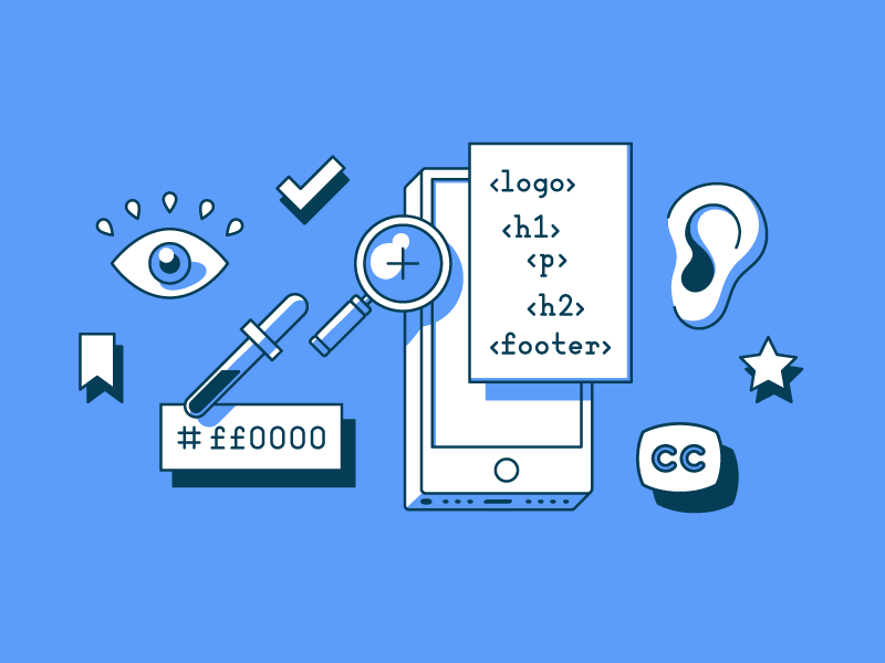
Outside of your team makeup, ask yourself: Have you ever used a screen reader? Or tried to navigate your website using only your keyboard? Seen your designs simulated against various types of vision?
If the answer is no, chances are you’re letting key accessibility features slip through the cracks. By putting yourself in the shoes of someone with impairments, these tools force you toward a better appreciation of their needs.
Try and get your team using these tools as early as possible, especially if you’re struggling to convey to them the importance of a11y. Once you’ve broadened your perspective, it’ll genuinely be harder to not see how people with different abilities are experiencing your product. Which is why you should come back to your product afterward, as a user, and explore it through a new lens.

4. You aren’t talking to your users
Lastly, there’s little chance you’ve built a truly accessible product without actually talking to its users. The general population is the most diverse set of critics to warn you if your product’s falling short for people of different backgrounds and abilities. Every single user experiences a product uniquely, and regardless of all the effort you’ve put in until now, there will likely be issues.
Lend an ear to a wide range of users, throughout the product life cycle. You can do this by doing user testing with each update, asking users to complete surveys on their in-app experience, and holding focus groups that proactively enlist people with a spectrum of needs.
Accessible design is just good design. It’s a misconception that it only improves UX for people with disabilities—it provides a better experience for everyone. And all founders want their product to reach as many people as possible. Once you put in the initial effort and embrace it, it becomes easier, like another tool in your kit. You won’t get it 100% right on the first try. But this is about progress, not perfection.

Learn Accessible Design with Cat Noone & Dribbble
The best time to start building more accessible products was yesterday. The second best time is now. Join Stark Co-Founder Cat Noone and Dribbble on September 8 & 15 for a two-part Accessible Design Crash Course.
If you create and share digital products online, this crash course is for you. Accessibility is relevant to everyone, so jump on board and learn with Cat. Get your ticket now! ■
![]() By Michael Fouquet: You’ll find me on a motorcycle or in front of a screen. Dog lover. Movie buff. Lead Product Designer @hudl. Changing design thinking @getstarkco.
By Michael Fouquet: You’ll find me on a motorcycle or in front of a screen. Dog lover. Movie buff. Lead Product Designer @hudl. Changing design thinking @getstarkco.
Find more Community stories on our blog Courtside. Have a suggestion? Contact stories@dribbble.com.


