Designer Nick Levesque drops by to share some of the most overused custom letterform designs in wordmarks along with visual examples.
As a designer and general human being, I’ve seen a lot of logos. Through years of observation, I’ve picked up on common ways designers alter letterforms in their logos to create more unique wordmarks. For those starting out, I thought it would be useful and fun to document the ones I see the most.
And please take this with a grain of salt. You don’t necessarily need to avoid any of these, just be mindful. I’ve been guilty of a few of these myself.
1. Topsy tur-V
One of the most popular ways I see designers customizing typefaces for a wordmark is to remove the crossbar inside of a capital A. The effect is like an upside-down V. And when that A is paired with a V — double whammy.
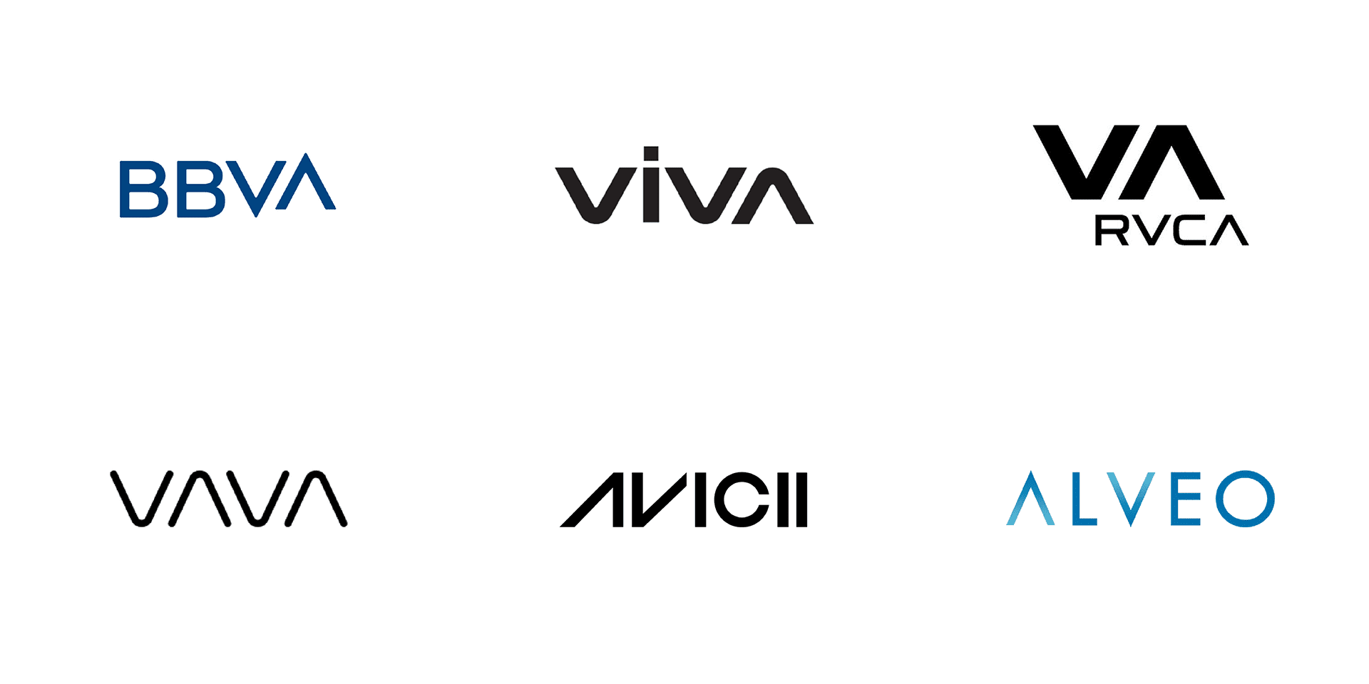
I’d say the most successful in this bunch is VAVA for fully committing to the abstractness and serving us NASA vibes.
2. Three’s a crowd
Another common letterform is an uppercase E drawn with three horizontal lines. This is often used to look futuristic, especially in the case of Tesla and the logo for the space movie Passengers.
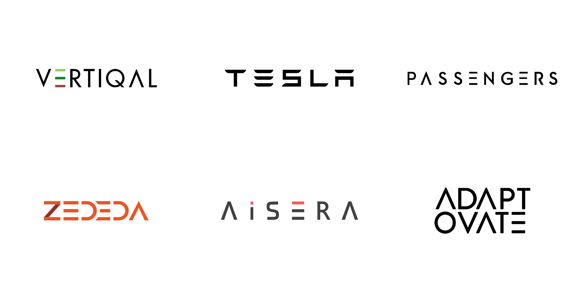
Bonus points for using the three line E and upside down V in the same logo.
3. Dot your A’s
This capital A removes the crossbar and replaces it with a dot. For any company rebrand that starts with an A, this is definitely one of the explorations in your sketchbook. I say this because it me.
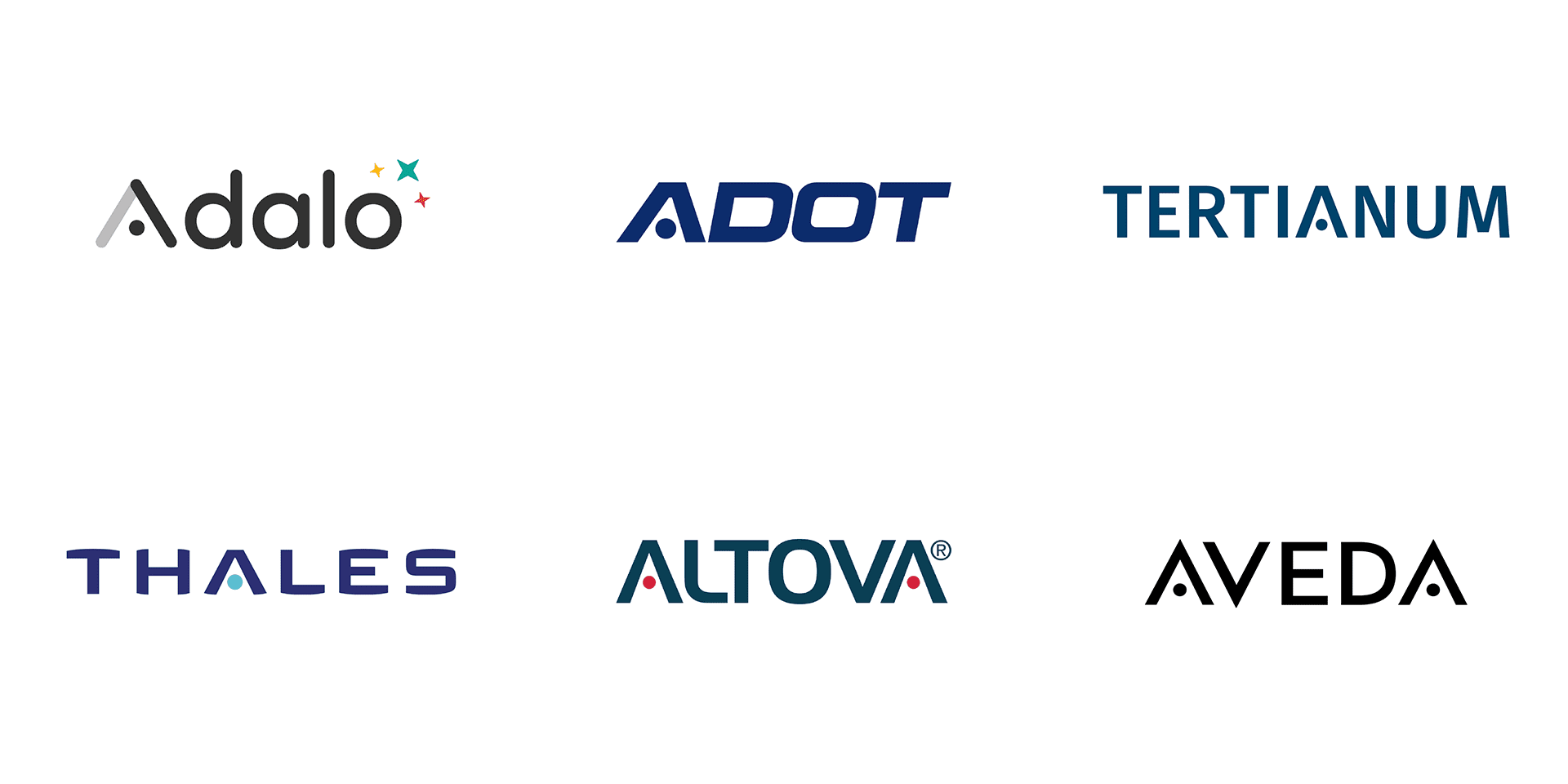
It’s worth noting that the A’s aren’t the only ones having fun. There are plenty of logos whose letters trade in a line for a circle.
4. Not u too
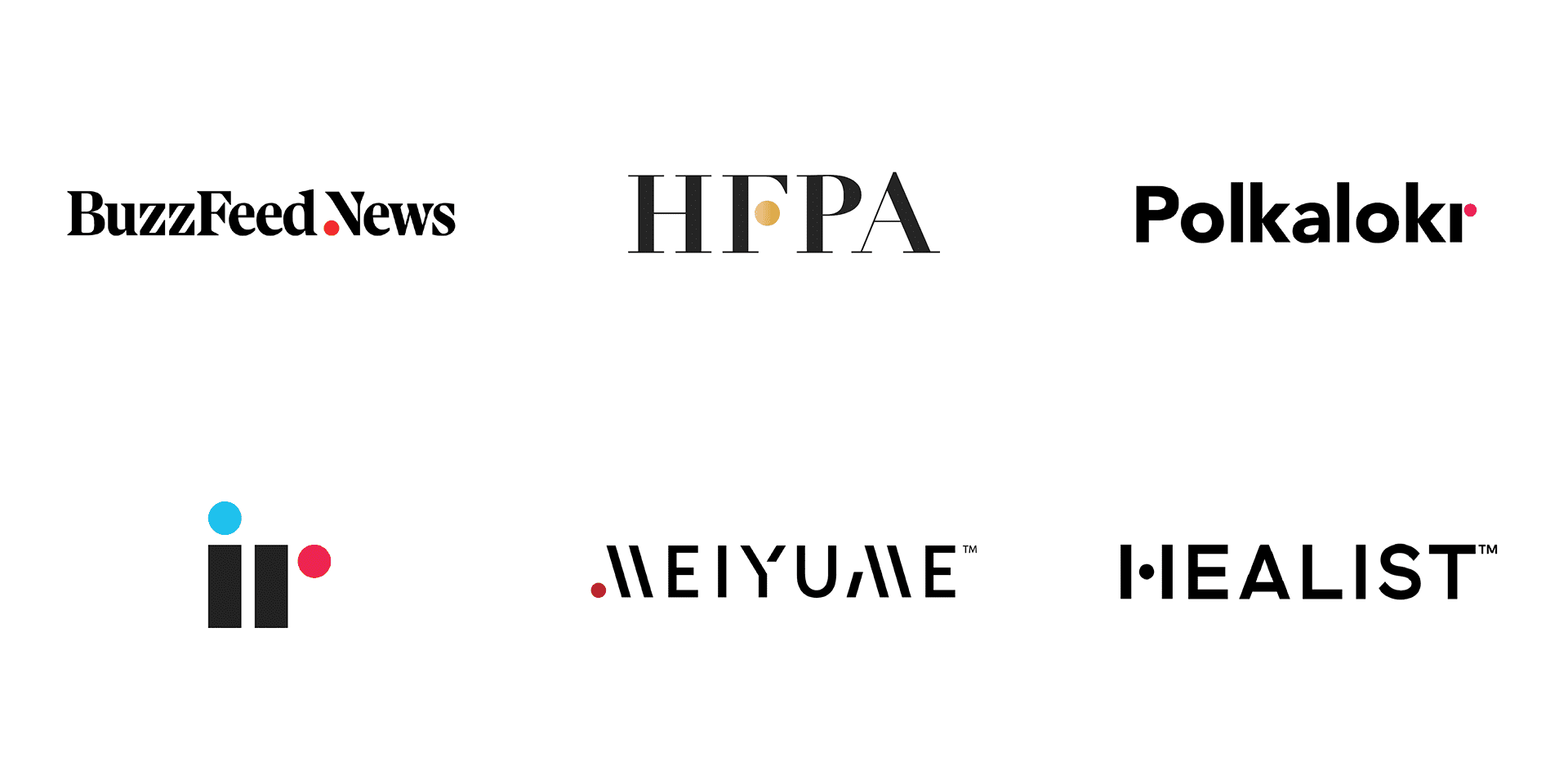
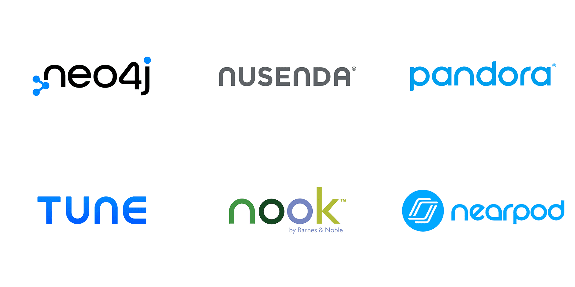
Similar to the upside down V as an A, the upside down u as an n is a common variation. This stemless n had quite the hold on us designers in 2015. Looking back, these n’s perhaps feel a little out of place when compared to the other letters with stems beside them.
5. My oo my
There’s nothing more tempting than bringing two o’s together in a logo. But infinity signs are already overused in icons, jewelry, and tattoos, so including them inside of a logotype doesn’t feel like it’s breaking any new ground.
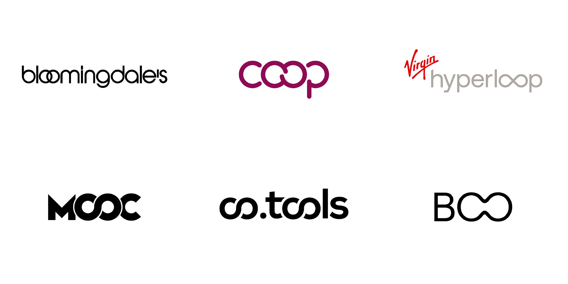
Google, Yahoo, and Deliveroo are great examples of logos that give their o’s some space.
6. So long, division
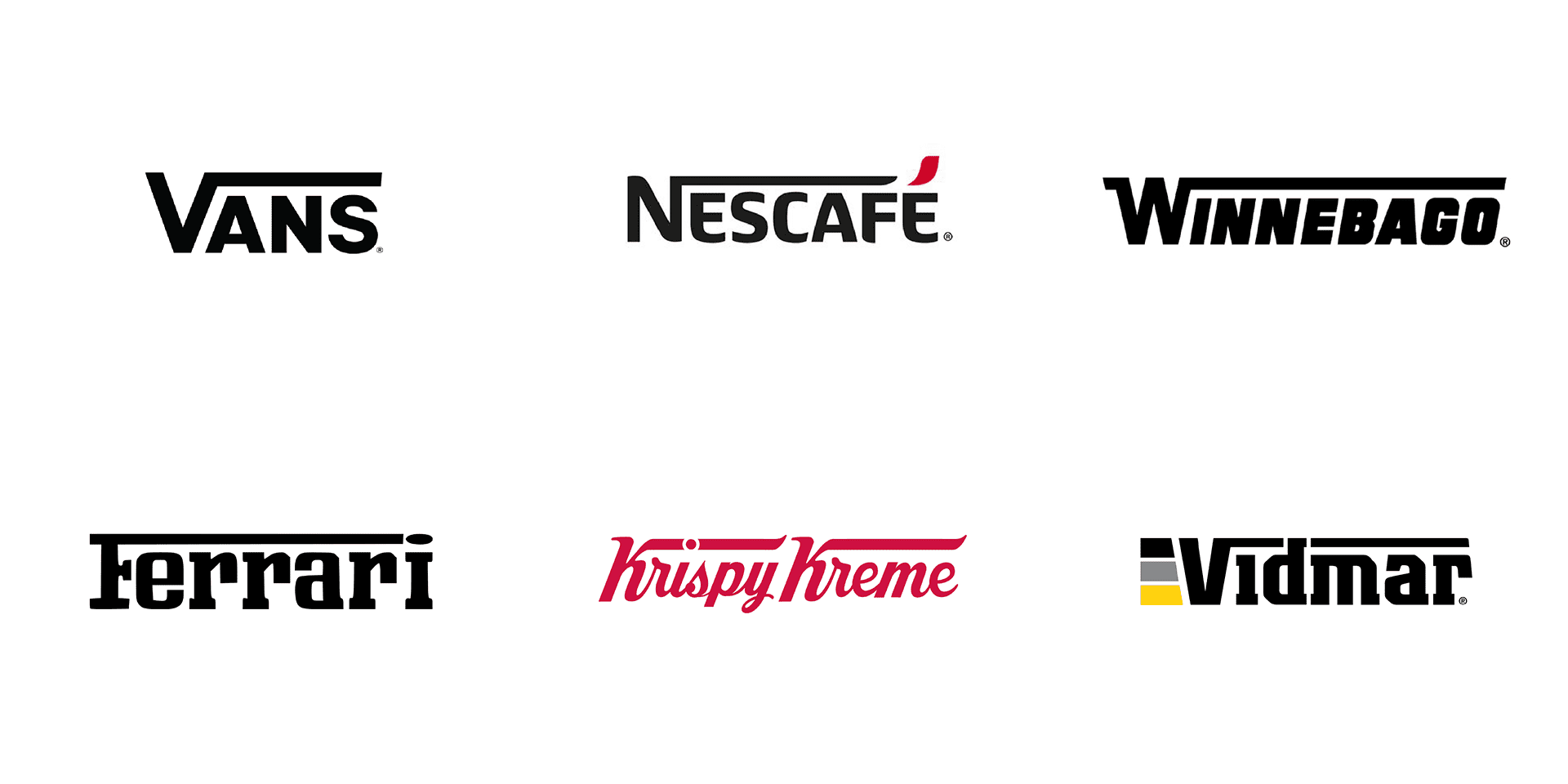
This letterform modification stretches part of the first initial over the top of the rest of the letters in the name. Often seen with a V, this effect looks like some kind of a math problem.
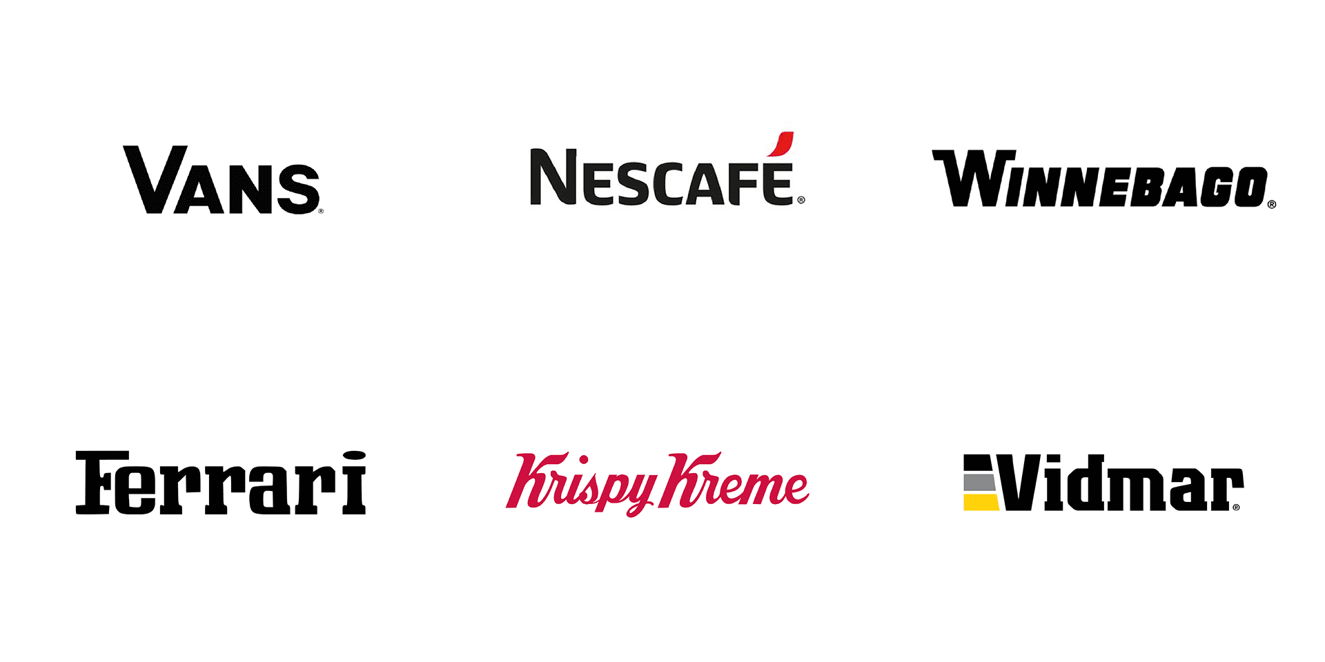
For fun, I wanted to see what these logos looked like without the top bar. Makes you wonder if they’re needed at all.
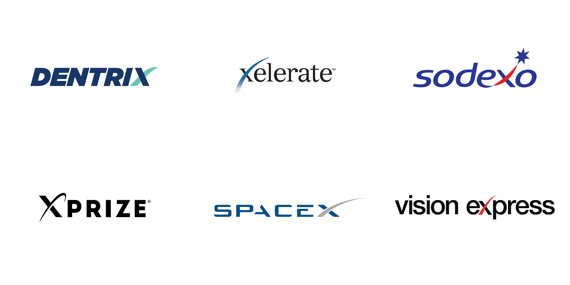
7. X-tension
Many logos use the x in their name to add character by stretching and extending one of the diagonal lines. To create something refreshing in this category, you’ll really have to reach for the stars.
Hitting the mark
As I said in the beginning, don’t take my word as law. But as you design your own logo, ask yourself, “Is there a compelling reason I’m drawing someone’s attention to this letter or does it just look cool?” “Is it competing with the rest of the letters?” Sometimes playing with letterforms can feel like a trap because you’ve seen it before or the letters have interesting geometry or symmetry.
Some of the most successful logos with altered letterforms are more original and meaningful to their business. Below are a few examples of character features in wordmarks that move past common play with geometry and give us a little more story.
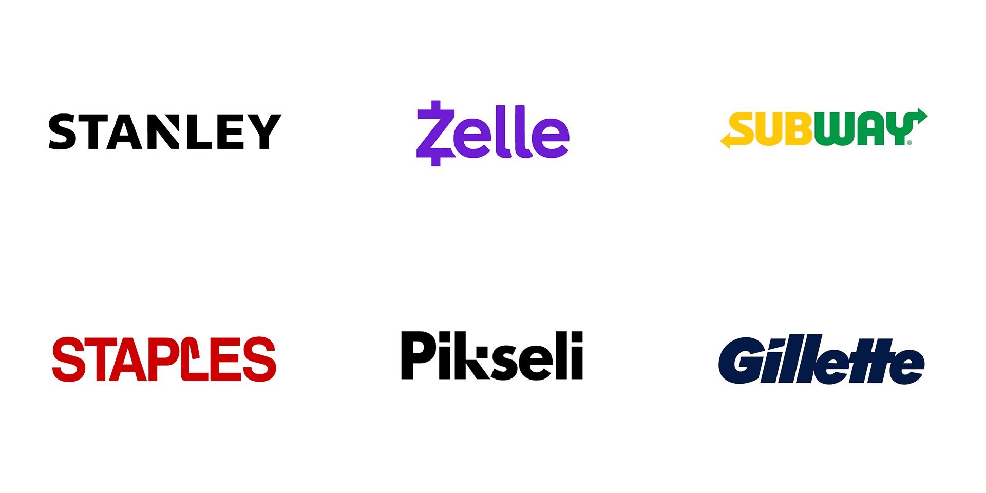
With the amount of logos there are in the world, it’s a difficult task to create something revolutionary. Sometimes the frills you add are what end up making logos look more alike. But if you are going to customize a typeface and alter letterforms, try digging deeper for something that feels natural, simple, and meaningful. ■
![]() Nick Levesque is a creative director with experience leading design teams and bringing creativity and clarity to brands. His editorial work has been published by Cosmopolitan, The New York Times, The Atlantic, and CNN.
Nick Levesque is a creative director with experience leading design teams and bringing creativity and clarity to brands. His editorial work has been published by Cosmopolitan, The New York Times, The Atlantic, and CNN.
Find more Process stories on our blog Courtside. Have a suggestion? Contact stories@dribbble.com.


