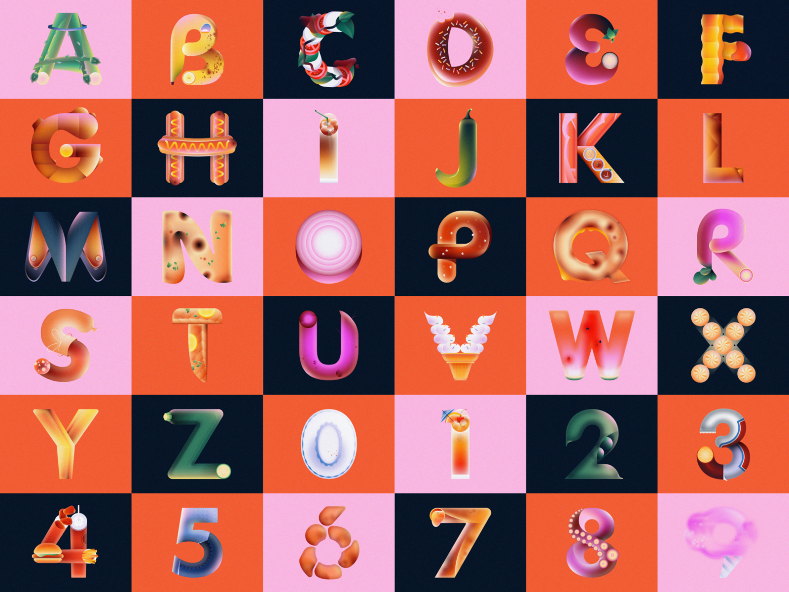
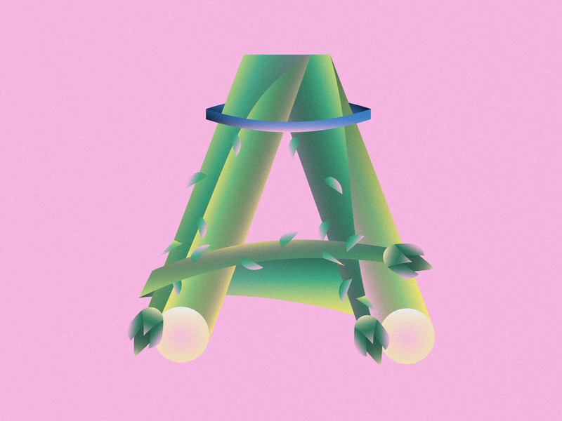
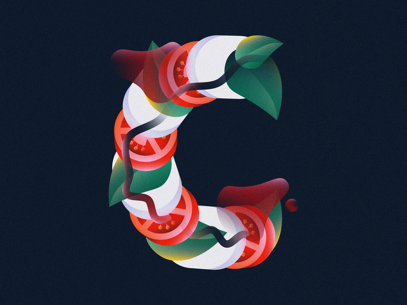
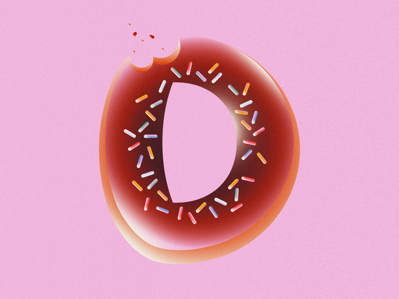
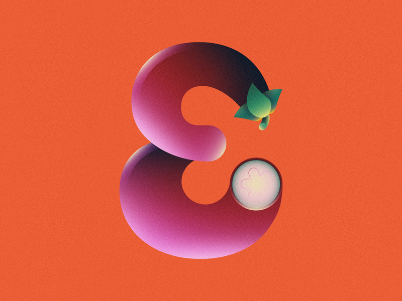
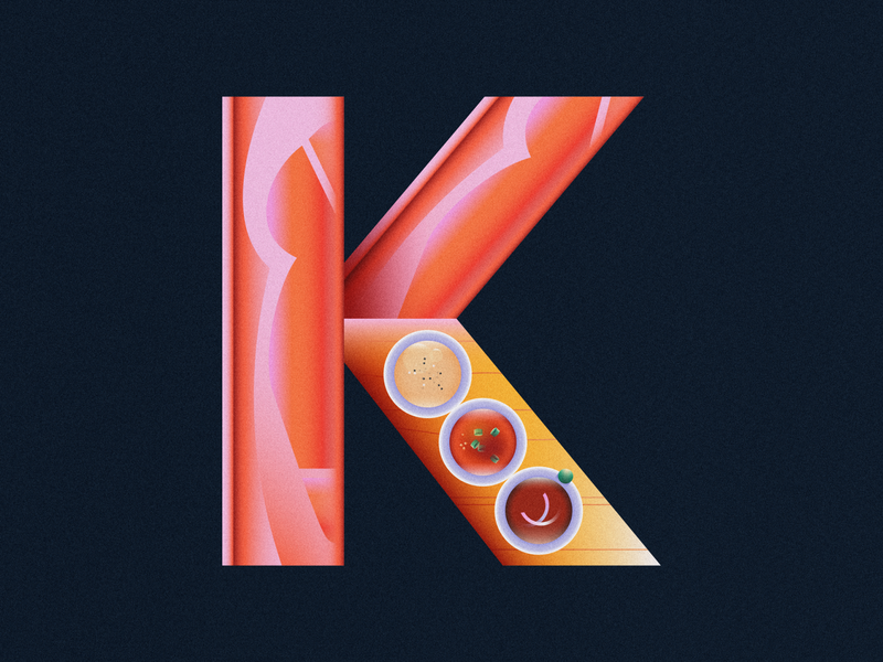
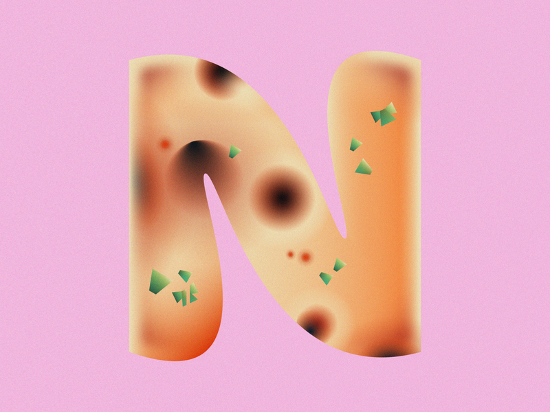
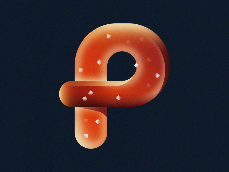
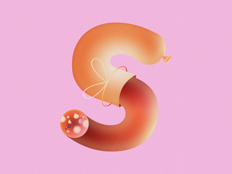
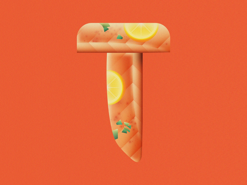
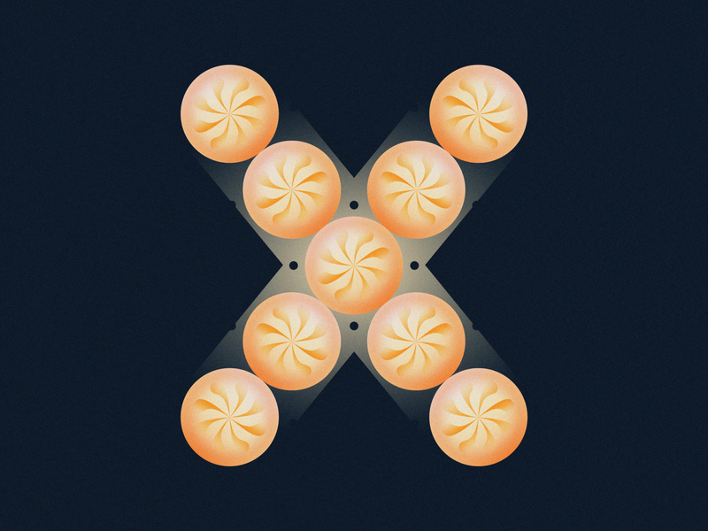
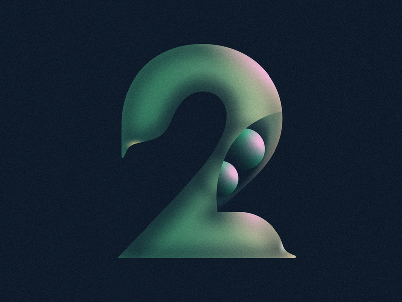
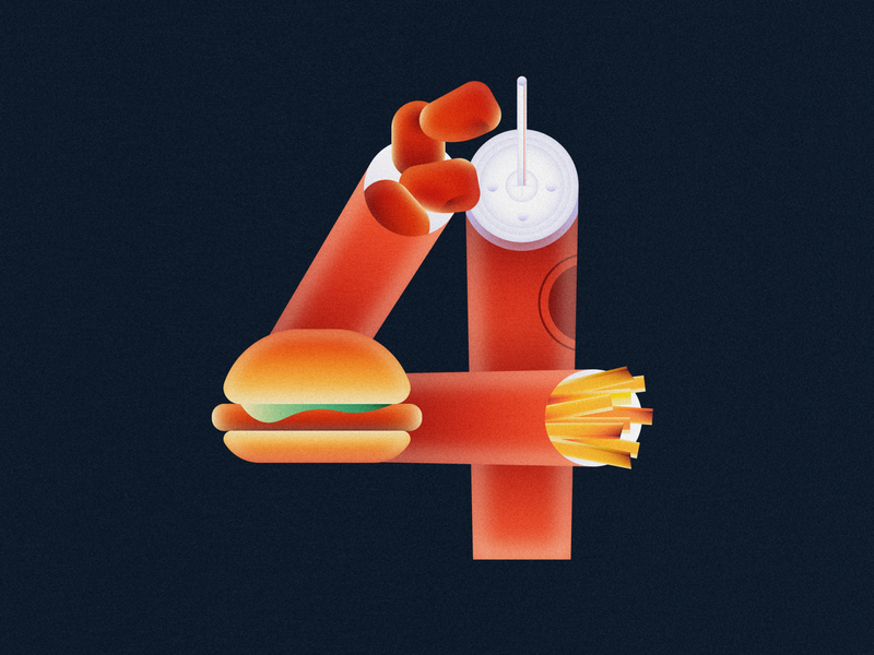
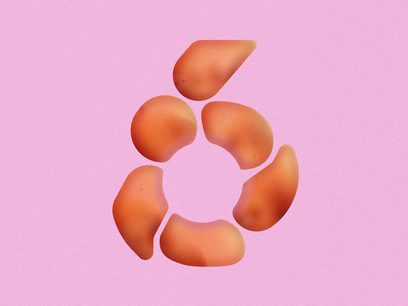
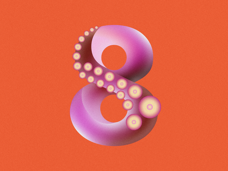
Every year, the creative community comes together to share their unique take on the letters and numbers of our Latin alphabet through the annual open call that is 36 Days of Type . So many incredible visual interpretations came out of 36 Days of Type 2021 and we’ve been following one Dribbbler’s delicious project extra closely!
Meet Katrina Navasca—a designer and illustrator who decided to take on the 36 Days of Type challenge for the very first time this year (and we’re so glad she did)! Katrina’s signature gradients and clever compositions are only a few of the reasons why we love this project so much. Keep reading to learn more about Katrina, her design process, and get inspired to challenge yourself creatively once in a while.
![]() Hi! My name’s Katrina. I’m a Filipino-American designer and illustrator based in Richmond, Virginia. Currently, I am a graphic designer at Siege Media, a content marketing agency.
Hi! My name’s Katrina. I’m a Filipino-American designer and illustrator based in Richmond, Virginia. Currently, I am a graphic designer at Siege Media, a content marketing agency.
Why did you decide to participate in 36 Days of Type this year?
I really just wanted to create more. I also wanted to challenge myself to illustrate at a faster, more consistent pace. I’ve found that when you discipline yourself into this daily practice of making, you constantly discover new ways of seeing. Your old techniques quickly evolve, and your design instincts sharpen.
What inspired the food theme you chose?
The idea felt like second nature to me—I’ve always loved drawing food, and I enjoy finding ways to deconstruct everyday forms into simpler, geometric shapes. I also saw this as an opportunity to bring attention to foods of cultural backgrounds that aren’t as known in the Western world.
What was the most challenging part of designing something everyday for 36 days?
Keeping up with the schedule was especially challenging. I started day one blindly, with no illustrations prepared, so I was doing the challenge in real-time.
About halfway through, I actually fell behind for about a week—but I knew I had to continue! At that point, I became less strict with myself. Keeping the quality of each illustration strong and consistent was much more important to me than catching up to the daily deadlines.
Your gradient work is so impressive. Any gradient tips you can share?
My advice is to layer multiple gradients, use gaussian blur, refer to photos, and play with color. Most importantly, trust your eye, and stick with what brings the most life and light to your illustration.
Want to keep up with Katrina? Find her on Dribbble and at katrinanavasca.com. ■
Find more Inspiration stories on our blog Courtside. Have a suggestion? Contact stories@dribbble.com.
