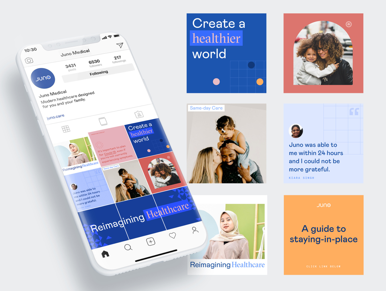
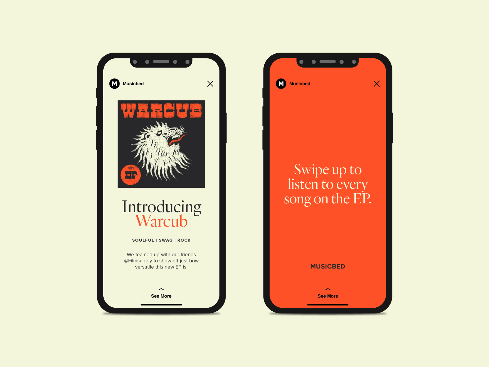
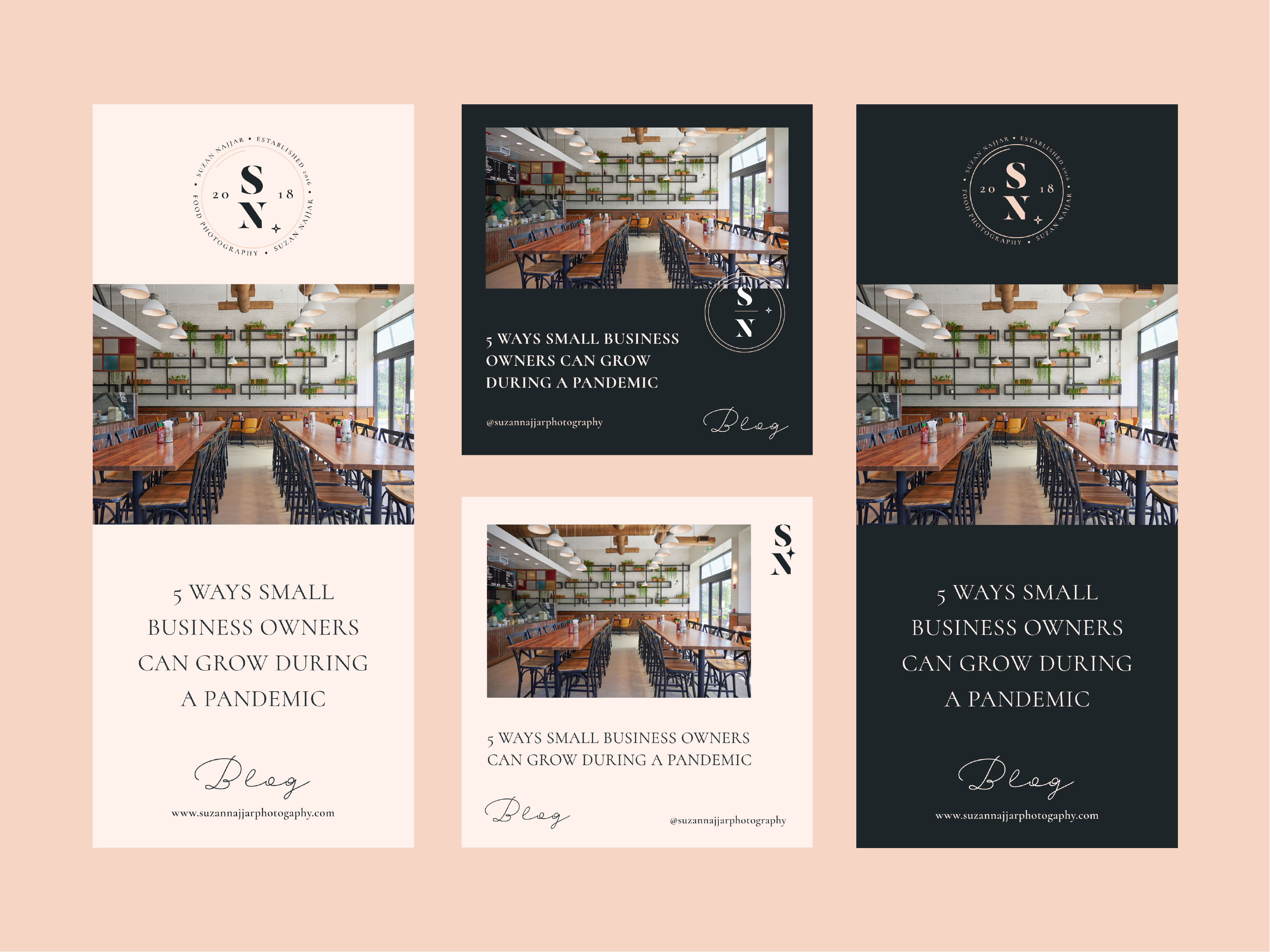
If you want to learn how to design even more engaging and on-brand social media content for yourself (or for a client), you’ve landed in the right place.
Did you know the human brain processes visual content 60,000 times faster than written content? That means that while your social media captions are important, the visuals that accompany them are critical to your brand’s success.
Designing engaging and on-brand social media content isn’t complicated. But it can feel overwhelming if you’re not organized or don’t have a clear idea of what kinds of content you want to post.
Follow these 5 steps, and get ready to watch your social channels grow and thrive in 2021:
- Define your visual brand
- Create a social media style guide
- Use a swipe file
- Invest time in creating custom graphics
- Create a set of templates
1. Define your visual brand
To create compelling visual content, you need to make sure your visual brand is well-defined.
Your visual brand includes the colors, typefaces, and other design elements that should be used consistently throughout your marketing materials, including your social media posts.
Taking the time to figure out the mood you want to convey on social media is an important step in defining your visual identity.
Your mood on social media should be in line with the overall mood of your brand, though you may want to tweak it based on the specific platform you’re using and the type of content users there are likely to expect. You’ll also want to take into account the limitations of each platform.
2. Create a social media style guide
Once you have your visual brand defined, create a style guide that includes those visual elements. A style guide helps keep your social media posts consistent, which is key for making your social media posts recognizable to your followers and others.
Your style guide should include examples of the typefaces and color palettes you’ll use in your posts, as well as examples of social media design templates, copy, and the types of images you’ll include.
Your style guide doesn’t need to be overly formal, but make sure it’s easy to access—particularly if multiple people will be designing for or posting to social media for your brand.
It should also include information about when and how your logo should be used within your social media posts. For example:
- Should your logo be included on every image?
- Which version of your logo should be used?
- Should your profile image be your logo or something else?
These are decisions each brand needs to make for itself.
3. Use a swipe file
Creating a swipe file of social media posts that are similar to things you want to post and in-line with your brand is a great way to make sure you have a ready supply of ideas.
Think of a swipe-file as a central place to collect all kinds of social media design inspiration for your brand.
Your swipe file can include posts from competitors, brands in entirely different industries, or elements of designs that you like.
There are a few ways to organize your swipe file. For example, you can save posts to a local file on your computer if you’re the only person updating your social media.
If multiple people are working together on your social accounts, creating a shared folder, notebook, or even Slack channel can be a more efficient want to keep your swipe file.
4. Spend time creating custom graphics
Not every brand has a photography budget. Stock images can provide an alternative to original images, but be wary of overusing them or using images that are already being used by a few dozen other brands.
It’s worth spending some time taking photos and creating graphics that are in alignment with the kinds of images you want to share on social media.
Your audience likely doesn’t expect professional-quality photos on all of your social accounts all the time, so don’t be afraid to post an occasional candid workplace pic or photos of your products in the wild.
When you do decide to use stock photos, take time to find images that haven’t already been used elsewhere. You can also make adjustments to the photos themselves, or use them within collages or templates to create more original content.
Even something as simple as flipping a photo horizontally can create a different feel for the image, setting it apart.
5. Create on-brand social media templates
Templates for certain types of posts are key to keeping your social media on brand.
This can include both visual templates and templates for the type of text you’ll share on social. These templates should be made available to anyone designing posts for your social media.
Make sure you create templates for each social channel you use (Twitter, Instagram, Facebook, Pinterest, TikTok, etc.). The specifications are different for each, and you may post slightly different kinds of content to each one.
By having templates readily available, you’ll save time and effort when actually posting. Templates also help keep your brand visuals consistent when multiple people are updating your social media.
Without templates, it’s easy for small inconsistencies to creep into your accounts. Make sure that each person creating images for social media is familiar with how to use the templates and what they should or shouldn’t change on them.
Bonus tip: Make a “Don’t Do” list
Almost as important as what you post on your social media channels is what you don’t post.
Create a standard for the kinds of content you don’t post. This can include colors you don’t use, the type of images to avoid, and even particular words or phrases that don’t align with your brand.
You can incorporate this into your style guide or keep it as a separate document. In either case, make sure anyone designing for or posting content to your social media accounts is familiar with the kinds of things not to post.
Wrapping up
Taking time to establish your visual identity for social media pays dividends with your audience.
When your content is consistent and in alignment with your brand values and mood, your content becomes easier to recognize for your followers and reinforces your overall brand message.
Not a designer? Hire a talented social media designer on Dribbble! ■
![]() About the Author — Cameron Chapman: Editor. Blogger. Author. Designer. Copywriter. Marketer. Entrepreneur. Speaker. Consultant. Coach. I wear a lot of hats. What most of them have in common, though, is storytelling.
About the Author — Cameron Chapman: Editor. Blogger. Author. Designer. Copywriter. Marketer. Entrepreneur. Speaker. Consultant. Coach. I wear a lot of hats. What most of them have in common, though, is storytelling.
Find more Process stories on our blog Courtside. Have a suggestion? Contact stories@dribbble.com.


