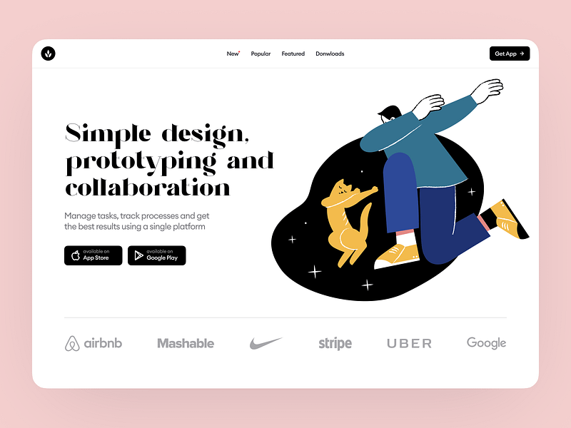
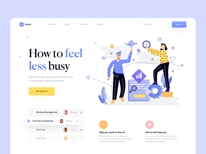
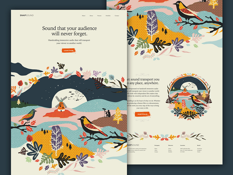
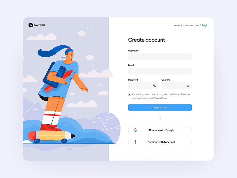
In this guest post by Petra Odak, learn how your website (and business) can benefit from incorporating thoughtfully crafted, on-brand artwork and illustration ■
If you’re of the generation that grew up with the Internet, you might have noticed how its aesthetic has evolved. From WordArt-heavy pages on GeoCities to the minimalist websites we see today, website design has become an art in itself.
While there are thousands of free templates available that you could use for your own blog or e-commerce site, most of them feel like templates. In other words, because they are generic, there is nothing in their design language to tell website visitors that they are visiting your site.
Don’t get us wrong—today’s web design tools make things a lot easier, especially if you’re not a coder. But if you rely exclusively on templates, you will end up with a site that looks just like thousands of other pages. Adding illustration to your website design will help improve your site’s aesthetic value, encourage visitors to stay longer, and increase conversion rates .
Read on to discover why website art is so important, and how you can use illustrations to give your own site the boost it deserves.
Row 1: Craftwork Studio for Craftwork, Taras Migulko, Ivan Ivanov.
The psychological impact of art & illustration
Before early humans started to read and write, they were already creating art. The earliest known works of art, drawings made by people who lived in caves across Spain and France, depicted the animals they hunted for food:
Modern humans view drawings and illustrations as an aesthetic experience. We might look at a painting and admire its beauty. Somewhere in the course of human evolution, we started looking at things simply because they were aesthetically pleasing to us.
Studies show that looking at images we consider beautiful improves knowledge retention, lowers stress levels, and helps people recall positive memories. Art has been used as part of therapy programs for both mental and physical health issues, thanks for its healing and restorative properties.
Neuroaesthetics, the study of the relationship between beauty and the brain, is a fairly new field. However, it has already succeeded in showing that looking at art directly affects certain parts of the brain. MRI images have shown increased activity in the orbitofrontal context, one of the brain centers that govern emotions, when the subject was viewing beautiful works of art.
Given the evidence, we can safely conclude that including art and illustration on your website can alter the experience of someone who visits it.
The evolution of artwork & illustration in web design
During the Internet’s early days, artwork and illustrations were considered an integral part of web design. Most illustrations were either done by site owners or commissioned specifically for their sites, and were designed to bring personality to early web pages.
Of course, the layouts and design choices used on early websites would raise a lot of eyebrows now!

In the late 1990s, web designers realized that they needed to be more precise in targeting their audiences, and many decided that illustrations were not up to the task. On the other hand, graphic design—with its singular focus on delivering business results through drawing attention to calls-to-action—was considered ideal.
This was the start of the debate between art and design as applied to websites. Designers began applying scientific terminology, such as information architecture and usability testing, to their craft. As a result, web design became all about creating something useful. Art, on the other hand, was dismissed as unimportant in the context of websites.
It is only relatively recently that web developers realized the value that art adds to their creations. Though some UX designers claim that what they do isn’t art and shouldn’t pretend to be art, others recognize that human psychology, which is deeply influenced by art, should be taken into consideration during the design process.
As a result, we are witnessing a resurgence of artwork and illustrations in web design. Site owners are realizing that art on their websites results in a more enjoyable customer experience, which in turn translates to increased traffic and improved conversion rates.
Why modern websites need art & illustration
There’s a reason we have favorite websites. One such factor is often that we like the way they look. When a website is easy on the eyes, we tend to spend more time on the site, consuming more content, and possibly making a purchase. On the other hand, if a website is visually unattractive, we’re more likely to leave and never return.
Artwork and illustration on a website grabs your audience’s attention and keeps them spellbound. Art can complement your written content, aiding understanding, and information retention. It can also help you reach out to the right people, especially if you are successful in identifying the type of images they are drawn to.
4 ways art & illustration can make a huge difference for your business
If you want to use art on your website successfully, you’ll need to find the right locations for it on your site. We have identified five such areas. You don’t need to utilize art on all of them, though you can if you wish. Let’s take a look at each one in turn.
Logo
Your logo’s core purpose is to reflect your brand identity. However, could also use it as a basis for artwork that expresses your support for certain causes, celebrates an occasion, or just adds fun and whimsy to your site.
Google is the best-known example of a business that uses logo-based illustrations to achieve these three effects and more. Google Doodles, as they are known, have been created for purposes from national holidays to sporting events, the birthdays of prominent historical figures, and support of charitable causes. Some of the Doodles are even interactive, allowing users to play games with them!

Landing pages
Landing page designs tend to be minimalistic, some featuring only a headline, short body text, and CTA button. However, adding images to a landing page increases its emotional appeal and reinforces your copy and CTA’s messages.
An illustration helps increase your conversions. If you apply appropriate alt text, it can also give you an SEO boost. The landing page for tutoring service website FindAGuru, pictured below, illustrates its business model in a fun, stylized fashion.

“Error 404” pages
Nobody likes clicking on a link only to find that the page doesn’t exist. More often than not, a visitor who gets a generic “This site can’t be reached” screen will close the tab, move on to the next website, and forget all about you.
However, it is inevitable that a page will need to be removed from time to time. So what are you to do?
You can reduce site bounce significantly by adding an illustration to your 404 page. An illustration softens the impact of discovering that the page is not there, and keeps them engaged long enough to encourage them to visit a different page on your site, instead. It’s also a good opportunity to strengthen your brand identity.

In the above example, Mailchimp uses a funny illustration (alongside a playful tagline) to make the visitor smile and encourage them to stick around.
Proposals
Creative proposals aren’t just for creative businesses such as graphic designers and artists! In fact, any business can get creative with its proposals. An illustration will help you show your business in action and allows your audience to understand your product or service better. This is easy to do nowadays, in an era when most proposals are delivered digitally.
The proposal template below, for example, uses an illustration to help convince a potential customer that the team at this handyman company can fix anything that needs fixing. It makes the proposal stand out and ensures it’s more memorable than a basic or generic proposal.

3 reasons to consider art & illustration for your website
Now that you’ve seen some of the areas where illustrations can be most effective, you might still be wondering whether it’s really worth adding art to your website. Ask yourself why you’re doing it. In our opinion, these are the three main reasons to add illustrations to your site:
In our opinion, these are the three main reasons to add illustrations to your site:
- If you want your site to stand out. — Many modern sites use minimalist templates that are easy to set up. Sadly, this also means that a lot of websites look near-identical. Adding an illustration will jazz up your site and make it stand out from an array of similar sites.
- If you want to appeal to emotion. — The “new normal” calls for a new, more empathetic approach to business. Adding hand-drawn artwork to your website can help you reach customers on an emotional level, making them feel something or giving them a smile.
- If you want to tell a story. — “A picture is worth a thousand words”, as the saying goes. If you’re using storytelling on your site, an illustration goes a long way.
People are visual creatures and tend to relate better to something they can see. Strategically adding illustrations to your site will get potential customers curious about your brand and perhaps convince them to give you a try.
Wrapping up
I hope I’ve convinced you as to the value of artwork and illustration as part of your web design. Perhaps you’ve even got a few ideas to get you started by now.
If you’re doing to use imagery on your site, it’s worth investing in custom artwork such as bespoke photographs or original illustrations. Yes, these cost more than stock images. However, it’s well worth the investment in terms of the additional traffic and conversions it will help you generate.
So think outside the box and let your creativity run wild. Don’t let your industry dictate the things you may or may not do—creativity is an asset in every kind of business. Make your website more beautiful and visitors will come more readily, stay for longer, and purchase more often. ■
Find and hire an incredible digital illustrator for your website using Dribbble’s Designer Search.
RELATED READING
- 7 Best Illustration Resources For Your Web Design Projects
- How To Get Started In Product Illustration
- 24 Examples of Creative Illustration Use in Mobile Design
Find more Process stories on our blog Courtside. Have a suggestion? Contact stories@dribbble.com.


