Email is one of the most effective marketing tools available. The people on your email list have given you express permission to communicate with them, unlike virtually any other medium. Because of this, for every dollar spent on email marketing, companies see an average return of $42 . That’s a huge ROI.
While advertising rates continue to go up and competition for impressions on social media gets stiffer, email marketing has become even more vital for engaging with an established audience. But capturing that engagement requires a well-designed email that draws readers in.
Make sure your branding is on point
Email is one of the most effective ways to reach your audience. Therefore, it’s an excellent time for you to reinforce your branding. Make sure your logo is featured prominently, that images you use reinforce your brand values, and that your color palette also matches your brand’s.
One other thing to keep in mind is that your email’s branding should resemble the branding and overall look of the page your call to action (CTA) links to. This helps orient readers and doesn’t interrupt the flow of their actions. A drastically different page may leave readers confused, wondering if they’ve landed in the right place. And if they’re confused, they’re more likely to navigate away rather than make a purchase, read an article, etc.
Use visual hierarchy
Visual hierarchy is an important principle of design, and email is no exception. Use images, headings, and other graphical elements to create a visual hierarchy that guides your reader through the email’s content, just as you would in any other design.
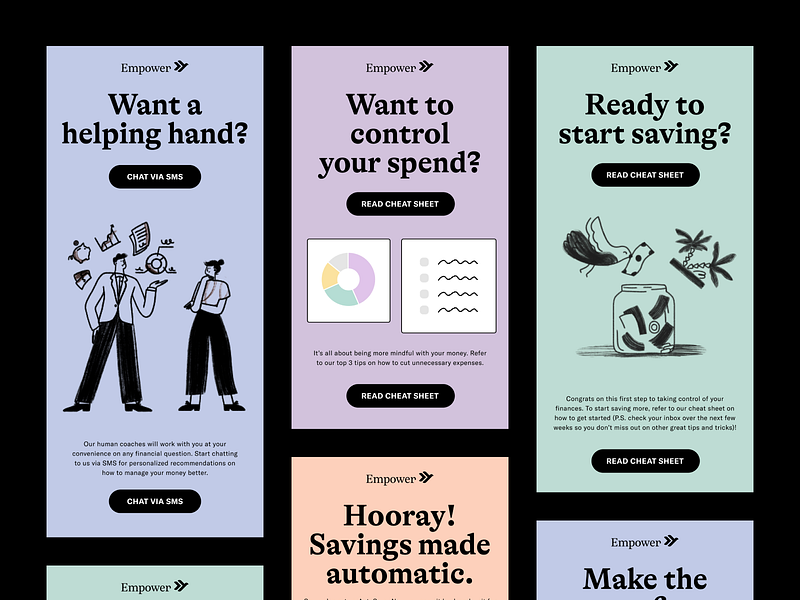
Make sure that the most important part of your email is the most prominent so that it immediately draws the reader’s eye. Your CTA should also be prominent so that readers aren’t wondering how to take advantage of the offer in your email.
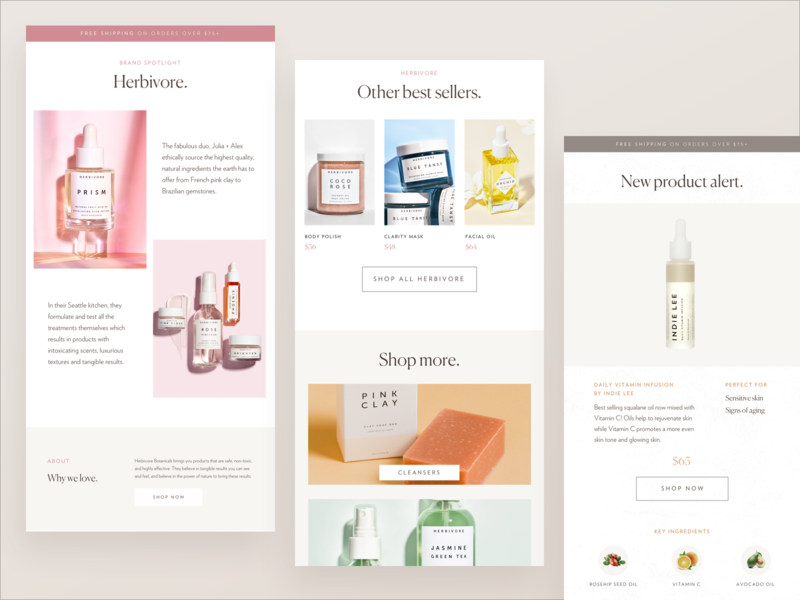
Z-patterns and inverted triangles both lend themselves well to email design. Inverted triangles (often with an image on top, a header underneath, and then additional content at a smaller size) are excellent for shorter emails with a single focus. Z-patterns are great for an email with multiple offers, articles, or products included.
Include unique visual content
The visual elements in your email should be unique. Graphics play an important role in converting your readers into customers. It’s vital to use images that draw the reader in and make them want to learn more about your offers.
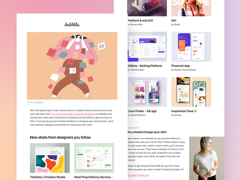
Making your visual elements clickable also greatly increases reader engagement. Whether it’s a header advertising a sale at the top of your email or a product image further down the page, readers expect to be able to click on images to see more information. Don’t leave them disappointed by a non-clickable image.
Use interactive content
Interactive content helps readers become more engaged with your emails (it can increase the click-to-open rate by 73%). This can take the form of polls, ratings, or surveys, among other options. Video is one of the best options for interactive content that improves engagement—videos can increase click-through rates by 300%.
In some cases, your “interactive” content is just an image that links readers to a web page with the actual interactive content, but that’s no reason not to use it (within reason).
Incorporate personalized content
There are a couple of ways to personalize emails , but personalization has a huge impact on how well emails work. Emails with personalized subject lines, for example, are 26% more likely to be opened than other emails. And emails with personalized content result in six times as many transactions.
You can personalize your emails with things like subject lines and openings that include the reader’s name. But you can also personalize the content itself, such as with recommended products based on prior purchases.
Related to personalized content is contextualized content . This has become a growing trend, as creating emails that contain content that’s completely customized for each user gets significantly higher engagement rates.
Keep your layout simple
While designing websites can lend itself to more complex layouts, email layouts should be kept simple. This helps ensure that various email clients don’t break your layout, as well as making the email easier to read on a variety of devices. It’s important to understand what the major email clients are capable of in terms of your layout, too.
Simple layouts don’t have to be boring. Just make sure that your designs incorporate plenty of white space to avoid looking busy and don’t use complex grids that are more likely to break.
Make sure your design is responsive
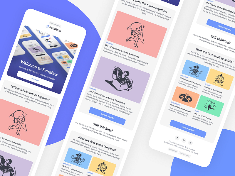
According to Hubspot , 46% of email opens occur on mobile devices. With nearly half of your readers likely reading from their phone, your email designs must be responsive and look just as amazing on mobile devices as they do on laptops or desktops.
This also means you should serve different size images for different devices to save on bandwidth. Not everyone has unlimited mobile data or blazing fast networks, especially if you have a global audience. Your readers will appreciate not using up a ton of bandwidth downloading images that aren’t vital to the email’s content.
A/B test your designs
Most email marketing platforms make it easy to A/B test your email designs with a portion of your subscribers. Test things like your layout, your header image, or your typography, among other things. Even once you’ve created a template that gets amazing results, it’s worth periodically running new A/B tests as you may find that changing things up once in a while creates higher user engagement.
Email design is both art & science
Email design is both art and science. But one of the biggest advantages to email marketing is the wealth of data most email marketing platforms provide. You can see exactly what readers are clicking on within your emails to see what works and what doesn’t. That kind of data is invaluable for both designers and marketers, alike.
Using principles of good email design combined with specific data on what’s working and what’s not, designers can create emails with excellent engagement and return on investment for themselves and their clients ■
![]() About the Author — Cameron Chapman: Editor. Blogger. Author. Designer. Copywriter. Marketer. Entrepreneur. Speaker. Consultant. Coach. I wear a lot of hats. What most of them have in common, though, is storytelling.
About the Author — Cameron Chapman: Editor. Blogger. Author. Designer. Copywriter. Marketer. Entrepreneur. Speaker. Consultant. Coach. I wear a lot of hats. What most of them have in common, though, is storytelling.
Find more Process stories on our blog Courtside. Have a suggestion? Contact stories@dribbble.com.
