This post was originally published on Creative Market, the world’s marketplace for ready-to-use design assets.
If you want to start leveling-up your typography, you’ve got to know how to properly kern your letters. Kerning refers to the spacing between individual characters of a font. While most typefaces come with built-in kerning, you’ll often need to manually make some adjustments for optically accurate results. In this guide, we’ll be sharing ten fool-proof tips to keep in mind when kerning your type. Let’s go!
1. Find out what kind of fonts you’ll be using
Different fonts have different widths and styles. You can’t kern until you know what font you’re dealing with. Also note, your headline, subhead, and text will likely all consist of different fonts.
2. Fix leading and tracking before kerning
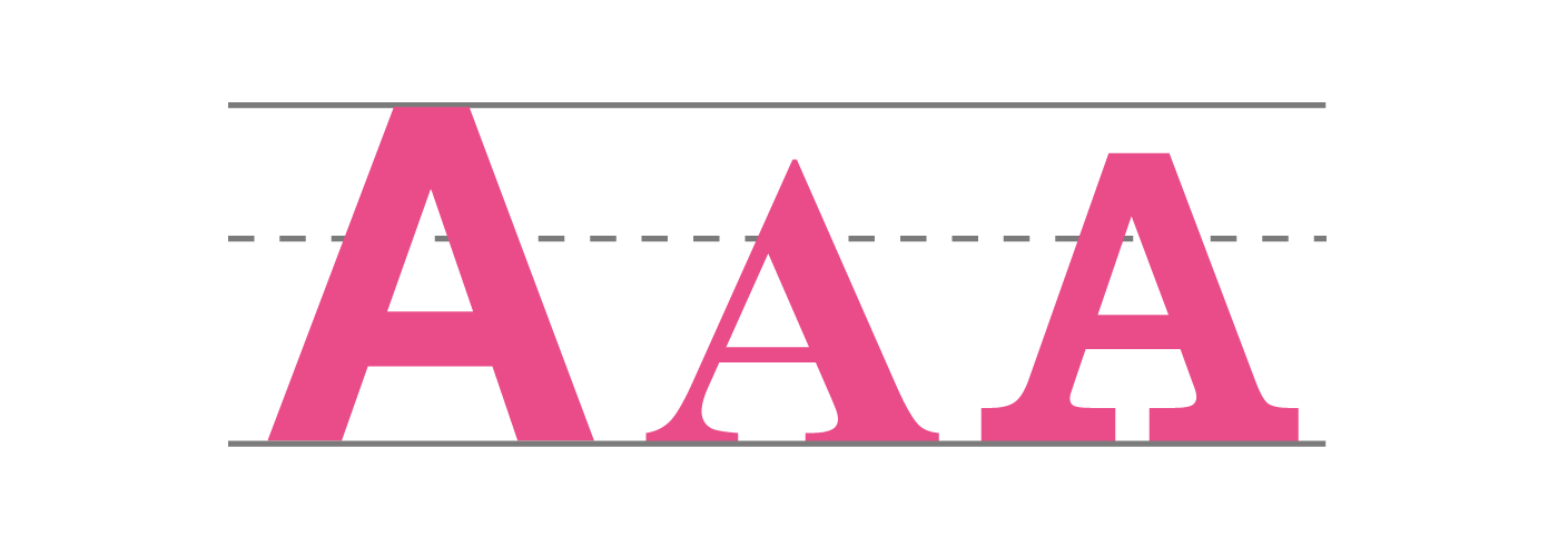
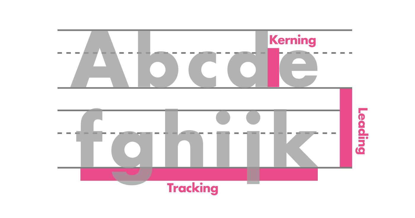
Leading, tracking, and kerning all fit together to make the design of your lettering whole. Kerning should be your final consideration.
- Leading — Vertical space between lines
- Tracking — Uniform space between all letters
- Kerning — Space between individual letters
3. Kern each letter individually (seriously)
Automatic kerning features are easy to find. Everyone wants a shortcut. The reality is, the human eye is still the best tool for judging design. Make the extra effort to ensure your design is premium quality.

4. It’s about visual space, not actual space
OCD doesn’t help in kerning. Your letters will only look perfect at varying distances. People won’t approach your design with rulers. All that matters is whether your lettering is easy and enjoyable to read.

5. Decrease spacing between similarly shaped letters
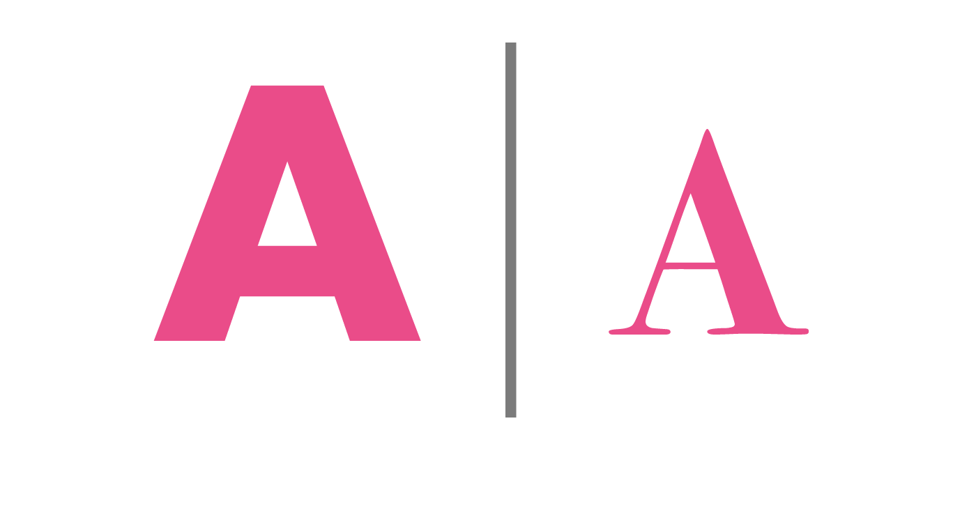
Letters wth slanted sides have a ton of negative space (A, V, Y, W). You can lessen that negative space when next to letters that can easily slip into each other.

6. Do your kerning in groups of three
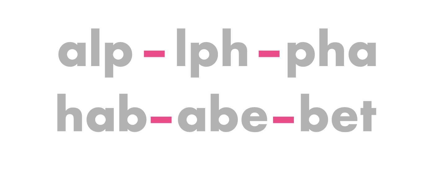
If you look at a word as one whole, it’s easy to miss the details. Take letters into groups of three, and kern one trio at a time.
7. Less is always more
Don’t over-kern! Excessively tight letters can become unattractive and difficult to read. Rule of thumb is, if it looks fine to you visually, leave it.

8. Don’t neglect the spacing between words
Letter spacing is important, but so is word spacing. Make sure there’s enough space between words to easily distinguish one from another.

9. Try flipping the typeface upside down
This ninja brain-hack short circuits your familiarity with words. Our familiarity with a word can affect us subconsciously. For example, the word “Thin” might influence you to kern it tighter than other words.

10. Always have at least two versions of the design
At least have one small and one larger version. This helps clients see how your work will look in different contexts. Use this to identify any kerning changes that might be required in the future.
![]() About the author: Laura Busche is the author of the Lean Branding book. Her approach to branding is blended, combining insights from an undergraduate degree in business, master’s degree in design management, and Ph.D. in consumer psychology. Laura is a Brand Content Strategist at Creative Market.
About the author: Laura Busche is the author of the Lean Branding book. Her approach to branding is blended, combining insights from an undergraduate degree in business, master’s degree in design management, and Ph.D. in consumer psychology. Laura is a Brand Content Strategist at Creative Market.
RELATED ARTICLES
- 5 online typography exercises to improve your skills
- How to choose typography for web design
- 5 sneaky typography errors to avoid
Find more Process stories on our blog Courtside. Have a suggestion? Contact stories@dribbble.com.
