In this article, designer at Heartbeat Agency, Vladimir Gruev explains how to craft a cohesive visual identity for digital products. Plus, how to successfully present your concept to clients, and integrate the visual identity into product marketing and interfaces.
In the modern world of digital products, we often see big names in the industry change their look to attract users’ attention. New brands are well-aware of this and try to be distinct, unique, and stand out in this highly competitive market. I see Visual Identity as an important element that help products achieve the goals mentioned above.
So, how do you create a strong, coherent, and most importantly, consistent identity for your product? Stay tuned, because we’re about to find out.
Note: This article is written in a compressed way for a broader overview of the whole picture. I’m sure there are intermediate stages of visual identity development that are just as important, but I’ll try to be as concise as possible :).
First: Do your research about the product
Before jumping into developing a visual identity, do your homework first. If you’re lucky enough to be working on a product that already has an existing brand strategy, you can pretty much skip this step and use these brand strategy documents to guide the product’s visual identity.
If you’re creating a brand strategy from scratch, researching the product will help you save a ton of time interacting with your client. So, let’s go ahead and dive into the discovery stage:
Find and fill out a Lean Canvas of the product you’re creating a visual identity for. It should include the following sections (order is important here):
- Customer Segments
- Customer Problems
- Customer Solutions
Next, fill out a Brand Canvas. This should include brand characteristics (the way your brand communicates with your customer), such as tone of voice, core traits and attributes, plus the brand story.
In essence, your job is to find out as much as possible about the company’s mission, values, and vision so you can fuse these insights into the visual identity you create.
Pro-tip: You can find Lean and Brand Canvas templates easily with a simple Google search. Or, fill both of them out using this link .
All of the information gathered will make up your initial research and provide you with enough details about the brand and/or product—from how it compares with competitors, the problems it solves for customers, user segments, behavioral factors, etc. Don’t hesitate to ask clients for additional product materials too!
Now that your research is done, it’s finally time for the visual identity creation process!
How to approach creating a Visual Identity
At its core, Visual Identity is how your user visually perceives and feels the product. It’s a set of visual assets that shape the user’s perception of this product.
I’d like to point out that visual identity is built upon these two fundamentals:
- The company’s culture & characteristics
- The product’s business niche
My working process always starts with an evaluation of the product’s bits and pieces that I’ve talked about earlier. As a designer, you want to feel knowledgable about the business and product by studying these materials. That way, you can confidently create a compelling image at the end.
Create a moodboard & sync up with your client
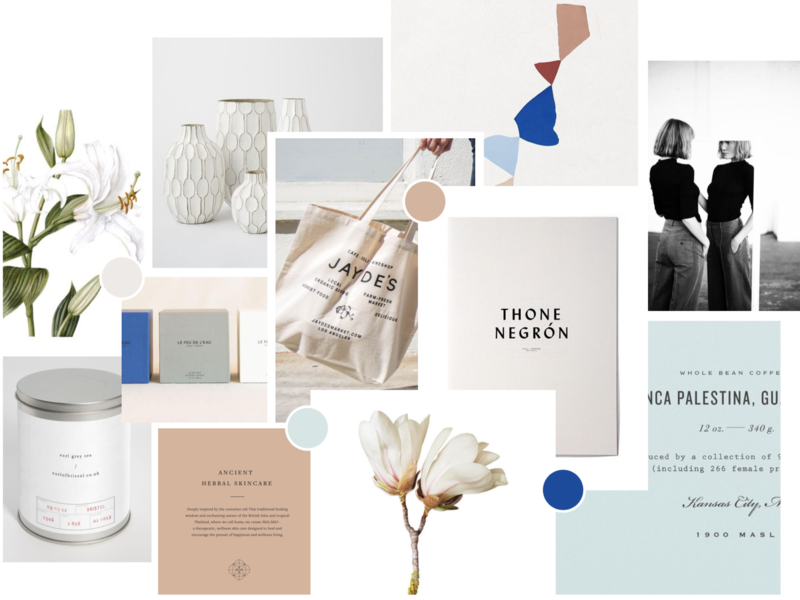
Start off by creating a moodboard (or inspiration board as others like to call it). This will contain various visual assets and materials that resonate with your client’s creative vision. A moodboard for a visual identity may include photos, illustrations, patterns, logo examples, typefaces, color palletes, print materials, etc.
I also recommend creating a second moodboard if the product is a web app. This second moodboard will present some UI/UX aesthetics for different platforms the product will live on. (Web, iOS, Android).
Here are a few tips for developing a strong moodboard:
- Take the TA into account along with the company’s values, niche, and other available strategic information, in order to accurately convey the spirit of a vertical business of a product.
- Always explain the process and its purpose to the client.
- Don’t push your client’s decisions or choose something yourself — ask them to share their impressions and provide feedback.
- If things aren’t clear — ask your client for more context or reasoning. Tell them to avoid responses such as: “I don’t like red”, “This is cool”. Encourage them with open questions.
Present your concept to clients
There are different approaches when it comes to developing a visual identity. We, at Heartbeat, believe that it’s enough to create a single visual identity concept and to have a couple of secondary ones if necessary.
At this stage, you’ll want to present your client with a draft in the form of a PDF presentation showcasing your core idea. Include things like a description of the concept, what it consists of, how you reached this point, plus, how it can be elevated and advanced in the future. This presentation should also contain the basics, such as logotype, typefaces, colors, etc…
Here are a few tips when presenting:
- Explain your concept by showing how it can be used in both digital and real-life applications.
- Do your best to explain the connection between the product and visual identity, even if it seems obvious.
- Validate the visual identity with your product discovery from earlier. Keep in mind the business niche and target audience.
Create your visual identity assets
Those are various components of the visual identity, deliverables you end up passing down to your client. This set of components and the way you showcase them really depends on your client’s goals and requirements. We like to arrange and save it as a Figma file, with a handy feature to export the necessary assets to png, SVG, and pdf formats. Here is an example list of components:
- Logo
- Colors
- Fonts
- Icons
- Illustrations, Photos, Patterns
- Communications / Videos
- Interactive elements
- Website (demo header)
Once the visual identity is done, it’s time to fit it nicely onto the product, just like a tailored outfit.
Integrating visual identity into a product’s website & app
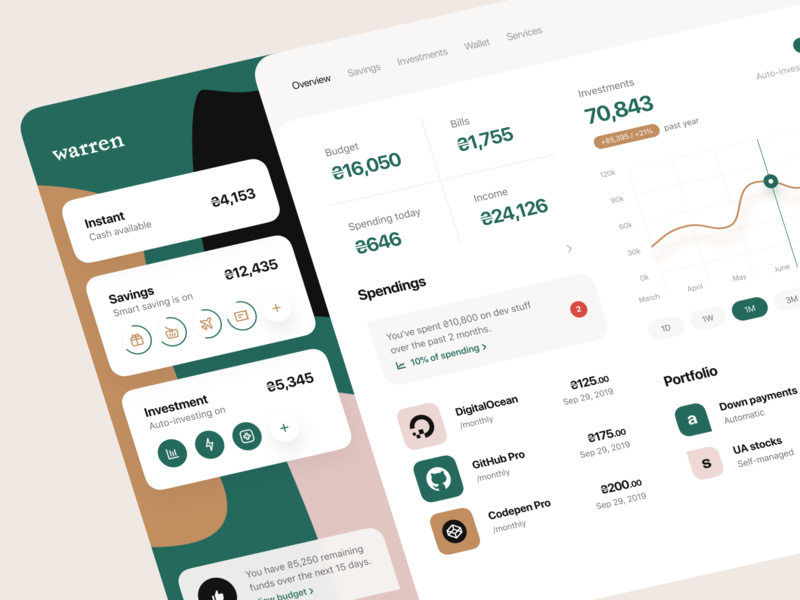
Today, we know that a product won’t perform as well as it should, if App or Marketing parts live on their own (or if one of them is simply absent). Both have their own practical applications. In other words, a product’s App should aim to solve problems for a user. Marketing, on the other hand, is about actually communicating a message to a user.
Simply put, a product’s App, Marketing, and even Sales can’t exist and function on their own. A good, modern digital product is about a seamless combination of these product parts, making a whole product work together as a single, uniform mechanism.
Applying visual identity to Marketing
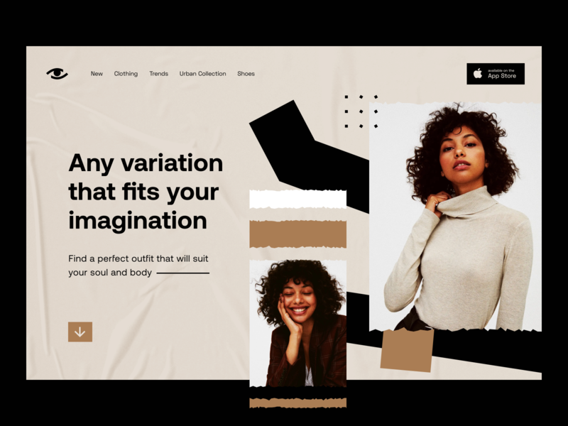
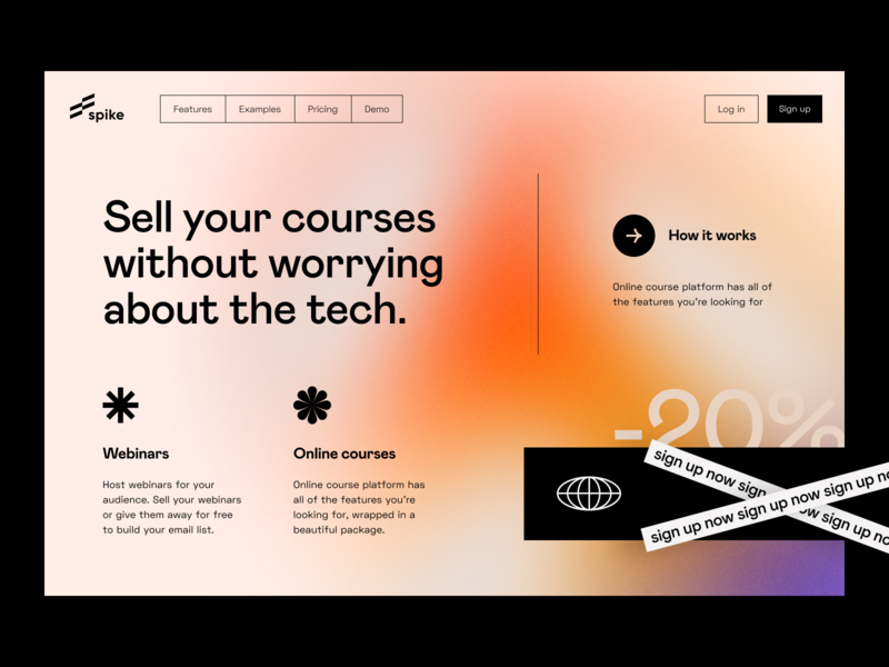
When it comes to marketing, all branding elements should work well together on your website and other mediums. This is the first thing customers (sometimes even investors) will notice when they familiarize themselves with a product. There’s a rather large variety of applications for digital marketing—social media, presentations, email newsletters, or even a post on Product Hunt.
Here are some tips to get the most out of your visual identity:
- Use visual identity wisely by not overloading it with graphics. Focus on sales triggers, CTAs, and main messages. Let your user scan the content without constraints.
- Follow consistency guidelines across all marketing materials to keep style nice and uniform across the board.
- For marketing webpages, use modern versions of the AIDA model and storytelling to raise users’ interest.
Applying visual identity to complex user interfaces
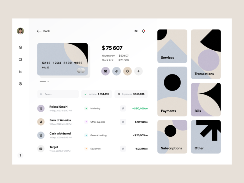
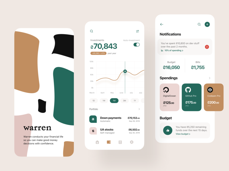
Naturally, there are some constraints that put certain restrictions on a designer. Remember that users open an app to use it, not to see all the great visuals you’ve created. Let them do their work first, and only slightly hint at your visual identity during their experience. Simply put, an app should preserve its swiftness and ease of use. If you want, you can add some visual touches to “banners”, “onboarding”, “placeholders”, “success messages”, etc. Here are some tips:
- Seriously consider a product’s platform, e.g. desktop/mobile. It will affect visual constituent, product’s core DNA, and user experience.
- Use design systems in the context of your product’s platform. Utilize your identity system containing visual assets such as colors, fonts, icons, illustrations, and others in order to preserve a unique product style.
- Apply elements of visual identity where you need a user’s attention, or if you’d like to entertain your user.
Let’s summarize
Always start your journey from the fundamentals. Things like company values, team, and product characteristics all prepare a strong base to build your visuals upon. Go from that, and then carry on by getting it all documented and shared across all team members.
Reinforcing that foundation with visuals will make everything feel organic and work as a uniform piece. Don’t just copy things—think of it as a system. Create one and enjoy the benefits of consistency and a visually complementing result.
![]() About the author: Vladimir Gruev is a digital designer who is keen on simplicity and usability. Find Vladimir and his work on Dribbble.
About the author: Vladimir Gruev is a digital designer who is keen on simplicity and usability. Find Vladimir and his work on Dribbble.
RELATED READING
- 4 factors that lead to more enjoyable product experiences
- 6 must‑read books that will shape your product design career
- The Growth Process of a Product Designer
- 5 soft skills every product designer should master
Find more Process stories on our blog Courtside. Have a suggestion? Contact stories@dribbble.com.

