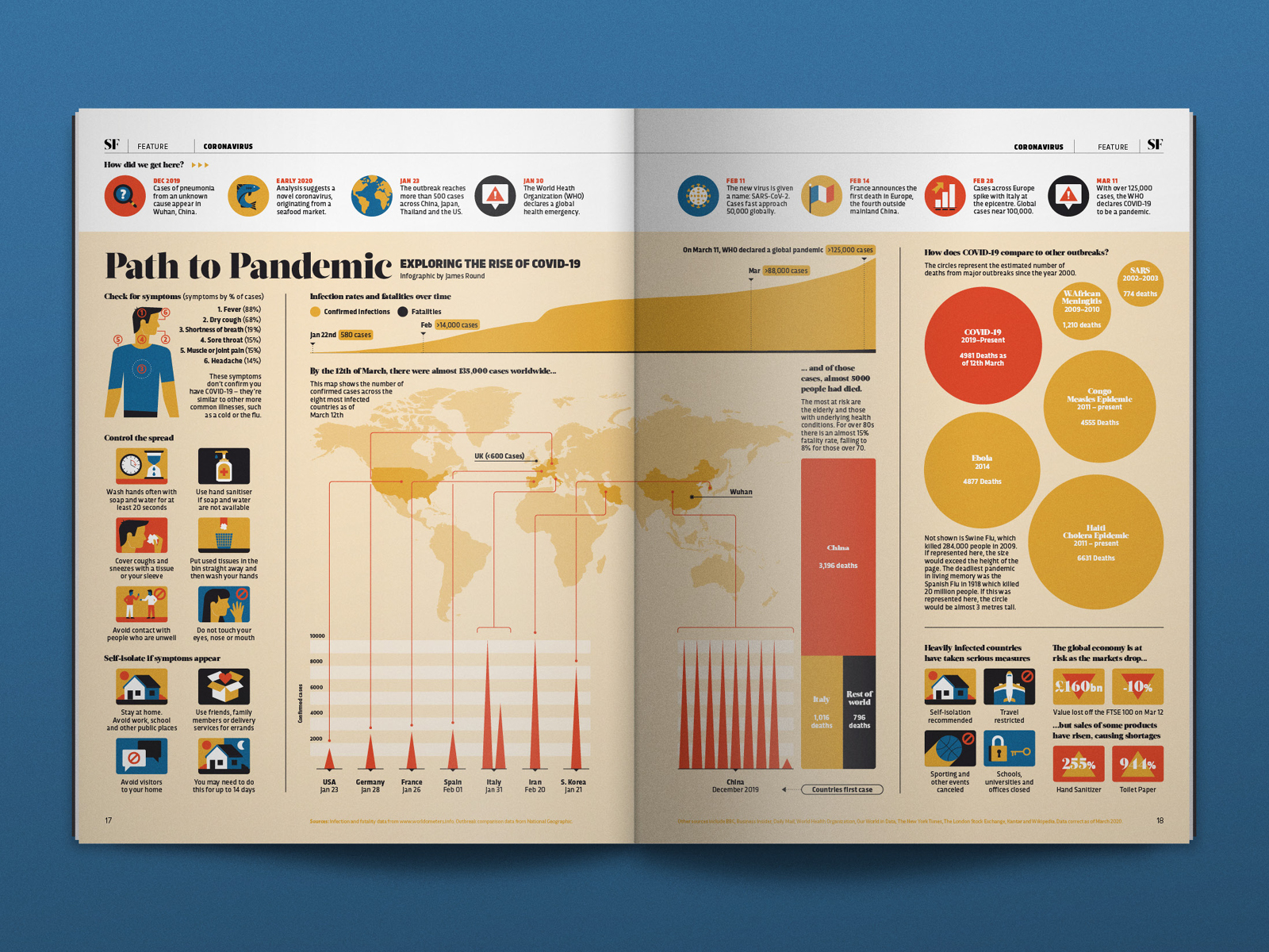
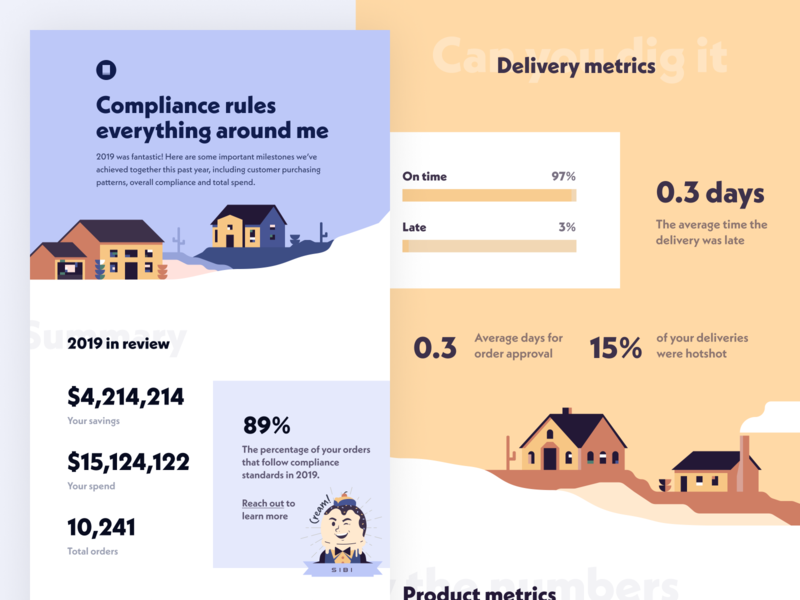
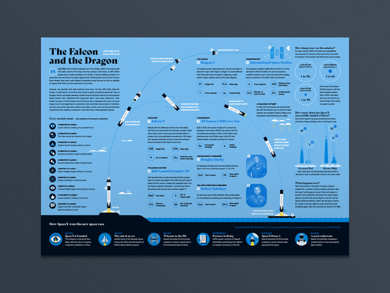
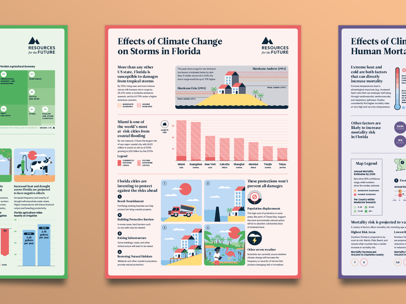
Combining visuals with text-based information greatly improves how well people retain the information being presented. In fact, it can increase the way people learn by up to 323%.
That increased retention of information is one of the best reasons to use an infographic rather than just conveying data through text. Besides being more interesting to view, infographics make learning easier. They can also capture more visitor attention since some readers will skim (or skip) large blocks of text but spend more time on visual content.
Infographic design is part art and part data science. They’re not appropriate for every situation, but when done well, they can be an excellent resource for your readers (and the best infographics tend to get shared more readily than text content).
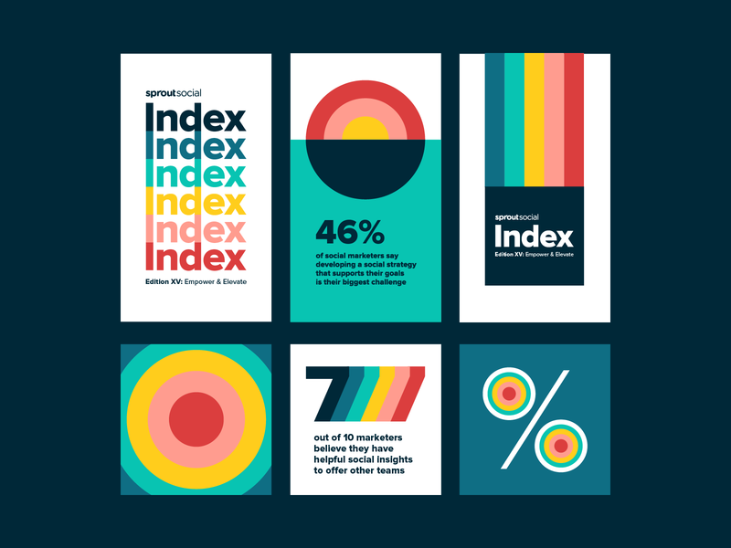
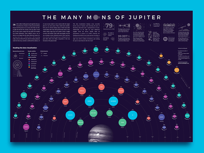
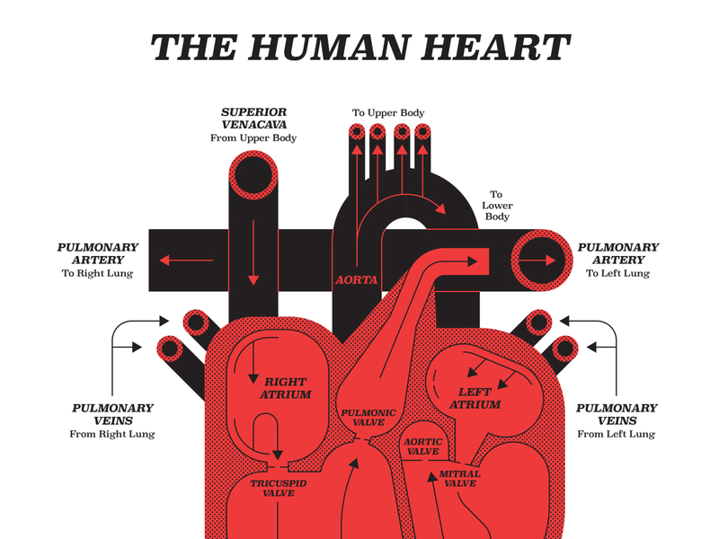
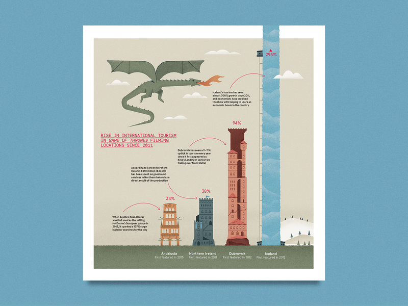
Row 1: Alan Tippins for SIBI, James Round, James Round.
Is an Infographic the right choice?
Not all information is best displayed as an infographic. Considering how much work goes into creating a stellar infographic, it’s a good idea to determine whether it’s the right choice before you start
Infographics are a good choice for displaying data, especially data comparisons. They can also be a good idea for things like comparison charts, checklists, or timelines. If the information you’re sharing is better shown visually than via text, then go for the infographic. But be aware that infographics aren’t necessarily good for in-depth data analysis (for that, you might want to create some kind of interactive dashboard instead).
1. Understand your audience and purpose
Is your audience going to respond well to a visual representation of data? That’s one of the first things to consider when deciding to build an infographic. If your audience values getting their information quickly and are interested in data and numbers, then infographics are a good fit.
What’s the purpose of your infographic? Infographics should be used to quickly convey specific, important data, and what it means. If that’s your purpose, then an infographic is the way to go. The other aspect of purpose is defining exactly what you want your infographic to explain. Defining the purpose gives you a firm structure to work within when designing the graphic itself.
2. Keep it simple
We’ve all seen crazy, complex infographics that are nearly impossible to decipher. While they can sometimes still be visually appealing, complicated infographics don’t serve their purpose. Infographics should have a clear-cut goal that’s conveyed in the simplest way possible. That means plenty of negative space, a simple color palette, and unified graphics.
Pick out the most important data to represent and focus on that. You don’t need to include every single data point included in a research paper or report. Figure out what data supports the goals of the infographic and include that. One caveat, though: be careful not to pick and choose data to support a biased conclusion that isn’t really accurate.
3. Show don’t tell
To borrow from a common writing adage, infographics are all about showing data, not telling readers about it. Think of visual ways to represent the information your infographic is trying to convey.
Visual representations of data could include charts and graphs, as well as using icons or illustrations to represent specific principles. Don’t tell people what the data represents, show them through the visuals you use.
4. Keep text short
Virtually all infographics include some kind of text. But that text should be kept short and to the point. Use it to support the visuals you use. If you can show information rather than writing it, then go that route.
Every bit of text on your infographic needs to serve a purpose. There’s no need to write in complete sentences or include long explanations. If you want to expand on the data included in the infographic, consider doing so in an accompanying article or report rather than in the graphic itself.
5. Consider your color palette
Color is one of the most important choices in any design, but it’s especially important in an infographic. If the infographic is being done for a brand, you’ll likely need to incorporate the brand’s color palette. But that doesn’t mean you can’t add other colors to create contrast.
Color can be used to define specific areas within the infographic, as well as to create flow and connection between sections. There also needs to be adequate contrast between the infographic background, text elements, and graphics.
Consider the tone your infographic should have, and choose colors accordingly. Is it supposed to be fun? Go for brighter colors and more contrast. If it’s a more serious graphic, darker jewel tones might be more appropriate. Your color palette should support the importance of the data being conveyed. Don’t use a bright, fun palette for data that’s supposed to be serious, and vice versa.
6. Keep it a manageable length
Longer is not necessarily better when it comes to infographic design. You’ve certainly seen those infographics that seem to go on forever. While the information they convey might need a longer format, they could have been better served by breaking up the data into multiple graphics.
Your infographic should only be as long as it needs to be to convey the data you’re presenting. If that means you end up with a horizontal or square infographic instead of the more “traditional” long infographic, that’s fine! Don’t force the length just so it looks more like what you think an infographic should look like.
7. Don’t underestimate your headline’s power
The infographic’s headline is the first thing most readers see. The headline should be descriptive, and it should be typeset in a way that draws the reader’s eye and makes them want to check out the rest of the graphic.
Keep your headline on the shorter side, so that it can be kept to one or, at most, two lines at the top of your infographic. Keep it consistent with the style of the rest of the graphic while making sure it’s large enough to stand out as the headline.
8. Make It Flow
There should be a certain amount of flow between sections of an infographic. This can be done with your color palette (using similar or repeating colors for each section) or by overlapping graphics. Some infographic designers opt to include arrows or lines to indicate flow between sections, which can be a great option if it supports the data being presented.
9. Data First
The most effective infographics are designed in a way that supports the data they’re presenting. The entire point of an infographic is to convey information in a way that’s easy to understand and process.
In every design decision you make, consider whether it supports the data and conclusions you want readers to make. If you focus on the data first, and design around that, your infographics will be significantly more useful and more likely to be shared.
![]() About the Author — Cameron Chapman: Editor. Blogger. Author. Designer. Copywriter. Marketer. Entrepreneur. Speaker. Consultant. Coach. I wear a lot of hats. What most of them have in common, though, is storytelling.
About the Author — Cameron Chapman: Editor. Blogger. Author. Designer. Copywriter. Marketer. Entrepreneur. Speaker. Consultant. Coach. I wear a lot of hats. What most of them have in common, though, is storytelling.
RELATED READING:
- Mastering Data Visualization: 3 Tips For A Smoother Design Process
- How to tell a compelling story using data visualization
- When science meets design: Data visualization for outer space
Find more Process stories on our blog Courtside. Have a suggestion? Contact stories@dribbble.com.
