Brand designer & Illustrator Flávia Mayer shares tips and best practices for using illustration in branding—from the impact it has on brands, the most important factors to consider, and how to create a brand style guide that incorporates a unique illustrative style.
When working on a branding project, we typically look for ways to make the visuals feel as unique and tailored to the client’s brand as possible. Illustration, be it in branding itself or as an accompanying feature, can be a great asset to take your project to the next level.
In this article, we’re going to take a look at how and when to use illustration to compose and/or complement a branding project.
Where can I use illustration in a branding project?
There are two main ways to use illustration when working on a branding job: as part of the logo or as a complementary asset to be used in many different materials.
To add a graphic element as part of your logo, you have to consider first and foremost style. What is your brand trying to communicate? Is it a digital product or service? In this case, you might want to consider simple, geometric illustrations. On the other hand, a handcrafted product would likely benefit more from more friendly, organic illustration styles.
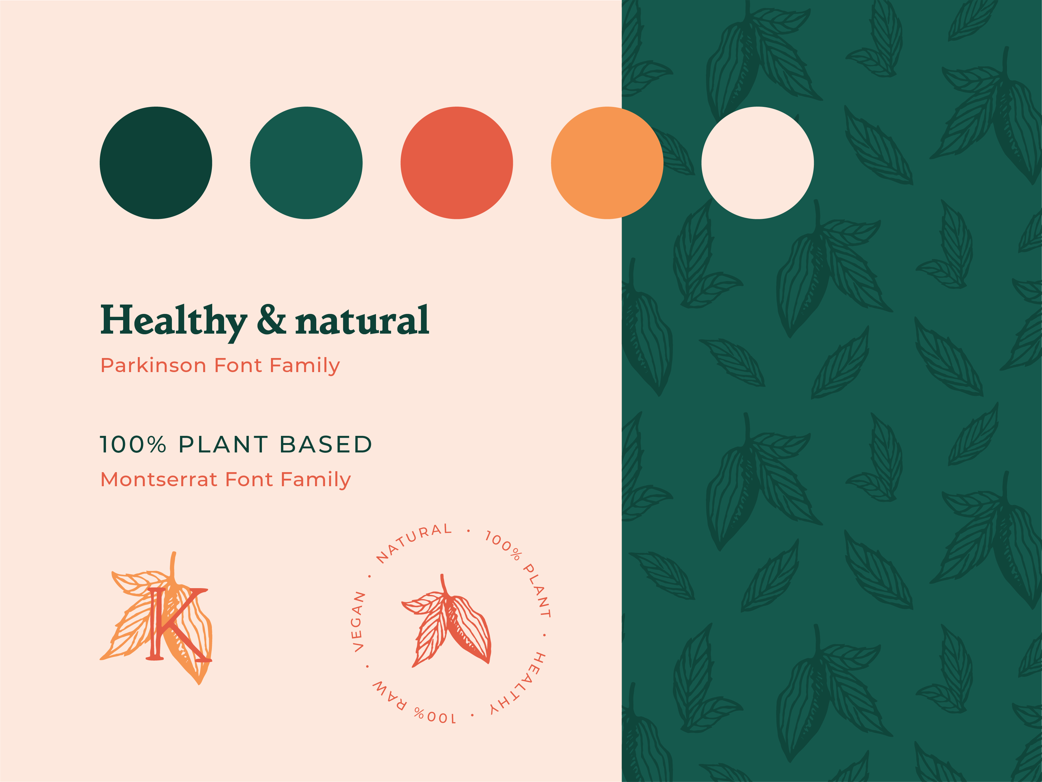
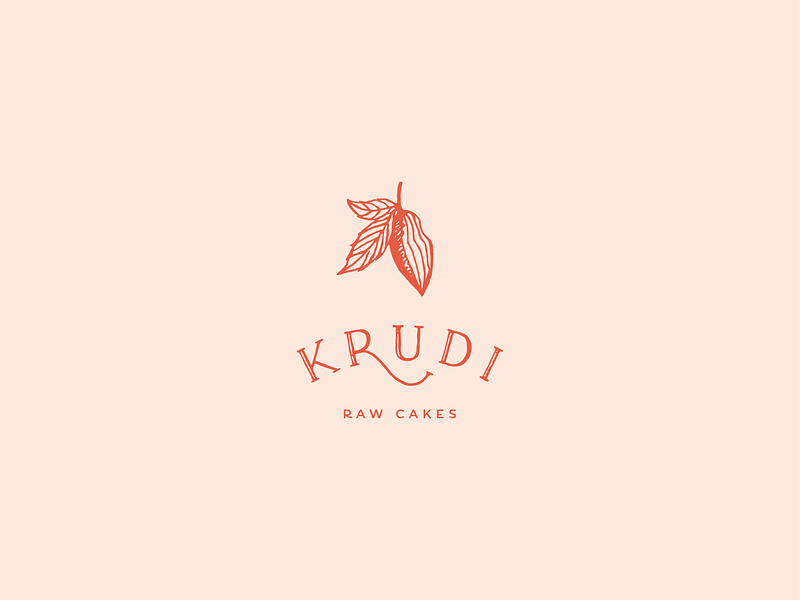
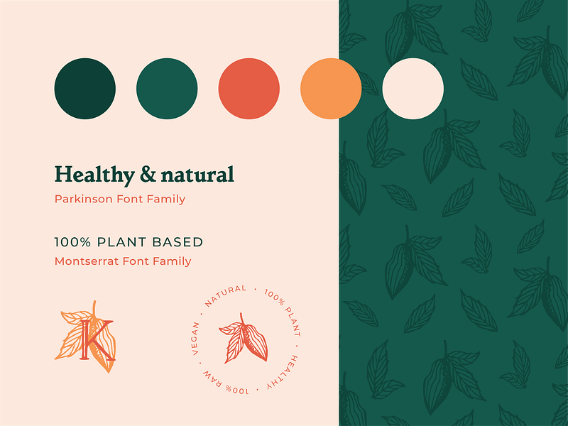
With Krudi for example, a raw cake company, the idea was to emulate something high-end and sophisticated that also conveyed a message that each product is unique and made from scratch. To achieve this, I went with both the graphic element (cacao pod) and hand-drawn typography. The custom serif font and the spacing bring the sophistication, while the irregular trace adds a unique flavor to the brand.
On top of that, I used the cacao illustration to form a pattern that could also be used as an additional branding asset—another great way to incorporate illustration in branding.
Remember, illustration in branding doesn’t have to be limited to just the logo design. Instead, you can also apply it to various brand materials to further communicate your client’s services and values. The applications are vast: website, social media, stationery, advertising, packaging, and so on.
It’s very useful to have a group of illustrations or a specific illustration style as part of your brand guide, especially now that many businesses need a strong online presence with continuous content production. This helps brands keep a consistent look & feel even with different designers working on a project.
Now that we know the many possibilities for using illustration in branding, we can ask ourselves:
Should I use illustration as a part of my branding?
I personally believe you can always incorporate illustration into a brand’s visual identity—and that you’ll most likely need to do it sooner or later. Illustrative elements are a great way to communicate ideas and values without words. In such a fast-paced world where we consume a high volume of information every day, images that communicate with your audience are a powerful tool of engagement.
With that being said, when choosing to work with illustration, designers must consider three things: budget, brand audience, and the aesthetics you’re going for.
1. Budget
When working on a large project for an established brand, for example, company’s can benefit from having an illustration direction and resources that they can easily apply across different platforms—maybe even working with a full-time illustrator is an option.
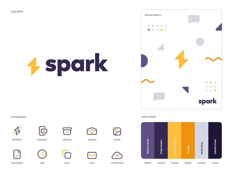
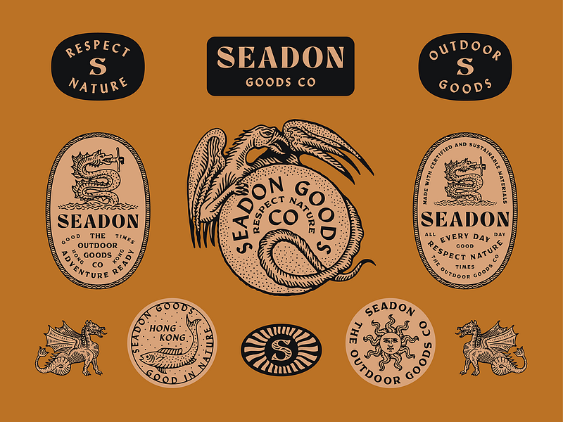
With a smaller budget, however, you might want to consider keeping it simple and creating a pattern from your illustrated logo, or simple icons that can be used as assets. This brand style sheet made by the studio Unfold is a perfect example of that:
2. Target audience
A brand’s target audience and presence on different channels should also be considered. If a brand is heavily present on social media, targeting a younger crowd, they might benefit a lot from having a package of illustrations that they can use as part of their content.
For example HiCo Homes, an upcoming home development in London offering affordable living spaces for millennials, approached Orca Design for a new full branding project. To appeal to their target demographic, we included modern vector illustrations as one of the key elements to promote their business:
3. Aesthetics
And last but not least, aesthetics matter a lot. If your logo has a hand-drawn feel, it would only make sense to create illustrations that match this look to keep the brand look consistent. If it’s a more corporate brand, on the other hand, you might want to work with more photography and have only simple icons or a pattern to complement that.
Jonathan Schubert creates amazing brands where the illustration is a key component of the aesthetics:
Now that we know the how and why, let’s take a look at how to actively implement illustration in a project.
How to effectively implement illustrative elements
The answer is simple: Brand Guidelines. They might not the most exciting part of a branding project, but very necessary.
To ensure the brand you’ve created uses illustration in a cohesive and consistent way, you need to include some rules and examples in the guidelines, so future designers and content creators (and even yourself) can refer back to them when working on new assets for the client. This is as important as defining a color palette or which fonts to use. After all, they all come together when producing a graphic piece.
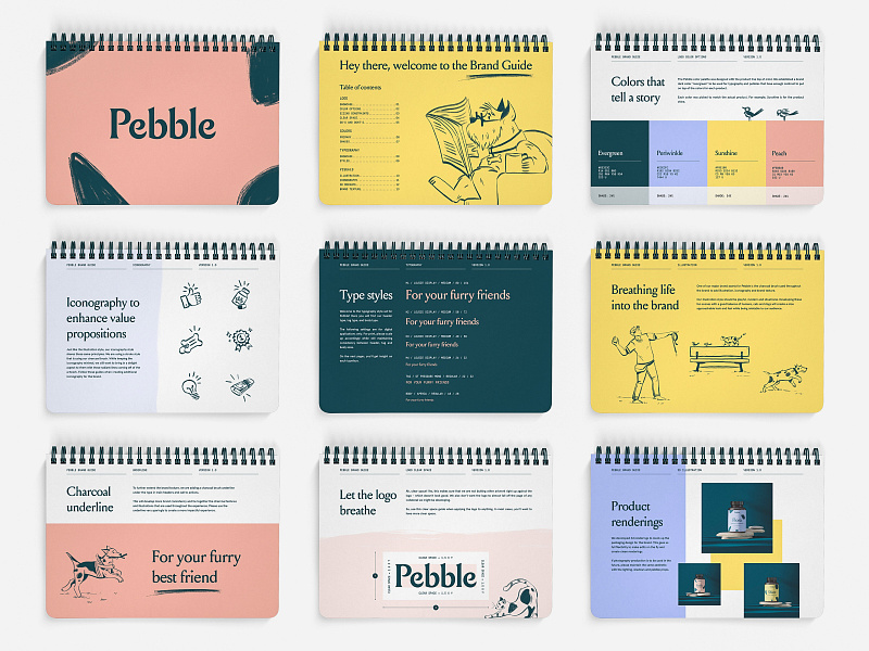
If budget allows, you can even create an illustration system with several elements that can be used for social media, website, print material etc. Or, if you can’t go that far, try to include 2 to 3 examples of illustrations in your brand guidelines, explaining the style and applications. For example:
“Use line illustrations with a hand-drawn look. Keep it simple with only one or two colors. No texture or outlines.”
Here is a perfect example by the studio Brass Hands, where the illustrations permeate the guidelines and add personality to the brand:
Another thing to keep in mind is that every brand can change and evolve and so should the illustration style if necessary. It’s important to establish a style and aesthetic, but also to be flexible and recognize when a brand look and feel needs some refreshing.
Final thoughts
Illustration can be a powerful tool to distinguish brands from competitors and create a strong connection with its audience. Hopefully, this article helps shed some light on how and when you can take advantage of this asset to elevate your project and successfully create a brand with originality and personality!
Flávia Mayer is a Latin illustrator & multidisciplinary designer passionate about using creativity to make the world a better place. She draws inspiration from nature and life, always looking for ways to create authentic experiences through her illustrations and designs. Follow her on Dribbble and Instagram.
MORE ILLUSTRATION RESOURCES
- Why hiring an illustrator is important for your business
- Exploring illustration systems with brand designer Adam Ho
- How to get started in Product Illustration
Find more Process stories on our blog Courtside. Have a suggestion? Contact stories@dribbble.com.
