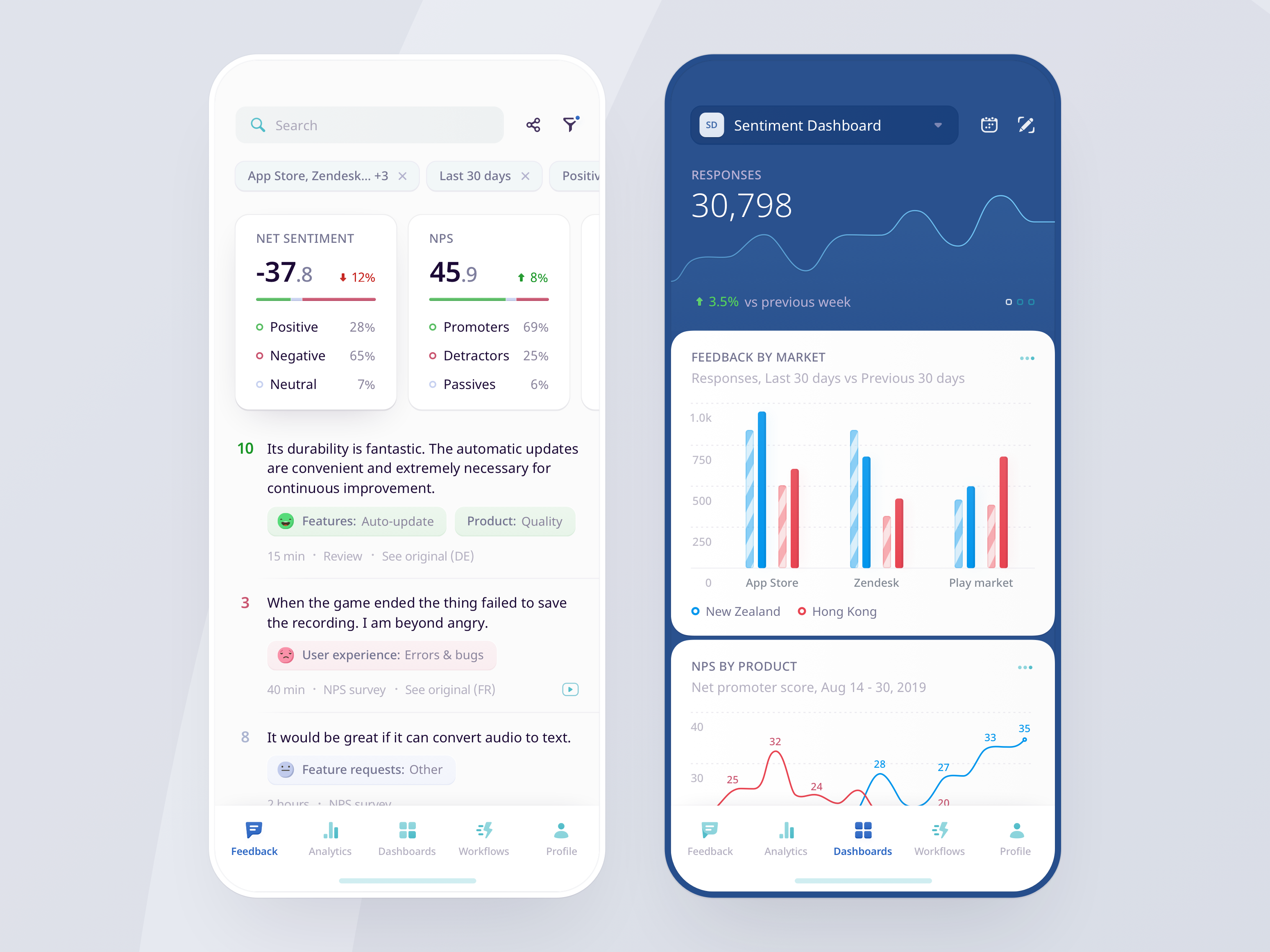
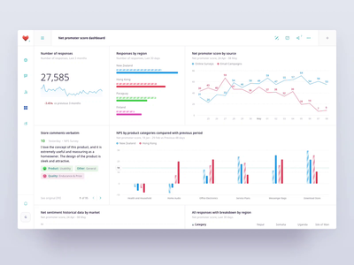
![]() Meet Gregory Muryn-Mukha, a Product Designer focused on building user experiences for complex enterprise software. Today, Gregory shares his top five tips for designing visually effective dashboards. Follow Gregory’s recommendations below:
Meet Gregory Muryn-Mukha, a Product Designer focused on building user experiences for complex enterprise software. Today, Gregory shares his top five tips for designing visually effective dashboards. Follow Gregory’s recommendations below:
1. Use right-aligned monospace numeric values for statistical data
If a data table or a list widget within a dashboard includes statistical numeric data, make sure the numbers are aligned to the right and each digit takes up equal space.
This helps to compare different numeric values in a column quickly without analyzing every single item. The majority of people read left-to-right, so right-aligned monospace values will be clearly distinguishable when reading through them.
The majority of fonts don’t have the “monospace numbers” option turned on by default and have proportional numbers—but, actually, most of the widespread ones do support this feature. You can also turn it on in Sketch or Figma by adjusting the OpenType features.

2. Allow your users to tailor and share dashboards
While this might not apply to every single product, if you are designing an analytical platform that implies teamwork, it makes sense to consider introducing customizable dashboards that can be shared by users with their teammates.
Since enterprise reporting tools usually serve a variety of use cases, it might be tricky to cover all of them with a predefined set of widgets. By allowing users to create a highly customizable collection of reports, we not only satisfy different user jobs but also increase adoption and, hence, usage of an application.
3. When to use pie charts vs. bar charts.
Circular pie charts are not usually efficient for clearly identifying how much larger one area is to another. Avoid using them to present quantitative data especially if there are more than 4-5 chart items. Pie charts work much better for displaying percentage shares with a small number of variables.
If you have many quantitative chart items, consider using horizontal or vertical bar charts instead (depending on the number of options and design objectives). Think about whether you want to focus on each individual item and how it differs from the others vs. whether you need to identify what stands out from the trend.

4. Take into account object hierarchy
A common request, especially when designing enterprise analytical products, is to quickly be able to access various types of data on the same page with as few user interactions as possible to grasp all important indicators.
In these cases, take into account the principles of Dynamic Composition. This means pointing out the most valuable data in a meaningful order based on your user flows.
It’s crucial to follow the hierarchy of objects and ensure that your data units are clearly distinguishable so the dashboard won’t turn into a mess. A simple rule of thumb that helps to establish this order is to be mindful that even if all figures, shapes, and accents might be different, they must constitute an organic whole.
Think in terms of the dashboard being a story. Ask yourself how to divide this story into a cohesive set of data units that conveys information in a quick, obvious, and comprehensive way.

5. Highlight shifts in statistics and react to anomalies
Everything is relative—and this is very important to take into account when visualizing data.
Point out how metrics change over time and what differences there are when comparing data sets. This will tell your customers whether they need to take measures or dive deeper into a report. Make data points on charts clickable: This will make an expanded view of specific data quickly accessible by directing users to a full report with predefined filters applied.
When operating a relatively big volume of historical data, it’s useful to catch unnatural changes in metrics on a regular basis. It will not only have a positive impact on your customers’ business but increase the usage and credibility of an app.
“Teach” your product algorithms to identify anomalies in data and not only notify customers when they happen, but also provide a list of corresponding actions when possible. For instance, if an ad budget is being spent too quickly, you can offer users to decrease a cost-per-action bid value by automatically suggesting the most appropriate one under given circumstances.

![]() Gregory Muryn-Mukha is a multidisciplinary designer focused on building User Experience through thought-out and beautiful interfaces for complex enterprise software. Gregory is currently involved in startups and is passionate about the intersection of design and business.
Gregory Muryn-Mukha is a multidisciplinary designer focused on building User Experience through thought-out and beautiful interfaces for complex enterprise software. Gregory is currently involved in startups and is passionate about the intersection of design and business.
Related Articles:
- Mastering Data Viz: 3 design tips for a smoother workflow
- How to use data visualization to tell a compelling story
- When science meets design: Data visualization for outer space
Find more Process stories on our blog Courtside. Have a suggestion? Contact stories@dribbble.com.


