This week on the blog, we’re covering all things making and selling merch as a designer. Today, we’re joined by Big Cartel’s Product Design Lead, Carl DeCaire, to hear his insights and tips for setting up an online merch shop for success. Use these tips as a guide for your own online shop and get ready to make some sales!
1. Before getting started: Create a plan
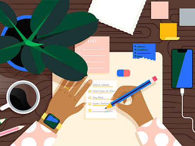
Whether you’re a seasoned creative pro or just out of art school, creating an online shop and selling products should be treated like any other project—and that begins with a plan.
There are a lot of questions to ask before starting a project like this: What are you selling? Who are you selling to? How will you promote it? Luckily for us at Big Cartel, we know a thing or two (or three) about where to sell it, but these questions barely scratch the surface. If you’re feeling a little overwhelmed, that’s ok. With the right plan, you can stay focused and not lose sight of your goals.
Pro Tips:
- Keep a simple to-do list and revisit it often, adding and checking off tasks as you go
- Try to identify any weaknesses you may have, such as: Do you have the skills necessary to write HTML/CSS, or do you need to hire some outside help?
- Do some research. Are your products for everyone or a niche market? Either is fine, but you should know the answer before you start.
2. Approach with simplicity
Now that you’re asking yourself all the right questions and formulating a plan, you can begin creating your products and setting up your online shop. Simplicity is a core design principle at Big Cartel, and it’s one of our most significant super-powers.
You don’t need hundreds of products or a sophisticated e-commerce platform to get started; by keeping it simple, you can focus on building your brand and telling a story without overwhelming yourself.
Pro Tips:
- Show your products in context. Lifestyle shots of a person wearing your apparel on a hike, or a print hanging on a wall like a modern gallery are engaging ways to display your product’s worth.
- Pick a color palette and typeface that compliments your brand, but isn’t distracting from your products.
3. Keep it accessible
Accessibility is as vital as ever and has become a priority for many individuals and companies alike. While much of this depends on how your shop is built (which could be an entire article of its own), it’s equally important to be aware of your design choices like colors and type sizes.
You should strive for a minimum of 4.5:1 color contrast ratios, and a base type size around 16px. There are no specific rules on how you approach this, but be mindful of your most important content such as an add to cart button, or product names and prices.
Pro Tips:
- There are plenty of online tools and plugins to help guide you: Colorable for contrast or WAVE for in-depth checking.
- Read the Google Design series on Global Accessibility for some best practices.
4. Be human
That should be easy, right? Connecting with your customers should be more than just shipping out their orders on time. Think about the packaging and how they will see it, add a handwritten note saying thanks, or include a free sticker. These little details let your customers know a real person is pouring their blood, sweat, and tears into their purchase, and that’s a powerful feeling.
Pro Tips
- Write up a brief story or bio talking about how and why you got started, and add it to an “About” page.
- Add and share your social network links whenever possible.
- Create a mailing list and promote new products and discounts during the holidays.
About Carl: For the past eight years, I’ve been helping artists make a living doing what they love as a product design lead at Big Cartel. Together, with a talented design team, we’re building tools and themes our customers use every day to manage their shops and sell products successfully on and offline.
related articles
- How this designer turned her online shop into a full-time job
- Making merch on the side: 5 tips for getting started
- We found the perfect enamel pins to gift your design friends
Find more Process stories on our blog Courtside. Have a suggestion? Contact stories@dribbble.com.


