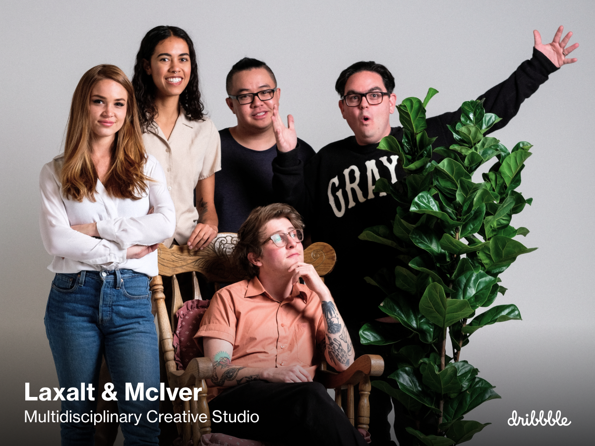
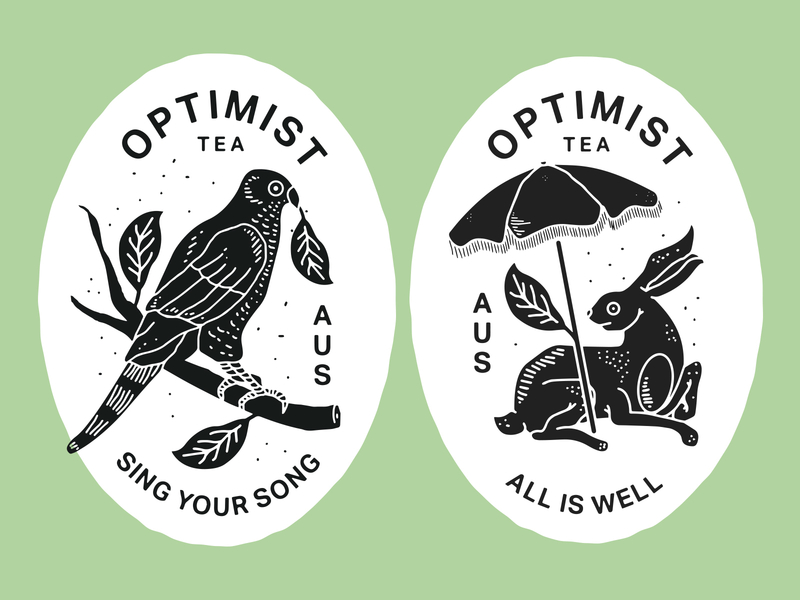
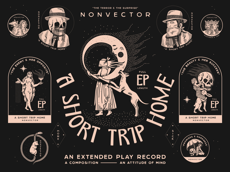
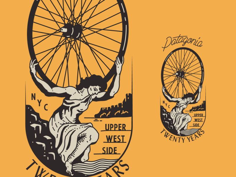
What is emotional design and why does it matter? In an exclusive Dribbble Video, we sit down with the talented team at Laxalt & McIver, a creative design studio, to learn more about how they lean on empathy and emotions to problem-solve and design better solutions. Get inspired to infuse more emotion into your own work as the team sheds light on their tried-and-true philosophy for design.
Peter Laxalt: My name is Peter Laxalt, and I’m one of the partners at Laxalt & McIver. We’re a multidisciplinary studio based out of Brooklyn, New York, and Reno, Nevada.
What is Emotional Design?
Peter Laxalt: Emotional design is kind of a philosophy we take internally at L&M. For us to approach these projects in terms of trying to zoom out and see it from another lens, allows us to kind of infuse what we call emotion into the design.
Kylie Souza: Every business has a goal that is to help humanity some way or benefit the world or put their thing out there. I really want to be able to see things from their perspective of how they want to help others and where that feeling comes from. How are these people feeling and how do they want other people to feel when they interact with their product or website?
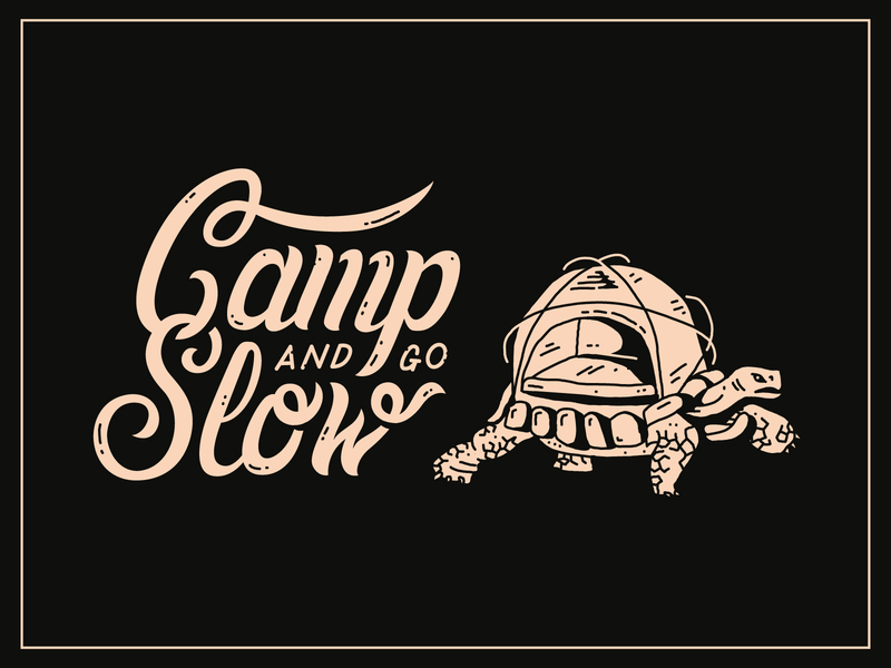
Peter Laxalt: To kind of give an example of that—design is a super contextual thing. If we’re going to do some designs for a hiking company, maybe an immediate thought is doing trees and doing stuff that you would think outdoors. But what we try to do, and one thing that we really do try to push and inspire each other internally in the company is, what does it smell like? What are the actual parts of hiking and camping? Is camping something that… are you remembering the trees? Are you remembering dancing naked around the campfire or staying up late drinking whiskey?
There’s these different contexts of what other people feel when you talk about those experiences. Taking the figurative instead of the literal route is a really key point that we really try to inspire each other to do. Taking the conceptual route rather than just saying it flat out.
Designing through the lens of an artist
Peter Laxalt: I think for us, what we’ve kind of tried to harness over the years is approaching design as artwork because good art isn’t just a visual piece. Good art is a feeling that you take away from that piece that lasts way longer than just the instant satisfaction of seeing it.
Matthew McIver: There’s so much noise and clutter out there. And oftentimes, we’re just so distracted with all the technology that we have in life and there’s just so much opportunity to get your art out there. And if your art’s not stopping somebody in their tracks or really making them think or question or create curiosity, I feel like we’re not doing our jobs.
Peter Laxalt: The more that we can kind of uncover that, whether it’s in code or whether it’s in doing illustrations or custom typography, it’s like if we’re able to show the emotion that we’re feeling when we’re designing it, it’s going to be more likely that the viewer is going to feel the same emotions that we’re trying to kind of infuse into the artwork.
How to design with empathy and emotion
Peter Laxalt: There’s this balance between work emotion and personal emotion and it’s obvious that it’s going to start intertwining between stuff. But there’s this skill that I have encouraged everybody to learn over the years, which is feeling other people’s emotions, being empathetic, and that kind of allows you to design and solve these problems for these projects by feeling what the other person is feeling—whether it’s pain, whether it’s happiness, if they’re passionate about something… feeling and trying to put yourself in the shoes of how they feel it.
Kylie Souza: There’s research at the beginning of any project, but in that research, there’s also emotional research. There’s also asking a lot of questions that might not seem directly related but kind of end up revealing more of the story and more of the meaning behind some of our clients’ goals.
If we’re working with a medical intelligence company, I may not know the logistics that go behind that sort of thing. But I can relate to wanting a healthy community and wanting to be a part of a healthy community, and that feeling of wanting to be sure about something and kind of calm someone’s worries.
Peter Laxalt: A great example on the hiking note—I grew up in Reno, Nevada. So for me, Desolation Wilderness or Lake Tahoe, it’s not about beautiful trees or anything, it’s about listening to silence and it’s about putting myself in the shoes of when I was like fifteen and running around in the mountains. And that’s the feeling that I have. But how can I convey that to other people?
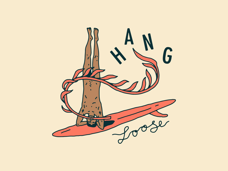
And that gets challenging when new projects come in. Like a surfing company that we worked with in Portugal. I never grew up surfing. None of our team has really surfed. So how do we emotionally feel that same exact feeling of a surf company or being a surfer growing up in it?
So what we do is, whether it’s watching surf movies, it’s not even about doing research and finding mood boards. It’s like watch a surf movie, read a surf magazine, look at vintage surf, what was the feeling, why do people do it and try and empathetically understand where they’re coming from so you can accurately convey their emotion.
Matthew McIver: You know, at the beginning and the end of the day too, we all have our personal battles and struggles in life, and we do encourage people to kind of leave it in the burden basket at the door. Like don’t bring in that emotional drama, but use that to empower yourselves. Use that to take your design to the next level and kind of use that creative outlet as a way to shift that energy.
Peter Laxalt: There are two types of memory that people are going to remember. They’re going to remember visually what it looks like, but I think a longer feeling, what people are going to remember is what it feels like.
This video was shot and produced by Matthew Kadi.
Want to keep up with Laxalt & McIver? Follow the team on Dribbble.
Find more Interviews stories on our blog Courtside. Have a suggestion? Contact stories@dribbble.com.
