Are you looking for some fresh new branding ideas to impress your clients? Try designing a logo that makes clever use out of negative space. Negative space logos are logos that creatively use the white space within an image (or letter) to create a whole new image. A classic example is the iconic FedEx logo in which a subtle arrow symbol is formed between the letters ‘E’ and ‘X’.
Designing a negative space logo isn’t exactly the easiest task, but there are a few tried and true ways designers like to implement negative space into their logo designs. In this post, we’re sharing three of these different methods to help inspire your future logo and branding package projects.
1. In a wordmark
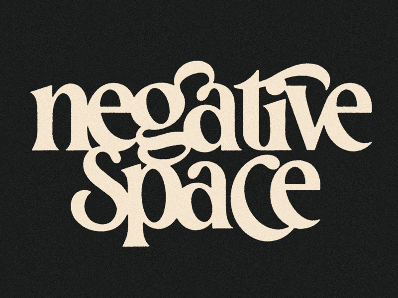
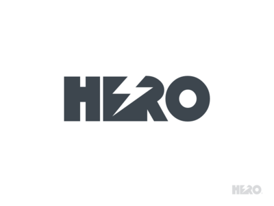
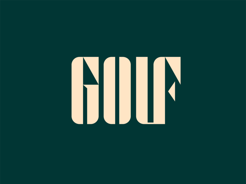
Can you pick out the hidden symbols in these logotypes? These graphic designers incorporated subtle, relevant symbols into their logo’s typography, making use of the negative space between different letter combinations and areas enclosed within letters:
Row 1: Leo, Heyo, Viet Huynh. Row 2: Aditya Chhatrala, Aditya Chhatrala, Alex Aperios. Row 3: Allan Peters, Antonio Calvino, Dan Fleming for 829 Studios.
2. A symbol within a symbol
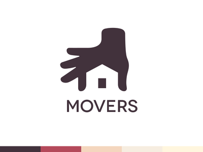
A negative space logo doesn’t necessarily have to make use of any letters. You can also combine two different forms to create dual meaning behind a single symbol. Viewers will enjoy attempting to find the hidden meaning behind your design, and you’ll impress them with the effortless way you were able to combine two separate ideas. Take a look at these examples of negative space logos to see what we mean:
Row 1: Sava Stoic, Ignas, Deividas Bielskis. Row 2: Wisecraft, Ramotion, Stefan Kitanović. Row 3: Sumesh | Logo Designer, Omnium, Nour Oumousse.
3. Inside a letterform
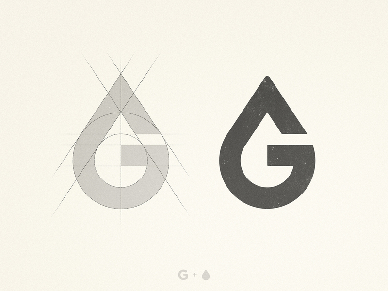
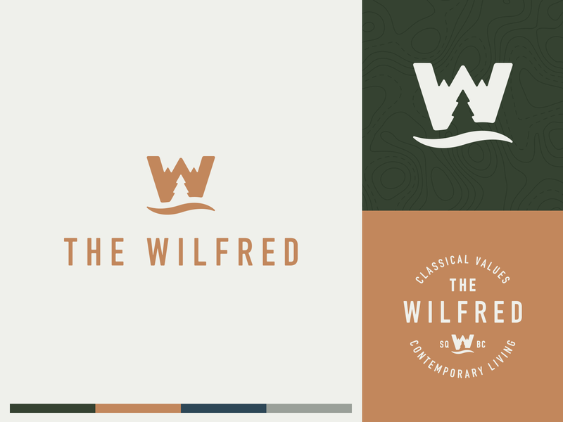
You can also design a clever logo by combining a single letterform with a symbol. In these cases, designers typically keep a letter’s positive space, and incorporate a symbol within the empty space inside or around it. When it comes to logo design, it only makes sense to use a symbol relevant to your brand’s product or service. Take a look at these examples below:
Row 1: Dima Lytvynenko, Kakha Kakhadzen, Deividas Bielskis. Row 2: Aditya Chhatrala, Wisecraft, Leo. Row 3: Nick Johnston, Sergey Yakovenko.
Remember that creating an eye-catching, negative space logo design won’t necessarily come naturally. It’ll take some practice and training of your eyes to “read between the lines” if you will. Start making a conscious effort to notice the space around different forms, and think about what kind of imagery might seamlessly fit within those empty shapes. Good luck and happy designing!
For more logo design resources, check out our blog post on how to NOT screw up a logo and our beginner’s guide to wordmark logos.
Find more Inspiration stories on our blog Courtside. Have a suggestion? Contact stories@dribbble.com.
