We’re big fans of Intercom’s design work and today we’re thrilled to chat with Intercom’s very own Product Design Manager Paul Murphy. Paul gives us an inside look at all things product design challenges at Intercom, how creative teams work together to fuse product and brand, and engraining feedback as a core company value.

Tell us about yourself and your role at Intercom.
Hello! I’m Paul, I’m a designer based in Dublin, Ireland.
I work at Intercom where we’re tackling the simple sounding, but pretty ambitious mission to make internet business personal. We’re doing that by building a customer messaging platform that helps businesses grow faster by enabling them to have better relationships with their customers.
At Intercom, I work as a product design manager. At its core, this means it’s my job to hire, grow, and retain a team of designers and help them to ship high-quality product quickly. Doing that involves a bunch of different things:
- Managing a team of product designers across multiple products.
- Coaching these folks and helping them to develop in their careers.
- Running design projects and ensuring we deliver high-quality work.
- Shaping the vision of our products and driving strategic design work.
- Evolving our design practice — our processes, our principles, our tools, etc.
- Growing our team by hiring new folks.
- Representing Intercom publicly, for example by writing or doing interviews, like this one!
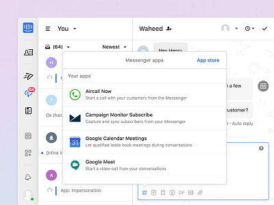
The number of people I manage can vary. Right now, I manage three designers across a bunch of different teams within Intercom. The teams I work with are our platform teams (who own our App Store), our design systems team (who own Pulse, our design system) and our messages team (who own, unsurprisingly, our Messages product).
Prior to Intercom, I cut my teeth at a bunch of different startups in Dublin, some of which are still around and doing great, some unfortunately not. The joys of startup life!
What are some of the major design challenges Product Designers face at Intercom?
Challenge #1 - Designing for two different sets of users:
When most people think of messengers, they think of the apps we use every day to talk to our friends and family, apps like WhatsApp or Facebook Messenger. Intercom is a little different to those products. It’s a messaging platform for businesses, and we have two very different types of user to design for.
- Our customers — sales, marketing, and support teams in internet businesses.
- Our customers’ customers — the people who buy and use their product.
This dichotomy is really interesting and can be a difficult one to wrap your head around (we refer to it internally as Inter-ception) and to me, it’s one of the key challenges we face when designing our Messenger.
Businesses need to acquire more customers, engage these customers so they are onboarded successfully, and support them so they retain. Their customers, however, have a very different need — to get their job done as effectively as possible. They also expect that when they interact with a messenger, the experience feels personal and rich, because that’s the type of experience that people are used to when using traditional consumer messengers.
So, the challenge is: how do you design an amazing experience for these two types of users who both have such different needs? How do you design a messenger that helps businesses nail their goals, but doesn’t get in the way of their customers getting their own job done? And how do you do all of this in a way that feels human and authentic and personal? That’s a tricky balance to strike.
Challenge #2 - Keeping Intercom simple and easy to use:
When people think of Intercom, they often think only of our Messenger, they recognize it from that little circular button that they’ve seen on the bottom right-hand corner of a bunch of websites. In reality, Intercom consists of much more than that. We have a customer data platform, multiple products, add-ons to those products and an app store, all of which work seamlessly with our Messenger. With a surface area of that breadth, it’s high risk that as we continue to scale our product, local optimizations and bespoke concepts start to creep in, ultimately leading to a more confusing Intercom. We don’t want that to happen, so we have a strategy which we use to help keep Intercom simple.
Our strategy is to design Intercom using a simple system of connected objects (things like messages, conversations, articles, etc) and we use and re-use these objects throughout the product to create different workflows for our users. Thinking in this way ensures that we don’t create similar but different concepts throughout the product, and that makes Intercom easier for us to build and maintain and easier for our customers to understand. This all sounds great in theory, but adhering to this approach in practice is really difficult. The challenge for design is to ensure that our teams can still move quickly and pragmatically build in their own area of the product, whilst still fighting to maintain the broader conceptual simplicity of Intercom.
There is no shortage of interesting design challenges at Intercom! Which reminds me, we’re looking for designers to help us face these challenges. If this sounds like the type of design work you’d like to do, you should check out our open roles .
How does the Intercom design team fuse product and brand?
For a long time, our product and our brand were actually quite disconnected. Sure, there has always been an expression of our brand’s visual language in our product (through type, colour, illustration, etc), however, beyond aesthetics, the broader aspects of our brand (marketing, advertising, brand story) were not carried through to our product in a clear and intentional way. This meant that the customer journey from visiting our marketing site through to purchasing and using our product was actually pretty incoherent, and this was a problem.
This disconnect manifested itself in two main ways. First, we were explaining features differently on our marketing site to how they actually worked in the product, which was pretty confusing for customers. Second, when designing our product, we often didn’t think enough about the experience for new customers — we designed features without thinking about how people would discover them.
The reason behind this was in large part an organizational one. Our marketing org (where brand design sits) and our R&D org (where product design sits) were very separate entities, often working in silos. It was actually possible to look at our product’s UI and work out the org structure of the teams in our company, which is really interesting but also not a good thing! Once we started to see that this misalignment was affecting our core business metrics, we set about seriously trying to fix this.
The most impactful thing we did to improve here was to rebuild our product onboarding from the ground up. Previously, Intercom’s onboarding was dispersed throughout the product and was built ad-hoc by different teams, without ever being considered holistically. We made the decision to centralize our onboarding into one place (which we call onboarding home) and this became the destination for all new customers when setting up Intercom. Onboarding home was the first place that users landed after journeying through our marketing site and purchase flow, it was the bridge between brand and product that we had never had before.
Onboarding home gave us the space to introduce Intercom’s features and concepts in a way that matched how they were being positioned on the marketing site. Product design partnered really closely with teams from around the company in sales, marketing, and product education to make sure we were totally aligned in our explanation of how Intercom worked.
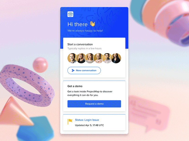
It was also a place in the product where we could afford to be a little more expressive in bringing through our brand’s visual language. We did this through the use of illustrations and photographs of people in the Intercom team in order to make the experience feel more personal — something that’s really important to us.
Lastly, the idea behind onboarding home was that a user could learn about the key parts of Intercom by working through a series of levels, each which contained multiple steps, almost like a video game. Each step was modular and self-contained, making it easy to add or change the onboarding experience or tailor it to a specific use case. The principles and patterns behind building for onboarding home were also documented and shared with all product teams. This was really important as it gave teams the framework to build onboarding experiences for their own product area, something we never had before.
If you’d like to learn more about the design decisions behind onboarding home, check out this talk by Cindy Chang, one of our awesome senior product designers!
How do you approach giving and receiving feedback to your team?
In terms of giving feedback, it depends on if we are talking about feedback on the work, or feedback on the person (their performance, their professional development, their growth, etc).
On the latter, I’m a big fan of leveraging established models and frameworks to help guide my approach. Some tools which I’ve found particularly helpful are:
- SBI — A structured format for delivering effective feedback by describing the situation, the behavior and the impact of the action taken.
- The Situational Leadership Model — A framework for adapting approach to leadership depending on the needs of an individual.
- Principles from the book Crucial Conversations — A set of ideas for how to tackle difficult conversations in an empathic and open way.
I’m also an over-preparer! I tend to really think in advance about what I want to say, why I want to say it, and what I want the outcome to be, and literally write that down before delivering it. I find that helpful, but can totally appreciate that may not work for everybody!
In terms of receiving feedback, at Intercom, we have a company value which I try to live by which is: “We love people who genuinely want to learn and grow. Who solicit feedback from others and offer feedback to others.” Having an emphasis on the importance of seeking feedback codified in this way helps me keep it top of mind. I’ve also found this article by Julie Zhuo really helpful (I’ve read and re-read it many times) which talks about the importance of taking feedback impersonally.
In terms of giving feedback on the work, there are a ton of great references and books out there on how to do design critique well. I like Mike Davidson’s approach which is simple and effective. In a nutshell, he talks about the fact that there are levels to giving good feedback, but the best critique always does three things: Identifies the problem, understands it’s cause, and proposes a potential solution.
Oh, and it doesn’t hurt to always remember, you are not your work!
Want to keep up with Intercom? Find Paul and the team on Dribbble, Twitter, and at Intercom.com—or check out their open roles!
Find more Interviews stories on our blog Courtside. Have a suggestion? Contact stories@dribbble.com.


