Pawel Szymankiewicz is a Senior Product designer at Netguru and co-founder of the coco apps team. Drawing on his expertise in user-centered design, Pawel shares his ultimate guide to designing user-friendly forms people will actually want to complete!
Forms are a key conversion tool—which is why it’s important to master the most effective form design techniques. Frustration should never be a part of a user’s process when filling out a form, and the tips outlined below should help create a more pleasant experience for them.
To start off, I’ll cover the three main components in every form and how to effectively use them. Next, I’ll jump into some best practices for constructing your form from start to finish. Finally, I’ll outline the three types of form layouts to help you decide which format works best for the kind of data you want to collect. Let’s jump in.
The 3 basic form components
Components are the foundation of every form and can be easily compared to a list of ingredients for a Sunday night dinner—you’ll want to choose the best ingredients and serve them well. Let’s cover the three essential components of a form and then jump into the most overlooked nuances around them:
1. Textfields
This is the primary form component that often ends up being over-designed. Save yourself some time and do not reinvent the wheel.
- Pick a familiar look: Use one of the two most recognizable textfield shapes: a well-known rectangle or a simple line (made popular by Google’s Material Design). Suggest the expected length of an input by its size.

- Describe what you need: Use labels to tell what input is expected. Make sure they are always visible so your form is easy to scan even when it’s filled. Place labels on top of the textfields or as a placeholder that transforms into a floating label while typing. Avoid putting labels on the left or right side of a textfield as it will create a mess once your form starts growing.

2. Dropdown menus
Dropdown menus gained their popularity on the web and are here to stay. After all, they do their job pretty well.
- Sort dropdown lists alphabetically: Sort answers in alphabetical order to help people find the answer they are looking for quickly.

- Place suggested answers on top: If you are sure one (or more) of the answers from the list will be chosen by most people (e.g. based on their current location), put this answer at the top of the dropdown and separate it from the others with a subtle divider.

3. Buttons
The real superstar of every form. Without a button, your form is useless. It’s extremely important to make sure it’s understandable and visible to everyone.
- Describe what the action button does: The word “Submit” doesn’t say it all. Make sure the text within your button is as simple and clear as possible. If it’s being used to add products to a shopping cart, label it, “Add to cart”. If it functions to remove unwanted products, label it, “Remove”. Try to describe the action that happens after clicking as concretely as you can.

- Use different styles to drive attention: Use colors to suggest whether your button is facilitating a positive or negative action. Different styles can also suggest which action is primary and secondary.
Form construction
Now that you’ve got the basics covered, how are you going to build your form so it’s successful? How is it going to work and interact with your users? Let’s dive into some best practices for constructing your form:
- Show advantages of filling the form: If your business depends on people successfully filling out a form, make sure you tell users why it’s worth spending a few minutes of their time on. Carefully choose your words and make sure they indicate the value users will get from filling the form out. Prepare something special—for example, an e-book packed with awesome tips for your target group. In this case, your button’s text can say something like, “Sign Up and Get the FREE e-book!”
- Arrange all components under one column: Naturally, we read from top to bottom. Try to place all of the elements under one column—this will make it easier to quickly scan your form without jumping from one side to the other.

- Ask only for stuff you really, REALLY need: Keep forms short. Avoid asking for data that isn’t necessary at the moment—you can always gather that later. The shorter your form is, the more likely people are actually going to fill it out.
- Explain why you are asking for sensitive data: If you need to ask for some sort of sensitive data that folks might hesitate to share, explain why you are asking for it. Build trust by being transparent about how and why you are going to use this data.
- Label fields that are optional: If your form contains some optional textfields, mark them with an “Optional” label instead of placing an asterisk next to them. People generally don’t like asterisks in forms because they remind them of signing complicated contracts and hidden statements.

- Group components and list them in logical order: Make it easier to quickly scan your form by inserting a heading on top of the grouped components. Try to follow familiar patterns that people already know from different, common situations.
- Don’t use an additional textfield asking users to confirm their password: Instead of making people type their password twice, allow them to peek at it. Even if they don’t and misspell their password at first, they’ll always have a chance (or at least they should) to change it later on.
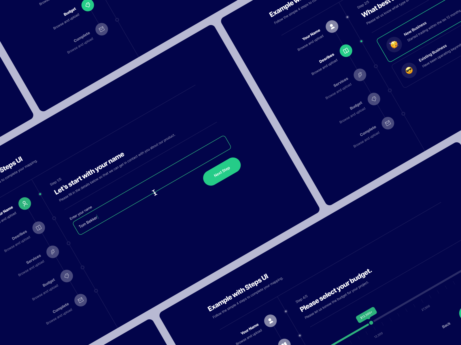
- Show form progress: If your form is rather long, it’s important to show progress so people know where they are and how much of the form is left to complete. This can be done with a simple progress bar or by dividing your form into shorter steps. As long as it gives hope that the end is near, it does the job well.

- Save progress: Just as important as showing progress, is actively saving it while the form is being filled. There is no worse scenario than a solid amount of time spent on a form then a lost connection resulting in all of the input data to disappear.
- Use icons and images when possible: If you’re asking for something strictly connected with images, besides describing it, show the image as well.
- Suggest answers: If your form is open and people are asked to type in different answers that in general are common as Skills or Tags used on Dribbble, suggest answers from your database as they are typed in.
- Leave enter/return alone: This key on the keyboard has a very well known role. Don’t make it send the form immediately, especially when it’s long and consists of a couple of text areas. Let the enter be an enter and navigate the cursor to a new line.
- Show what went wrong, and remember color is not everything: If there are some validation issues, show what went wrong. That doesn’t mean simply using the color red as an indicator. A nice description ideally supported with advice on how to make things right would be useful as well. You can also try applying a shake animation to poorly filled fields.

- Let people know what went right: A simple message that the form was successfully sent to your server is pure gold. No more guessing whether it went through or if some problem occurred during the process.
Types of form layouts
The final stage of designing a form is its presentation. How are you going to sell it visually?
Standard (one page) form:
The most common presentation is a simple one-page form. It consists of all of the components and works great for short and less complicated forms.
Multi-step form:
Multi-step forms are mostly used for check-out processes on e-commerce platforms. People like doing things step-by-step so it’s immediately familiar. By design, it also shows the user’s current progress. This format is best for more complicated, longer forms. It makes them less scary. Just remember to group components well and make sure each step is a closed part of the process.
Conversational form:
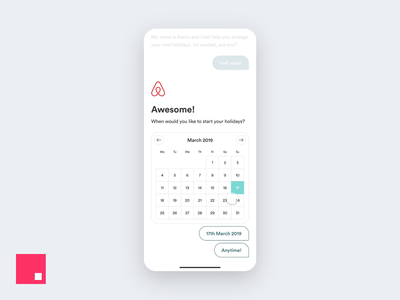
Conversational forms are a really nice and natural way of collecting data seamlessly. Their potential still seems to be undiscovered, however, they’ve been around for a while. Asking for one thing at a time gives the impression of a faster form process. While people focus on the conversation, they overlook the actual length of the form.
While forms may not be the most exciting thing to design, we can’t deny their importance and impact. Next time you feel like running away from designing a form, just remember to stop overthinking it, use these tips as general guidelines, and last but not least, think about the people that are going to be filling it out. Keeping them happy will make your business successful!
Want to keep up with Pawel? Find him on Dribbble and Twitter.
Find more Process stories on our blog Courtside. Have a suggestion? Contact stories@dribbble.com.


