Product Designer and Muralist? Now that’s an interesting combination! Get a glimpse into the life of designer Liviana Popa based in Bucharest, Romania. Livi is constantly looking to learn new skills and grow as a creative. Check out what she’s working on now and hear what inspires her work.
Who are you?
My name is Livi, short for Liviana. I’m a Product Designer currently based in Bucharest, Romania. I recently took a leap of faith and went freelance, but I’m on the lookout for my next team or new city to call home. I’ve lived in the same town for almost my entire life and I don’t think that leads to a great life. I’m also a spare time muralist, so that’s a combination I don’t think you find very often. But it does wonders for the online/offline work and life balance.
What are you working on?
I’m going through a phase where I’m trying to focus on myself, grow as a designer, learn new things (coding!), and read more books. I’ve neglected creating my portfolio for quite some time since I’m my own worst critic (nothing’s ever good enough), so that’s my number one priority at the moment.
I’m also working on some nice projects. One of them is a cool new website for a German hotel chain that provides serviced living for people who are on-the-go a lot, recreating “at home” comfort even when you’re away on business. Another project is all about safety while traveling. This one is for a platform that provides clients with security intel about cities around the world, and also real life protection according to one’s needs. I love it when I get to work on something that I know for sure people are going to find useful and enjoy using.
Choose a favorite shot of yours. Why is it your favorite?
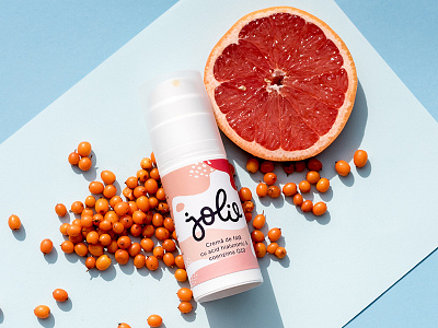
That’s a tough one. I struggle with posting regularly and keeping stuff up to date. This is one of my favorites though, because the project was very fresh looking—especially for the Romanian cosmetics market. I had a lot of financial and time constraints, so I had to get creative and do a lot with very little. But I think things turned out pretty great and I also got featured on the Under Consideration/Brand New website.

Tell us about your setup. What tools did you use to create the shot?
My weapon of choice is my 15 inch MacBook Pro, a 27 inch Dell monitor, white paper, and a pen. And I can’t forget my Wacom tablet or iPad. Depending on the project, I also whip out my brushes and ink and play with shapes and textures to bring an analog vibe to the digital table. When I create wireframes, I prefer to organize my thoughts on paper, making lists and quick sketches before moving to digital. I do try to use less paper so at least when I’m working on apps or websites I don’t have to worry about that.
For this shot, the process started with me creating some handmade patterns and textures using black China Ink, scanning everything, and turning those elements into colorful labels. I created the final packaging using Adobe Illustrator and Photoshop and natural sunlight to take photos of the products.

What are your biggest sources of inspiration, in and out of the office?
My biggest source of inspiration is life and all of the motivated people out here in this big world, hustling to make their dreams come true. But I also find a lot of motivation and inspiring ideas online, especially by listening to podcasts, reading reports, articles, and books. I also love talking to people and observing how they interact with things, how they understand or see different subjects, products, apps, trends, and so on.
I feel like there’s so much hype around “user-centered design”, especially in the tech industry. It’s funny because all Product Designers are user-centered nowadays, yet we spend all day in front of a screen, and barely interacting IRL because we’re always so busy!
Choose a favorite shot from another Player. Why do you dig it?
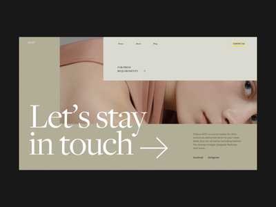
I really like most of Zhenya’s work. The attention to interaction details, smooth transitions, and clean, breathable layouts are like eye candy for me. I’m not very keen on creating this kind of UI myself because I prefer things that work better than they look (I’m more preoccupied by usability), but I do appreciate these details when I see them.
Want to keep up with Liviana? Find her on Dribbble and Twitter.
Find more Interviews stories on our blog Courtside. Have a suggestion? Contact stories@dribbble.com.


