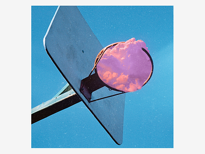
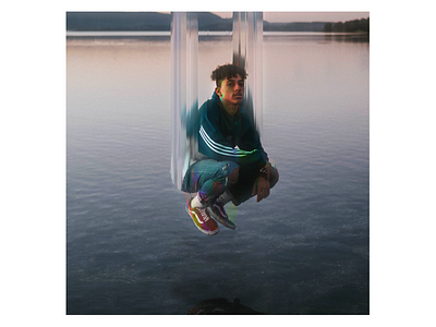
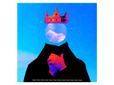
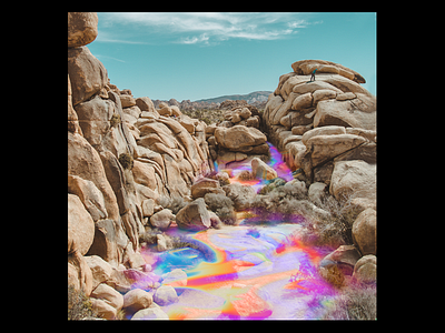
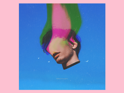
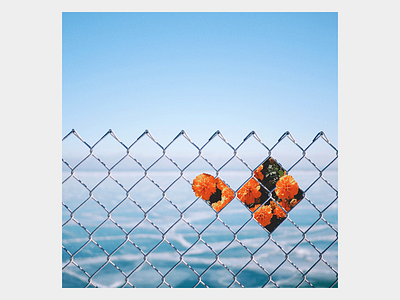
Filipino designer and artist Edwin Carl Capalla has been captivating us with his whimsical photo manipulation work for quite some time now. Get to know Edwin, what he’s up to, and learn how he got into the art of photo manipulation after starting out as a logo designer.
Who are you?
I’m a graphic designer based in Iloilo City, Philippines. I actually started out as an IT student, but after taking a web design and development class, I realized I had a passion for creating cool looking websites. It was also during that time that I stumbled upon a talk on Youtube given by Michael Bierut of Pentagram about his backstory on design. One of his ideas really struck me—it was him explaining that the process of compressing all of a brand’s ideas and personality into a little logo mark was amazing if you actually think about it. After watching that video, I felt motivated to design even more. I started to learn more about logo design, I bought many books, and I also started to watch more tutorials. Google was my friend back then and still is. I really enjoyed that phase of my career.
Fast forward a couple of years, I started to feel stale. One day, I stumbled upon Vasjen Kastro, more popularly known as @Baugasm. He was in the middle of a series where he created a poster every day for a year. I was really inspired by that and took it as an opportunity to learn. Before this, I was only using Illustrator to design logos and I was very inexperienced with Photoshop. I found the software very intimidating but nevertheless, I started to design a poster every day for a year and gladly I was able to finish the project. During that time I also landed a couple of other projects and got an offer for a remote design job. It was a pretty successful year. Right now, I’m in the process of completing my ‘experiment’ series where I create different album covers. I’m also planning to relocate to a different country for a design role. Things are looking pretty swell right now.
How did you get started with your photo manipulation work?
I have always been intrigued with artwork showing a balance between reality and imagination—the more you look at a simple effect, the greater it hits you with a wave of awe. This is the kind of artwork that I find most interesting right now. Slimesunday and Nevan Doyle are my favorite artists at the moment.
My photo manipulation pieces started with my experiment series. If you look deeper into my Dribbble profile, you’ll notice the art I created for my poster everyday series is more abstract, uses more light, form, shapes, and texture. My style was more playful back then. If you compare that to my ongoing series, you can still see some traces of my past self but I’ve decided to use more images. A mix of abstract, collage, and surrealism is what I want to achieve now. However, I still try to learn different techniques in Photoshop or other programs to keep things interesting and so I don’t get bored of using the same effect all the time.
Tell us about your setup. What tools do you use to create your work?
I share a setup with my brother, a birthday planner, who takes up half of the desk space. Sometimes his stuff gets onto my side and vice versa, but I try to keep it clean and tidy most of the time! As for hardware, I operate a Windows desktop because I find it easier than using a Mac. Attached to it are a Razer mouse, a keyboard, a pair of budget speakers, and finally my Wacom tablet. Most of my artwork is made on Photoshop with a mouse, but now I use a Wacom tablet. I bought one because I wanted to try drawing digitally thinking it would be a good start for a new series and good opportunity to learn a new skill. But I lost interest halfway seeing that I was too impatient to learn and draw in general. Right now, I just use the tablet with Photoshop for my experiment series.

What are your biggest sources of inspiration?
I don’t have a specific source of inspiration, but I try to take in all the different things I experience and see in books and in my daily life. This includes events that happen throughout my day, the things I read, and the people I meet—my girlfriend would be one of those people. In terms of platforms I use for inspiration, I mostly browse through Dribbble and Instagram. Unsplash is also another great platform for designers to source photos, and that’s where I usually find imagery for my photo manipulations. As for other designers who inspire me, the people that come to mind immediately would be Nevan Doyle, Slimesunday, Owen Davey, James Gilleard, Quentin Deronzier, and Garrett DeRossett.
Choose a favorite shot of yours. Why is it your favorite?
My favorite would definitely be Experiment #69 of my experiment series because the process was really interesting. I was having trouble with the overall design and trying out all kinds of different things like image overlays, playing with composition, and adding/removing typography. I became frustrated staring at the image of this woman and was about to close Photoshop when I thought of a really cool iridescent texture that would match perfectly with the photo. On top of that, the texture really complimented well with the curves of the face. The final piece is really up to interpretation but for me, it depicts a softness and blissfulness a woman is experiencing that no one can take away. I was really tired when I created it so after looking at it the next day, I noticed there were issues with the texture which wasn’t pairing up well with the blur. After a couple of weeks, I tried again and fixed all the imperfections.
Choose a favorite shot from another Player. Why do you like it?
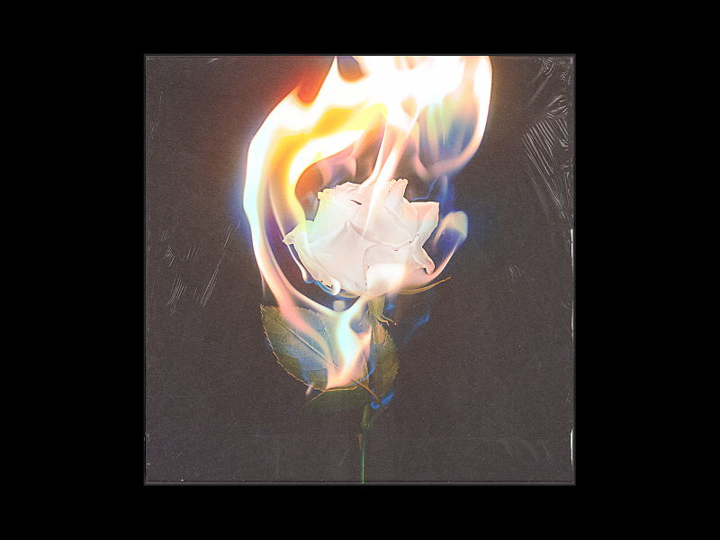
It has to be the artwork of Garrett DeRossett. I think the reason why I like his work so much is that he does album covers and anything album cover related is a hit for me. I also love the way he plays with his imagery. The effects he uses always have a textured, faded, dreamy, and minimal feel which I really resonate with. My personal favorite of his would be this piece where he depicts a flower on fire. The darkness of the background and the way it contrasts with the colors of the flame wrapping around the flower is just candy for the eyes.
Want to keep up with Edwin? Find him on Dribbble, Instagram, and purchase his prints on Society6.
Find more Interviews stories on our blog Courtside. Have a suggestion? Contact stories@dribbble.com.

