PageCloud is an intuitive website building tool on a mission to simplify the web building process for everyone. Their team puts a huge emphasis on User Experience and after chatting with PageCloud designers Mark Stephenson and Lexi Mercier, it’s easy to see where all of their passion comes from. Mark and Lexi are also artists outside the office and they aren’t afraid to use their other creative skills in their work at PageCloud. Keep reading to see what they’ve been up to and get a glimpse of what it’s like working at PageCloud!
Who are you and what is your background?
As the Chief Designer at PageCloud, I lead our creative and User Experience practice. This involves keeping a focus on the needs of our customers, developing empathy, and providing the best product experience possible. My background is in graphic design with twenty years of web and product design experience.
I’m also an artist—it’s been a constant throughout my design career and very complimentary. My art projects and installations often have a strong focus on User Experience and I find inspiration from my work in design. For example, the work I did at a social media monitoring startup inspired a project called Social Portraits where I painted people’s online social media photos (capturing their online persona) and exhibited them in a setting where visitors could add emoji stickers and talk bubbles. I believe strongly in giving back to the community. This is why I sit on the board for Arts Network Ottawa and I’m president of the international annual juried art prize called Figureworks.
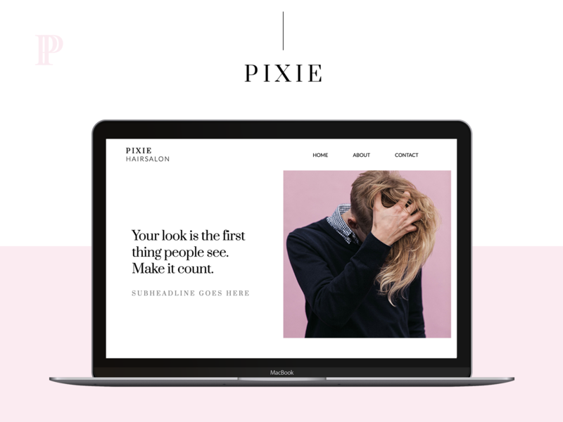
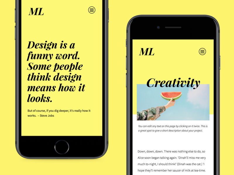
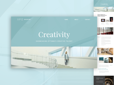
You could say that I have the best of both worlds; I focus on brand creative and web design. As a Designer on the Growth team, I help establish our brand’s voice and style and use it across our promotional material. I also have the beautiful responsibility of getting users excited about the possibilities of PageCloud by designing visually-appealing and user-friendly website templates. Users can then use these layouts as a starting point but they are encouraged to make it their own! I mean, how great is that? It’s always amazing to see what our customers come up with.
I get inspired by anything design-related, but my latest passion is photography which I share on Instagram. I like to escape the noise by spending most of my spare time outdoors, traveling, or with loved ones. In order to be the best designer I can be, it’s key to have a healthy work/life balance.

What’s new at PageCloud?
Mark: A few months ago, we released a new drag and drop form builder that has been really well-received. We are following that up with a substantial update to galleries. We’ve put something together that we are very proud of—it’s going to make it much easier for customers to create, style, and update galleries. Like everything we do at PageCloud, we try and go above and beyond what is currently offered by the market. For example, you will be able to drag a group of images off your desktop and automatically convert them into a styleable gallery.
Lexi: Lately, the team has been working really hard on improving the user experience and adding some pretty exciting features to the app. Marketing design has also been a huge focus. We recently launched a new home page which involved research, a content audit, new messaging, and fresh creative. By showcasing more of our UI, we aim to set better expectations for first-time visitors while familiarizing them with our product. We decided to use a timelapse video to showcase two use cases when building a website. The first part highlights a business owner modifying a template while the second part demonstrates the speed and flexibility of PageCloud for a creative professional building from scratch. This process was rigorous as the homepage acts as the first impression we have with potential customers. Every painstaking detail matters.
Choose a favorite shot of yours. Tell us why it’s a favorite.
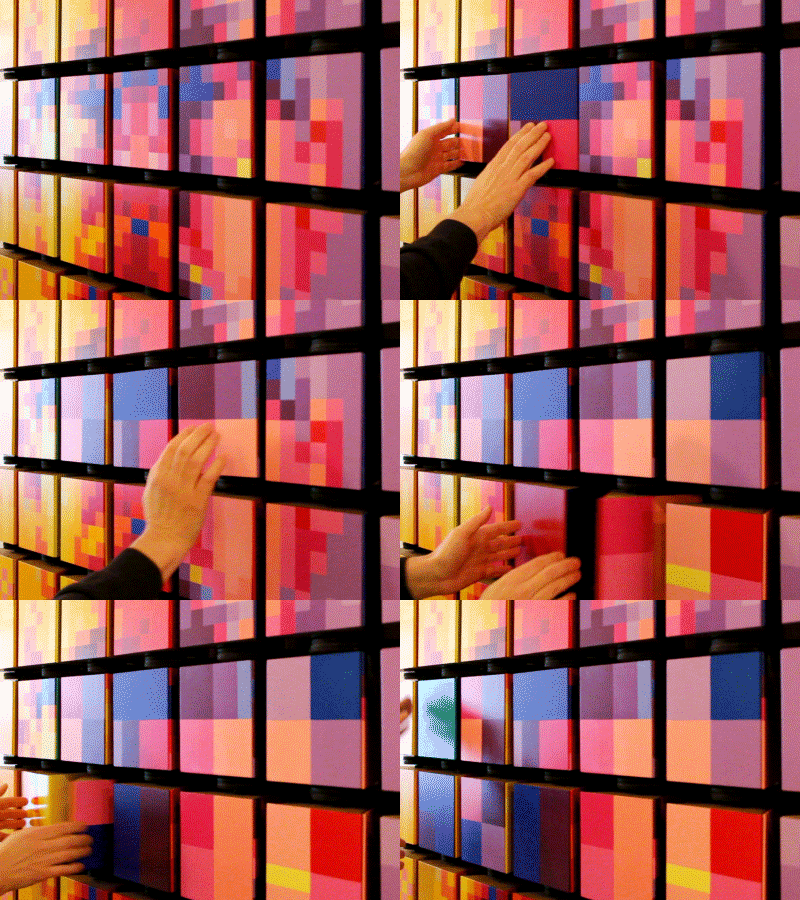
Mark: This shot is from an art installation I created a couple years ago called ‘M’. The installation was designed to engage a community of people around a shared experience. It’s created from a large grid of individual pixel cubes that visitors can interact with, creating countless possible permutations within the art. Each pixel had three ‘faces’ that the visitor could rotate and the overall grid had three large pixel portraits that visitors could discover and disrupt. I spent a lot of time considering and conceiving the experience. It involved quite a few prototypes along the way. The tactile and affordance was important; visitors needed to understand that yes, they can touch, rotate, and spin the pixels. Scale, size, design, and color played important roles.
Creative projects outside the workplace like this one often lead to innovation within. Exploring new materials, design concepts, and interactions along with discussion with colleagues all broaden a foundation of knowledge and experience that I draw upon daily at PageCloud. It’s important as a designer to have opportunities to explore creativity outside of the constraints of your day-to-day projects. Go define your own project, explore materials and process, you’ll certainly bring those learnings into your team.
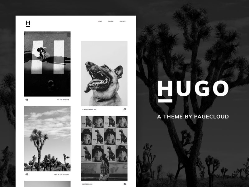
Lexi: As I mentioned earlier, I’m a big fan of photography which is why I’d have to pick the Hugo shot, which showcases a template I designed specifically for photographers. I’ve always been fascinated by classic photography and the contrast between black and white. Its two-column grid is simple but the vertical offset alignment of the images adds a modern twist to the page layout.
Tell us about your setup. What tools did you use to create the shot? (e.g. hardware, software, pens, paper, blowtorch)?
Mark: For the art project M, I used a variety of tools: Adobe Illustrator for design, an Epilog laser to cut out all the box pieces, acrylic paint, cardboard for prototyping, and wood and magnets to get the feel just right when people rotated the panels within the pixel boxes.
For design work at PageCloud, it’s pen & paper, Illustrator, Photoshop, Sketch, After Effects, InVision and I’ll do some work on our design system directly in code.
Lexi: I simply used PageCloud to create the actual template along with beautiful images from photographers on Unsplash. Photoshop was used for this specific shot. For other projects, I use my sketchbook, MacBook Pro, whiteboard, Post-it Notes, Adobe Illustrator, Invision, Screenflow, and After Effects (I wish I had used a blowtorch! Sounds fun.).
What’s the best part about working on the PageCloud design team?
Mark: We have a strong design practice at PageCloud. Design is a part of our DNA. We work in cross-functional teams bringing design knowledge, User Experience, and problem-solving into everything we do. Everyone is at the top of their game and after twenty years of experience, I’m still being challenged and learning every day. PageCloud is a deep product with a lot of interactions and UI. We’re continuously improving our design system and are seeing the payoff as we improve the experience and develop new product features.
Lexi: Creativity and culture inspire us daily. It’s incredibly exciting to play a part in the founding pillars of PageCloud. I have the opportunity to develop our brand’s look and personality and also watch how it evolves over time. At the end of the day, I have to give it to the team! Knowing that I am surrounded by such talented and determined individuals motivates me to do even more. We all work together towards a common goal of improving web design for everyone. So far, it amazes me to see what we have accomplished as a team and I cannot wait to see what challenges lay ahead!
Find PageCloud on Dribbble, Twitter, Instagram, and at pagecloud.com.
Find Mark on Dribbble, Twitter, Instagram, and at markbstephenson.com.
Find Lexi on Dribbble, Twitter, and Instagram.
Find more Interviews stories on our blog Courtside. Have a suggestion? Contact stories@dribbble.com.

