Terry Edward Elkins is a designer and illustrator based out of Alberta, Canada. His work is mainly inspired by nature and the beautiful landscapes of Western Canada. We’re so excited for Terry to share his illustration process and touch on one very common blocker in the creative process—imposter syndrome. Read further to see how Terry accomplished this stunning mountain landscape illustration:


The beginning of a project can be tough—especially if it’s a personal “for fun” project. It often starts with a confident “Let’s do this!” and unravels into a mess of “I’ve sat here staring at my screen for an hour and still nothing…” Sound about right? For me, the way up and out of this rut is actually pretty easy: Just pick something you’re interested in and draw it. Don’t over complicate it or finish it in your head before you’ve started. Over time, with practice and a tried-and-true process, it gets easier.
To put my money where my mouth is, I’ll be showing you a breakdown of my illustration process. Now you may be saying to yourself, “I’m a logo designer, not an illustrator, this won’t mean anything to me.” I’m actually a logo designer myself and believe me, there’s a ton of cross-over. Just try to look past the drawing parts and dig into the underlying concepts. Now let’s jump into my process:
Step 1: Where to begin?

Before I think of anything visual, I think of a subject matter. What’s a fun activity? Where does the mind wander to? For me, it’s nature or the outdoors—specifically the mountains in Western Canada. If I’m not in the Rocky Mountains, I’m dreaming of them or drawing them. Mountains are where my heart is and they are often the subject of my personal projects.
Now that I have the subject, I start thinking about visuals. Do I have a photo from a past hiking trip? An imaginary landscape in my head? Perhaps a blend of the two? Whether it’s a photo or a rough sketch of a made-up location, I take it and use it as the base layer within whatever vector software I’m using. I like to think of this base layer as my “under-drawing”. In terms of software, my go-to is Affinity Designer but an Adobe Illustrator and Photoshop combination works just as well.
Step 2: Blocking in basic shapes and working in grey color values

Using the rough sketch or photo, I start blocking in basic shapes in vector and working only in grey color values. Simple shapes in grey are all I focus on at this point. Working this way allows me to focus on a limited number of things: Creating the base of the composition and establishing depth and visual flow (how I want the viewer’s eye to move through the illustration). A lot of tinkering, adjusting, and some redrawing happens here.
I should note that it’s usually at the end of this stage when doubt starts creeping in. I’m insanely impatient and I constantly want to skip to the end where everything looks polished and pretty. I often find myself doubting the work and doubting my abilities at this point. It’s a struggle even with a tried-and-true process. If you’re the same way, try not to get discouraged.
Step 3: Applying gradients

After some hard looks in the mirror and repeating “I am strong and confident” two (or five) times, I move on to the next step which is adding gradients. I don’t use color yet—I still work in grey. Here I maintain the base shape layers and add the gradients as layers on top. These gradients will usually be black to transparent or white to transparent if I’m working in some gradated highlights. The gradients enhance the structure and depth to help establish lighting and mood.
At the end of this stage, I’m usually in much better spirits! I’ve gotten over myself and I’m usually pretty excited about where the illustration is headed. Once I finish up the gradients, I typically post to social media. I do this for two reasons: First, I want to share what I’m working on. At this stage, it looks like I may actually know what I’m doing and people might actually like it. Second, it forces me to commit to finishing the illustration.
Step 4: Time to color

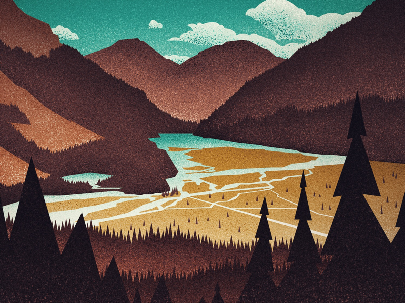
That’s right kids, time to color! My go-to in terms of color is a limited palette consisting of two or three colors, sometimes monotone. It really depends on the vibe I’m going for. For this illustration, I’ve used a rust, yellow, and teal color palette. For me, it’s usually a gut decision when I’m choosing colors but sometimes I’ll be inspired by images I’ve come across on Instagram or Dribbble. When on Dribbble, the color palette listed under shot tags is super helpful.
Looking at the illustration, I decided that I want the criss-cross of rivulets (the small stream-like elements) and the lake in the background to be the primary focus. I apply the colors to support this decision. All surrounding trees and mountains are tints of the rust. The yellow draws the eye to the valley and the rivulets, and their colors draw your eye to the lake. The color and gradient in the sky complement the colors in the lake.
Step 5: Applying texture and final adjustments

For the majority of my work, I choose between two texture types: I either use a noise effect that is applied over the entire illustration, a more selective spatter effect (almost like a dry-brush texture), or a combination of the two. I make sure to apply the spatter effect carefully as it’s fun to use but easy to get carried away with! If you also use Affinity Designer, you can find the noise effect setting located within the color panel. It’s super easy to apply and manipulate. As for my go-to brushes, you can find them on Frankentoon—they have some great Affinity Designer and ProCreate resources.
Once the texturing is complete, it’s time to sit back and take everything in. I’ll typically pick it apart and make small adjustments to tones, textures and a few details like adding the plane and jet stream to the sky—a recurring element in a few of my illustrations.
Final thoughts
To wrap things up, I’d like to offer my list of key takeaways:
- Make time for personal projects. While they may be time-consuming, you’ll find creative outlets integral to your well-being.
- Have fun with the process and don’t take it too seriously.
- Choose an idea and stick with it. Committing to a concept is more than half the battle already.
- Develop a process that breaks down your project into smaller, more manageable pieces.
- Trust the process and push through the hard phases—you’ll get there.
- Share your work and support others that are doing the same with words of praise and encouragement. Remember just like you, everyone else loves words of encouragement.
That’s all folks! I hope you walk away with some tips, tricks, and helpful bits from going through my illustration process. I’d love to connect on social media to see what you’re up to and reciprocate by sharing what I’m working on—don’t be a stranger.
Interested in connecting with Terry? Find him on Dribbble, Twitter, Instagram and at terryedwardelkins.com.
Find more Process stories on our blog Courtside. Have a suggestion? Contact stories@dribbble.com.


