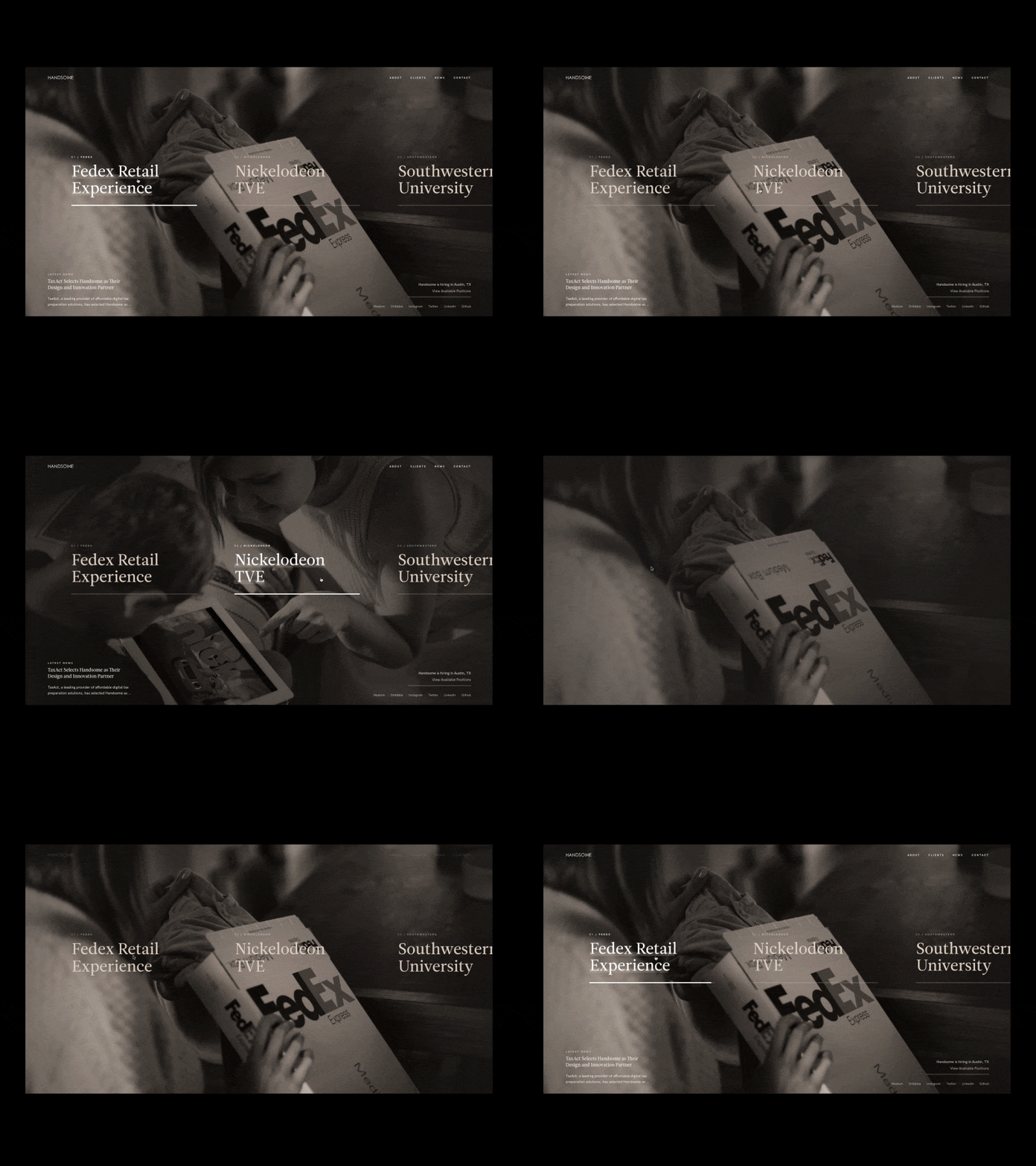
Handsome is a holistic experience design agency based in Austin, Texas. We’re so impressed by how Handsome operates as a team and puts an emphasis on collaboration and thoughtful approaches to each project. This is an agency that clearly values quality, human-centered design and it definitely shines through in their work.
Want to hear what the team at Handsome has been up to? Catch up with Co-Founder and Executive Creative Director Brandon Termini, and Product Designers Steven Hanley and Sam Thibault below. Also, don’t forget to check out the photos from their recent Austin Dribbble Meetup!
Who are you and what is your background?
As the Creative Design Partner at Handsome I work with our creative teams to build beautiful, thoughtful, and innovative brand stories for clients like FedEx, Facebook, Audi, Nickelodeon, and AMC. I initially joined Dribbble as an outlet for me to create conceptual work that I wasn’t able to do in my day job, and naturally started diving into the world of product design. Then in 2011, I started Handsome with three co-founders and have been leading the creative team ever since.
I’m a Product Designer at Handsome. I went to school for advertising at the University of Texas at Austin before starting my career as a designer working at a mid-stage startup in Austin post-graduation. I wasn’t originally hired as a designer, but after recognizing there was a serious lack of focus placed on the design aspect of our marketing and product efforts, I went out of my way to learn Photoshop to help out our Sales team. I guess my boss liked it. Eventually, I decided to move on and freelanced for about a year, working on a wide variety of projects including branding, web design/development, and mobile app design. I then set my sights squarely on landing a job at an agency and was lucky enough to get hired by Handsome.
I am a Product Designer at Handsome. I went to school at the University of Texas at Austin for computer science and advertising. I started my design career in high school doing freelance web design which fueled my interest in product design going forward.
What’s it like to work as a designer at an agency?
Brandon: What I love about Handsome is how tight-knit and collaborative the team is. We all push each other to be the best designers we can be. There’s truly no ego here, just a pursuit to improve our craft on a daily basis.
Steven: I love the pace and variety that comes with working at an agency. Having previously worked as an in-house designer, I knew that I wanted to find a place where I could broaden the scope of my project work and have the opportunity to work with a wide range of brands and industries. It’s impossible to get bored when you constantly have new clients and new opportunities to create something awesome. One reason I prefer it to freelance is the team atmosphere and the importance that everyone in the company places on design. Freelancing is a lot of bouncing your own ideas off of yourself. It’s amazing to know that I can go to anyone in the company and get thoughtful, intelligent, and creative feedback.
Sam: I really love the opportunities agency work offers over those at a strict product company. The range of products I get to touch and the challenges I encounter are amazing. Coming into the agency world as a young designer, this environment gave me a great way to learn and grow extremely fast. Agency work tends to be more fast-paced than other jobs in the industry, but being able to be comfortable with the unknown is definitely one of the keys to being successful.
Choose a favorite shot of yours. Tell us why it’s a favorite.
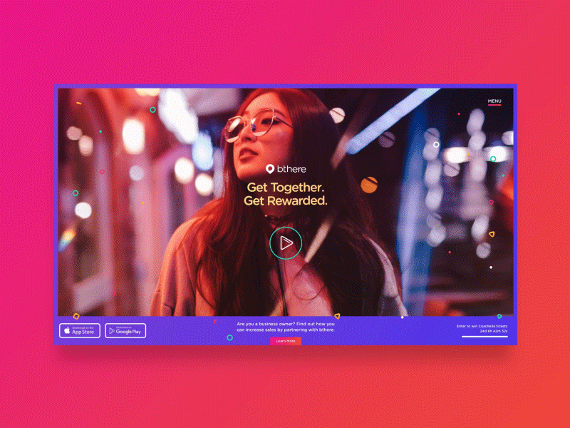
Brandon: This is a concept for a loading animation I created for one of our clients, bthere. I really love this shot because it was a ton of fun coming up with out of the box concepts for a loading state that tied back to the brand. Additionally, I had never really worked with character animations before, so it was a great opportunity to learn a new skill.
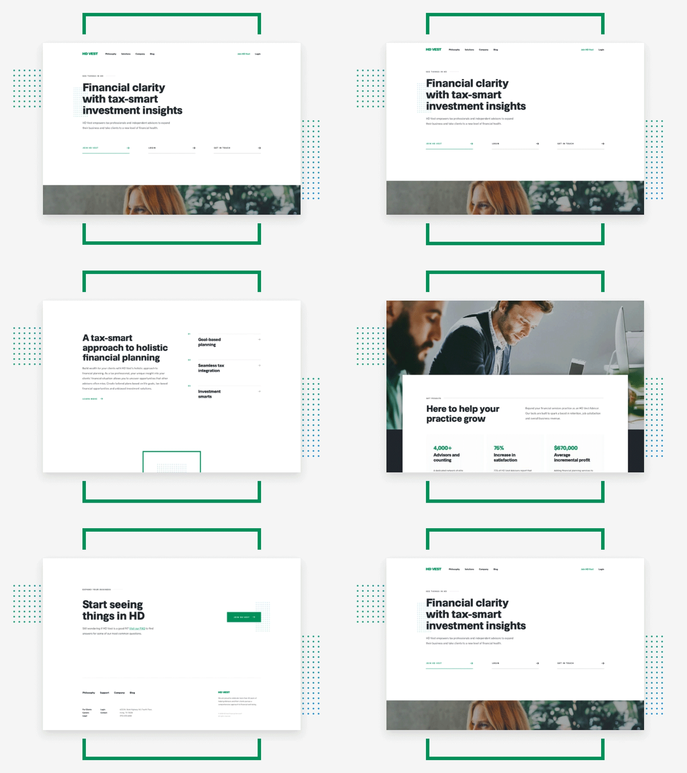
Steven: My favorite shot, or series of shots, comes from the HD Vest project. I was the primary designer on the project so I was responsible for most of the design and production of the website we created for the client. I also did a lot of interfacing with the client, which I tend to enjoy. It was really cool to see that site go live and receive such kind words from our stakeholders—the culmination of a lot of hard work by the team.
Sam: I really enjoyed producing this series of shots that centered around new ways to navigate within an iOS application we were working on. This also marked one of the first client projects in which we started to use one of the new interaction prototyping tools, Principle. In exploring these interaction concepts we were able to quickly mockup all these ideas, test with users, and present to the client in a matter of days.
Tell us about your setup. What tools did you use to create the shot (e.g. hardware, software, pens, paper, blowtorch)?
Brandon: Illustrations were made in Illustrator. UI designs were made in Sketch. Motion designs for the piñata animation were created in Adobe After Effects. Page transition interactions were created in Principle.
Steven: Sketch and Webflow are the two tools where I do most (if not all) of my production work in. I primarily use Principle for quick animation mockups, but Webflow has become increasingly powerful and sometimes I just dive right in to start creating something real.
Sam: All design projects I am on generally center around Sketch and Principle. I have been able to create a really efficient workflow utilizing plugins, like Invision Craft, to design, prototype and test relatively quickly. I use Principle on top of that to push animations further if needed to test out more complex motion concepts.

What’s the best part about working on the Handsome design team?
Brandon: The best part for me is that Handsome doesn’t operate like a machine with a list of services and processes. Every client and project is unique, and Handsome allows the flexibility to be nimble in their approach. The result is that engagements feel less like transactions and more like partnerships.
Steven: Something I love about Handsome is that we are always encouraged to set aside time outside of client projects to work on personal goals and hone our skills, both technically and creatively. The design leadership at Handsome is extremely thoughtful, motivating, and constructive. Everyone on the team is given the opportunity to provide suggestions or feedback, no matter how long or short you’ve been with the company. I remember distinctly a conversation I had with Brandon when working on a project a couple of months after I started. We had differing opinions on how something should be designed and after casually discussing for a bit, I decided to throw in the towel and basically said, “Alright, you’re the expert. Let’s do it that way.” Brandon swivelled around in his chair and said, “Don’t ever say that to me again. If you think you’re right then convince me. Don’t just design it my way because I’m your boss.” It sounds way more dramatic than it actually was, but at that moment I knew that I was working in a great environment.
Sam: Autonomy and sense of ownership are qualities I have always appreciated in the Handsome team. As a designer at Handsome, you are able to own your work and influence on a project on a level that fosters creative design and solutions.
Choose a favorite shot from another player. Tell us why you dig it.
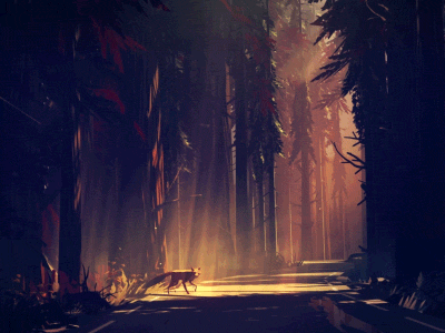
Brandon: This is one of my favorite shots of all time by Mikael Gustafsson. Where to start? I love this shot, first of all, because it’s something so outside my wheelhouse. I can’t imagine the patience and time it takes to create a full 3D scene like this. I also love the fact that even though it’s 3D, his style feels more flat and illustrative. Seriously a masterpiece.
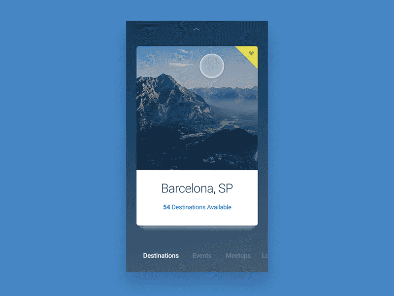
Steven: This is basically an impossible question because there’s so much incredible work out there, but I love this shot from Valentin Salmon. There’s so much to this. You have a cool card-based navigation pattern. The illustrations are great and animated. Satisfying micro-interactions. Smooth page transitions. Overall, the interface is minimal but well branded. Just a quality shot from top-to-bottom.
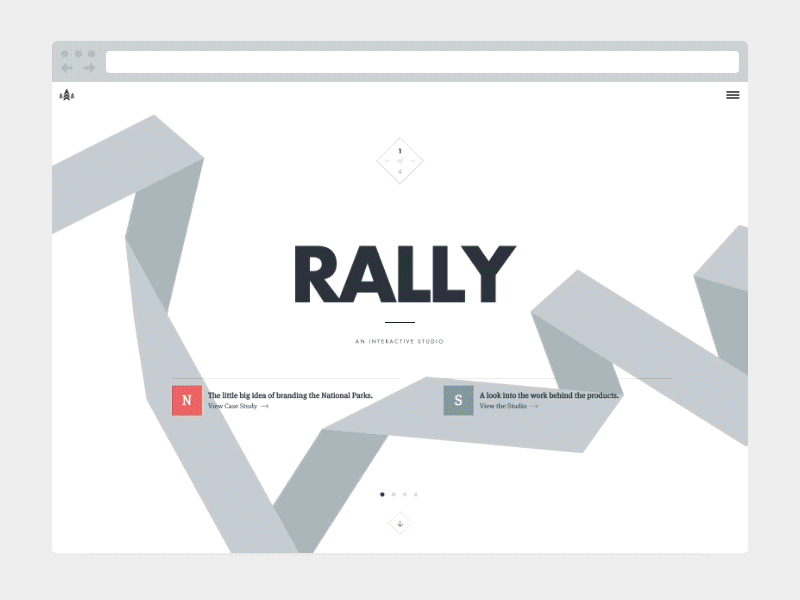
Sam: I really enjoyed seeing the production of one of the last iterations of the Rally Agency site. The creative design and development were really inspiring and definitely made an impact on some of the projects I have worked on.
Find Handsome on Dribbble, Twitter, Instagram, and at handsome.is.
Find Brandon on Dribbble, Twitter, and Instagram.
Find Steven on Dribbble and Twitter, and at steven-hanley.com.
Find Sam on Dribbble and Twitter.
Find more Interviews stories on our blog Courtside. Have a suggestion? Contact stories@dribbble.com.
