Who are you?
Hey, I’m Renee! I manage the content for the Dribbble’s Blog and I absolutely love it. I currently live across the bay from San Francisco in Oakland, California. In my free time, I enjoy designing logos for friends and family and dabbling in vector illustration work. I’ve always loved being creative, although design and illustration is something I only got into after graduating college (with a completely different degree)! Dribbble has been a huge source of inspiration for me on my design-learning journey, so I feel extremely lucky and happy to be a part of the team now!
What are you working on?
For a while now, I’ve been brainstorming on a series of illustrations that I’d like to start. I love series projects and I’m inspired by great ones like Windows of New York and Brewskies. Traveling and exploring different places is a favorite hobby of mine, so I’d like to create a series of prints representing different cities. I’ve got a few sketches in the works, but what I’m struggling with now is envisioning a cohesive and unique style the prints will have. We’ll see how it goes, stay tuned!
Choose a favorite shot of yours. Why is it a favorite?
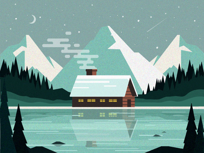
My favorite shot is Cabin in the Woods because I was genuinely surprised by the outcome. I can’t tell you how many illustration pieces I’ve started and given up on because I’m not able to execute exactly what I imagine in my head. With this illustration, instead of creating something that so specifically followed my sketches and notes, I let my process be more flexible and fluid. Rather than writing off my original idea when things weren’t looking so great, I transformed certain elements to turn them into something different and eventually better. All of this to say, the illustration turned out totally different than what I had envisioned. Funny how that works! Ever since creating this piece, I’ve tried to not be so hard on myself during the design process.
Something I read in an art book recently that really stuck with me when I was creating this illustration is the concept of the U curve:
“When you begin a piece of art you are at the top of the U. Things look clean and wonderful in the beginning. But as you develop a piece of work, it often gets messier; that is the bottom of the U curve. Working through the bottom of the curve—the point at which we think our work looks horrible or awkward—is critical to making good work.”
Easier said than done, but this is what I’m constantly trying to keep in mind during my creative process!
Tell us about your setup. What tools did you use to create the shot (e.g. hardware, software, pens, paper, blowtorch)?

My set up is pretty simple: pencil and graph paper for rough (and very quick concept sketching), then straight into Adobe Illustrator. I have a mouse connected to my laptop which I try to use—but what usually ends up happening is I start to feel my pinky finger hurting and realize I’ve subconsciously moved to the trackpad!
Choose a favorite shot from another Player. Why do you dig it?
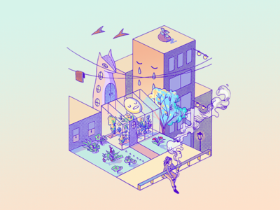
I love so many things about this shot by Jenny Yu. First of all, I’ve always admired isometric design because it seems very challenging to execute. But on top of that, I love how she’s used both gradients and texture, and how intricate the details are. You can just stare and stare at it for a while and keep noticing new interesting things to look at. The color scheme also hits home for me. This is the kind of uniqueness I want to strive for in my work.
Want to keep up with Renee? Find her on Dribbble, Instagram, and LinkedIn.
Find more Interviews stories on our blog Courtside. Have a suggestion? Contact stories@dribbble.com.


