Here at Dribbble, we’re big fans of Flow, an app for project and task management for teams. Full disclosure: we use it for all of our project management, and we even already wrote about it.
We decided it was time we talk with Product Lead Jesse Herlitz, and Product Designers Emma bell and Saransh Sinha of the Flow Team to find out more about how they work, and their process.
Who are you and what is your background?
I lead the product team at Flow. My background is in iOS interaction and visual design. Started out doing agency work after being an Apple repair tech for 5 years in Seattle. I used to run the product design team at Starbucks, and spent a little time at Simple before joining Flow a little over 2 years ago to try the product thing.
I work on the product design team at Flow, focusing on our web app. Before that, I did agency work at MetaLab for a few years. I’m mostly self-taught; my love for design first started when I became obsessed with customizing my MySpace profile as a teenager. I studied business in college before dropping out in my final year to start a freelance gig, building websites for small businesses around my hometown. It wasn’t until I scored an invite to Dribbble, actually, that I was hired for my first big design role though!
I’m a product designer at Flow, and I focus on our mobile apps. I studied Computer Science in college while designing and developing for startups from my dorm room. Like most designers, my interest in designing things started with a bootleg copy of Photoshop in high school. When I first started working as a front-end engineer and designer at a startup in Bangalore, I realized how much more I enjoyed the design aspect of it all. Oh, and I’m also one of the only Flow employees on this side of the planet.
What’s new at Flow?
Jesse: This latest effort is one of our biggest undertakings so far. We were outgrowing our interface, so we decided that now is the time to molt and grow a new one. The navigation changes make it a lot faster to get to the features people use the most, and also give a lot more visibility to what’s going on with your team. We added some new features too that help people plan work much more efficiently.
Choose a favorite shot of yours. Why is it a favorite?
Jesse: We added color to projects, and wanted every interaction with color to be fun. This was a collaboration with Emma Bell — who spent a fair amount of time trying to pick colors that are both nice to look at — and color blind safe for most people.
Emma: I like this illustration because it is kind of fun and silly and doesn’t take itself too seriously. It also demonstrates one thing that Flow is about: that productivity can also be fun and an interface that you spend most of your day looking at should make you smile. And also, cats!
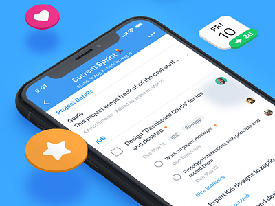
Saransh: It has to be this. Firstly, because it was the first time I was sharing something I’ve worked on at Flow. But also because it illustrates what we’re trying to do with our redesign – focusing on what’s important. In a pretty way!
Tell us about your setup. What tools did you use to create the shot (e.g. hardware, software, pens, paper, blowtorch)?
Jesse: Sketch and Principle.
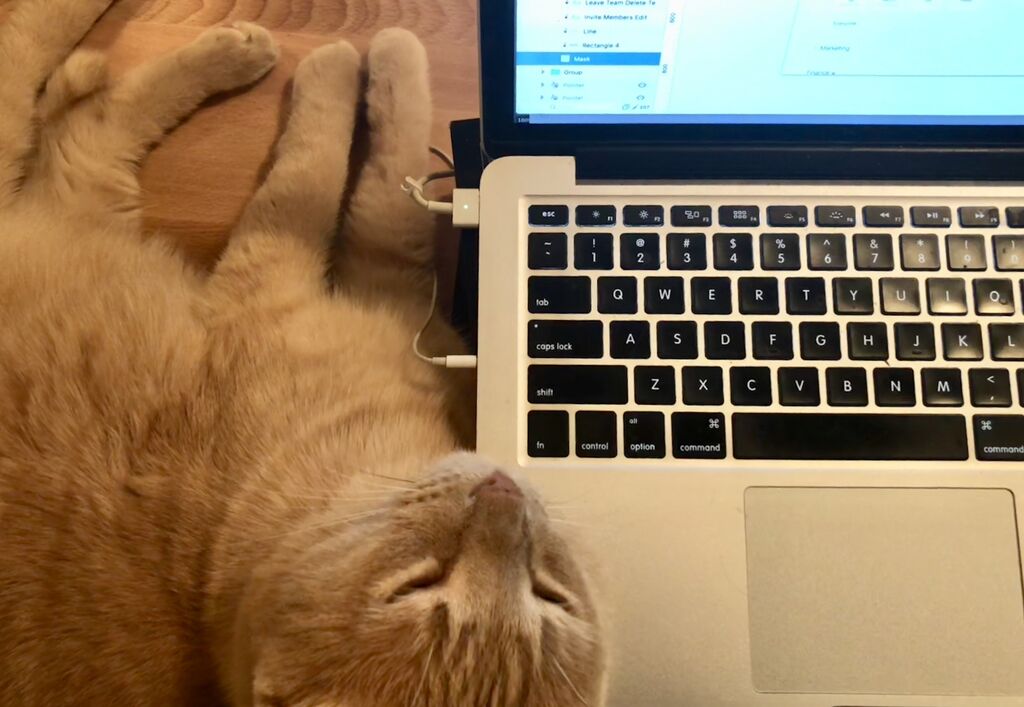
Emma: I work on a Macbook Pro and use Sketch the majority of the time and Illustrator for any vector drawing. I’m also often accompanied by this fur ball, Hobbes.
Saransh: I use Sketch and Principle for designing and prototyping micro interactions. For this shot, I used Sketch and Photoshop.
What’s the best part about working on the Flow team?
Jesse: They all really give a damn. Everyone here is very kind and thoughtful. We’re a very solution oriented bunch. I love these people and consider them family.
Emma: Working on the Flow team is just the best in all ways. There is a lot of mutual respect and kindness among everyone on the team, we’re like a little family. I also love working on Flow because of the hard problems we’re trying to solve — no two people work quite the exact same way, so designing a productivity app that can adapt to multiple varieties of teams and workflows is a humbling challenge.
Saransh: It’d have to be how much they all care – about each other, design, customer feedback, among other things. Since I come from a different work culture, I appreciate this a lot. I also love the fact that we actually use what we are building. Using Flow has given me the freedom to be anywhere in the world and still keep things on track. I’ve had the pleasure of attending our team calls from 5 different time zones.
Choose a favorite shot from another player. Why do you dig it?
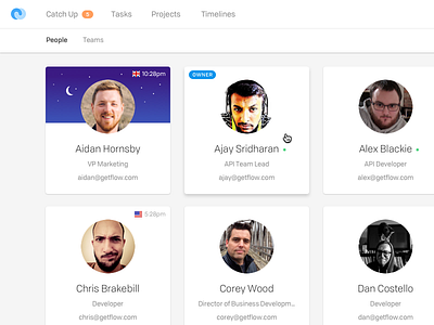
Jesse: Our goal with Flow is to help people be good to each other. Work is so much more fun when people are thoughtful and kind- so small details like showing which people might be sleeping in another timezone really make me smile. This idea didn’t come from me, which is another reason I love it. The execution of the design was also further refined by a suggestion from one of our engineers. It’s a portrait of our values, of why I love working at Flow so much.
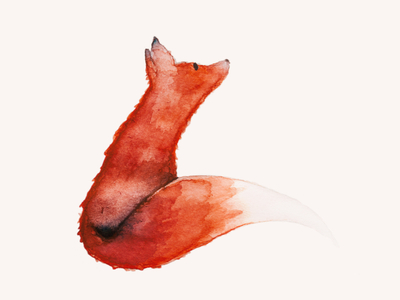
Emma: I really like this shot because I love the texture of it, and I’m a sucker for animals as you can tell, but I always find it really cool to see examples of different mediums designers work in besides just a screen.
Saransh: I might be a little biased, but it would have to be my fellow designer, Emma Bell. I love the sparse but intentional use of color, and the white space just makes me happy. Productivity tools often get too complex for their own good. We try to get out of the way and help people work on the important stuff.
Find Flow on Dribbble, Twitter, and at getflow.com.
Find Jesse on Dribbble, Twitter, and at herlitz.co.
Find Emma on Dribbble and Twitter.
Find more Interviews stories on our blog Courtside. Have a suggestion? Contact stories@dribbble.com.

