Who are you?
I’m Jon Ezell, a Senior User Experience Designer currently living in Portland. I grew up in Orange County and fell in love with design while I was in high school. When I started, I primarily focused on branding and print but over the course of time designing for digital platforms has become my passion. I love the the tech industry because it is always growing and changing. I love how every day there is a new device, platform, app or tool that has been created. The possibilities in the tech industry are endless. Because everything is digital and moving so quickly, it feels like the only limit is your imagination. That feeling makes it all really exciting. In the last few years, I’ve had the privilege of designing apps, websites and digital experiences for some amazing companies including: Billabong, RVCA, Element Skateboards, VonZipper and now Nike.
What are you working on?
After recently joining the incredible team at Instrument, I’ve had the privilege to work with Nike on a daily basis. While I can’t go into specifics yet, I can say we are designing the future of Nike+, Nike Run Club, and Nike.com. Working with Nike and the team at Instrument has been an incredible experience. The expectations and standards are set high, it pushes me to expand my thinking further than I thought I could go. Stay tuned!
Choose a favorite shot of yours. Why is it a favorite?
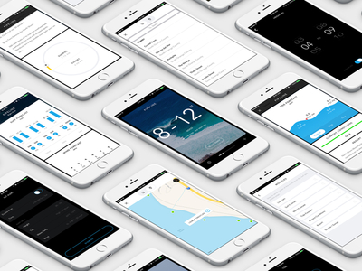
The Billabong Surf Report was one of my favorite projects to work on while I was at Billabong. I had the privilege to work under Austin Neill who gave me a lot of freedom to create the app from scratch without any limits. Because of that creative freedom we got to explore a lot of interesting ideas including Augmented Reality. After finishing the design process we got to work with our friends at Rally Interactive, who we met at Epicurrence, to help us refine some of the interactions and kick off dev for the app.
Tell us about your setup. What tools did you use to create the shot (e.g. hardware, software, pens, paper, blowtorch)?

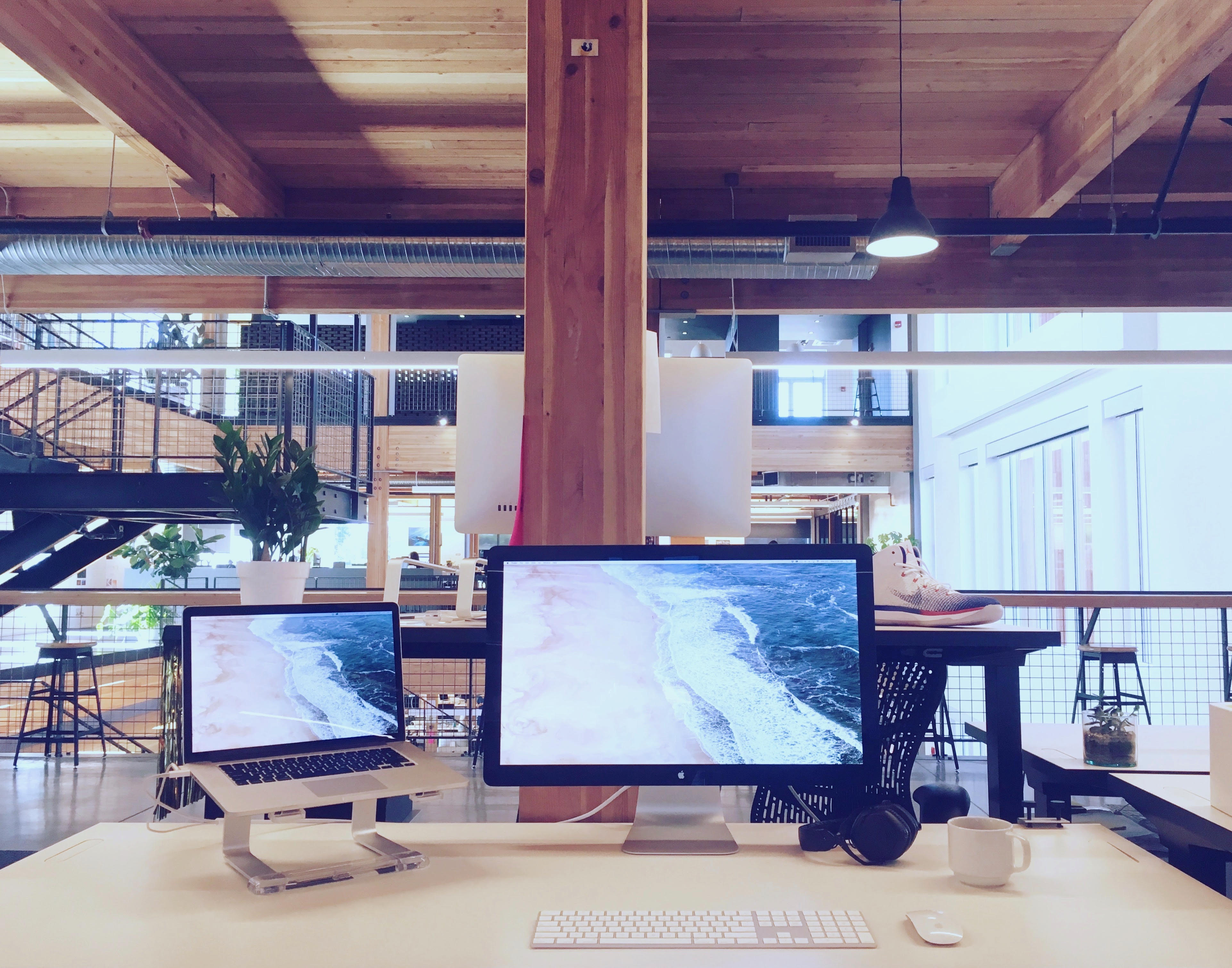
I have a pretty classic setup with a 15” Retina MacBook Pro and a 27” Thunderbolt Display. I keep a minimalist desk with only the essentials. This helps me focus on the design without any distractions. In terms of software, we used Sketch to design the app and we prototyped it in Pixate (#RIP). That allowed us to have a fully robust demo of the entire app before we kicked off development.
Choose a favorite shot from another Player. Why do you dig it?
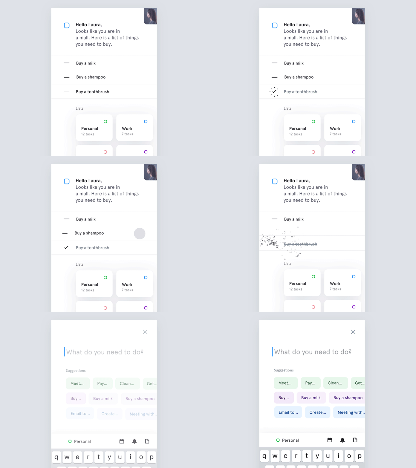
Right now one of my favorite shots is Jakum Antalik’s “Microinteractions for to-do list app”. I love the cleanliness of the design and the thought through micro-interactions. His attention to detail is really inspiring!
Find Jon on Dribbble, Twitter, and at jonezell.com.
Find more Interviews stories on our blog Courtside. Have a suggestion? Contact stories@dribbble.com.


