
Lingo is the cloud-connected visual asset library that helps design teams establish and maintain their visual languages. Founded by the folks at Noun Project, Lingo empowers creation and ensures visual consistency for entire teams.
Want to know what the Lingo team is working on right now? We chat with a few members of their design team below.

Who are you and what is your background?

Hello! My name is Kimi Lewis, I’m the marketing manager here at Lingo HQ and my background is in branding. Ever since I can remember I’ve been fascinated by symbolism and systems which is probably why I ended up as a brand designer and thinker, developing visual languages for businesses.
 Henrique Ourique
Product Designer who does UX, UI, and some Frontend • 10+ years of experience • Currently at Good Money. Previously at @lingoapp by @nounproject. Worked/lived in US, Spain, and Portugal.
Henrique Ourique
Product Designer who does UX, UI, and some Frontend • 10+ years of experience • Currently at Good Money. Previously at @lingoapp by @nounproject. Worked/lived in US, Spain, and Portugal.
My name is Henrique Ourique and I am the Product Design Lead at Lingo. I’m currently based in Los Angeles, but before I lived in Spain and Portugal where I did a mix of agency and in-house work. When I’m not obsessing over design systems, consistency and efficiency, I can be seen either chillin’ with my wife or at the skatepark.
How does Lingo make the design workflow easier on teams big and small?
Kimi: Assets no longer need to live in style guides, hidden in folders or archived in emails. Lingo has everything an entire team needs to develop and maintain a visual language.
Lingo makes designers lives easier by allowing everyone on their team instant access to the design language; from logos to marketing materials. Instant access allows them to spend less time worrying about dispersing the visual assets and more time being creative and looking forward.
Henrique: Lingo helps design teams ensure consistency at scale by allowing them to build a central design library that is accessible and usable by their entire organization. This library establishes a common set of assets to work with which in turn empowers everyone – from design to marketing and engineering to management – to create on their own, knowing that the result will be consistent with the overall experience.
Choose a favorite shot of yours. Why is it a favorite?
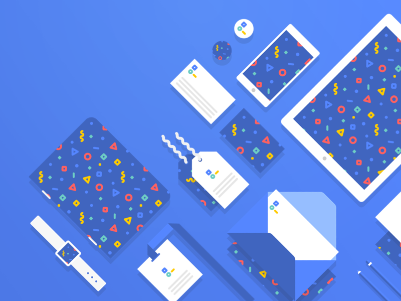
Kimi: My favorite shot is one Henrique and I collaborated on recently showcasing how Lingo helps design teams and businesses maintain visual consistency across multiple touchpoints from digital to print.
Henrique: I never considered myself much of an illustrator, but redesigning Lingo’s Marketing Site a few months ago forced me to get out of my comfort zone and sharpen my skills. One of the goals of the redesign was to convey the idea of consistency in “design language” and that’s what I tried to communicate with this illustration. I think most designers out there can identify with the metaphor being presented so I would say this is a pretty successful illustration. Also, this was my first shot for the Lingo App team so it gets extra love.
Tell us about your setup. What tools did you use to create the shot (e.g. hardware, software, pens, paper, blowtorch)?
Kimi: White board to illustrator!
Henrique: I used a combination of Sketch and Illustrator. Sketch to create the overall composition and the different objects (phone, tablet, notebook, envelope, tags, etc.). Illustrator to create the repeatable confetti pattern which was then used in Sketch as a pattern fill.
What’s the most challenging part of your job?
Kimi: Great question. I’m also in charge of Lingo’s blog at the moment so it can be challenging at times coming up with articles that are both educational and interesting for the design community.
Henrique: Convincing everyone of the importance of stopping to rethink parts of the customer experience with a holistic mindset. It’s far too easy to ship something new every day, never look back, and ignore the complexity creeping in. The more complex a product becomes, the more holistic your thinking has to be. This is the only way to ensure a great experience, from start to finish.
Choose a favorite shot from another player. Why do you dig it?
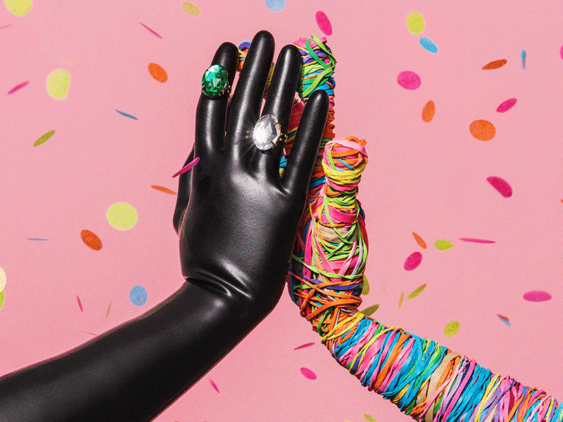
Kimi: I don’t know what’s going on there but I like it. I love Headspace’s whimsical illustrations and the visual language they’ve developed over the years. Recently I’ve seen more photography introduced into their system which has given them a more mature edge.
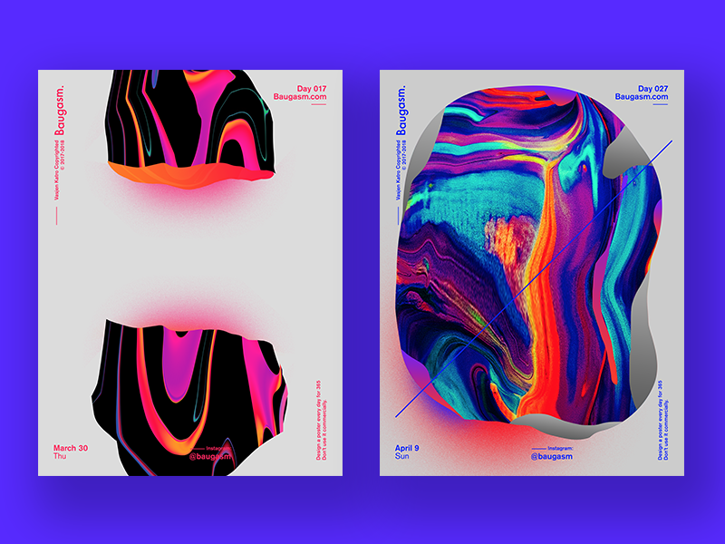
Henrique: I find the posters in this shot by Vasjen Katro mesmerizing and soothing in unexpected ways. The bold colors and the visual contrast hold my attention hostage while the weird melting effect pulls me in and relaxes my brain. It’s like a trip in a Dribbble shot. I must confess that I do have a soft spot for poster design so I’m a little biased.
Find Lingo on Dribbble, Twitter, and at www.lingoapp.com.
Find Kimi on Dribbble, Instagram, and at www.kimilewis.com.
Find Henrique on Dribbble and Twitter.
Find more Interviews stories on our blog Courtside. Have a suggestion? Contact stories@dribbble.com.


