Who are you?
I am James Louis Walker, a designer and educator originally from Saint Louis who now resides in sunny Austin, Texas. I split time between my studio practice, Husbandman, and teaching design and interaction at the University of Texas at Austin.
What are you working on?
Over the summer, David Rygiol and I started Type Hike: a typographic exploration of our National Parks. Much of my time is devoted to organizing exhibitions, press, and individual inquiries. We’re both really proud of the response and the work made for the project, with 100% of proceeds going to the National Park Centennial Fund. The show represents all 59 National Parks, plus a Centennial poster, from 60 different designers including: Lauren Dickens, Keith Young, Matt Plays, Lauren Coggins, Fuzzco, Other-Studio, OMFG Co, Jessica Hische, and David Carson!
Beyond Type Hike, Husbandmen is working with several clients on packaging, illustrations, branding, and advertising. Always doing my best to keep things playful, never stagnant.
Choose a favorite shot of yours. Why is it a favorite?
Recently, I was approached by the University of Texas to create a birthday card. The brief was open, but they wanted something memorable. Years ago, I put together a small website called Scroll Slow Have Fun, and have been wanting to do a print version of that site ever since. I create a series of small vignettes that, as you slide a piece of transparency over them, animation to create an exciting interaction.
I enjoy connecting the expectation of rich media from screen-based projects with print - how can we make print more engaging beyond good design?
There is a video of it in action here: http://www.husbandmen.com/#/university-of-texas/
Tell us about your setup. What tools did you use to create the shot (e.g. hardware, software, pens, paper, blowtorch)?

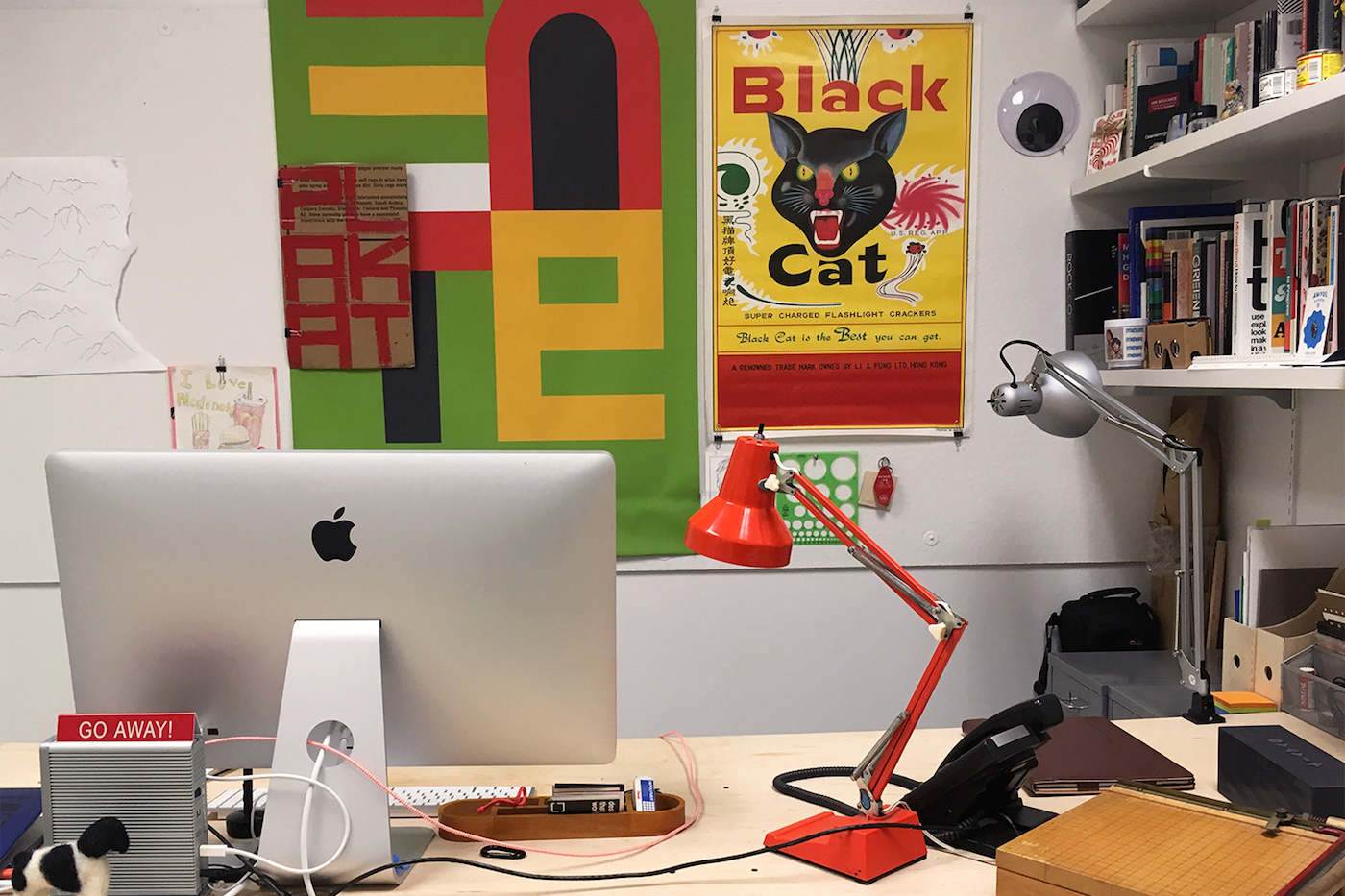
This year I custom-built a 4’x8’ table so I would have more room to draw, cut, and make. Beyond a standard setup of computer + monitor, I generally sketch on canary paper allowing me to layer sketches as a I refine. I also use an iPad Pro with iPencil for some illustration work as it outputs directly to Adobe CC. A good set of headphones keeps me focused.
The birthday card required about 25 iterations to get the sequencing right. Everything was hand-cut at first, then moved into digital where things could be tightened up. Originally, the idea was to create a birthday factory, with small packages filled with cakes being wrapped by a robot. It proved too complex for this treatment, so had to move to more abstract shapes.
Choose a favorite shot from another Player. Why do you dig it?
Honestly, anything coming from Other-Studio or Eileen Tjan catches my eye. There’s a lot of derivative work out there, which I am also guilty, but I find Other’s work refreshing, exciting, and always fun. They are doing a great job of creating work that challenges, but still meets the needs of a client.
Find Husbandmen on Dribbble, on Twitter, and at www.husbandmen.com.
Find more Interviews stories on our blog Courtside. Have a suggestion? Contact stories@dribbble.com.


