We’ve all used a dashboard at some point, right? Dashboards are a part of our day-to-day now—whether it’s a dashboard for tracking your time at work, monitoring your health and exercise habits, or even checking on your finances in your bank’s mobile app.
Maybe you’ve even designed a few dashboards yourself. If so, you know that dashboard UIs are complex and often challenging to design. It can be tricky to display a massive amount information in a way that’s cohesive and easy to understand.
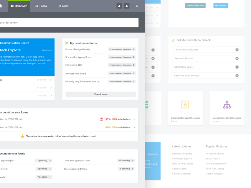
We’ve gathered shots from a few skilled dashboard designers in the Shot Block below.
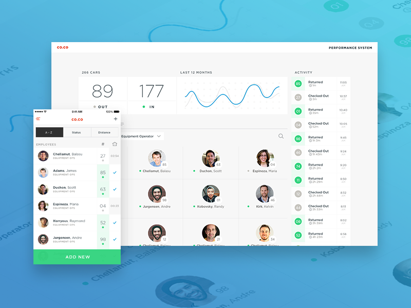


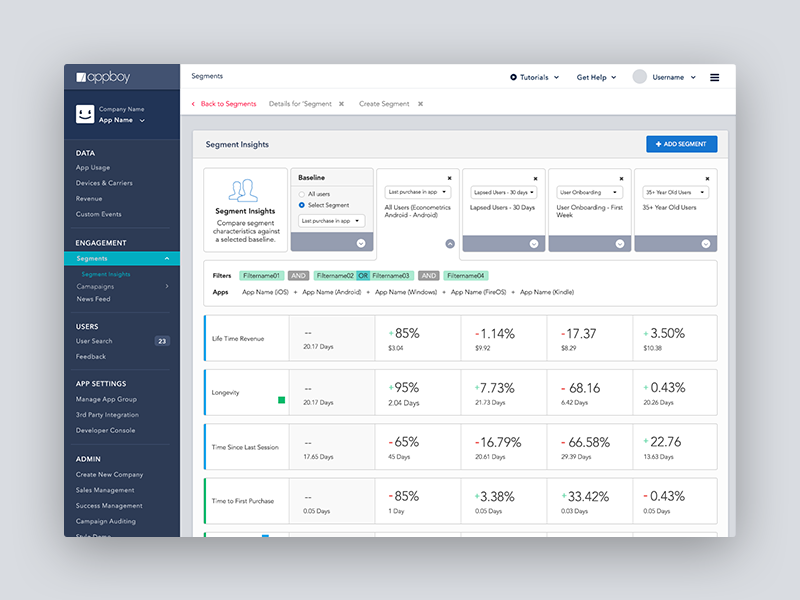
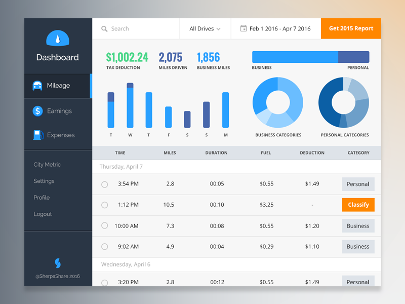

Top: Hayden Bleasel, Rick Messer for Funsize, Adam Czajkowski for Symu.co. Center: Amit Jakhu for My Planet, Adam Deutsch for Handsome, Jordy Arnoldussen for Formstack. Bottom: Rachel Gelb for Appboy, João Oliveira Simões for 44 Studio, Alisha Ramos.
Find more Inspiration stories on our blog Courtside. Have a suggestion? Contact stories@dribbble.com.


