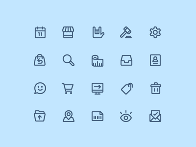
Up today in our Designing Icons series: Zach Roszczewsk! Tune in tomorrow for our final installation, with Anne Ulku.
For this project, the goal was to create a consistent family of icons that were friendly and approachable, while keeping the designs simple and professional. I have found three main areas of focus for creating a series of icons that will aid in keeping them consistent and unified.
1. Line Weight
When creating icons, keeping consistent widths of elements will help tremendously with the overall balance of the set. Therefore, every line used to build these icons is set at a 2px width. This automatically creates a consistency within your icons and makes them feel like a family.
2. Amount of Detail
In order to create an overall weight consistency amongst the icons, the amount of detail in the icons comes heavily into play. If one icon is more detailed than the others, it will stick out from the rest of the set like a sore thumb. My main strategy is to keep in mind the amount of detail being used for the icons as I build them. If I feel an icon is too simple, I will add an element of detail to give it some extra weight. Reversely, if the icon is looking too detailed, I will dial it back and remove an unnecessary detail. Reviewing the icons as a whole while building them will help you keep an eye on consistency. If you find an icon that is sticking out, chances are it is more detailed or less detailed then the rest.
3. Corner Radius
This is a key factor in creating consistency as well as determining the type of style or vibe that the icons give off. If you use straight edges, the icons will feel very professional and crisp. On the other hand, if you use a large corner radius it will make the icons feel more playful and approachable.
Since this project called for a friendly and approachable style, and at the same time keeping things professional, it made sense to find a sweet spot in the middle. Therefore the end result was a 1.5px corner radius. This number tends to be the sweet spot for me, as it softens the corners slightly, making it friendly and fun, but not too much to where it starts to look bubbly and unprofessional.
When line weight, detail, and corner radius are implemented consistently, you will be well on your way to creating a consistent series of icons.
More Zach
Even More Zach …
… at Dribbble, on Twitter, and at zachroszczewski.com. See more of his work at flaticons.co and take a sneak peek at his Moji app, “the app that contains all the emojis you always wish you had, but don’t currently exist.”
Read the rest of the Designing Icons series - Introduction and Designing Icons: Jory Raphael.
Find more Process stories on our blog Courtside. Have a suggestion? Contact stories@dribbble.com.


