Yesterday four motion designers shared a few basic tenets of their craft. Today, those four designers provide particulars, using their own work as example.
In general, my process always begins with looking at the design (if I design it myself, I’ll design with animation in mind), brainstorming in my head and picking out the parts that will really help the animation sing. For example, in the case of my Lady Liberty animation, it was the arm and the flame, which also happens to be the focal point of the design.
I’ll then construct the animation around that, animating everything else in a more simple, understated way. Once I have a rough idea of what I want to do, I’ll just start animating. I’ll normally come up with new ideas along the way after seeing things actually move on screen, and then implement those ideas too, so it’s a pretty ad lib sort of process ultimately.
In their book [The Illusion of Life: Disney Animation(http://www.amazon.com/The-Illusion-Life-Disney-Animation/dp/0786860707)], the great Disney animators Ollie Johnston and Frank Thomas developed 12 principles of animation which address physics, appeal and emotions of the animated subjects. Although these were initially made for traditional animation, they also greatly apply to UI animations and every other design in motion.
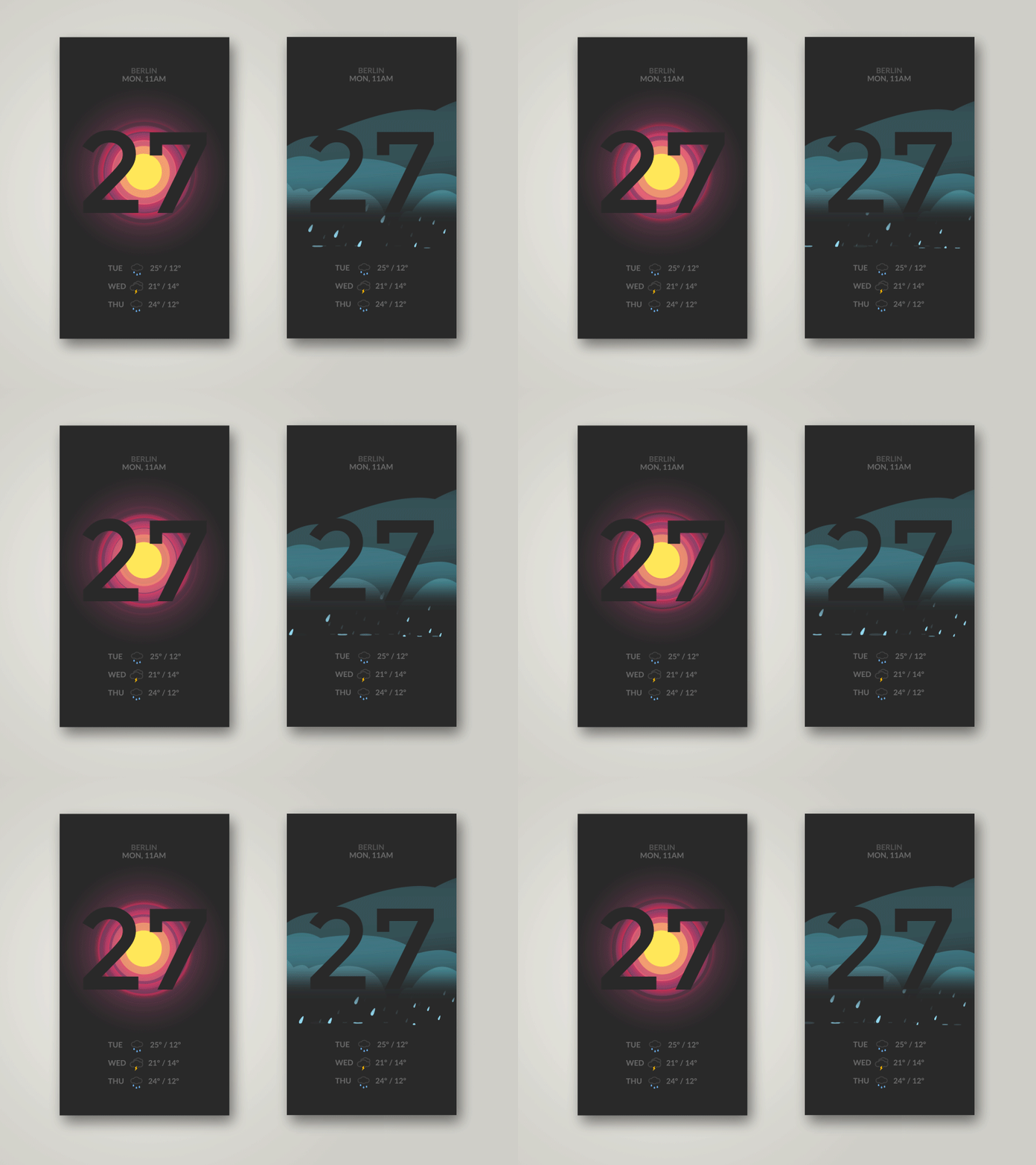
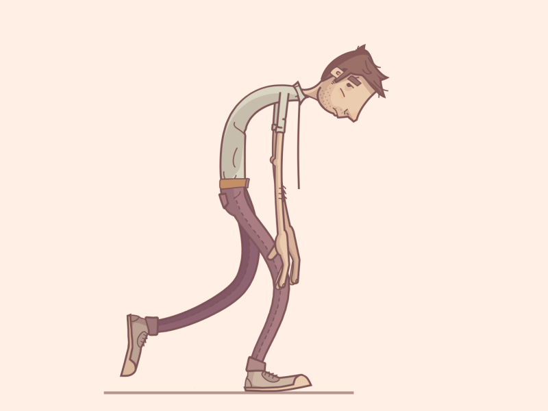
Based on my UI Weather App shot and my character walk cycle Depressed Slurp Cycle, I want to show how four principles relate to these different subjects.
Appeal: This is a crucial point for building the connection to the audience — creating visually interesting and appealing content through form, color, surroundings and the charisma of the action. Those build the foundation for animations. This way motion becomes emotion.
The goal for the depressed guy was to make the viewer feel sorry for him. The Weather App animations visually support dry data numbers in subtle manners.
Timing: Subconsciously, we know how the laws of physics behave on objects through lifelong observation of our environment. Correct timing gives the impression that these laws are fulfilled. But this doesn’t mean everything has to obey the laws of earth gravity! As long as the timing is right within its own “micro universe” and among the elements in the scene, they appear right.
Playing around with these laws of physics and using them correctly, timing is a great tool to deliver and set a mood. Heavy bodies and low gravity feel more intense and are more likely to be connected to sadness than joy. That is why I decided to go for a deep center of gravity and low muscle action for the depressed guy, to display that “weight of the world” on his shoulders. The rain for the weather app is slowed down to make the screen calm and not hectic. This is working because it is a stylized version of rain and the splashes behave correspondingly. Which leads to the next principle, Exaggeration.
Exaggeration: Exaggeration can be used to amplify a mood or the message you want to bring across, like the dragging of the feet for the depressed guy. This works especially for stylized designs. The timing just needs to fit that exaggeration, and makes it all feel much more dynamic.
Squash and Stretch: Another valid concept is that objects should always have the same mass. When they are dragged and deformed they need to stretch and bend accordingly, like the impact of the raindrops in the Weather App.
For a short presentation of all those principles, you should watch the awesome short from our fellow Dribbbler and master of motion Cento Lodigiani, The Illusion of Life.
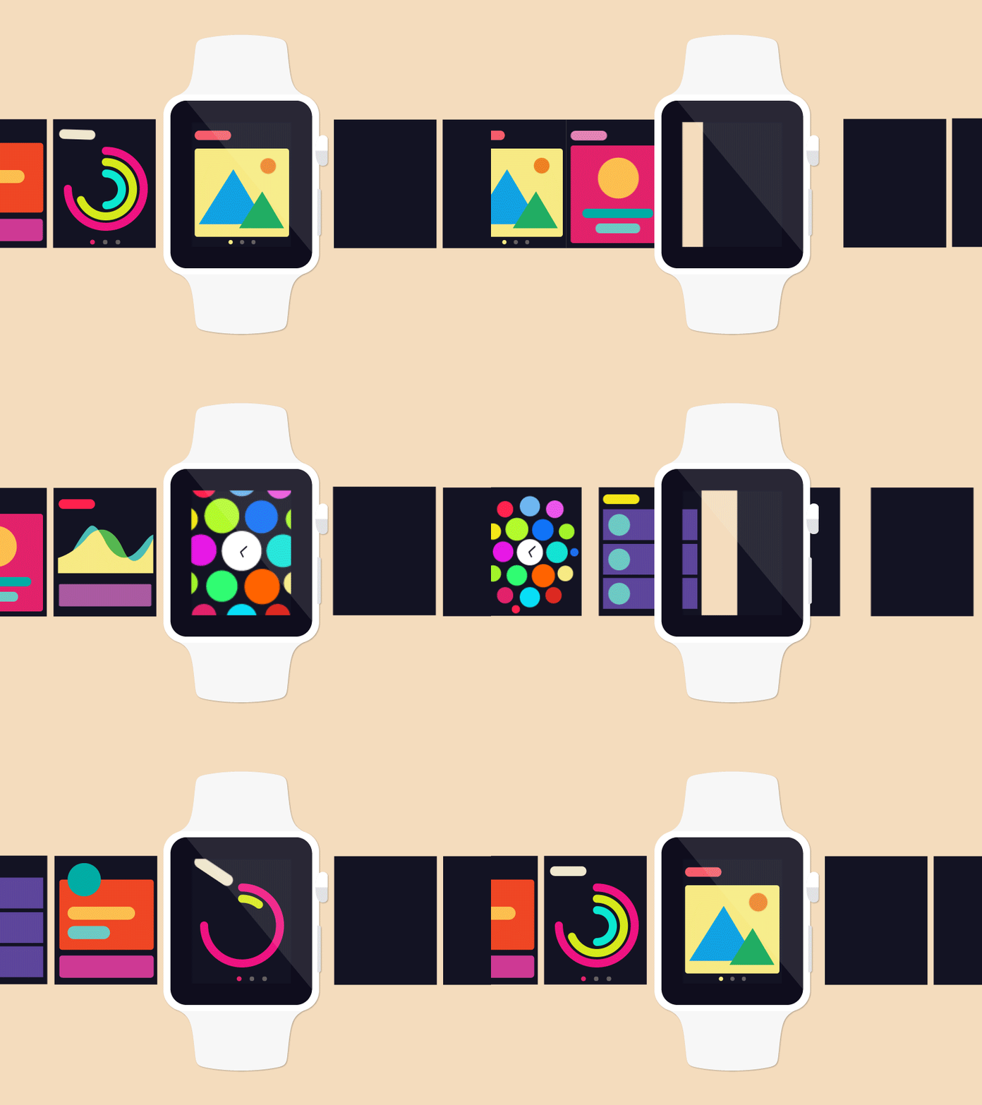
I am currently focused on UX/UI design on wearable devices. Thus far the work has been both interesting and challenging. I’ve discovered that the small interface requires a variety of patterns to be effective and that is what I’ve attempted to include in my Dribbble posts. I hope people can take my information animations and designs to use them for inspiration for their own fun and cheerful designs.
My process starts with sketching potential patterns I would like to use, typically seven or eight. Next I create fake data to make the design look authentic without creating a bias based on data. Next I focus on using simple shapes such as circles, squares and rectangles to represent patterns in Adobe Illustrator. Finally, I import the AI file to Adobe AfterEffects to create the animations.
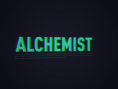
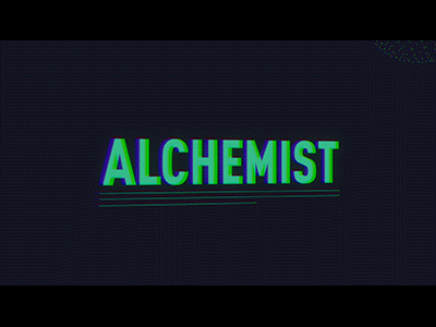
This was a personal project I did to sharpen up some skills. I had just gotten a Particular plugin and wanted to test it out. It’s based on a quote by Nicolas Cage during his talk at SXSW. (Without any irony, I think he is a brilliant actor and his ability to reinvent himself in incredible and terrible roles is what makes him the best.)
I used some masking animations to allow the two type pieces to animate in and out of each other and then added a glow and 3D camera to tilt the perspective. I then modeled a beaker in Cinema 4D and brought it into a Particular plugin and animated it in 3D, doing a 360-degree rotation as it moved from top to bottom. I then duplicated the layers and placed them next to each other, adding an additional glow.
I used tiny particles in the background for a dusty effect and larger particles to create “bubbles” that additional text would animate in on. I also created the letters “LEAD” in 3D and used a physics system with high velocity to mimic lead hitting the ground. This gave me a pretty cool “thud” effect. I then traced over it with trim paths, and then used some more fun masks to reintroduce the shape. I also have some polygons joining together in the background because it just looks cool. I then went over the entire project with a glitch effect that allowed the high-chrome colors to bleed from the corners.
It was a quick and fun project that allowed me to play around with a medium that is constantly evolving and improving itself.
Miss Part I? Go read!
Design For is an occasional series taking a closer look at a design niche. Want more? Check out Design on a Can: Part I and Part II, and Design in a Book: Part I and Part II. If you work in a special design niche you’d like to see us highlight, email stories@dribbble.com.
Find more Process stories on our blog Courtside. Have a suggestion? Contact stories@dribbble.com.


