Who are you? Let us know where you hail from, what you do, and what your role is at Ghostly Ferns.
Meg Lewis: Yo! I’m Meg. I am the founder of Ghostly Ferns and hail from Brooklyn along with the rest of the GF team. At Ghostly Ferns I do brand strategy and design along with product design working for happy companies.
Brad Evans: I’m Brad, I’m from Kansas City, and I specialize in web, product, and mobile design. I became a Ghostly Fern in 2009, when I joined my wife Meg.
Laura Bohill: Laura Bee’s mah name, don’t wear it out. I’m from Durham, a cute little city in the UK. At Ghostly Ferns you’ll find me specializing in digital illustration, iconography and branding.
What are you working on?
Meg: I’m working on brand strategy for a company who curates the happiest news stories across the world.
Brad: I’ve recently been working on a checkout flow revamp. I helped to simplify the entire process and reduce stress points as well update the UI. Currently I’m working with one of our clients on creating some additional screens for their app.
Laura: Right now I have a couple startups that I’m working with on an ongoing basis, providing them mostly with spot illustrations and iconography to help illustrate their content to complement their product design.
Choose one favorite shot of your own work, and tell us why it’s a favorite.
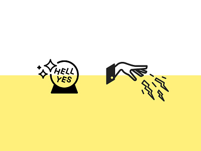
Meg: This shot is one of my favorites because I really got to put a ton of personality into a client’s brand. I think it’s great when a client of mine wants to pack their design with a ton of personable design. It makes today’s minimal, flat web much more exciting to me. Plus, who else gets to put “HELL YES” into a client project?
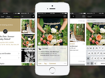
Brad: I recently had a two-year position with Paperless Post where I was able to do quite a bit of work on the iOS app. The photos feature was one of my favorites and it’s really great to be able to share some of the designs.
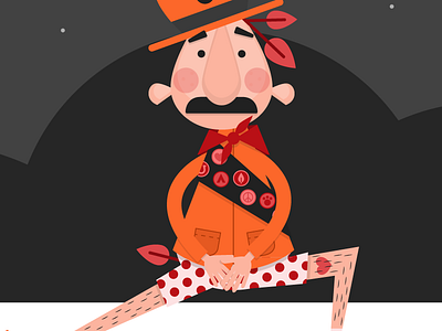
Laura: My favourite shot has to be Misfortunate Monty. I love it when I get to put a load of hilarity into my work, this little project had me actually giggling over my sketchbook.
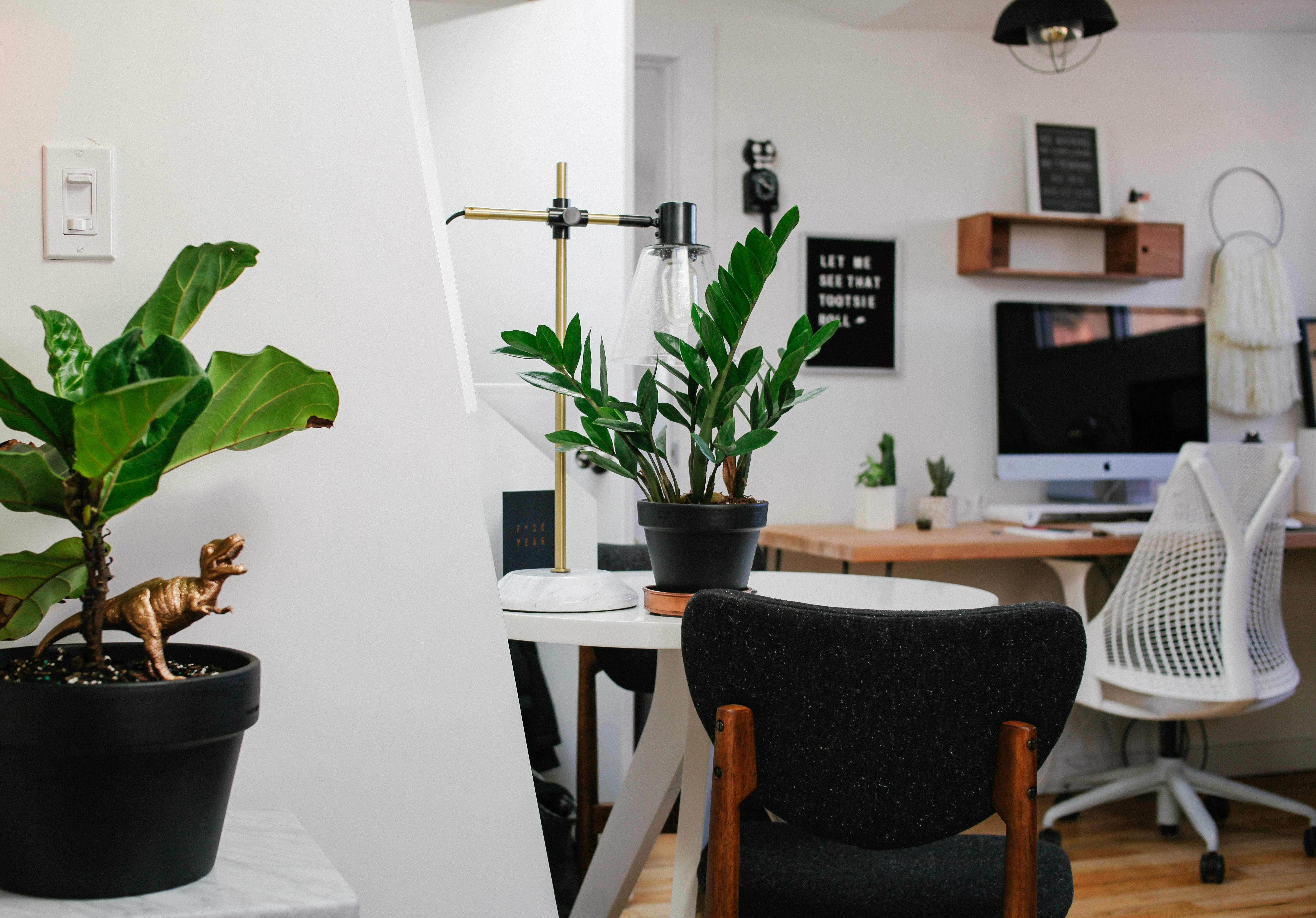
Tell us about your workspace, AKA your Haunted Attic.

We work from The Townhouse, a shared workspace within a four-story townhouse in Brooklyn, with around 25 of our dearest friends. Us Ferns have just the right amount of butts to occupy the attic entirely, and we have now named this space The Haunted Attic of Ghostly Ferns. (We think maybe haunted by a poodle named Suzie?) Being around each other is very important to us. We’re best friends who love to laugh together and provide each other with support and encouragement in every way. Our space is filled with beautiful furniture, a load of plants and items that we love. You’ll find poops, butts and dinosaurs all over the place. It’s perfect for us and we love it.
Choose a favorite shot from another player on Dribbble and tell us why you dig it.
Meg (left): I’m loving this portrait by Bryan Butler so hard right now. The simplicity and bold contrast are so pleasing. Plus, it’s really freakin’ cute.
Brad (center): I’ve really been enjoying all the great designs coming from the InVision team lately. This shot from Anton Aheichanka has really been one of my favorites with the clear presentation of information and fun pops of color. I really want to see what this secret project turns out to be.
[Ed. Note: Brad wrote his response about the Anton’s shot last month. The project teased in the shot was released earlier this month. See our recent User Friendly with Anton for the scoop.]
Laura (right): Oli Lisher made me so happy with this shot. I love to see other designers embrace the power of illustration in web design, so much vibrant personality that excites the eyeballs.
Find Ghostly Ferns at Dribbble, on Twitter, and at ghostlyferns.com.
Find Meg at Dribbble, on Twitter, and at megforever.com.
Find Brad at Dribbble, on Twitter, and at brad.ghostlyferns.com.
Find Laura at Dribbble, on Twitter, and at laura.ghostlyferns.com.
Find more Interviews stories on our blog Courtside. Have a suggestion? Contact stories@dribbble.com.


