Who are you?
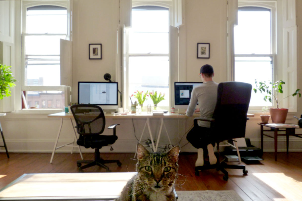
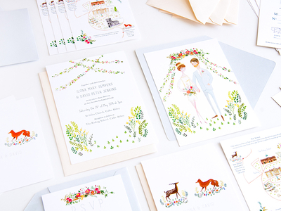
We’re Laura Shema and Tom Hart of Jolly Edition, we make illustration and stationery. Tom is an Englishman who started his career as a graphic and web designer (both inhouse and agency) in the UK. Laura spent most of her life preparing to be a traditional painter. She even spent time in New York working in Jeff Koons’ studio before meeting Tom. If you don’t know Jeff Koons, he’s the guy who makes the giant balloon dog sculptures.
After marrying in 2011 we had to figure out a way to make money whilst being together so we combined Tom’s design experience and Laura’s painting skills to make stationery. We still create artwork but we’ve also taken on administrative and big-picture roles for the company which is a job in itself. We really liking being small business owners as much as we enjoy the creative side of things.
We’re incredibly proud of what Jolly Edition can offer both customers and freelance illustrators. About a year ago we started introducing new illustrators to design with us because there’s a demand for interesting and meaningful wedding stationery. Laura was illustrating and designing dozens of projects every month so we needed more illustrators to take that work off Laura’s shoulders.
What are you working on?
We have dozens of stationery projects on the go at the moment for six illustrators. Aside from that we’re busy growing our offering for family and kids products. As the years have gone by our first clients have begun to have kids and grow their families — we want to be part of those experiences and have our products in their homes as they grow. This year is largely about pursuing that new direction and we’ve made strides to work with illustrators whose personality is naturally more fun and optimistic. It’s a perfectly aligned transition and we’re excited to start releasing Home and Family lines soon.
Choose a favorite shot.
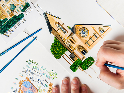
St. Cuthbert’s Catholic Church. This was a special project for us, the clients had such special ingredients and genuinely believed in our ideas on how to use them. They were dual-national like us and one of their ceremonies was at this beautiful church. They also had this medieval imagery so we got to play with mythology. Not all clients are that trusting. It’s also a really satisfying photograph because it shows us literally making our products by hand.
Tell us about your setup.

Laura loves to paint with gouache but we both use Photoshop and Illustrator everyday (thank you Creative Cloud). Asana helps keep our brains intact when dealing with so many processoriented projects between illustrators and clients. Tom’s always professing his love for InDesign but nobody cares.
We’re lucky to work with illustrators with vastly different tools and techniques. Sarah Andreacchio, Lydia Nichols, Emmeline Pidgen and Stephanie Shafer are nearly all digital. Natalie Adkins, Katie Harnett, Lesser Gonzalez Alvarez and Ana Petrak are somewhere in the middle and we have a bunch of analog professionals too — Jessie Bayliss, Emma Block, Livi Gosling, Elizabeth Graeber, Katie Wilson.
Tell us about Baltimore. What’s the design scene like, and what makes you excited to be a part of it?
Laura grew up in Baltimore, went to college at MICA and found her way to the U.K. via New York. We moved back to Baltimore over the holidays so we’ve only been back for a few months.
Baltimore’s a funny place, it’s full of talented, enthusiastic and smart people. Its problem is the disparate groups of creatives and sparse concentrations of neighborhoods, we desperately need to unify better. There are tons of hidden, design-oriented gems — from the raw bursts of creativity to the sophisticated, high-end design — they occur in clusters all throughout the city. We’re enjoying ourselves here and we hope to get more involved with Baltimore’s design and business landscape.
There’ll be a lot of people condemning our city as a whole after this week but we’re proud to be from Baltimore (and we’re only a few blocks from the centre of the recent events). It’s all too easy to focus on the salacious violence but we’re outspoken about being from this city because it formed our voice. If you like our work you can’t ignore Baltimore’s positive influence on us. We don’t want Baltimore being tarnished by America’s systemic problems. This is a great city.
Choose a favorite shot from another player.
We’re pretty eclectic in our tastes so we broke all the rules here and included eight. We’re so bad.
Top Row, Left-Right: Kaleidoscope by Melissa Ginsiorsky. Melissa’s great, she pours so much love into her work, check out that detail. Palm Springs by Fuzzco. They’re the best agency we know of and this is such a typically fresh image. Lions and Tigers and Bears by Lydia Nichols. Lydia is a rare combination of unbelievably talented and unbelievably friendly.
Middle Row, Left-Right: Need/Want by Bart-Jan Verhoef. This guy has a fun name and all his interface work is packed with well crafted thinking. Queen Club by Ricky Linn. Ricky knows how to pack a punch and his decision making is always spot on. A prodigy if ever there was one. Football Lover 2 by Alessandro Covella. You can’t teach personality, it’s even harder to get it through in an animated gif. Well played.
Bottom Row, Left-Right: A sparkly internet by Melanie Richards. Melanie’s work is so chirpy, this makes us smile. Lady Parrot by Brad Woodard. We enjoy Brad’s playful tiptoeing between modern and passed influences. [Ed. Note: We’re adding a ninth, Poodle Shower from Jolly Edition, to fill out our grid!]
Find Jolly Edition at Dribbble, on Twitter, and at jollyedition.com.
Find more Interviews stories on our blog Courtside. Have a suggestion? Contact stories@dribbble.com.


