Who are you?
I am from Zagreb, Croatia, and I currently lead the design team in an award-winning, full-service digital agency - Degordian. In addition to that, I’m a product designer at Mediatoolkit. Within the design department I worked on the development of smaller teams such as the creative, user experience, video and front-end.
Besides leading the team, my everyday job consists of working on digital strategies and services like web design, applications, product design and digital branding for global as well as local clients. While working on projects I pay a lot attention to typography, layout and interactions.
What are you working on?
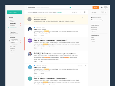
As a product designer at Mediatoolkit, a media monitoring tool that tracks relevant mentions of brands across the web and social media in real time, I’m currently working on development of its new user interface. Big emphasis is placed on interface simplicity and user experience improvement, so that users’ everyday usage of the tool would be on a cleaner interface.
Choose a favorite shot.
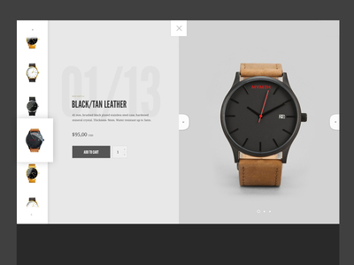
I love to experiment with the layout on the web and I love trying out some unusual things. Those kinds of shots are the most interesting to me on Dribbble, so with my shots I try to make something that might be interesting to others. Generally, in web design I love to move away from standards and some things that have been seen before. I think there are still lots of untried patterns that could be applied to layouts on the web and a lot of things that are still not being applied. Otherwise, I’m a big fan of typography and minimalism, so I always say that good design is the reduction and removal of all unnecessary elements of the interface.
Tell us about your setup.

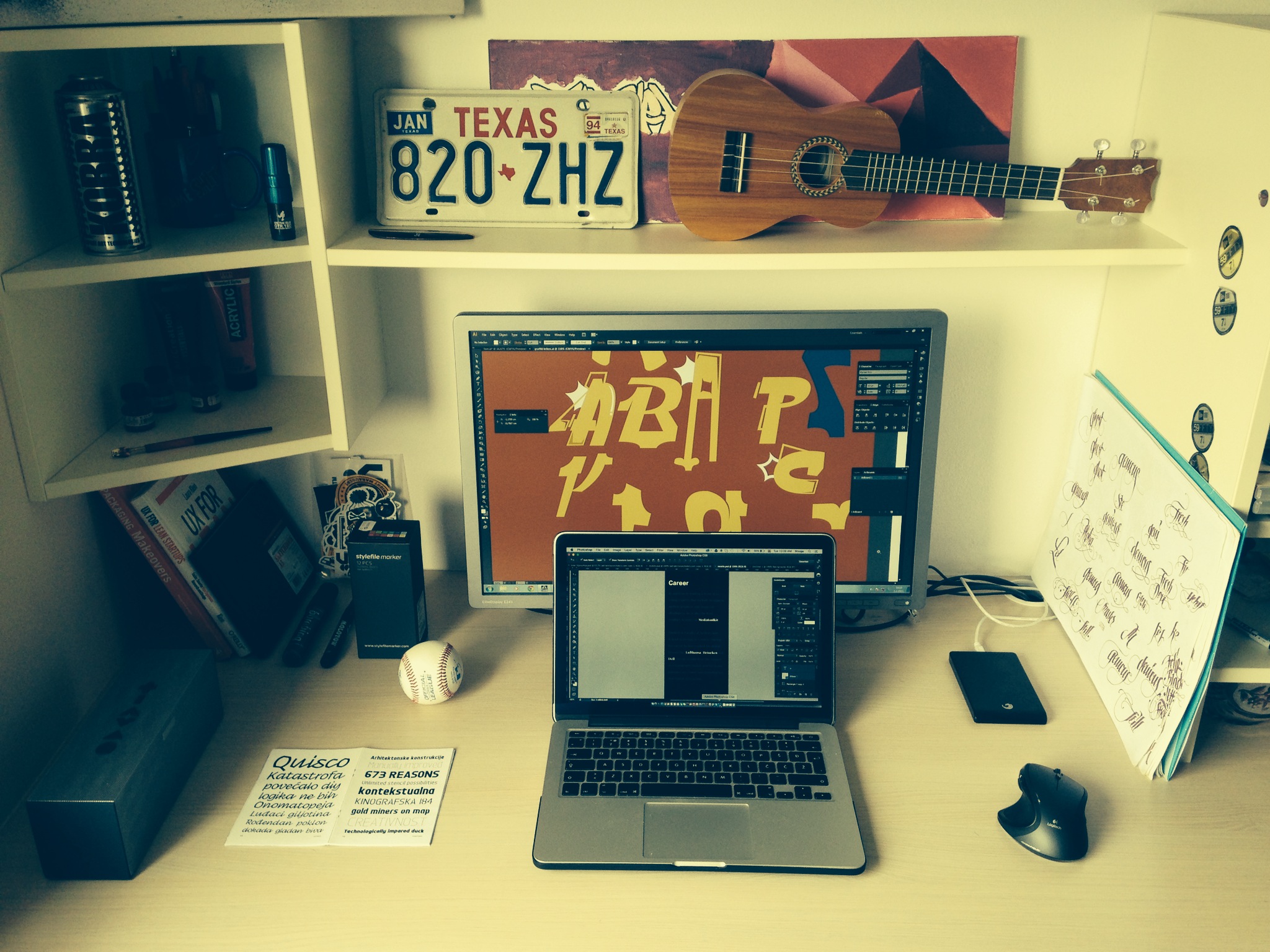
I’m still a big fan of pen and paper, that is why most of my ideas come to me while I’m scribbling sketches on paper. The computer and the programs we have are only means of expression through which we reproduce ideas. Of the software, I use Sketch, Adobe Illustrator and Photoshop, and of the hardware, I use a MacBook Pro which is perfectly suited to my current needs, because I like to change seating positions every day and be very flexible while I work.
Choose a favorite shot from another player.
I don’t have a favorite shot. My favorites are changing daily because I follow a lot of very talented people who often put something new and interesting. I would single out work from Marc Anderson, Claudio Guglieri, and amazing illustrations by Ryan Putnam. [Ed. Note: Below, we included the most recent shot from each of the three designers mentioned. Marc’s Pet Shopping Basket, left; Claudio’s Leaves Motion Test, center; Ryan’s Earth Day Icons, right.]
Find Hrvoje at Dribbble, on Twitter, and at www.hrvojegrubisic.com.
Find more Interviews stories on our blog Courtside. Have a suggestion? Contact stories@dribbble.com.


