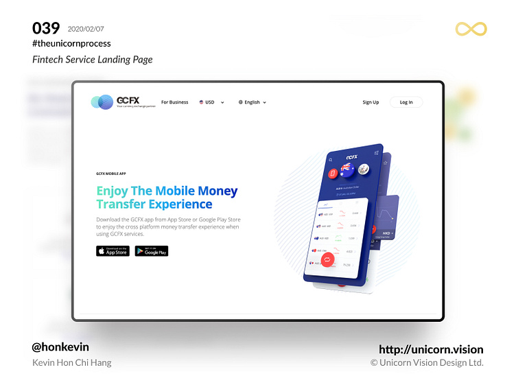
039 - GCFX App Landing Page
Keyword: Landing Page
Marketing people, of course, know what a landing page should look like. There should be a tagline along with a call-to-action button on the top part of the page, following with some introductory text, after that add a signup form along with another action button. Under the signup form, there should be a testimonial section with all the good words from you true and made-up customers. The bottom part above the footer, add one more call-to-action button. This structure is pretty standard in the marketing industry.
In most of the circumstances, we can apply the standard structure on the landing page. But instead of long-form content, sometimes a quick and short landing page is also very popular, especially for the app download page. The role of the landing page, in this case, is as an entry point to funnel the user. It should be quick and straightforward, guide the user to the application store page and that is.
It is important for the product owner to strike a balance between the density and clarity of information. The best way to measure the efficiency is through a heat map and track the scroll area. How far the user scrolled? Which buttons did they click? So you will have a clear idea of how to improve the design in the next iteration.
By Kevin Hon Chi Hang on 2020/02/07
iOS & Android Download: http://bit.ly/36vIDON
#theunicornprocess #unicornvision #honkevin #flutter #gcfx #gcfxapp #ios #android #reactjs

