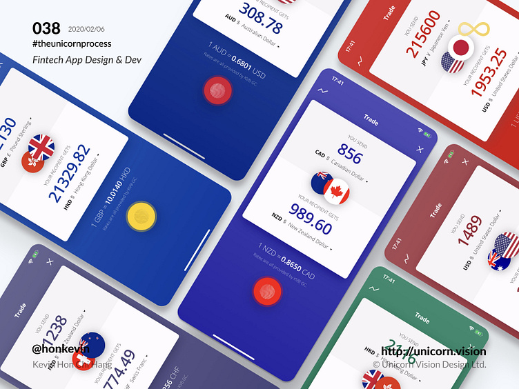
038 - GCFX iOS & Android Design & Development with Flutter
Keyword: Action Button
The action button is the heart of an application interface. It should be clear, intuitive and eye-catching. When you taking a look at the human interface guideline or the material design guideline, there is a very clear instruction on how to place and handle the action button when designing the interface.
In Unicorn Vision, we always focus our effort to design interfaces that help users utilize the core function in a simple way. One thing we do care about is the size of the hit area of the button along with the button placement on the interface. The hit area is always the aspect that may cause a problem to the user interface. When the developer code out the interface according to the design mockup, if the action button is not large enough, the developer should have the sense to fix it to increase the hit area with an invisible div/ component/ widget.
Everyone talks about user experience design, but no one can conclude what it is with a solid definition since it can be very broad. User experience is somehow an abstract concept, it requires real-life studies to train up the design sense. If you have no gut to make it right, just follow the design guideline from Apple or Google. You will be fine then.
By Kevin Hon Chi Hang on 2020/02/06
iOS & Android Download: http://bit.ly/36vIDON Sign Up for Secure Money Transfer: http://bit.ly/3b3KUU3
#theunicornprocess #unicornvision #honkevin #flutter #gcfx #gcfxapp #ios #android #reactjs

