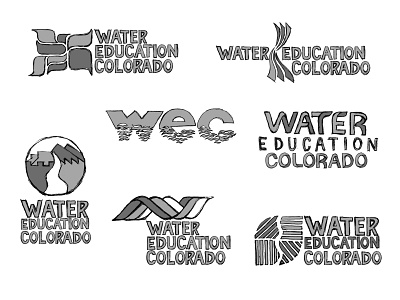
Water Education Colorado Logo Design Process 4
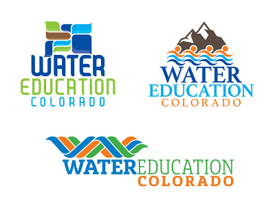
It's not uncommon to make the move from presentable pencils to computer-rendered comps. What is uncommon here is the addition of color, generally the first computer comps would still be black and white. There were budget limitations if I recall correctly, so I introduced color and type exploration at an early stage.
At every stage, each design concept is presented on it's own board and has an accompanying description. The descriptions for these concepts are below, clockwise from upper left.
CONCEPT 1
This concept features a simplified, graphic representation of the state of Colorado’s watersheds. The varied shapes allow for vibrant color exploration, and the map concept alludes to a deep knowledge of water issues in Colorado.
CONCEPT 2
The waves of water flow below and across a stylized peak, forming a bridge connecting the two sides of the mark. The peak symbolizes the Rocky Mountains, which stand tall between the eastern plains and the Western Slope. Snow reminds us where our water comes from, and the stylized figures linked together emerge from the river graphic, symbolizing that we are the water, and the water is part of us. And working together we become the bridge.
CONCEPT 3
The flow of liquid suggested by this graphic is also reminiscent of a DNA helix, the building block of life, a cupped hand, or the letter W. The intertwined ripples of water are symbolic of the unifying work Water Education Colorado does to bring the water community together.