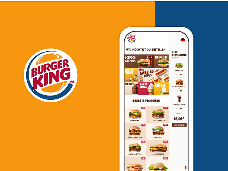
Burger King Self-Service Kiosk - Concept
We just finished a concept redesign for a Self-Order Kiosk for Burger King, the main weak points in their current interface are:
1. Adding multiple items takes unnecessarily long, hence makes for a bad UX.
2. Order Editing was reduced to the main screen instead of skipping between your cart and the main screen, hence improving the UX
3. The Banner based layout makes for easy advertising of current offers/promotions.
Hope you like it 💕
Software: Figma ------------------------ Do you have a project you’d like to collaborate on? Email us at support@dotweb.agency
Visit us: Dotweb Agency
More by Karim El Kanfoud View profile
Like

